I’m pleased we didn’t have to wait as long as last year for the Pantone® announcement of the Fall/Winter colours to look out for in 2018. In fact, it even took me a bit by surprise!
With the fashion week season just kicking off (this month is New York, London, Milan and then Paris) we start to think about those autumnal months.
And it seems that Pantone® are back in their stride, as we return to a top ten of colours (rather than a dozen that we saw for spring 2018). Plus I’m pleased to see the report continuing to be predictions again rather than a counting colours exercise from the catwalks.
It’s great to see an increase and update to the bonus colours that act as neutrals and core basics too.
Bonfire night warmth
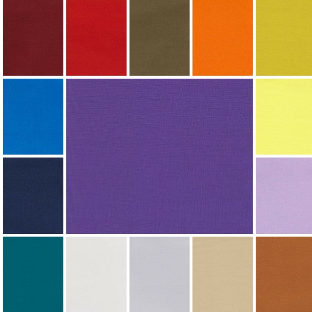
I love this collection of bold colours that will trend in Autumn. They certainly pack a punch and make a huge statement.
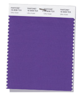
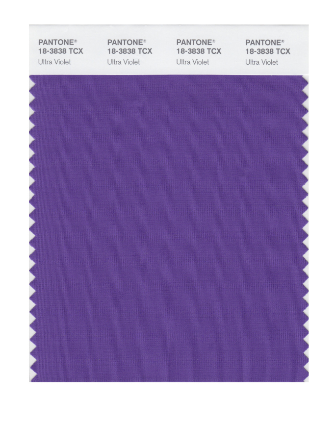
Alongside some typical, rich autumnal colours, there’s some great accompanying vibrant shades that sit nicely alongside the colour of the year, Ultra Violet.
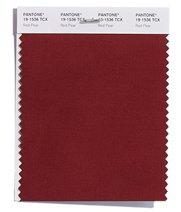
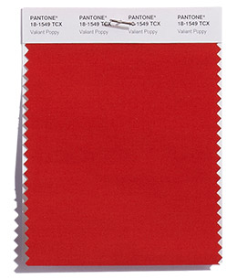
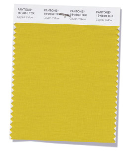
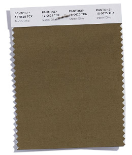
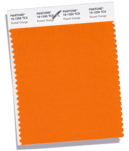
You can feel the warmth of the reds, orange, yellow and brown colours radiating out like the flames of a bonfire on Guy Fawkes night with Red Pear, Valiant Poppy, Ceylon Yellow, Martini Olive, Russet Orange (and Meerkat from the neutrals).
Peacock blooms
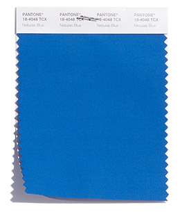
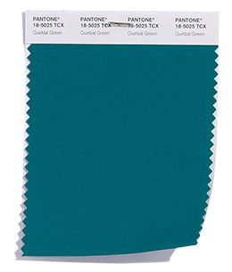
The dark, jewel colours (of Nebulas Blue, Ultra Violet and Quetzal Green) are fitting for my prediction of peacock inspired weddings this year. With the deep teal of Quetzal Green even named after a striking colourful bird.
Many of the names of the colours in this season seem so evocative and conjuror up images of space, sky, sea and land. With the interstellar cloud of dust of Nebulas Blue, Ultra Violet (the colour of the year tipped to suggest the mysteries of the cosmos), the cold, dark North Atlantic water of the Sargasso Sea and the expanse of poppies in Flanders Field reminiscent of Remembrance Day.
I’d love to have the job of thinking up the names of the colours – any one for a cocktail to accompany Martini Olive?!
Winter transition
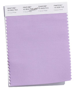
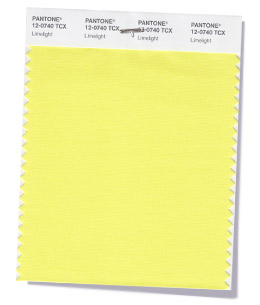
With the start of the Winter Olympics in Pyeongchang today, it’s lovely to see some icy counterparts to take us in to winter with Crocus Petal (a paler version of Ultra Violet) and Limelight (a lighter version of Ceylon Yellow). They’ll make good transition colours to next spring too.
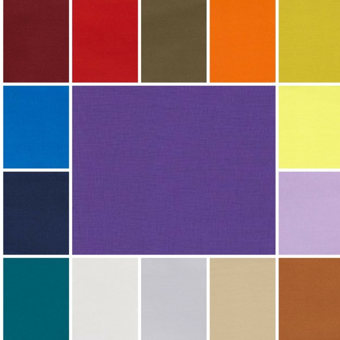
Fall 2018 colours
The top ten colours for Fall 2018 are:
PANTONE 19-1536 Red Pear
PANTONE 18-1549 Valiant Poppy
PANTONE 18-4048 Nebulas Blue
PANTONE 15-0850 Ceylon Yellow
PANTONE 18-0625 Martini Olive
PANTONE 16-1255 Russet Orange
PANTONE 18-3838 Ultra Violet
PANTONE 15-3520 Crocus Petal
PANTONE 12-0740 Limelight
PANTONE 18-5025 Quetzal Green
Fall 2018 extra colours from LFW
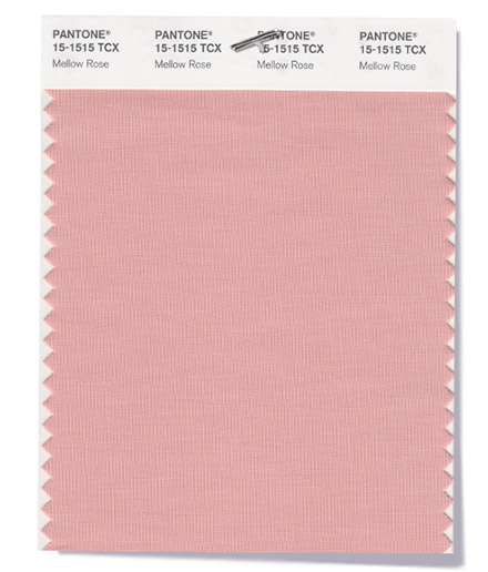
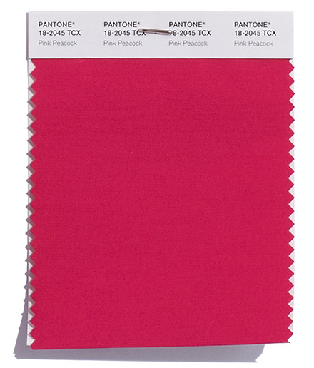
Plus a couple of additional pops of pink from London Fashion Week round off the colours for Fall 2018:
PANTONE 15-1515 Mellow Rose
PANTONE 18-2045 Pink Peacock
Neutral basics
Pantone® have also created a Fall 2018 Classic Colour Palette. These are a group of neutrals that are core basics in the form of navy, white, beige, grey and brown.
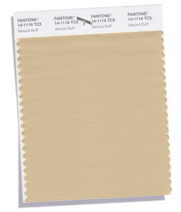
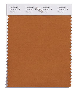
You could wrap yourself up in these warm neutral colours. This is hygge at its best – with a great addition of Meerkat brown – so comforting, warm and cosy.
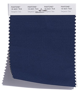
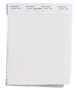
The bonus classic neutral colours for Fall 2018 are:
PANTONE 19-4031 Sargasso Blue
PANTONE 11-4801 Tofu
PANTONE 14-1116 Almond Buff
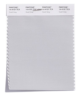
PANTONE 14-4107 Quiet Grey
PANTONE 16-1438 Meerkat
Colour themes
It’ll be great to see how couples incorporate these colours in to their weddings later this year.
Pantone® is the world-renowned authority on colour and the Pantone® Color of the Year is always really influential in any popular colour themes in fashion, interior design and weddings.
As well as general wedding planning chat, today we are talking about 2018 wedding trends #weddingplanning #UKWedLunch
2018 WEDDING TREND 1: Clothing – what do you think to the arm warmer style sleeves, trailing bows on shoulders or Watteau backs on wedding dresses? #UKWedLunch
2018 WEDDING TREND 2: Culture – do you think films like jungle book or aquaman will influence tropical and underwater wedding themes next year? #UKWedLunch
2018 WEDDING TREND 3: Celebrities – will Harry and Meghan’s wedding influence some great British street party style weddings? #UKWedLunch
2018 WEDDING TREND 4: Colour and styling – how do you see the @pantone color of the year working in couples’ schemes? #UKWedLunch
2018 WEDDING TREND 5: Catering – will family style serving and buffets still be big news at weddings in 2018? #UKWedLunch
2018 WEDDING TREND 6: Current affairs – will the winter Olympic swimming or World Cup in Russia influence some wedding themes in 2018? #UKWedLunch
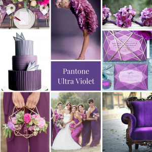
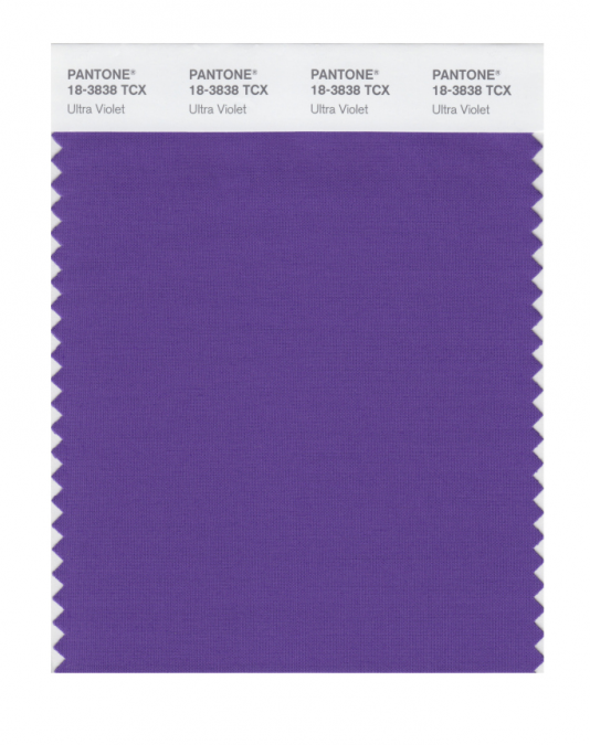
Pantone® have picked a deep purple ‘Ultra Violet’ as their colour of the year for 2018!
What a wonderful, vibrant colour that I can’t wait to see couples incorporating into their wedding colour schemes next year.
For me, it was always going to be a toss up between a bright yellow or a brilliant shade of purple. I’m over the moon that Pantone® have gone for such an attention grabbing and bold purple to be the colour of the year. It is a remarkable blue-toned shade of purple called Ultra Violet (also known as Pantone® 18-3838) and I’m pretty pleased as purple just happens to be my favourite colour!
As Pantone® Vice President Laurie Pressman said, it is an “optimistic and empowering color” for “originality, ingenuity, and visionary thinking”. It feels futuristic, magical and regally majestic – which is quite fitting for the year of another royal wedding in the UK.
Pantone® is the world-renowned authority on colour and the Pantone® Color of the Year is always really influential in any popular colour themes in fashion, interior design and weddings.
I’ve been desperate for a yellow or an orange colour to get top billing for a couple of years and my guess for the Color of the Year 2018 was for Meadowlark (see my Spring 2018 report). But I’m so pleased to see a vibrant, bright colour leading the way again in 2018.
See more about my Ultra Violet mood board from the UK Academy of Wedding and Event Planning’s SS18 Pantone® mood board competition from earlier this year.
The children are only just back to school today so I was surprised to see the news from Pantone® about Spring 2018 colours landing on my desk already – how exciting!
Their timing to announce the next season’s colours has been much earlier this time around and ahead of all the fashion weeks. In February, we were left waiting until after both New York and London Fashion week to announce their Fall 2017 fashion report. But the Spring Summer 2018 New York fashion week isn’t due to kick off until tomorrow so I wasn’t expecting Pantone® to announce their colour forecast just yet. It’s great to see their report is going back to being a forecast rather than a colour counting exercise from the catwalks though.
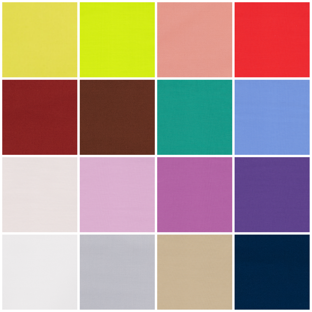
So not only is their timing unexpected but so are the colours – both in quantity and palette.
This season, instead of the usual 10 colours, we’ve been given an extra 2 to make 12 colours that Pantone® forecast to be the colours for Spring/Summer 2018. As if that wasn’t enough, they’ve also thrown in 4 bonus colours that act as neutrals and core basics.
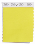
I am so pleased to see yellow featuring high on their list – it’s such a comforting ray of sunshine. Does this mean that we’ll finally see a yellow as the colour of the year in 2018? I’ve been desperate for a yellow (or an orange colour) to get top billing for a couple of years and I cross everything for a bright colour like Meadowlark to take the top slot.
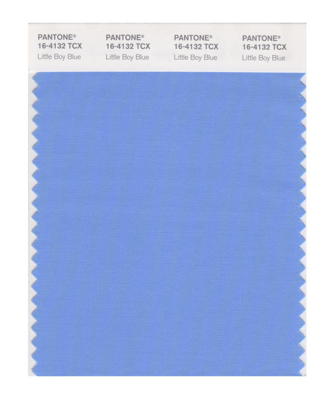
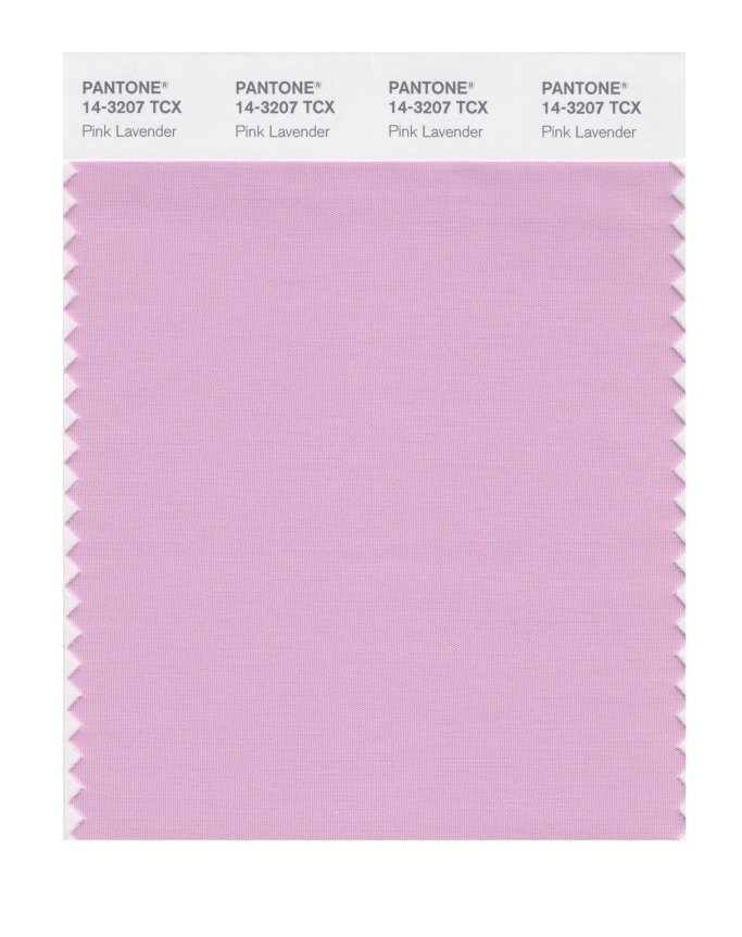
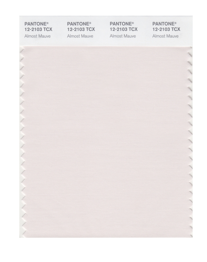
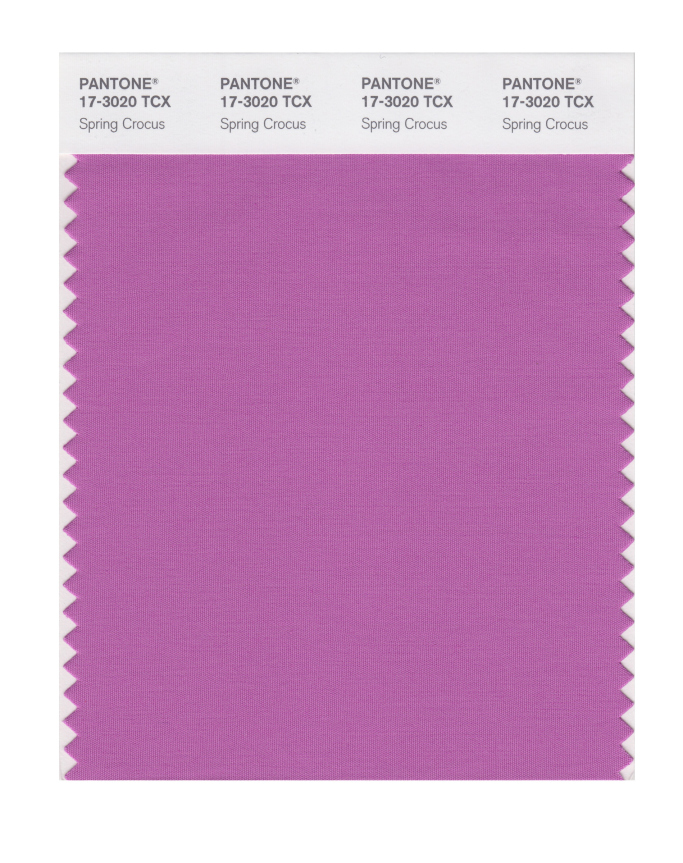
These Spring colours are certainly attention grabbing and there’s even a neon yellow amongst them. For me, I love that they are continuing the Spring 2017 trend away from pale pastels. This palette is right up my street! I love the blues (Little Boy Blue and Sailor Blue) and how these evolve in to my favourite colour of purple. With Pink Lavender, Ultra Violet, Almost Mauve and Spring Crocus.
The pastels that are used are barely-there colours and really work with the trend for gentle, ethereal and floaty materials and textures that are featuring in bridal attire at the moment.
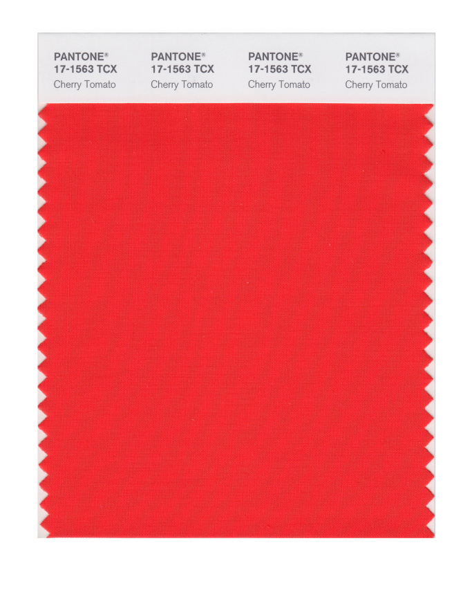
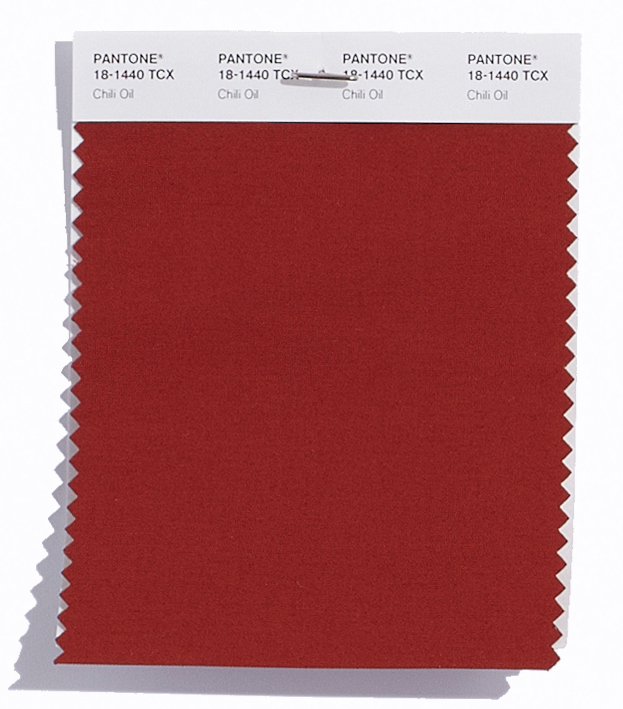
I also like the food based colours that show a real culinary influence of Cherry Tomato and Coconut Milk, with a bit of added spice from Chili Oil.
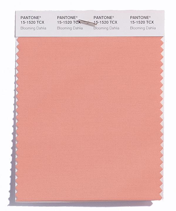
Along with this is some wonderful floral inspiration for a beautiful spring meadow such as Blooming Dahlia, Spring Crocus, and Pink Lavender.
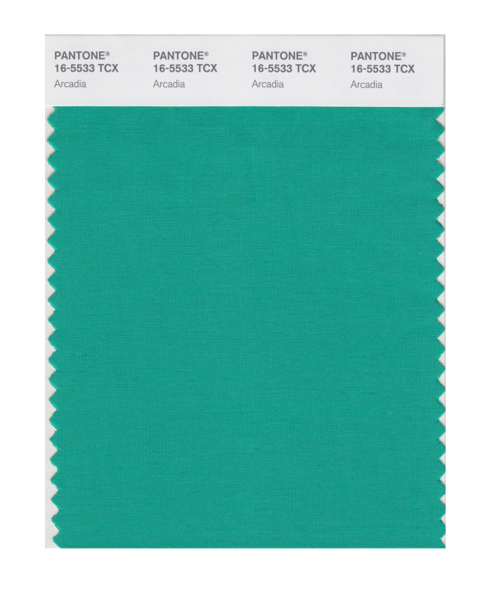
Plus the evolution of green continues in to this season. From the freshness of Greenery for Spring/Summer 2017 (and colour of the year in 2017), to the evergreen foliage of Shaded Spruce from Fall/Winter 2017, to a wonderful teal colour in Arcadia next Spring/Summer 2018 that mixes calming blue in to the green mix.
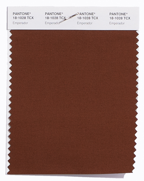
There’s also some unexpected earthy autumnal colours (like Chili Oil and the rich chocolatey brown of Emperador) that seem a little out of place from a traditional Spring palette but will act as great transitional colours to take us in and out of seasons.
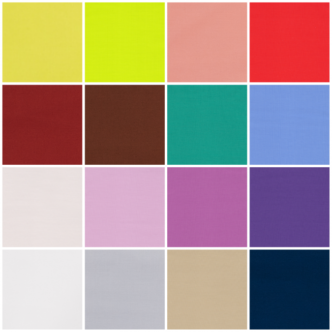
The top twelve colours from NYFW for Spring 2018 are:
Meadowlark 13-0646
Cherry Tomato 17-1563
Little Boy Blue 4132
Chili Oil 18-1440
Blooming Dahlia 15-1520
Pink Lavender 14-3207
Arcadia 16-5533
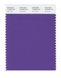
Ultra Violet 18-2828
Emperador 18-1028
Almost Mauve 12- 2103
Spring Crocus 17-3020
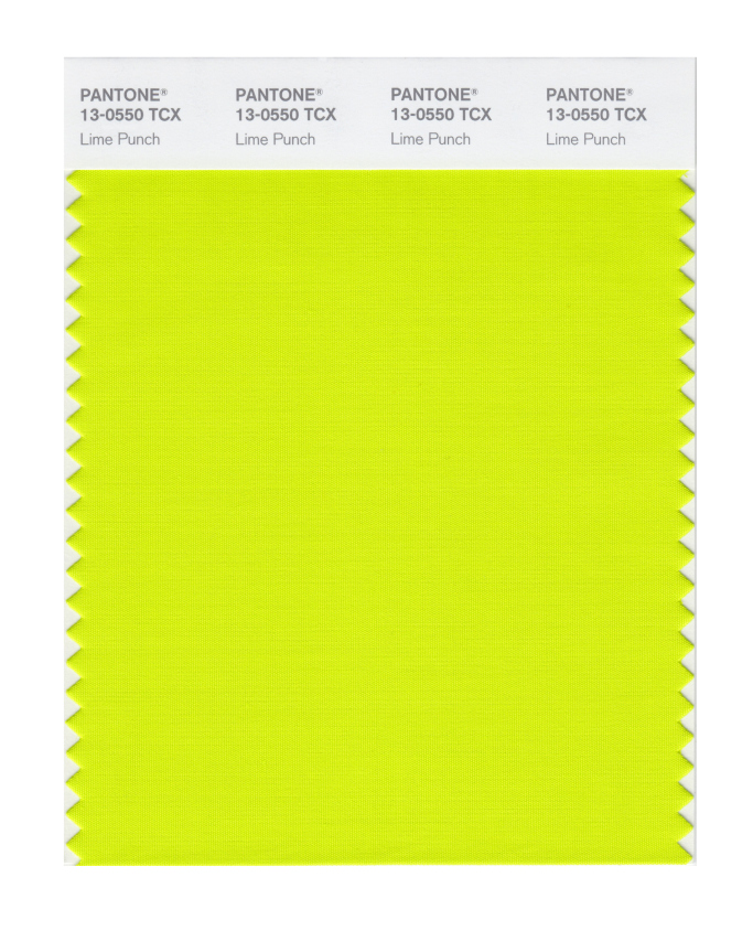
Lime Punch 13-0550
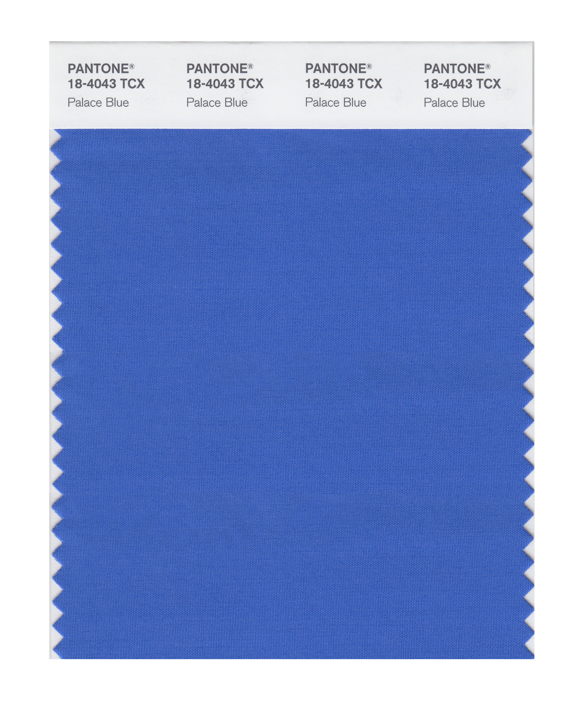
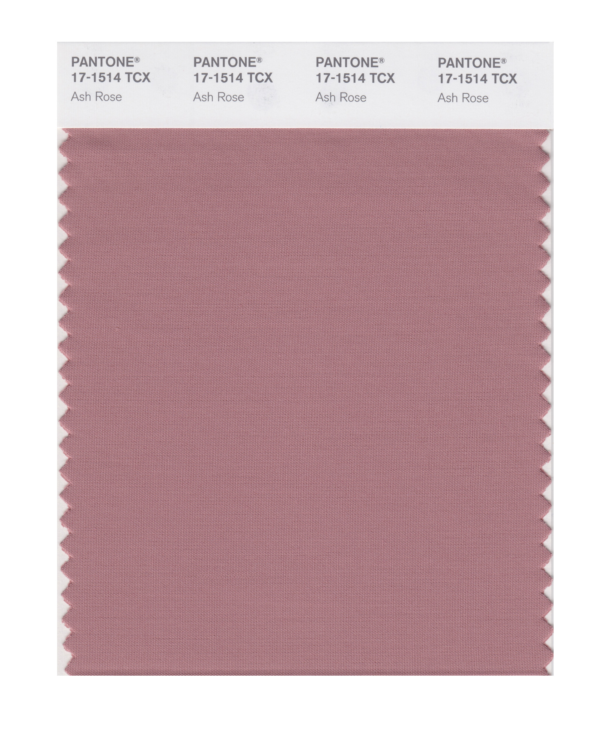
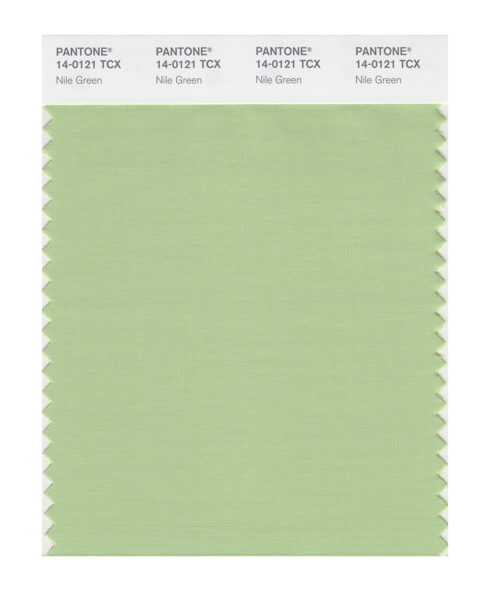
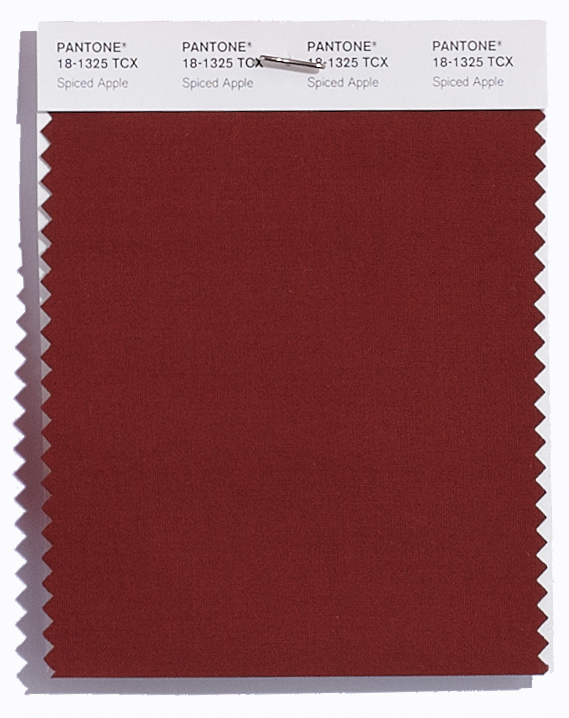
Plus these from LFW (which are pretty similar to the ones from New York apart from the addition of another blue, a couple of wonderful dusky pinks, a warm burgundy and a fresh green):
Cherry Tomato 17-1563
Palace Blue 18-4043
Ash Rose 17-1514
Nile Green 14-0121
Meadowlark 13-0646
Blooming Dahlia 15-1520
Ultra Violet 18-2828
Spiced Apple 18-1325
Pink Lavender 14-3207
Almost Mauve 12- 2103
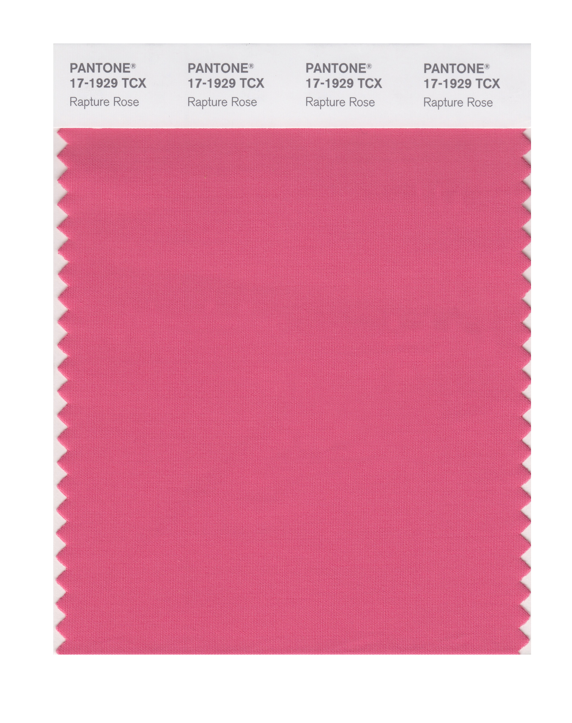
Rapture Rose 17-1929
Lime Punch 13-0550
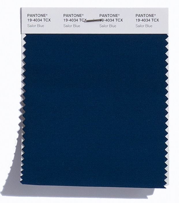
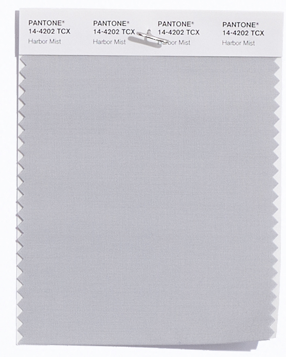
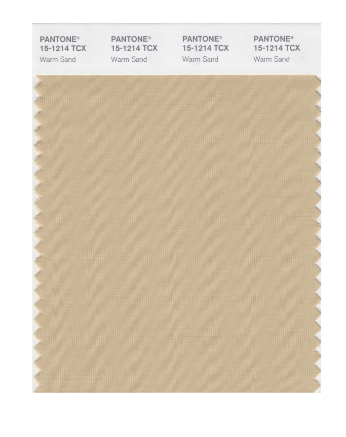
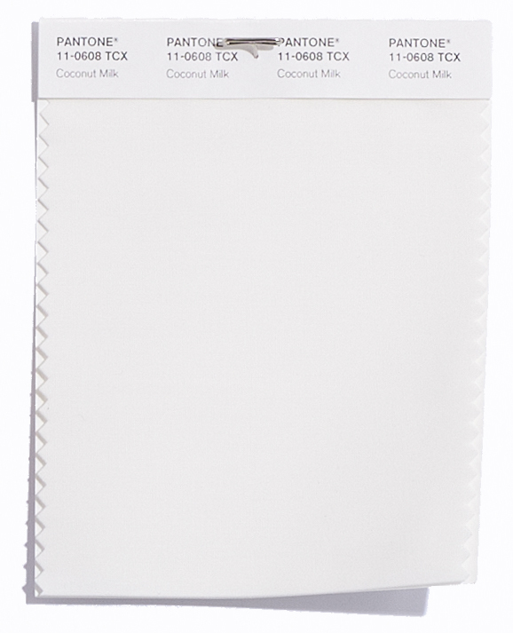
Pantone® have also created a Spring 2018 Classic Colour Palette. These are a group of neutrals that are core basics in the form of navy, grey, beige and off white (of Sailor Blue, Harbor Mist, Warm Sand and Coconut Milk respectively).
The bonus classic neutral colours for Spring 2018 are:
Sailor Blue 19-4034
Harbor Mist 14-4202
Warm Sand 15-1214
Coconut Milk 11-0608
It’ll be great to see how couples incorporate these colours in to their weddings next year. I can see how the classic neutrals will play a big part in coupling up with some of the more vibrant choices.
Pantone® is the world-renowned authority on colour and the Pantone® Color of the Year is always really influential in any popular colour themes in fashion, interior design and weddings.