I’m beginning to think that the warmer weather of last week was ‘false spring’ and led me in to a false sense of warmer months being imminent. Because this week, we are back to the erratic weather including rain, floods, high winds and even more frosty nights and misty mornings.
It seems the shoots in the ground thought the same as me and I hope they can make it unscathed through to spring soon.
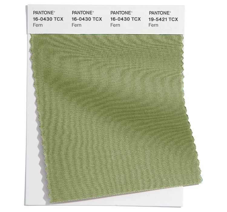
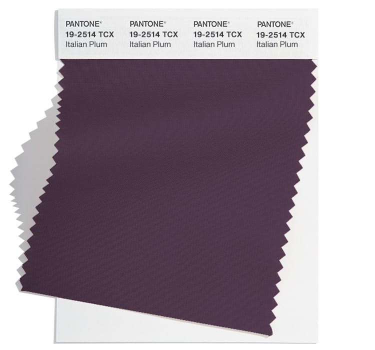
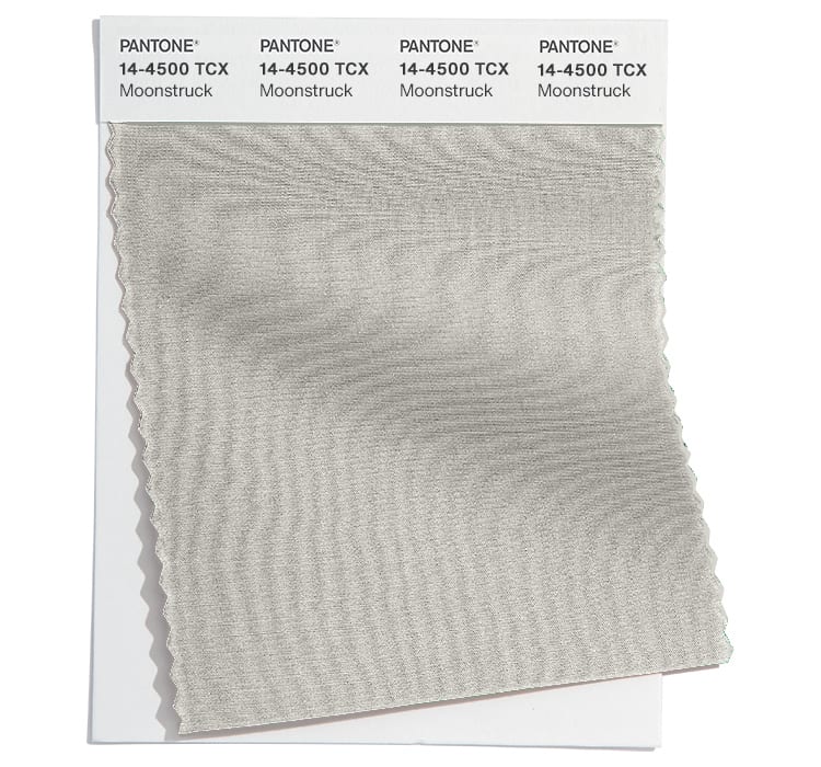
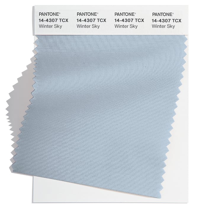
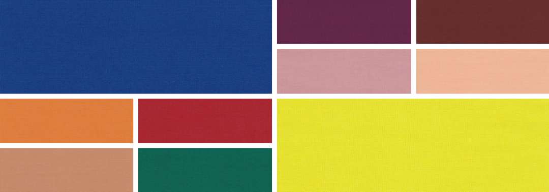
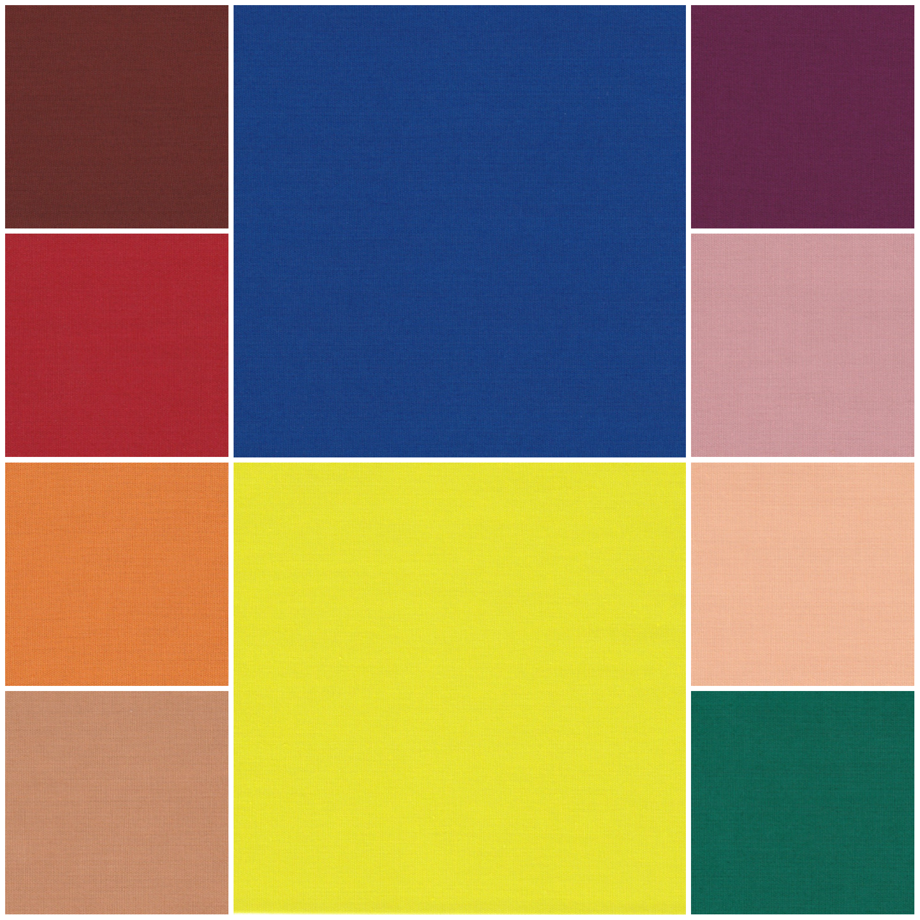
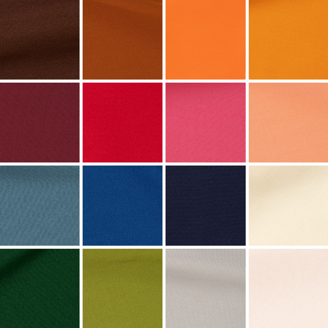
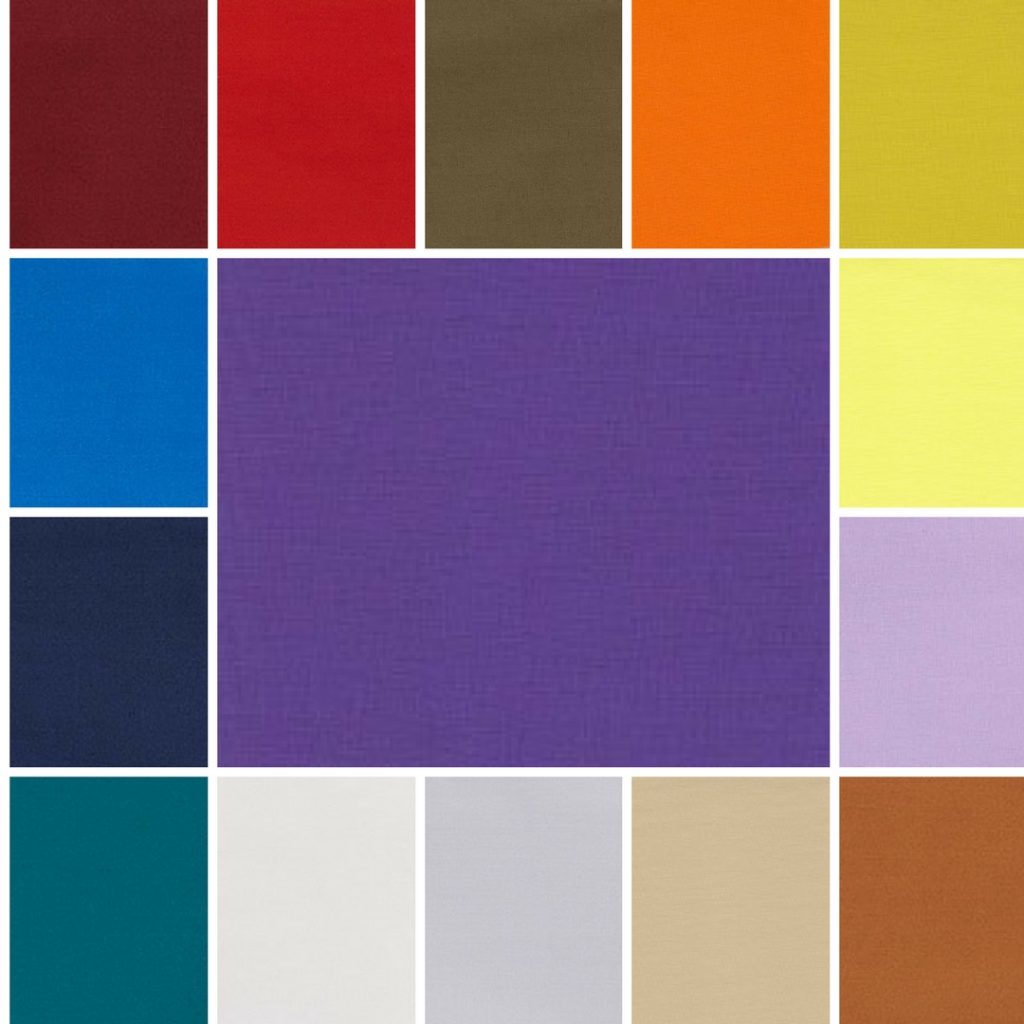
Autumn 2024 colours
Whilst I am longing for Spring, it’s at this time of the year that I think about seasons even further away with the recent fashion weeks in New York, London and Milan this month, and Paris this week.
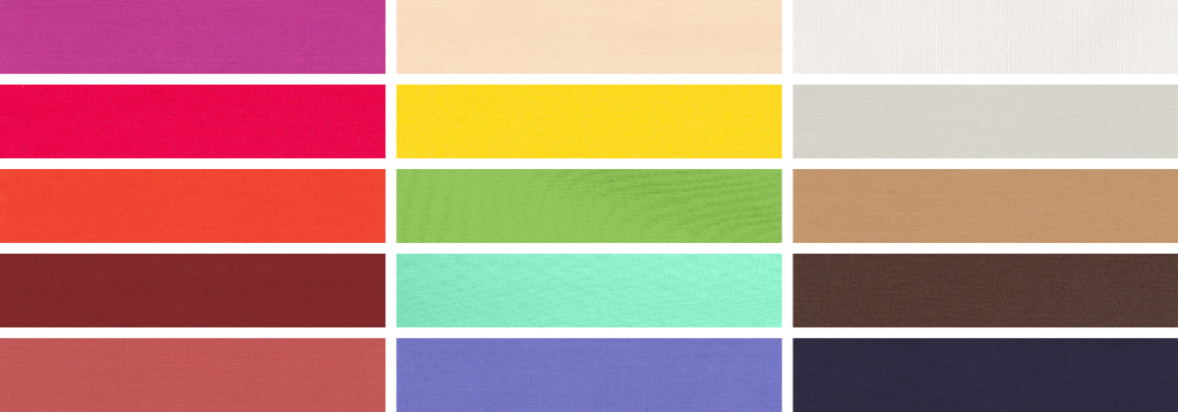
From these fashion weeks, Pantone® have predicted 10 colours that they think will be prevalent in Autumn/Winter 2024/25 which all make me feel warm and cosy like I’m wrapped in a luxurious velvet blanket.
Food
There’s a big vibe of autumnal produce and harvest time in this mix of colours including names of plum, pumpkin, orange, tomato, egg plant (aubergine), and almond milk.
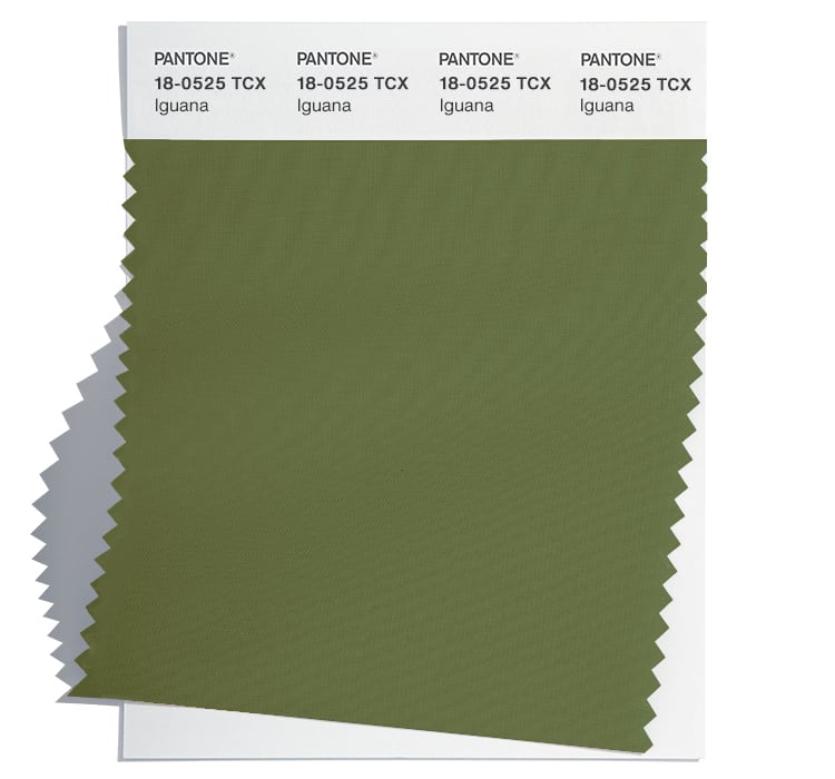
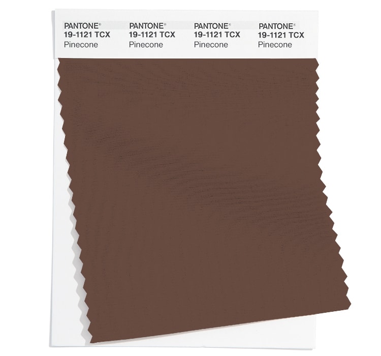
Nature
Lots of the colours evoke the natural work around us with fern, rainforest, iguana, pine cone, sheepkin and swan.
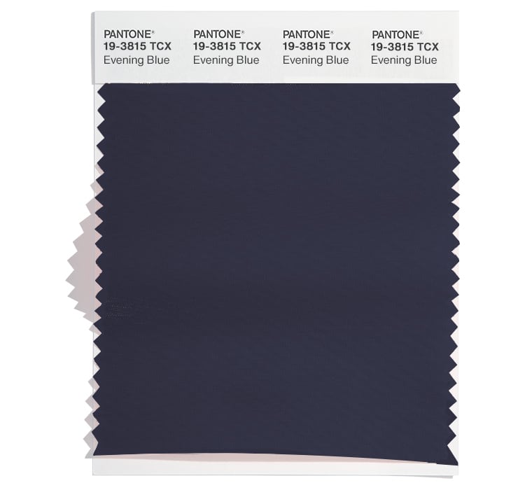
Crisp mornings
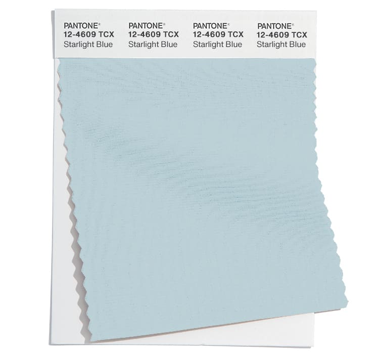
There’s a sense of chilly cold winter skys from Starlight Blue right through to Evening Blue.
Weather
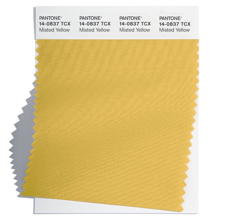
Even these colours are hinting at the crazy changing weather we’re experiencing with extremes such as Storm Front, Sunburn, Misted Yellow and Moonstruck.
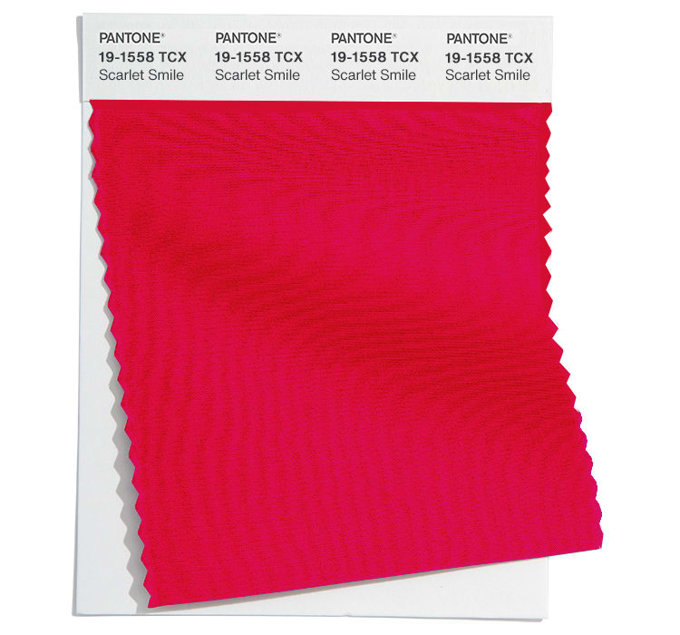
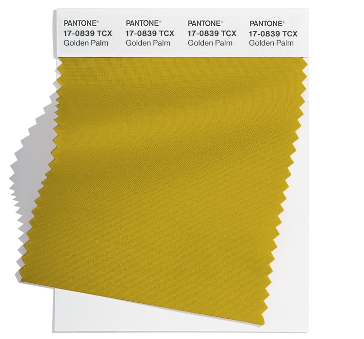
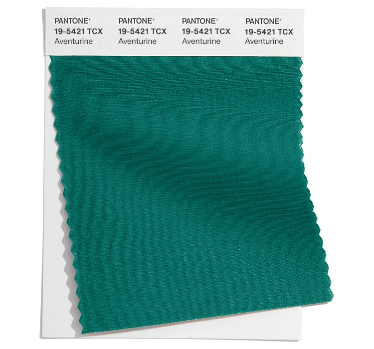
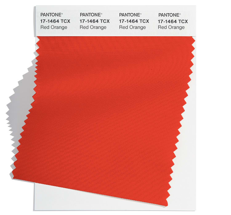
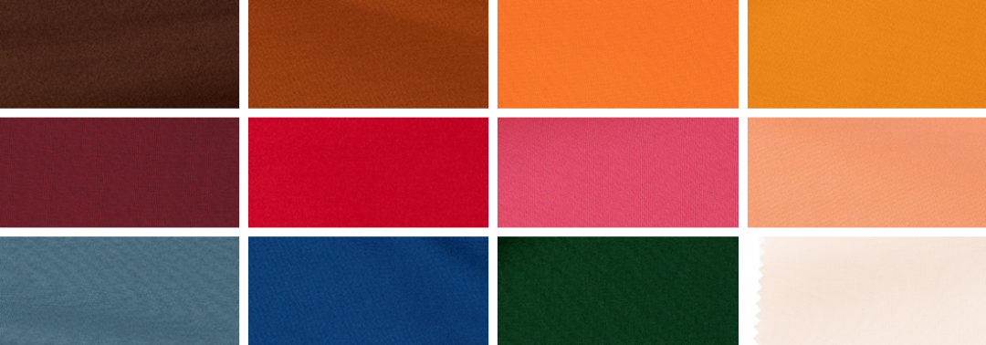
Fall 2024 colours
The top ten colours for Fall 2024 from New York Fashion Week are:
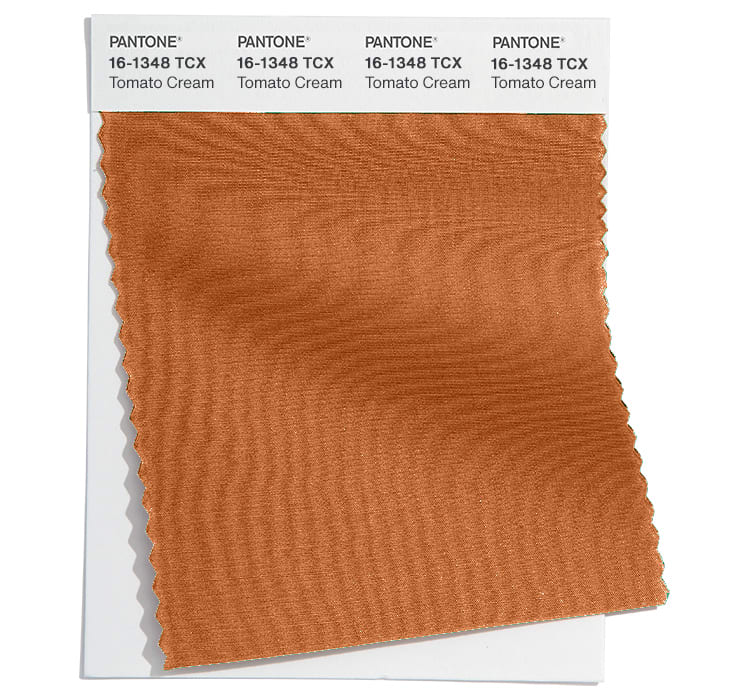
Tomato Cream 16-1348
Scarlet Smile 19-1558
Golden Palm 17-0839 TCX
Aventurine 19-5421
Red Orange 17-1464
Fern 16-0430
Italian Plum 19-2514
Moonstruck 14-4500
Winter Sky 14-4307
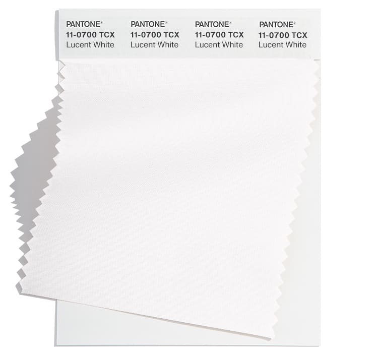
Lucent White 11-0700
Fall 2024 extra colours from LFW
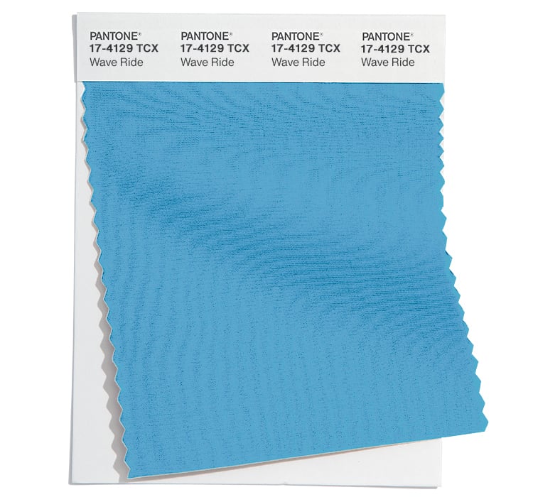
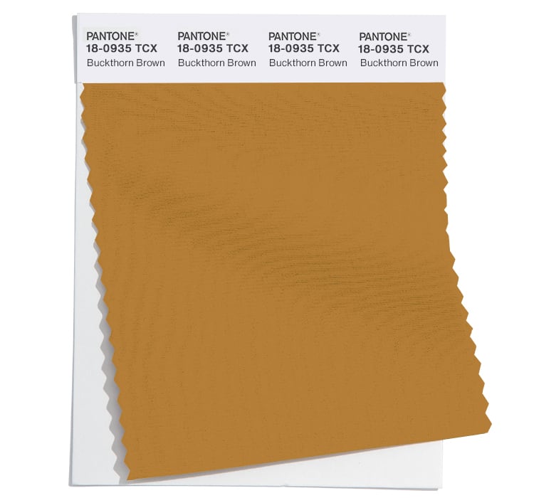
Most of the colours have the same vibe at London Fashion Week, with some slightly different hues. The noticeable difference was a yellowy brown at NYFW (of Buckthorn Brown) which were replaced with a bright blue (or Wave Ride) at LFW.
Here are the colours for Fall 2024 from LFW:
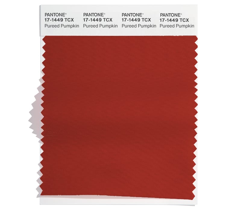
Pureed Pumpkin 17-1449
Misted Yellow 14-0837
Starlight Blue 12-4609
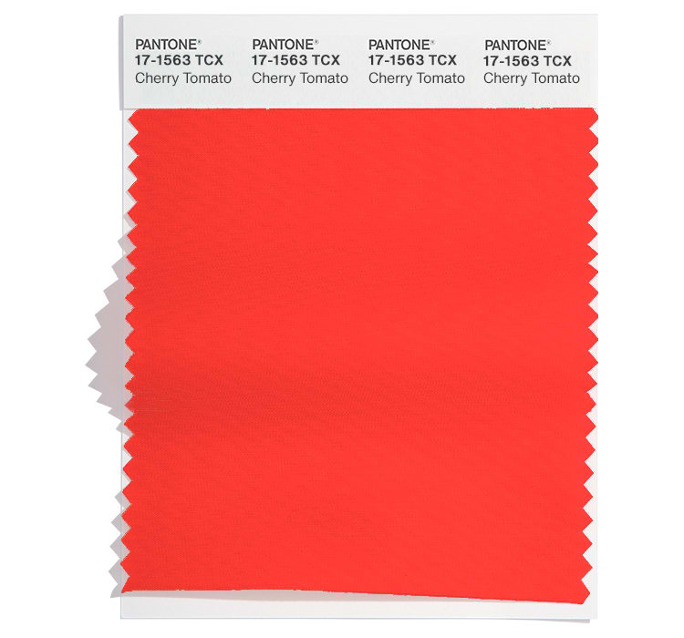
Cherry Tomato 17-1563
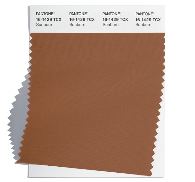
Sunburn 16-1429
Wave Ride 17-4129
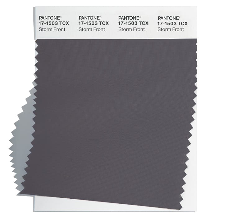
Storm Front 17-1503
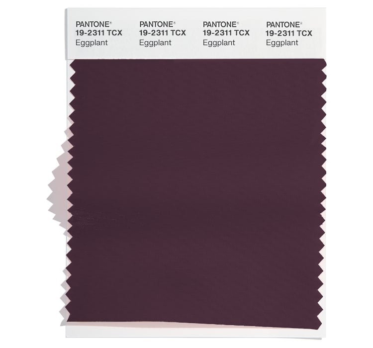
Eggplant 19-2311
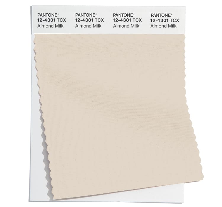
Almond Milk 12-4301
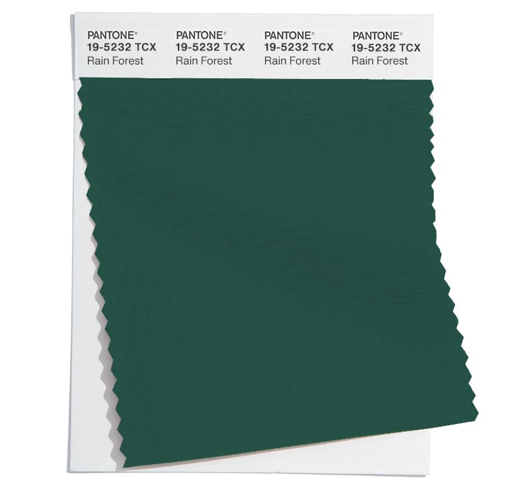
Rain Forest 19-5232
Neutral basics
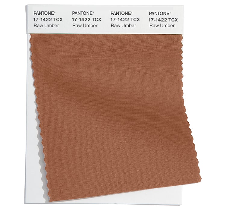
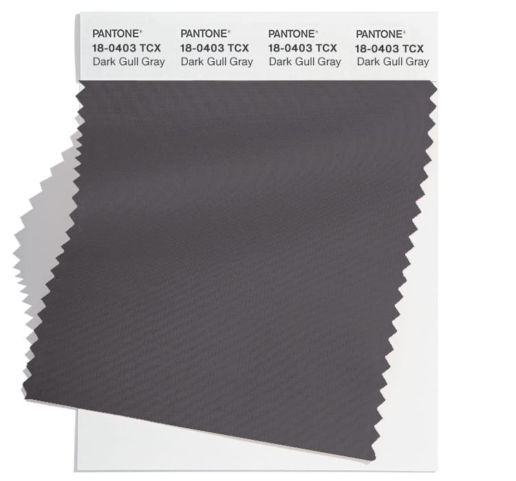
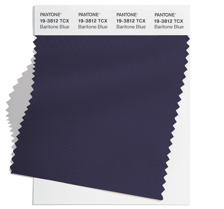
Pantone® have also updated the Fall 2024 Classic Colour Palette. These are a group of neutrals that are core basics in the form of beige, brown, grey, navy, and an earthy brown. The normal whites made it in to the main set of colours this season.
The bonus classic neutral colours for Fall 2024 from NYFW are:
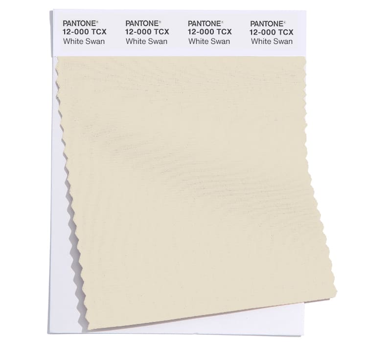
White Swan 12-000
Raw Umber 17-1422
Dark Gull Gray 18-0403
Baritone Blue 19-3812
Buckhorn Brown 18-0935
The Fall 2024 Classic Colour Palette at London Fashion Week swapped some of the main colours to the neutral palette including the addition of a moss green. They are:
Sheepskin 14-1122
Iguana 18-0525
Pinecone 19-1121
Dark Shadows 19-3906
Evening Blue 19-3815
Colour themes
Colour plays an important part in our lives and it’ll be interesting to see how these colours filter through to influence everything around us.
Pantone® is the world-renowned authority on colour and the Pantone® Color of the Year is always really influential in any popular colour themes in fashion, interior design and weddings.
At the time of writing, some vegetables are being rationed at some supermarkets due to poor weather in the countries where the produce is grown. We just for granted that whatever the season and time of year, that we can have any type of possible fruit or vegetable. We are disappointed not to be able to buy tomatoes at the moment but realistically they aren’t really in season.
Since lockdown and more so in recent times of economic uncertainty and a cost of living crisis, it has become apparent and more important to me that we should eat seasonally, buy locally and even grow our own produce. To not only help our pockets but to make sustainable choices for the environment too.
Paralleled with this, for Lent I had decided to ‘give’ this year, rather than ‘give up’. Like I did at Christmas with a reverse advent calendar, I am giving something each day of Lent to the local foodbank.
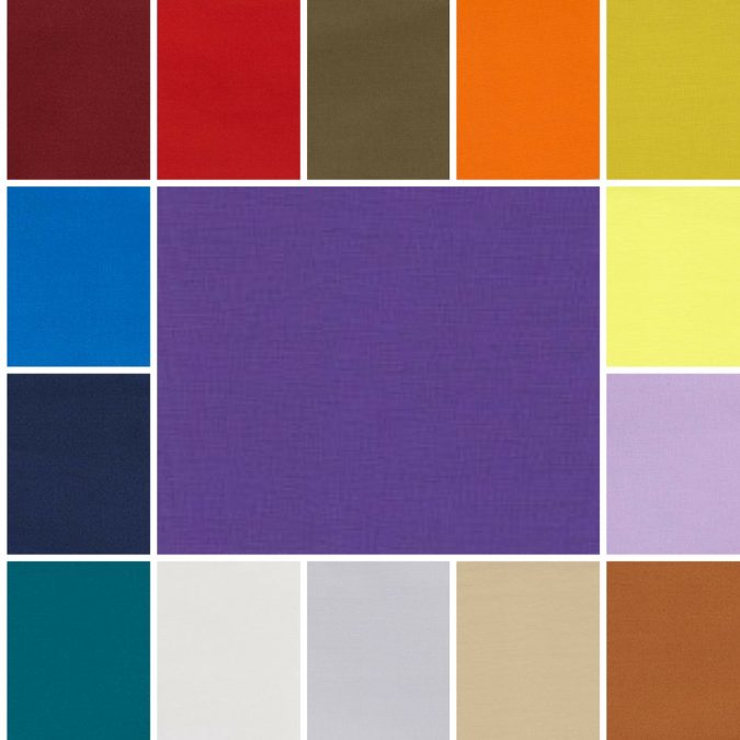
Autumn 2023 colours
All these thoughts of seasons is quite timely, as whilst we are on the brink of Spring, my thoughts are drawn to the end of the year with recent fashion weeks in New York, London and Milan this month, and Paris next month.
From these fashion weeks, Pantone® have predicted 10 colours that they think will be prevalent in Autumn/Winter 2023/24 which all evoke an earthy, back to nature vibe in keeping with my current food seasonality thoughts.
Forest school
Nothing quite beats a crisp morning surrounded by nature. With trees sheltering you away from technology, away from noise, away from any stresses. Just exploring and being present. Then warming up round a roaring fire, cradling a warm mug of hot chocolate. Some of the colours ooze autumnal vibes, like the changing colours of the leaves as they fall from the trees. With reds, burnt oranges, browns and yellows flickers of the fire.
Winter getaway
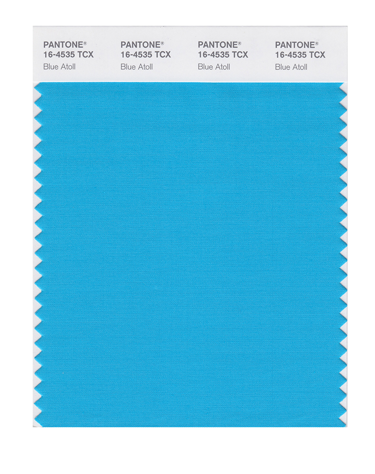
These warming colours are contrasted with the icy cold winter days of a winter skiing scene, such as turquoise, lilac and bright blues reminiscent of cloudless skies and mountain ranges.
Fresh vegetables
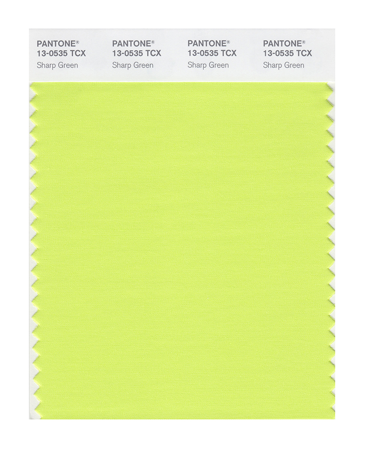
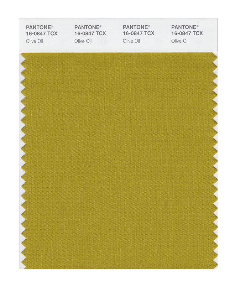
Finally, there is a sense of freshness in the cool green shades eluding to any harvesting crops perhaps of Kohlrabi (which is in season now), Olive Oil and Sharp Green.
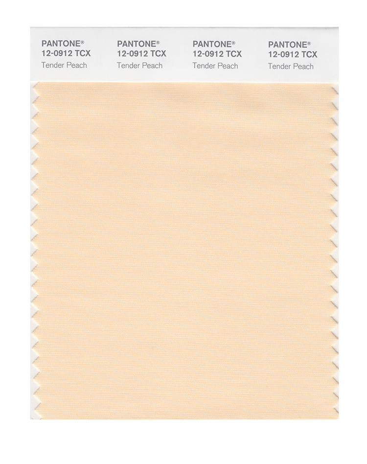
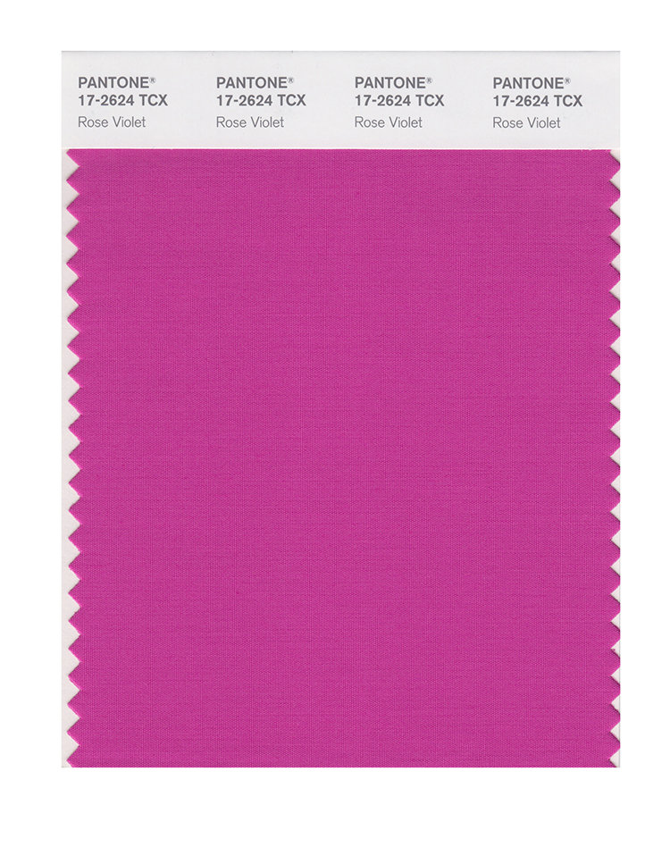
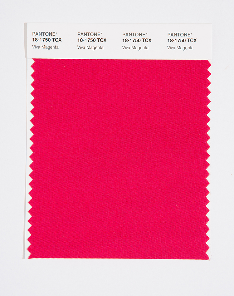
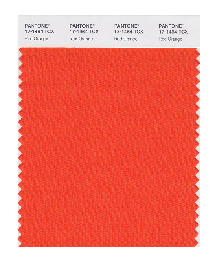
Fall 2023 colours
The top ten colours for Fall 2023 from New York Fashion Week are:
PANTONE 12-0912 Tender Peach
PANTONE 17-2624 Rose Violet
PANTONE 18-1750 Viva Magenta
PANTONE 17-1464 Red Orange
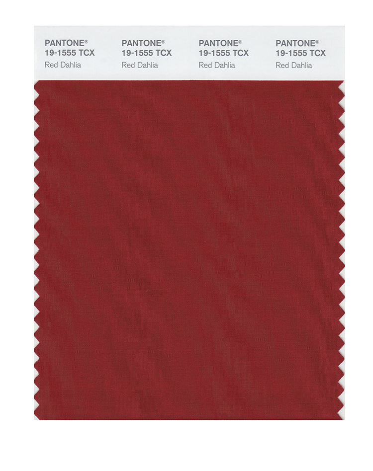
PANTONE 19-1555 Red Dahlia
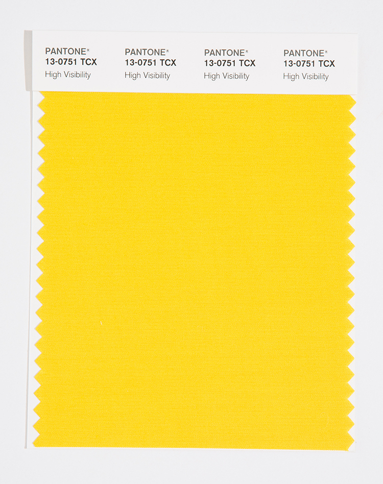
PANTONE 13-0751 High Visibility
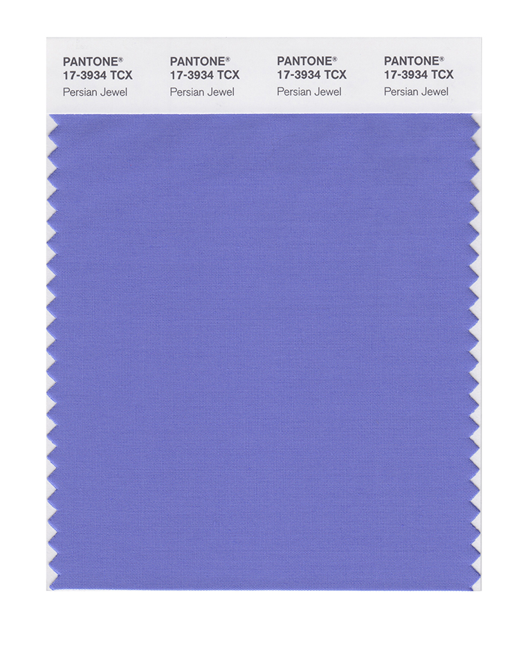
PANTONE 17-3934 Persian Jewel
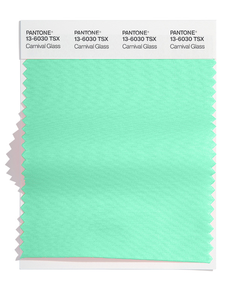
PANTONE 13-6030 Carnival Glass
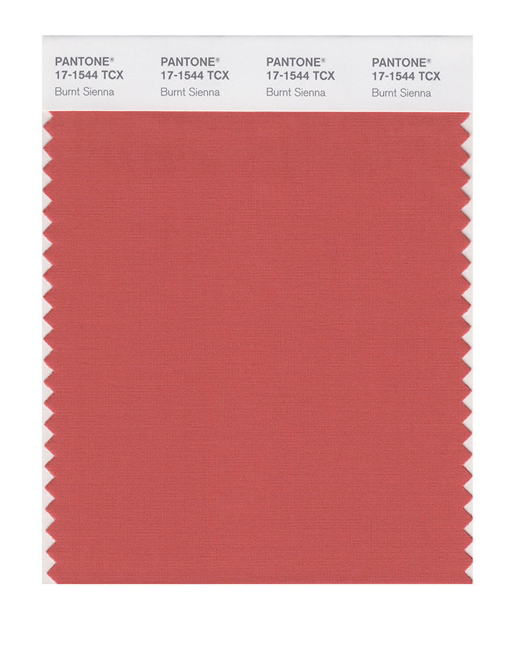
PANTONE 17-1544 Burnt Sienna
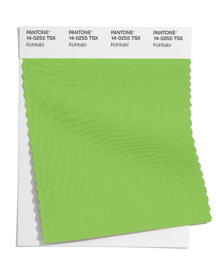
PANTONE 14-0255 Kohlrabi
Fall 2023 extra colours from LFW
Most of the colours have the same vibe at London Fashion Week, with some slightly different hues. The noticeable differences were the oranges at NYFW (of Tender Peach and Red Orange) which were replaced with a purple and bright blue at LFW.
Here are the colours for Fall 2023 from LFW:
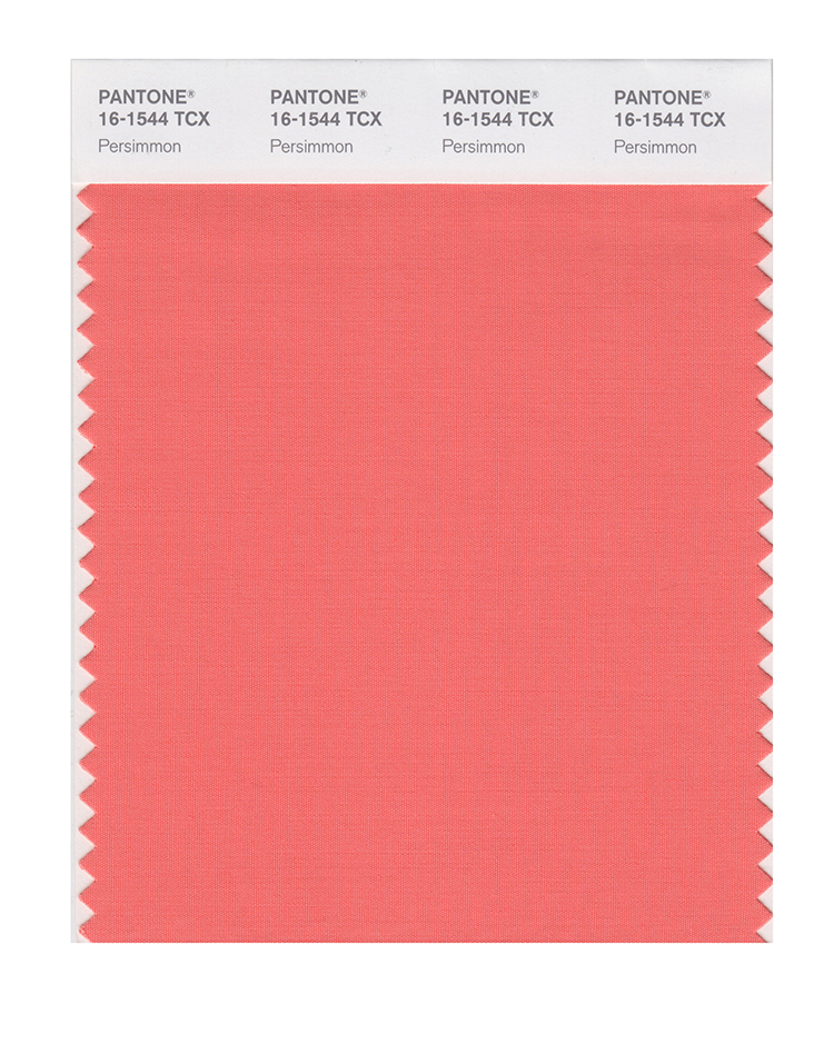
PANTONE 16-1544 Persimmon
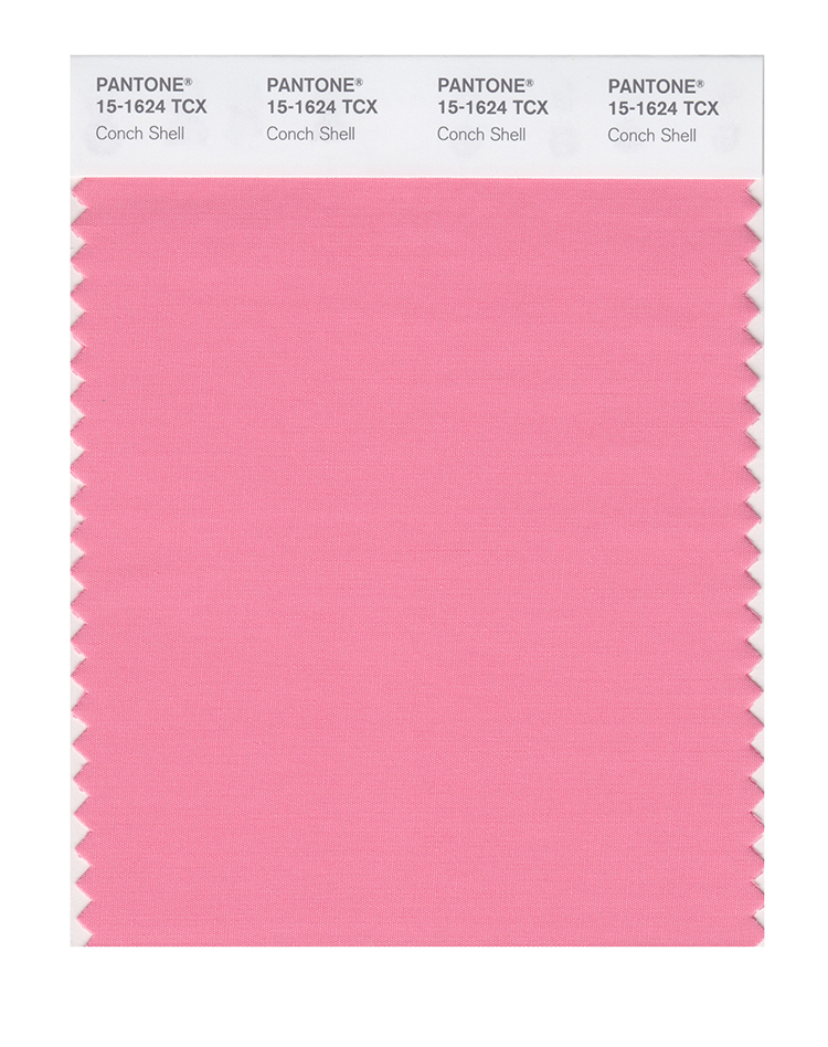
PANTONE 15-1624 Conch Shell
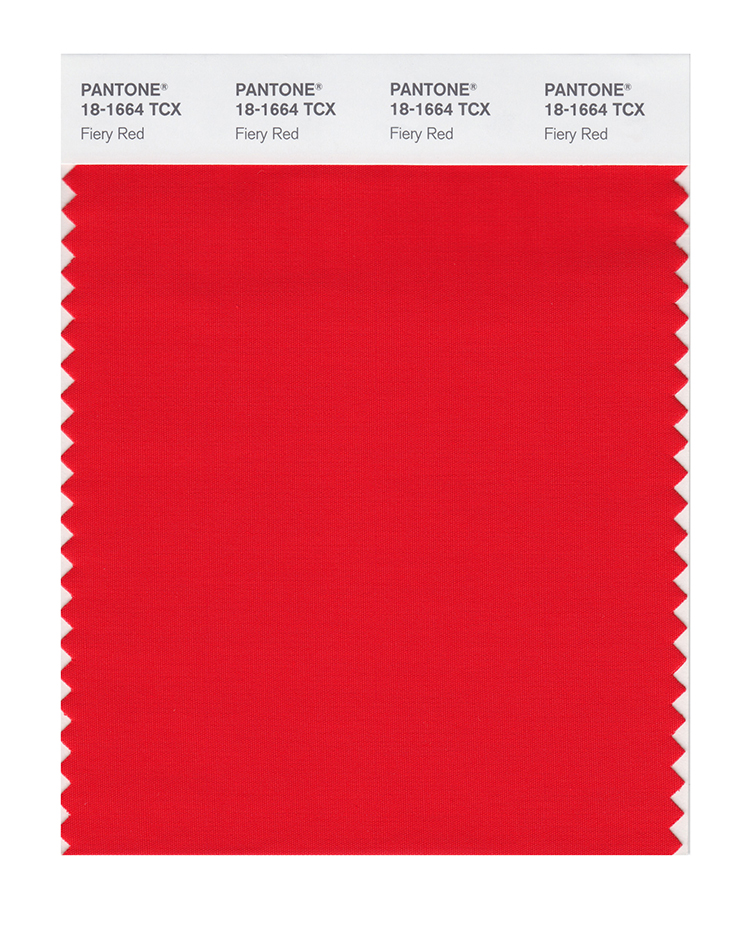
PANTONE 18-1664 Fiery Red
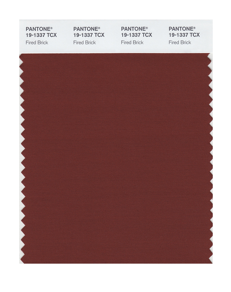
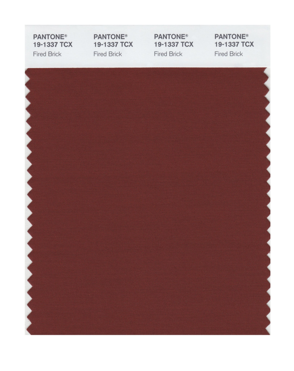
PANTONE 19-1337 Fired Brick
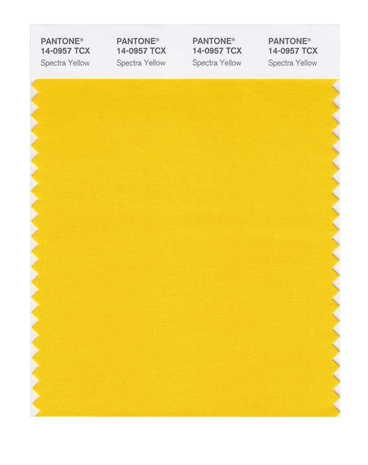
PANTONE 13-0535 Sharp Green
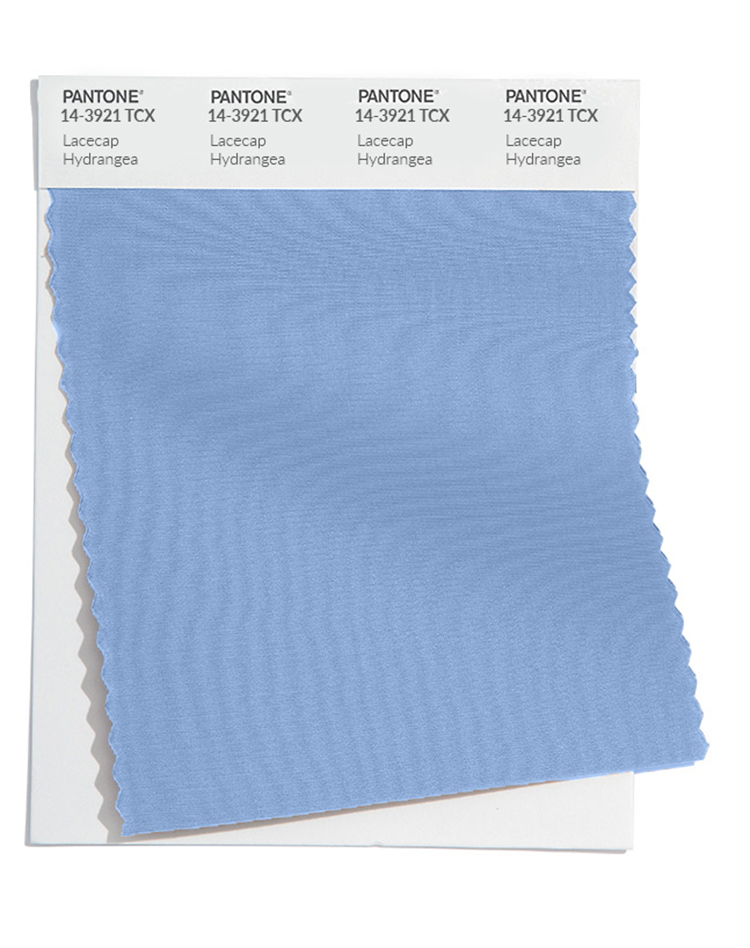
PANTONE 14-3921 Lacecap Hydrangea
PANTONE 14-0957 Spectra Yellow
PANTONE 16-0847 Olive Oil
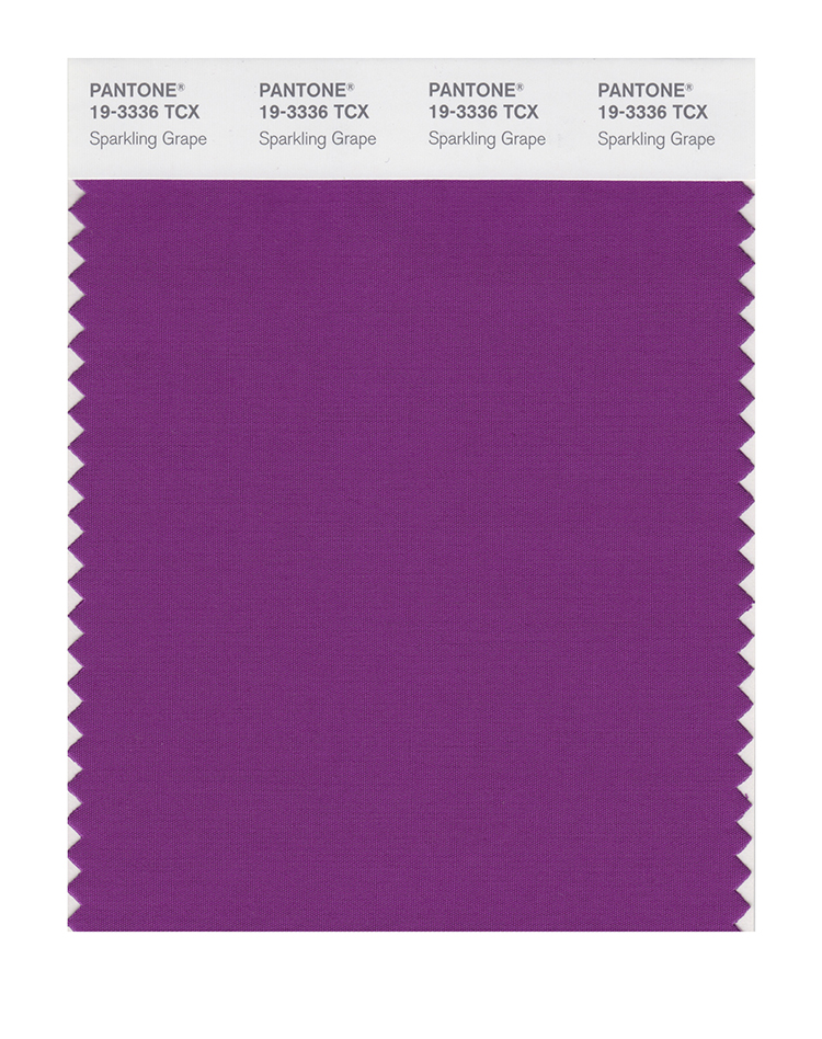
PANTONE 19-3336 Sparkling Grape
PANTONE 16-4535 Blue Atoll
Neutral basics
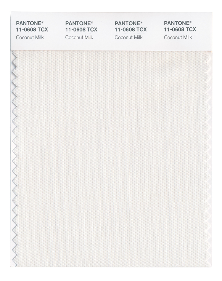
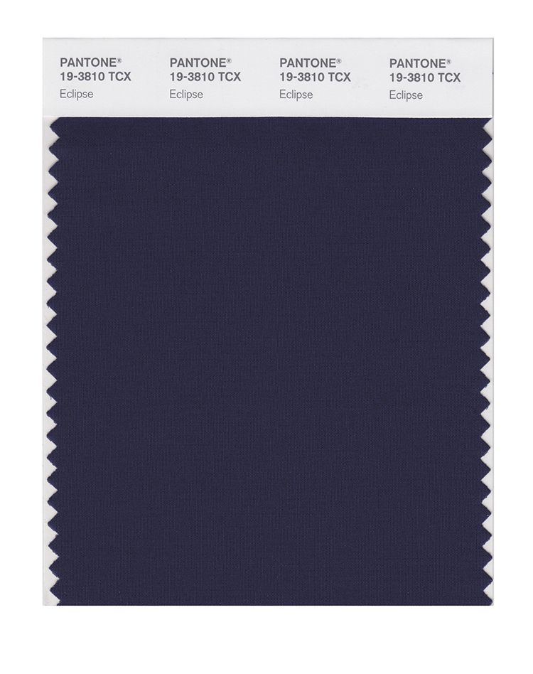
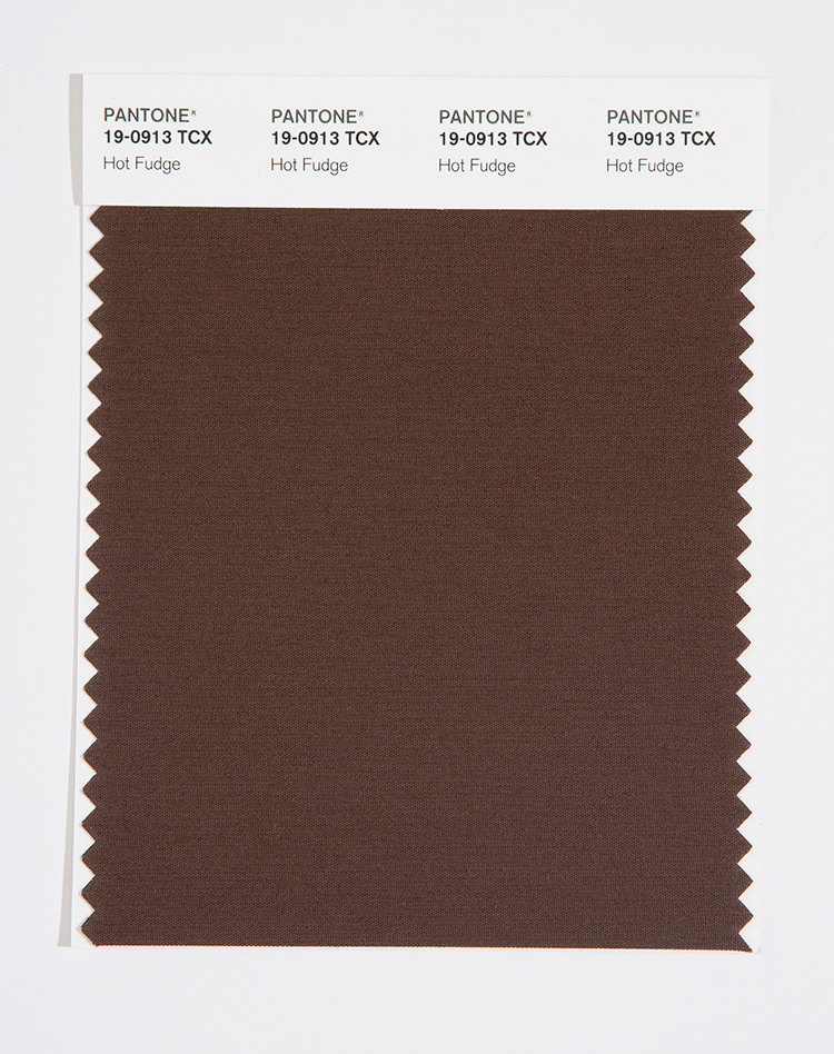
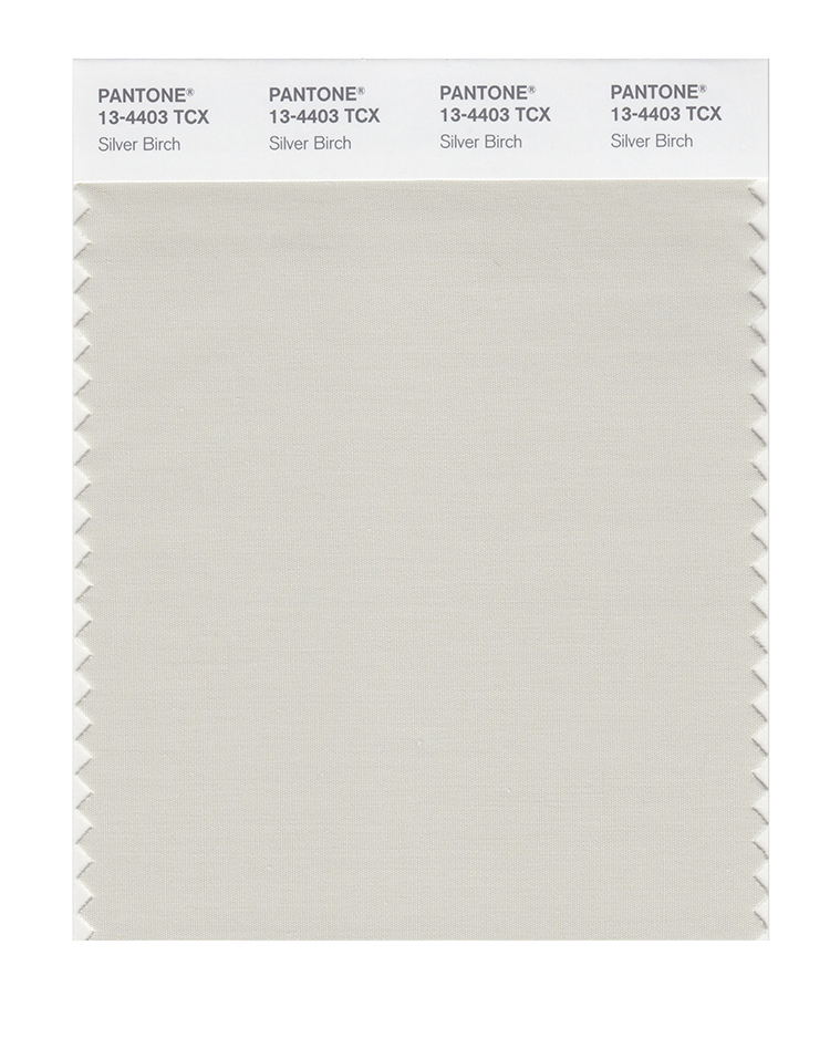
Pantone® have also created a Fall 2023 Classic Colour Palette. These are a group of neutrals that are core basics in the form of white, navy, an earthy brown, light grey, plus a rich beige.
The bonus classic neutral colours for Fall 2023 from NYFW are:
PANTONE 11-0608 Coconut Milk
PANTONE 19-3810 Eclipse
PANTONE 19-0913 Hot Fudge
PANTONE 13-4403 Silver Birch
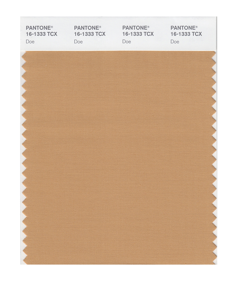
PANTONE 16-1333 Doe
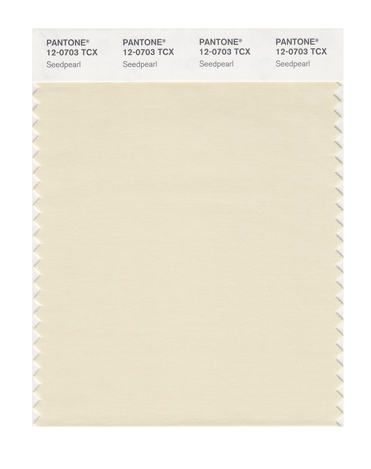
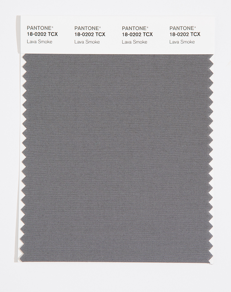
The Fall 2023 Classic Colour Palette at London Fashion Week swapped out the navy and earthy brown, for a dark forest green and a dark grey. They are:
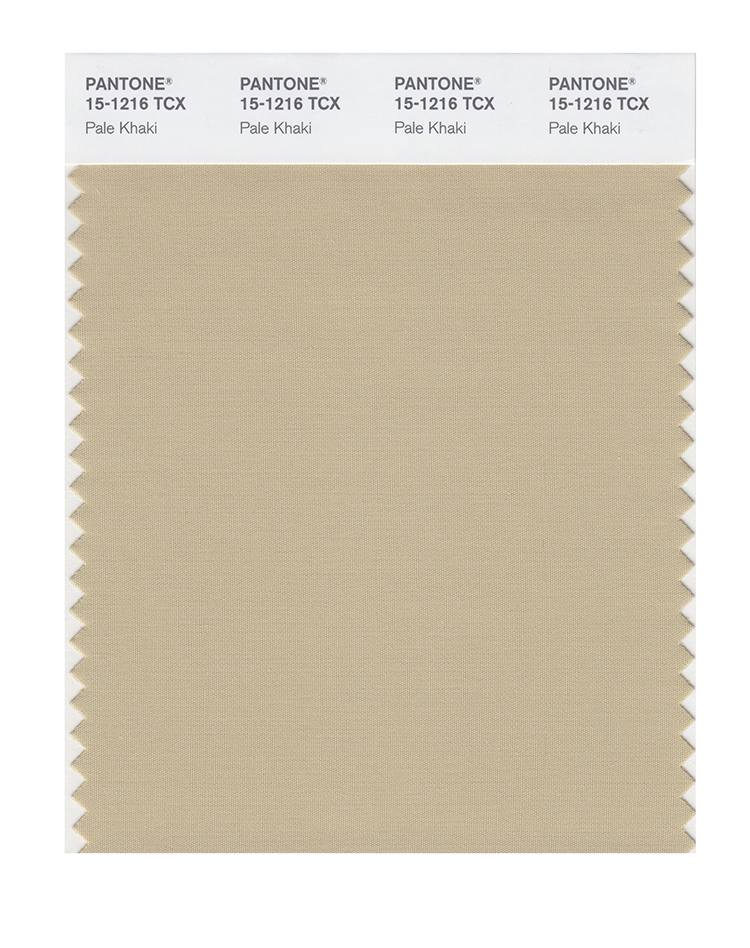
PANTONE 15-1216 Pale Khaki
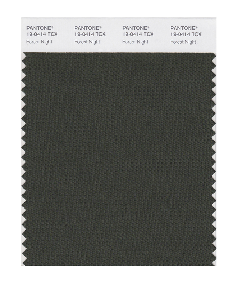
PANTONE 19-0414 Forest Night
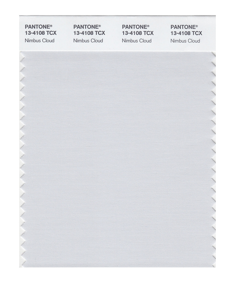
PANTONE 13-4108 Nimbus Cloud
PANTONE 12-0703 Seedpearl
PANTONE 18-0202 Lava Smoke
Colour themes
Colour plays an important part in our lives and it’ll be interesting to see how these colours filter through to influence things around us.
Pantone® is the world-renowned authority on colour and the Pantone® Color of the Year is always really influential in any popular colour themes in fashion, interior design and weddings.
It’s coming up to the Spring equinox this weekend and it definitely feels like the seasons are shifting with the very welcome return of sunnier weather and longer days. I feel like I’ve lost a whole month – February was a complete right off for me. So it’s quite a shock to be in March already!
With the change in season, comes the start of the ‘social season’ in spring and summer when it was traditional for members of the upper class to change their residence (from their country houses to London) in order to attend events of the season.
These events include Cheltenham Festival (March), the Grand National (April), The Boat Race (April), Badminton Horse Trials (May), Chelsea Flower Show (May), Epsom Derby (June), Royal Ascot (June), Cricket test matches at Lord’s (July), Wimbledon (July), Henley Royal Regatta (July), Edinburgh International Festival (August) , Cowes week (August), the Proms (July-September) and ending with Goodwood Revival (September).
Historically the ‘London season’ events would’ve coincided with political business in the city and conclude when the elite would return to their country homes for the beginning of the shooting season on 12th August.
Autumn 2022 colours
Whilst we enter the beautiful and hopeful season of Spring, my thoughts drift to the cooler months at the end of the year with the recent fashion weeks in New York, London and Milan last month, then Paris earlier this month. It was good to see them back to being in person again this year (although only via invite only this time).
From these fashion weeks, Pantone® have predicted 10 colours that they think will be prevalent in Autumn/Winter 2022/23.
Fiery
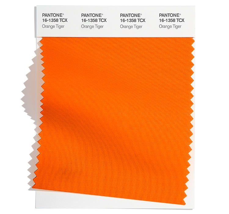
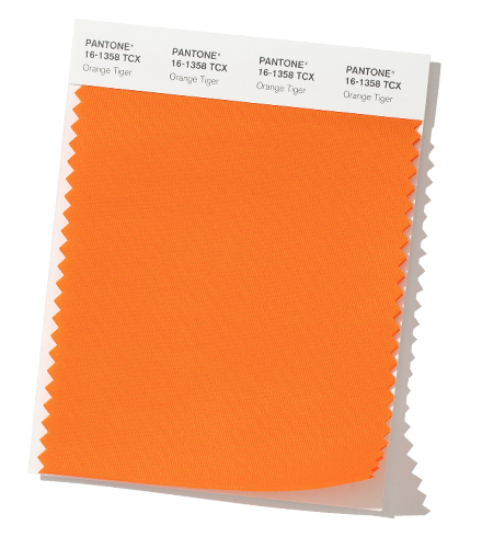
There are some really bright and bold colours to make a statement this autumn that are reminiscent of a roaring fire on Guy Fawkes night. Or for me, they evoke memories of the recent Winter Olympics and Paralympic Games held in Beijing. The fiery red (Lava Falls) feels similar to the Chinese flag and the Orange Tiger provides a nod to the Year of the Tiger which was marked recently for Chinese New Year.
Polar
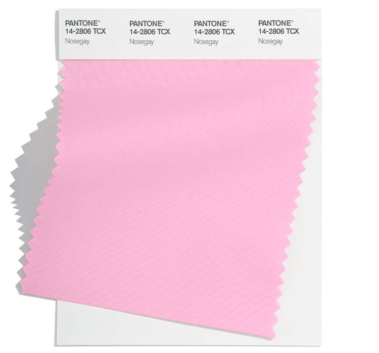
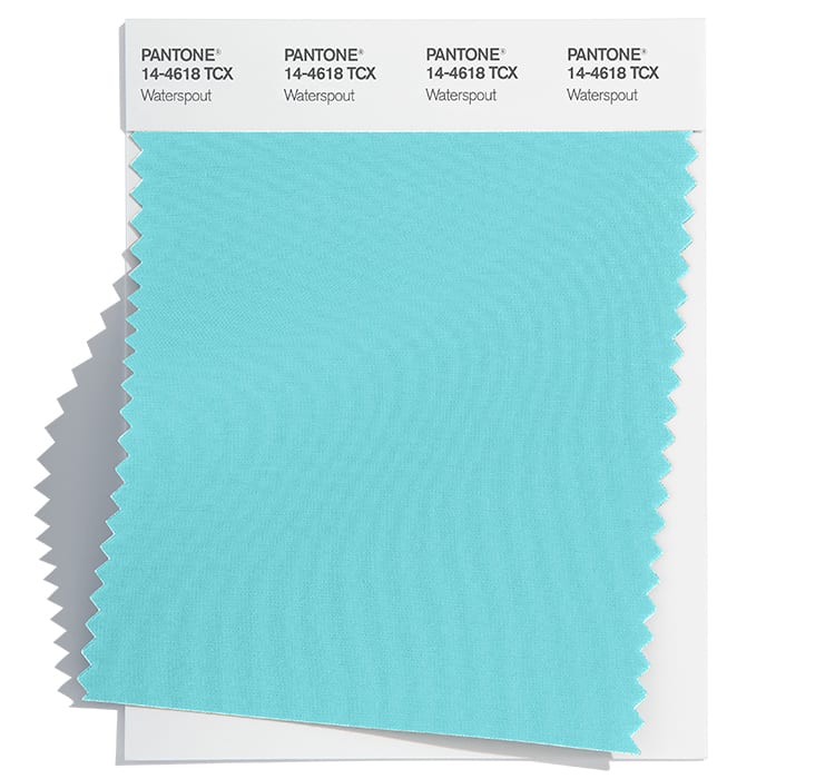
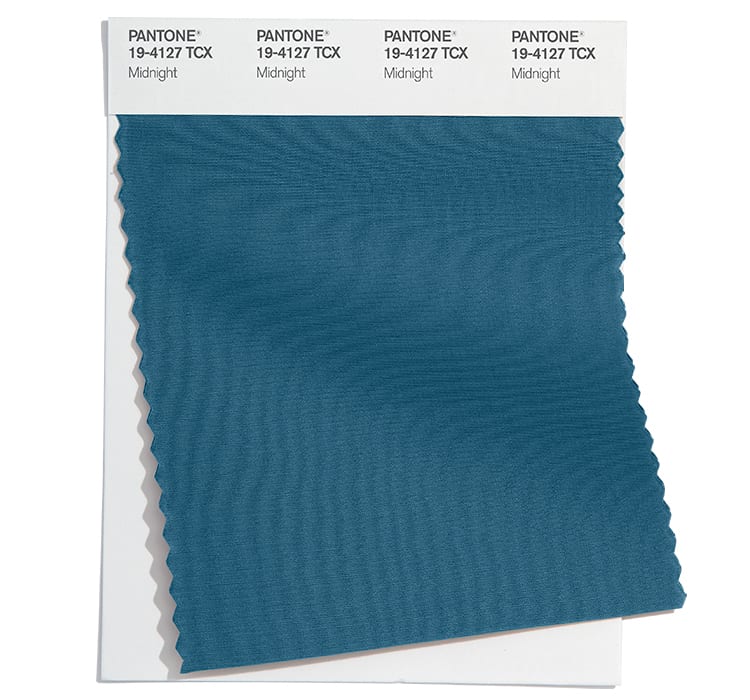
I’ve loved watching all the winter sports coverage and a number of the colours conjure up images of cold winters on the piste (or equally on a dark polar night) such as an icy turquoise (Watersprout), a pale pink (Nosegay) and the dark navy blue night sky of Midnight.
Rainforest
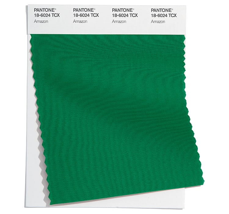
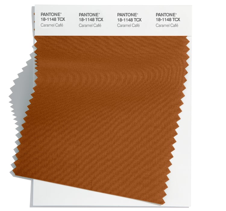
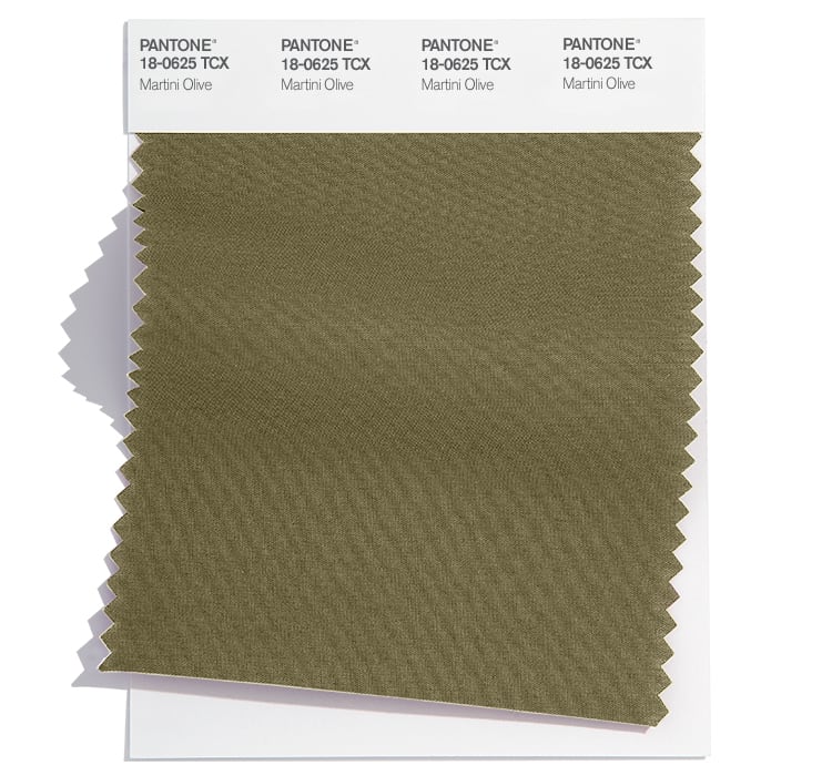
Lastly, there is a real grounding of some earthy, natural colours that would be happily found in a luscious rainforest including greens of Amazon and Martini, along with a rich brown (Caramel).
Fall 2022 colours
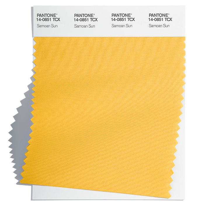
The top ten colours for Fall 2022 from New York Fashion Week are:
Pantone 18-1552 Lava Falls
Pantone 14-0852 Samoan Sun
Pantone 16-1358 Orange Tiger
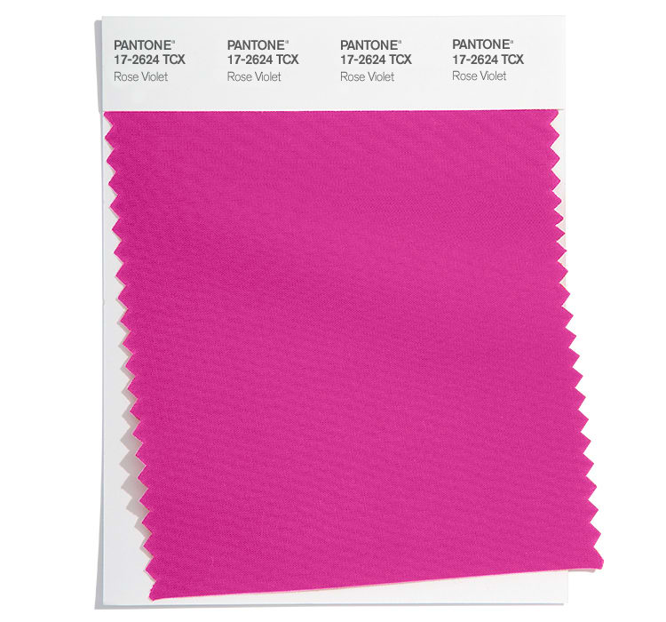
Pantone 17-2624 Rose Violet
Pantone 18-6024 Amazon
Pantone 14-2806 Nosegay
Pantone 14-4618 Waterspout
Pantone 18-1148 Caramel Café
Pantone 19-4127 Midnight
Pantone 18-0625 Martini Olive
Fall 2022 extra colours from LFW
They may have different names but in the main the colours are repeated at London Fashion Week, with Watersprout apparent at both. There was one additional colour (instead of the bright pink from NYFW) to round off the colours for Fall 2022 in the form of the purple of Meadow Violet (similar to the current colour of the year, Very Peri).
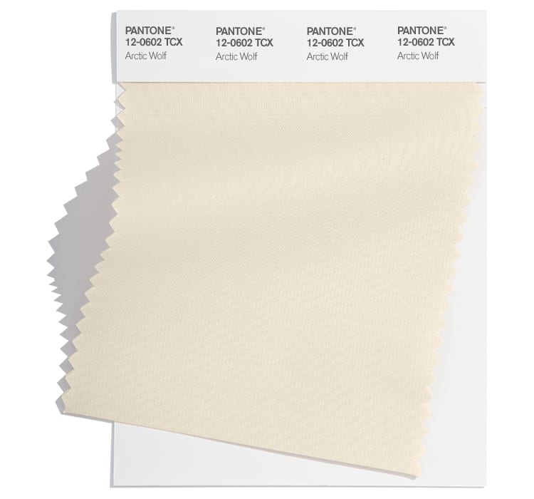
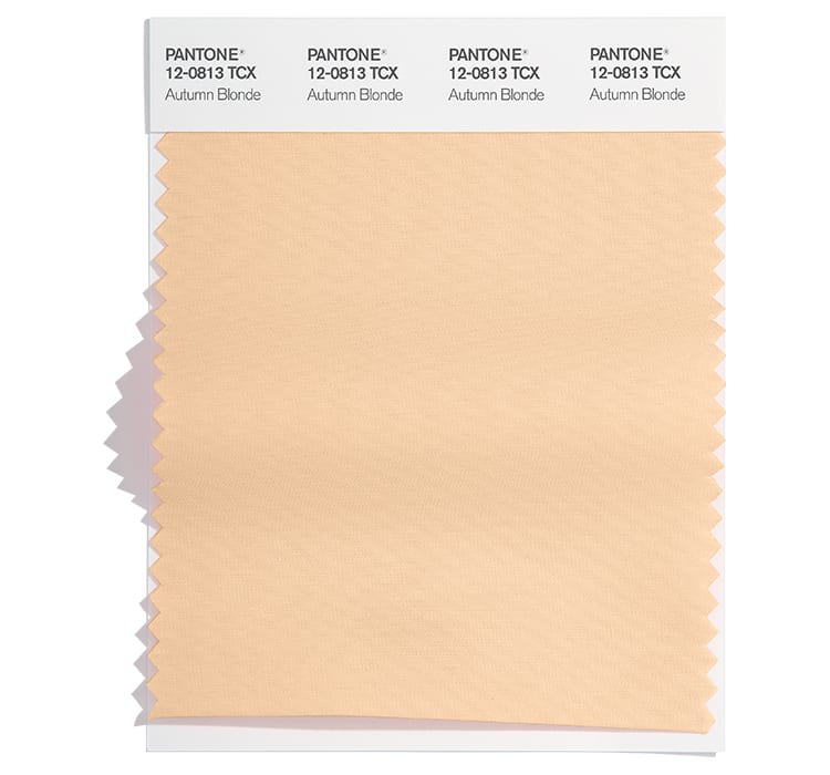
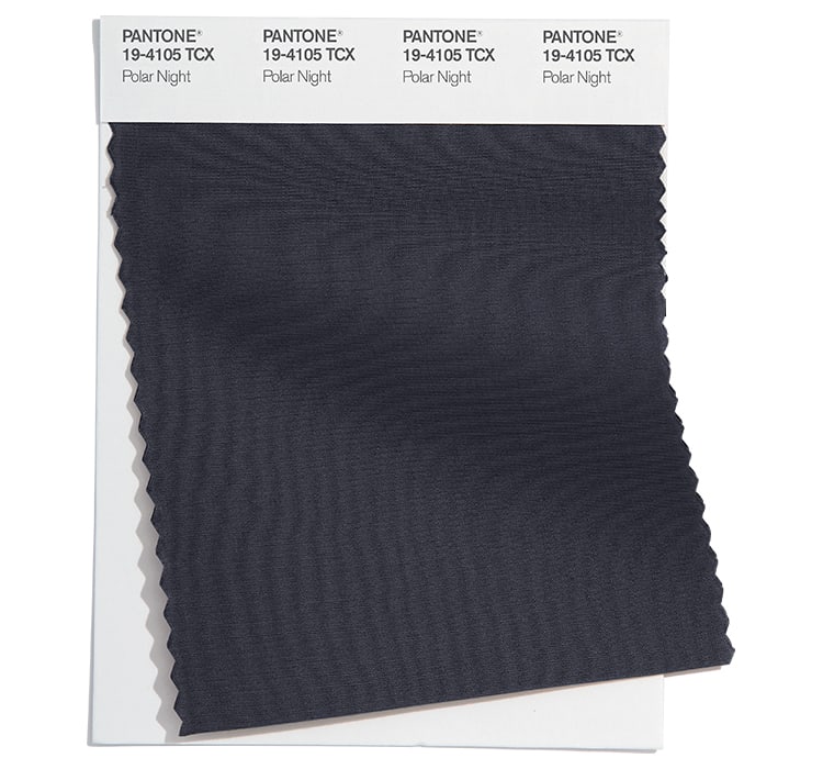
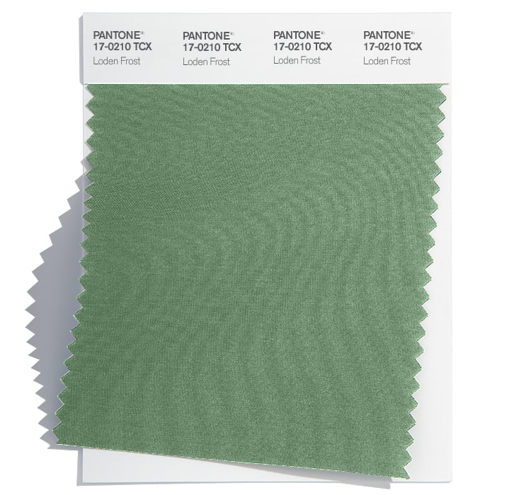
Neutral classics
Pantone® have also created a Fall 2022 Classic Colour Palette. These are a group of neutrals that are core basics in the form of white, cream, dark and light grey, plus khaki green.
The bonus classic neutral colours for Fall 2022 are:
Pantone 12-0602 Arctic Wolf
Pantone 12-0813 Autumn Blonde
Pantone 19-4105 Polar Night
Pantone 17-0210 Loden Frost
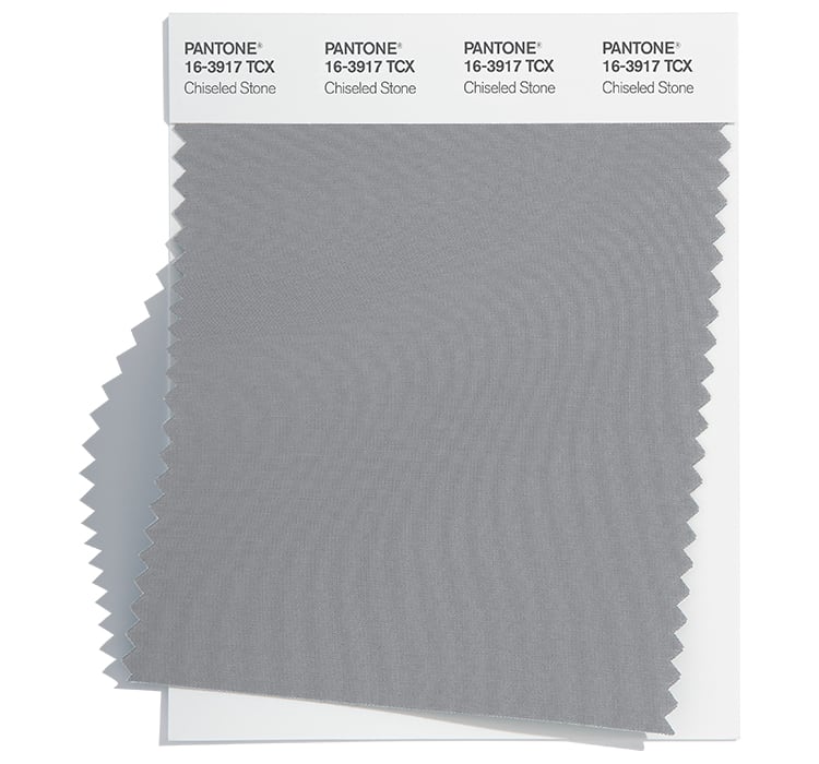
Pantone 16-3917 Chiseled Stone
Colour themes
Colour plays an important part in our lives and it’ll be interesting to see how these colours filter through to influence things around us.
Pantone® is the world-renowned authority on colour and the Pantone® Color of the Year is always really influential in any popular colour themes in fashion, interior design and weddings.
We await the roadmap announcement next week, when we hope that there is clearer guidance on the way out of lockdown including what will happen to weddings in 2021. We can assume that weddings may not include receptions for a while and then may remain in quite small numbers for a while.
Hopefully by autumn, we will be in a better position to think about weddings again. I’m thinking ahead for later in the year as Pantone® have announced the colours for the autumnal and winter months of 2021/22.
Fashion weeks have been taking place virtually this year with New York last week, London this week and Milan and Paris later this month. Pantone® have predicted 10 colours that they think will be prevalent in Fall/Winter 2021/22.
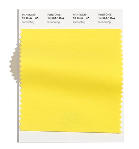
bold
There are some bright and bold of colours to really make a statement this autumn. Leading the way, the yellow colour of the year (Illuminating) brightens the mood and provides a glimmer of sunny days ahead.
the blues
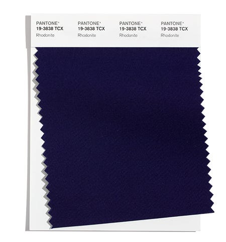
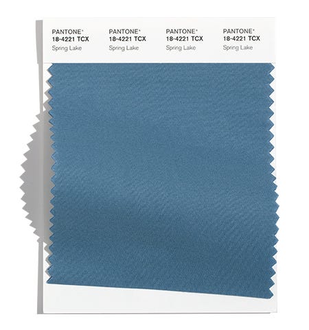
We may be feeling a bit blue at the moment, but the calming blues will relax us by a Spring Lake or under the Clear Sky, lazing by the pool of Mykonos or Ibiza Blue. With reliable and stable navy (Rhodonite or After Midnight).
bonfires
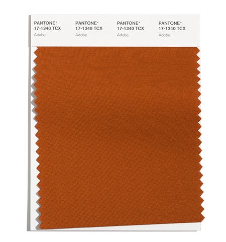
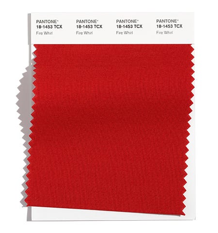
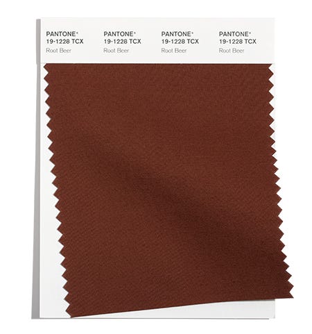
Rich, earthy, autumnal fiery colours are reminiscent of bonfires and sitting from a firepit toasting marshmallows, including Fire Whirl, Adobe, Root Beer, Red Alert, Tomato Cream, Daylily, Downtown Brown.
Fall 2021 colours
The top ten colours for Fall 2021 are:
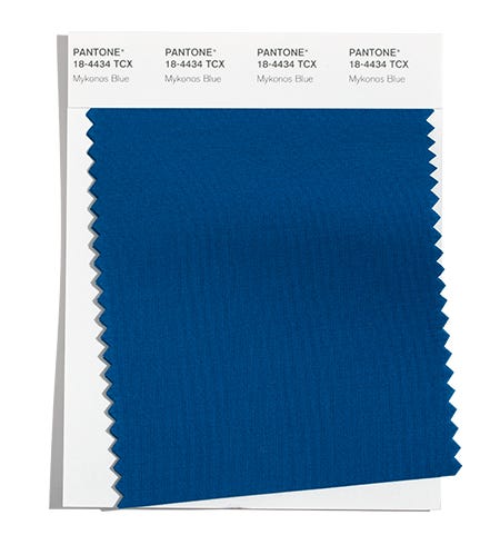
Pantone 18-4434 Mykonos Blue
Pantone 13-0647 Illuminating
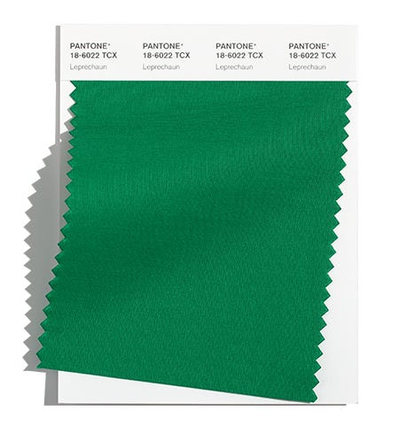
Pantone 18-6022 Leprechaun
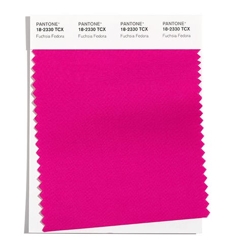
Pantone 18-2330 Fuchsia Fedora
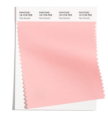
Pantone 13-1716 Pale Rosette
Pantone 17-1340 Adobe
Pantone 18-1453 Fire Whirl
Pantone 19-3838 Rhodonite
Pantone 18-4221 Spring Lake
Pantone 19-1228 Root Beer
Neutral basics
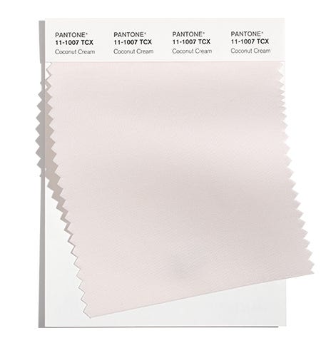
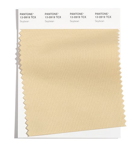
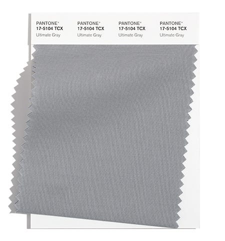
Pantone® have also created a Fall 2021 Classic Colour Palette. These are a group of neutrals that are core basics in the form of off-white, grey, cream and olive green.
The bonus classic neutral colours for Fall 2021 are:
Pantone 11-1007 Coconut Cream
Pantone 17-5104 Ultimate Gray
Pantone 13-0919 Soybean
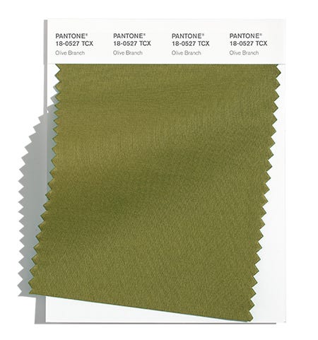
Pantone 18-0527 Olive Branch
Fall 2021 extra colours from LFW
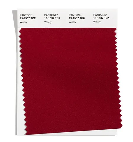
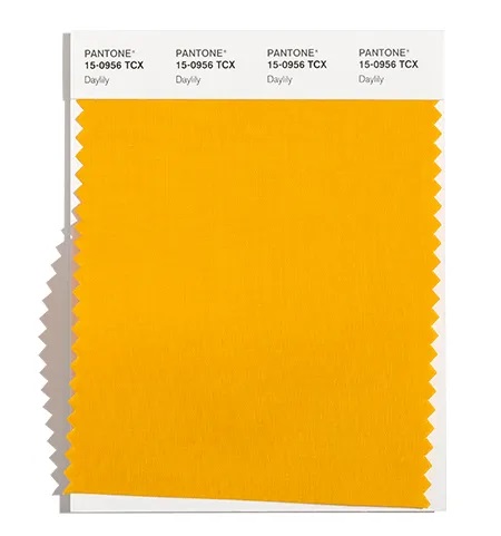
They may have different names but in the main the colours are repeated at London Fashion Week, along with a couple of additional colours (instead of the bright cerise pink and cream colours) to round off the colours for Fall 2021. There’s also a bit of a rejig of whether some colours sit in the neutrals or the main set (as navy gets demoted at LFW to the neutral basics). Here are the extra orange and burgundy shades:
Pantone 19-1537 Winery
Pantone 15-0956 Daylily
Colour themes
It’ll be great to see how couples incorporate these colours in to their weddings (hopefully) later this year.
Pantone® is the world-renowned authority on colour and the Pantone® Color of the Year is always really influential in any popular colour themes in fashion, interior design and weddings.
sign up to receive the latest posts straight to your inbox
After what seemed like the slowest and longest starts to the year, February now seems to be zipping away. And the blossom buds on the trees remind us that spring is just around the corner.
But I’m already thinking about forthcoming seasons later in the year, as Pantone® have announced the colours for the autumn and winter months of 2020/21.
With fashion weeks just kicking off in New York yesterday (before moving on to London on Valentine’s Day, Milan on the 18th and Paris on the 24th), Pantone® have predicted 10 colours that they think will be prevalent in Fall/Winter 2020/21. And it’ll be great to see these colours appearing in autumn weddings this year.
It’s no surprise to see half of the colours in earthy and typically autumnal colours. They are also joined by some rich jewel colours, some dusty pastel colours and a pop of statement neon.
Greatest hits of colours
This line up feels a bit like the greatest hits tour for Pantone®, covering all their number one hits in the form of previous colours of the year (such as a peach for Living Coral from 2019, a purple for Ultra Violet of 2018, a strong green for Greenery in 2017, a pastel pink for 2016 and of course Classic Blue, the current 2020 colour of the year). And then there’s a new unheard of song that none of the fans know all the words to yet and don’t quite know what to make of it.
Pantone® Color Institute executive director Leatrice Eiseman wants consumers ‘to feel at ease with a spectrum of colors’ and this season offers ‘traditional tones and surprising ones that offer plenty of room for experimentation.’
Potter’s wheel
Fitting with the current more sustainable ‘make, do and mend’ way of life, our nation’s obsession has gone from baking, sewing and now to pottery. (I can’t get enough of the Great Pottery Throw Down at the moment especially when the judge gets so emotional over the makes the potters produce).
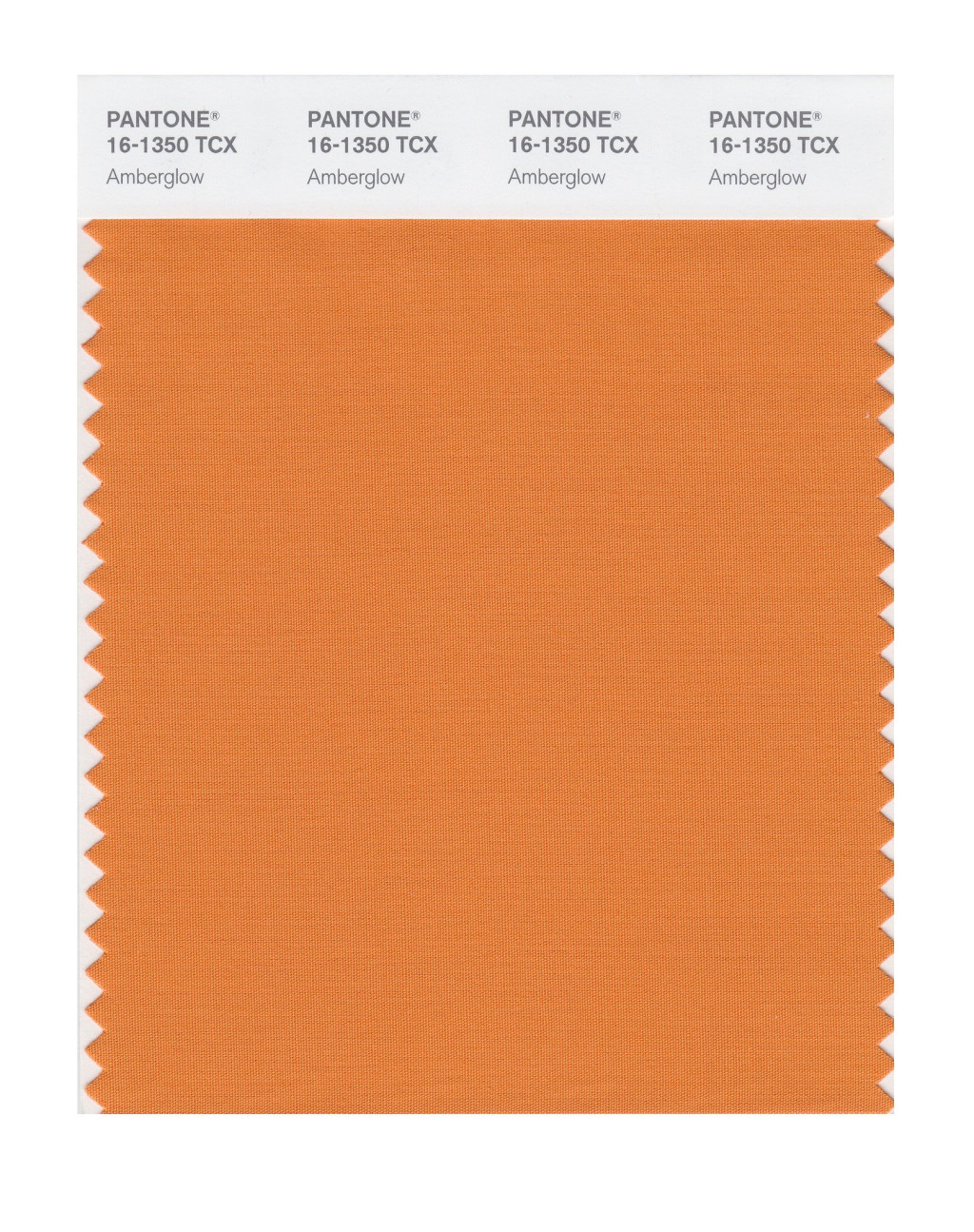
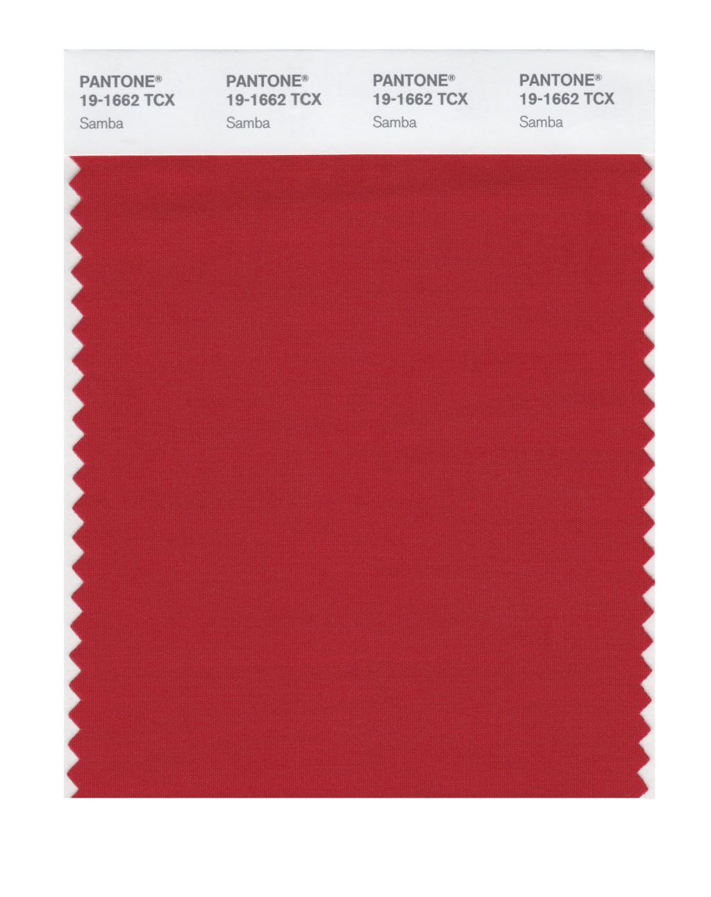
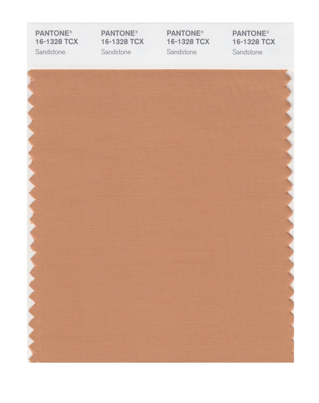
So the earthy palette of the Fall 2020 colours reminds me of the range of clay colours you’d find in a pottery. With the brown Fired Brick and Sandstone being placed in the hot orange and red fire of Amberglow and Samba.
90s inspired neon
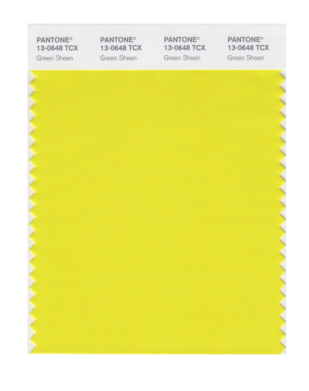
I’m pleased to see the pop of the neon Green Sheen appearing amongst the colours. Neon signage, perhaps with a personalised pun, is popular at the moment as wedding décor, along with a nostalgic nineties injection of vibrant colour.
Lots of nineties babies are tying the knot. So nods to the nineties will be found in holographic stationery, glow in the dark elements, as well as lace seeing a revival.
And it’s all about unique lighting with vintage lampshades, statement chandeliers and 90s inspired neon.
Rich jewels
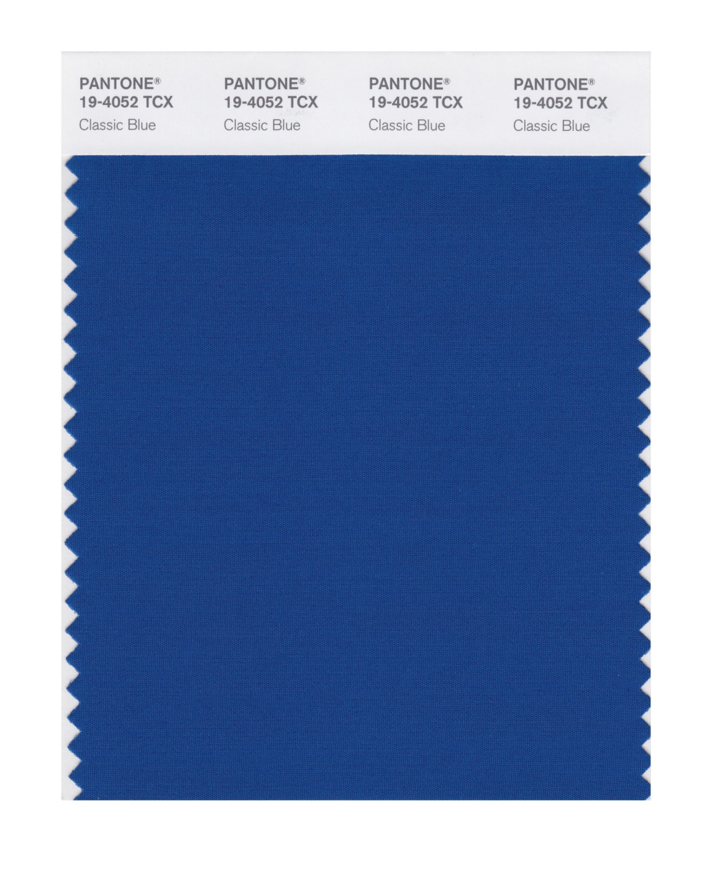
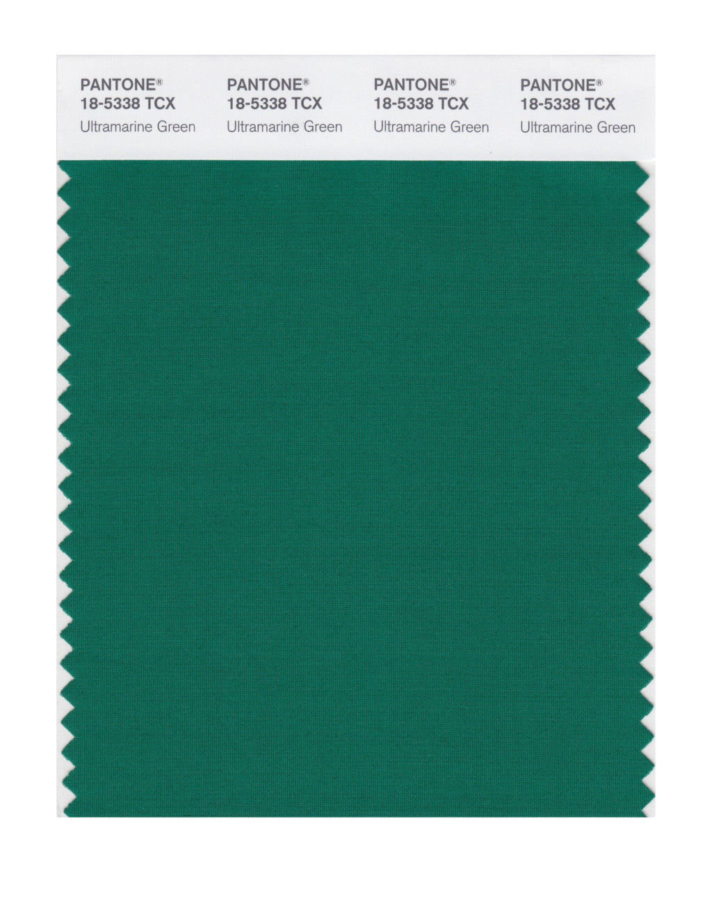
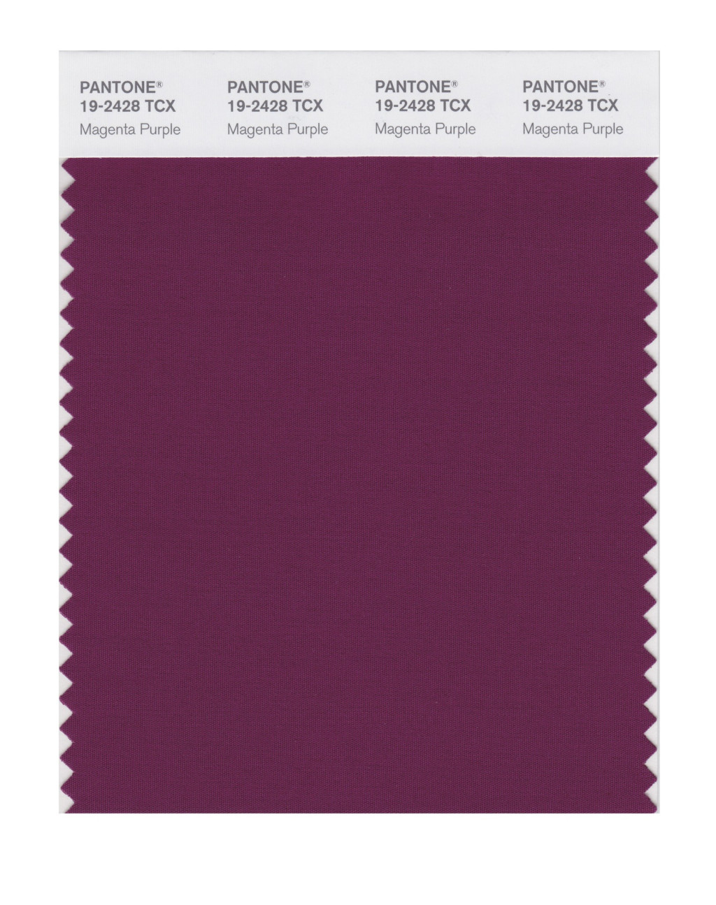
The inclusion of some rich colours in the mix are almost tactile and velvety. Ultramarine Green, Magenta Purple and the colour of the year, Classic Blue, almost feel regal and would be very fitting for a medieval banquet style wedding.
Muted pastels
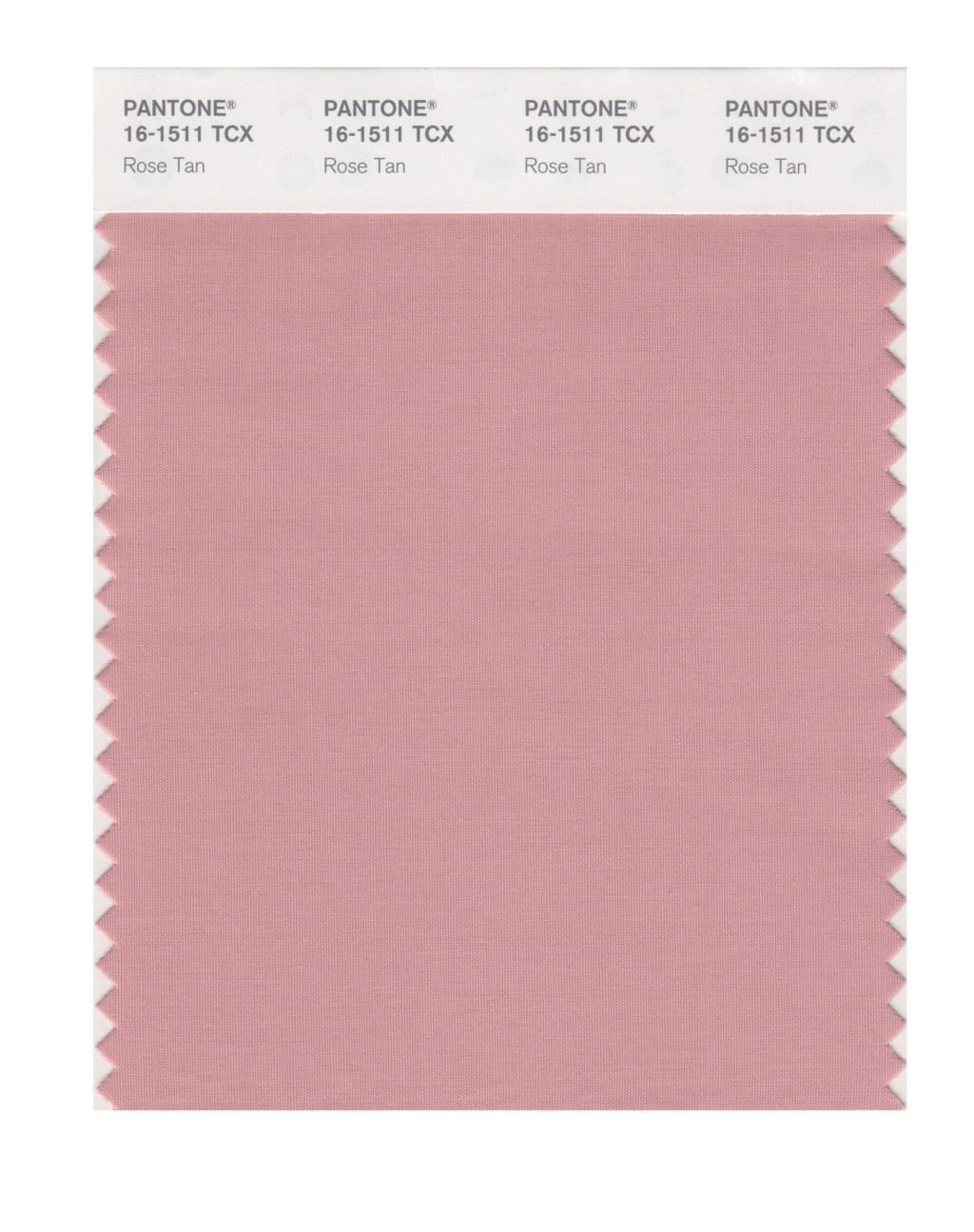
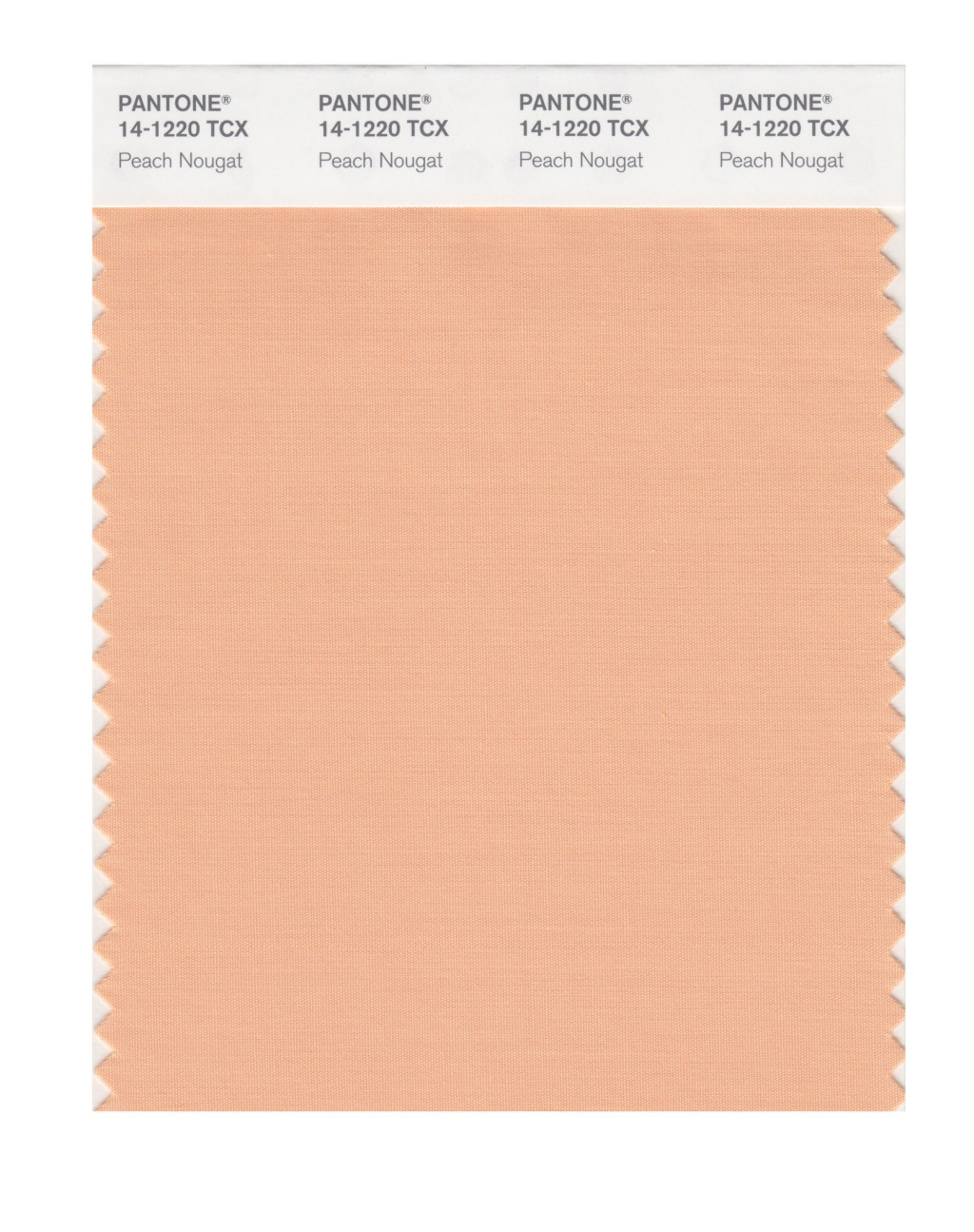
In addition, the subtle Rose Tan and Peach Nougat are lovely transitional pastel colours to lead us in to spring next year.
Fall 2020 colours
The top ten colours for Autumn/Winter 20/21 are:
Amberglow PANTONE 16-1350
Samba PANTONE 19-1662
Sandstone PANTONE 16-1328
Classic Blue PANTONE 19-4052
Green Sheen PANTONE 13-0648
Rose Tan PANTONE 16-1511
Ultramarine Green PANTONE 18-5338
Fired Brick PANTONE 19-1337
Peach Nougat PANTONE 14-1220
Magenta Purple PANTONE 19-2428
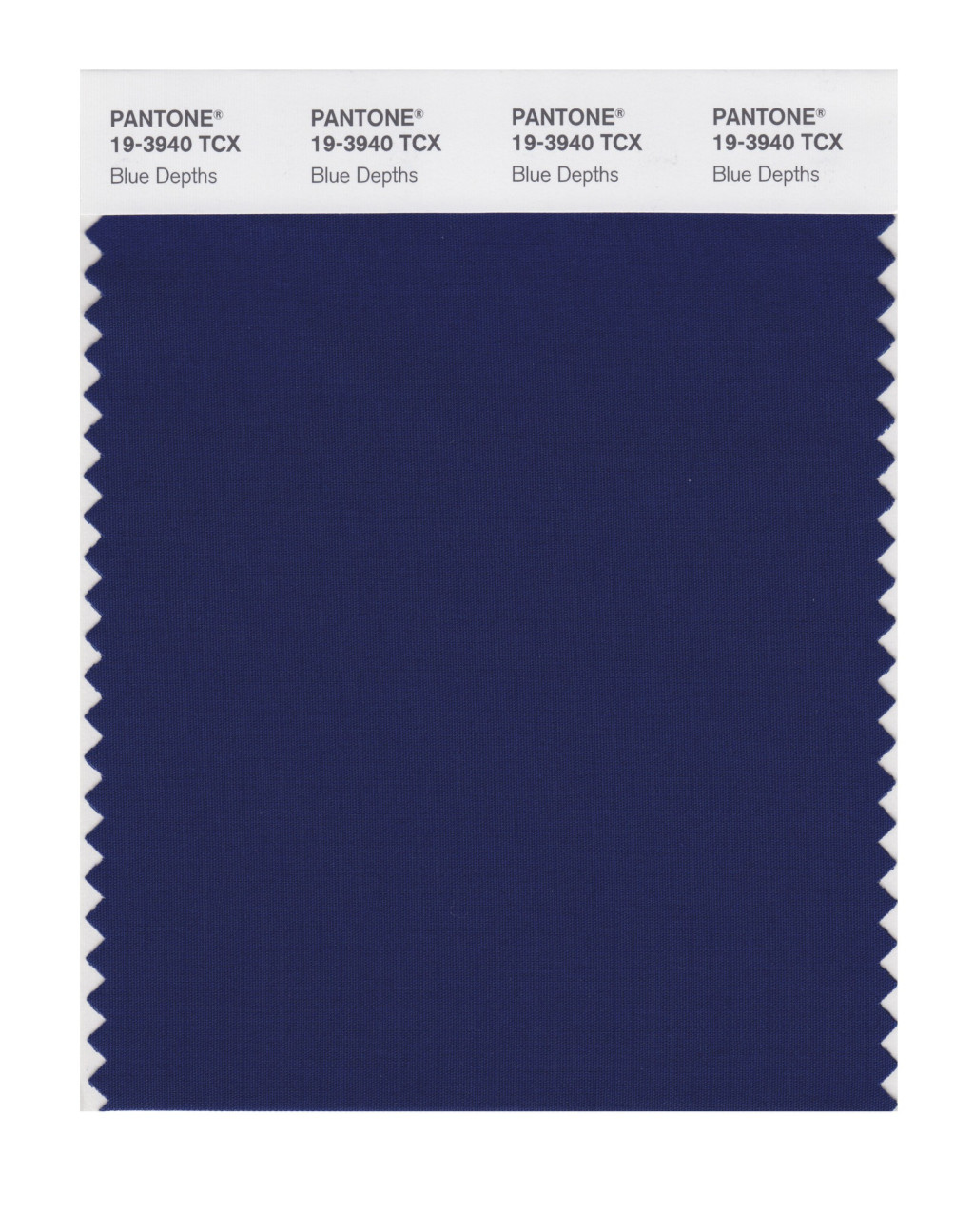
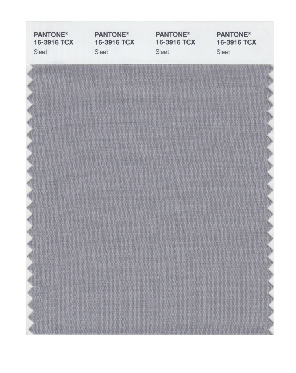
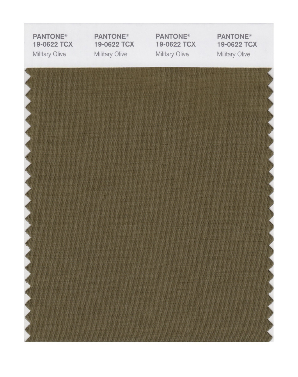
Neutral basics
Pantone® have also updated the Classic Colour Palette. These are a group of neutrals that are core basics, this time in the form of a white, navy blue, grey and olive green. The bonus classic neutral colours for Fall 2020 are:
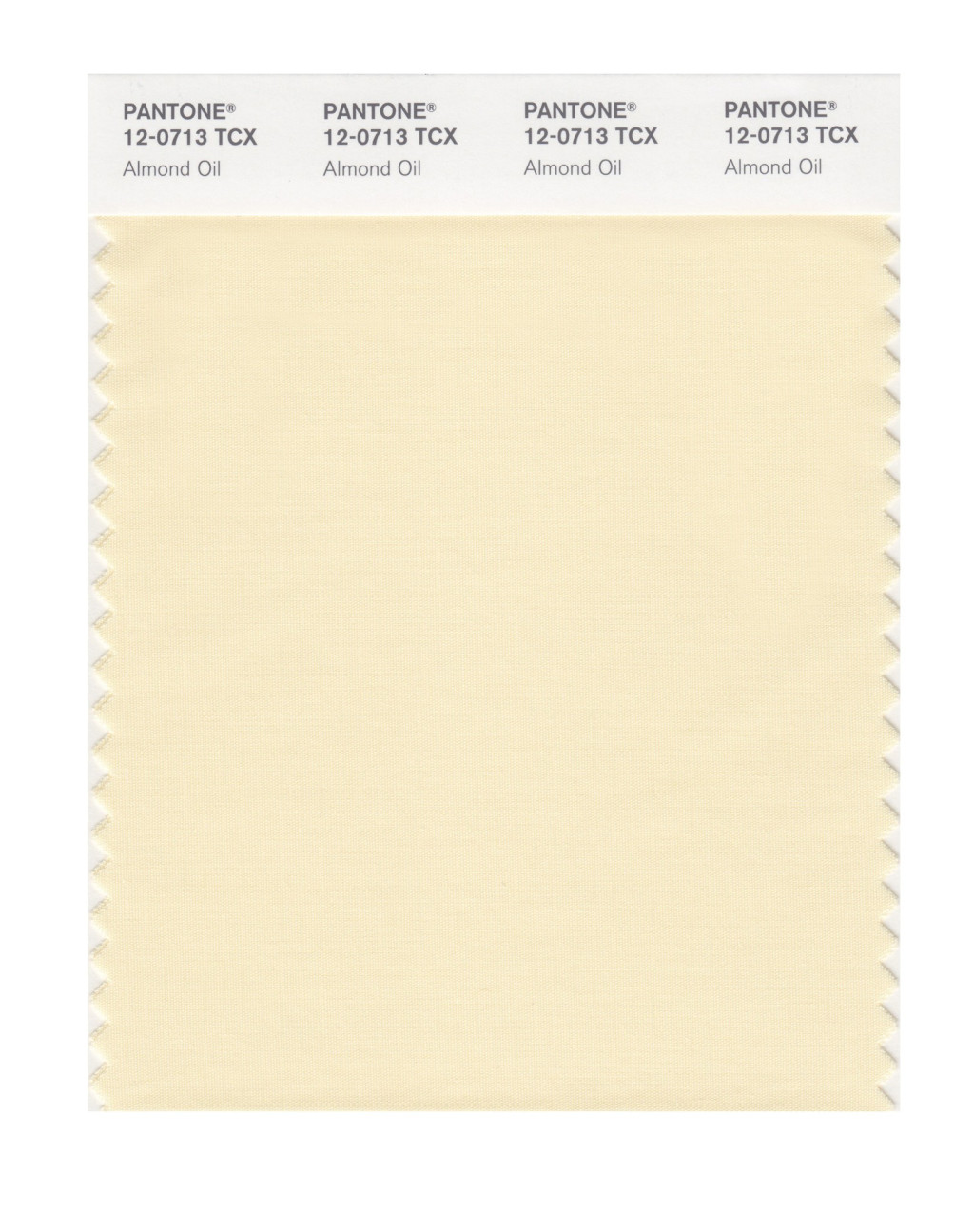
Almond Oil PANTONE 12-0713
Blue Depths PANTONE 19-3940
Sleet PANTONE 16-3916
Military Olive PANTONE 19-0622
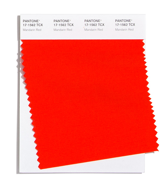
Fall 2020 extra colours from LFW
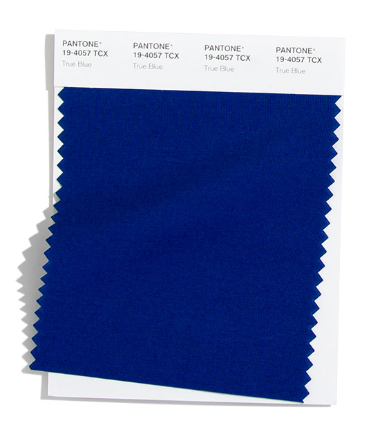
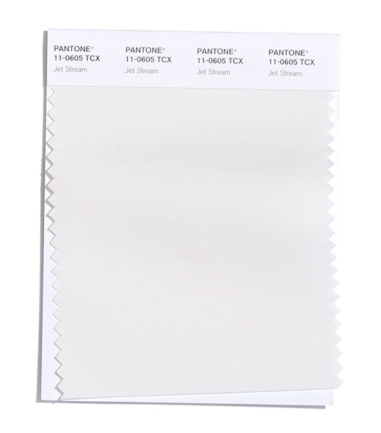
They may have different names but in the main the colours are repeated at London Fashion Week, along with a couple of additional colours (instead of the pastel pink and purple colours) to round off the colours for Fall 2020. There’s also a bit of a rejig of whether some colours sit in the neutrals or the main set (as Military Olive gets promoted at LFW) along with a purer white in the neutral basics. Here are the extra red, white and blue shades:
Mandarin Red PANTONE 17-1562
True Blue PANTONE 19-4057
Jet Stream PANTONE 11-0605
Colour themes
It’ll be great to see how couples incorporate these colours in to their weddings later this year. I can see how the classic neutrals will play a big part in coupling up with some of the more vibrant choices.
Pantone® is the world-renowned authority on colour and the Pantone® Color of the Year is always really influential in any popular colour themes in fashion, interior design and weddings.
I’m always excited to see the next Pantone® announcement for their predictions of colours that will dominate the scene for forthcoming seasons. So with the fashion weeks kicking off (this month is New York, London, Milan and then Paris) we start to think about this year’s autumnal months.
This week saw Pantone® showing their hand for the Fall/Winter colours to look out for later in 2019. And it’ll be great to see which colours will appear in autumn weddings this year.
There’s an array of rich vibrant earthy colours. Out of the 12 main colours, 8 of them are from the red palette. There are 3 orange colours and 5 reddy/browns, with some of the peach colours paying a slight nod to Living Coral, the colour of the year. What is great is that a juicy green has made it alongside the neutral and core basic colours too.
Seventies festival vibe
Perhaps to match the festival and eco friendly vibe on trend at the moment, there is a plethora of reds, oranges and browns that dominate the Fall 2019 colours.
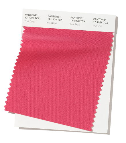
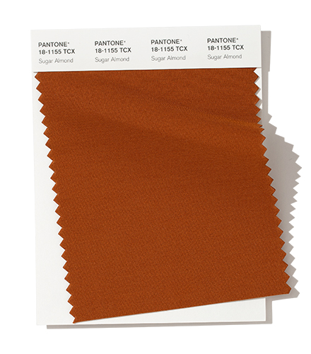
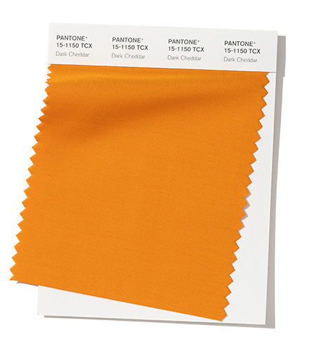
There’s a real sense of being grounded and at one with the world. With the feeling of the warmth coming from Chili Pepper, Biking Red, Peach Pink, Rocky Road, Fruit Dove, Sugar Almond, Dark Cheddar and Orange Tiger.
For me, it’s like someone has opened a door on the décor of my childhood house with memories of all the orange and brown on wallpaper.
Mouth watering food
There are lots of culinary references in the colour names that make my mouth water just thinking about them. Perhaps this in light of the importance that we are being made more aware of nowadays to cook fresh and sustainable food.
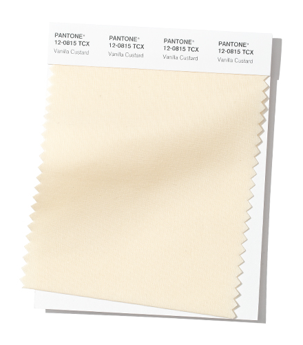
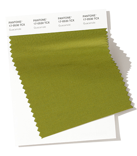
There are strong flavours in these colours that pack a punch both to taste and also visually. This plays on the trend to appeal to all 5 senses at a wedding or any event. Such as Chili Pepper, Crème de Pêche, Peach Pink, Rocky Road, Fruit Dove, Sugar Almond, Dark Cheddar (plus Vanilla Custard and Guacamole from the neutrals).
This evokes amazing memories of seeing guacamole being prepared by the side of our table in Mexico – the fresh, spicy and warming flavours produced by one small dish of food.
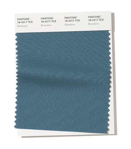
Succulent foliage
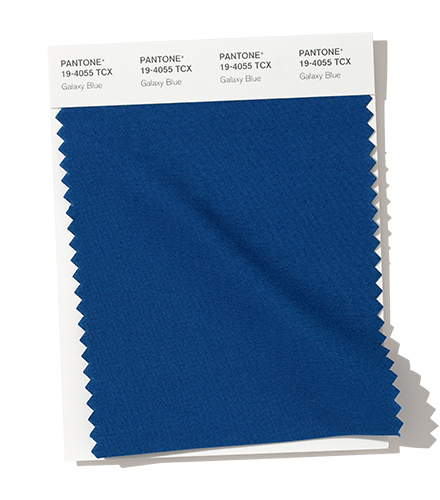
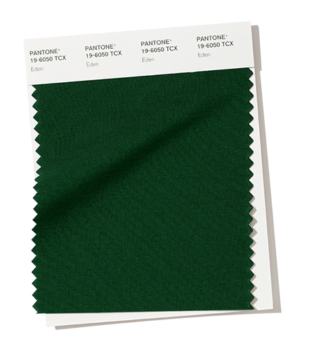
Alongside these earthy colours are greens conjuring up an amazing garden image with the forest green of Eden. Plus the bluey green of Bluestone makes me think of amazing succulent plants accenting and dotted about on the dry earthy ground.
The blues will certainly make good transition colours to next spring too.
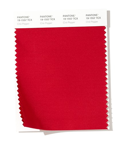
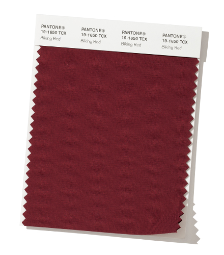
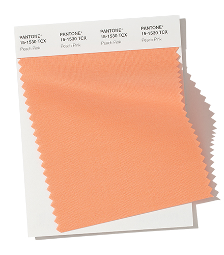
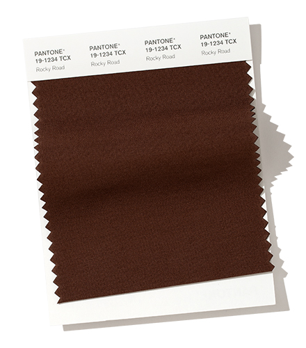
Fall 2019 colours
The top colours for Fall 2019 are:
PANTONE 19-1557 Chili Pepper
PANTONE 19-1650 Biking Red
PANTONE 12-1110 Crème de Pêche
PANTONE 15-1530 Peach Pink
PANTONE 19-1234 Rocky Road
PANTONE 17-1926 Fruit Dove
PANTONE 18-1155 Sugar Almond
PANTONE 15-1150 Dark Cheddar
PANTONE 19-4055 Galaxy Blue
PANTONE 18-4217 Bluestone
PANTONE 16-1358 Orange Tiger
PANTONE 19-6050 Eden
Fall 2019 extra colours from LFW
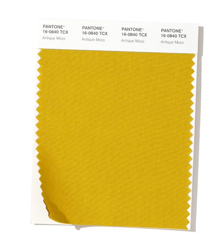
Plus a couple of additional colours (instead of the peach and orange colours) from London Fashion Week round off the colours for Fall 2019:
PANTONE 16-0840 Antique Moss
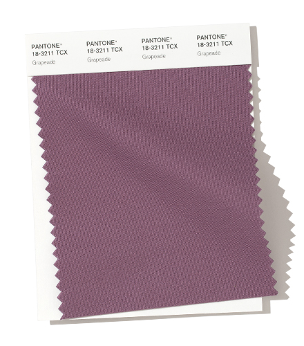
PANTONE 18-3211 Grapeade
Neutral basics
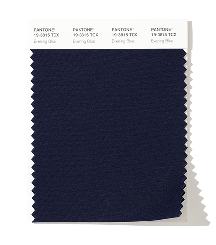
Pantone® have also created a Fall 2019 Classic Colour Palette. These are a group of neutrals that are core basics in the form of cream, navy, grey and the addition of a green.
The bonus classic neutral colours for Fall 2019 are:
PANTONE 12-0815 Vanilla Custard
PANTONE 19-3815 Evening Blue
PANTONE 16-0000 Paloma
PANTONE 17-0530 Guacamole
Colour themes
It’ll be great to see how couples incorporate these colours in to their weddings later this year.
Pantone® is the world-renowned authority on colour and the Pantone® Color of the Year is always really influential in any popular colour themes in fashion, interior design and weddings.
I’m pleased we didn’t have to wait as long as last year for the Pantone® announcement of the Fall/Winter colours to look out for in 2018. In fact, it even took me a bit by surprise!
With the fashion week season just kicking off (this month is New York, London, Milan and then Paris) we start to think about those autumnal months.
And it seems that Pantone® are back in their stride, as we return to a top ten of colours (rather than a dozen that we saw for spring 2018). Plus I’m pleased to see the report continuing to be predictions again rather than a counting colours exercise from the catwalks.
It’s great to see an increase and update to the bonus colours that act as neutrals and core basics too.
Bonfire night warmth
I love this collection of bold colours that will trend in Autumn. They certainly pack a punch and make a huge statement.
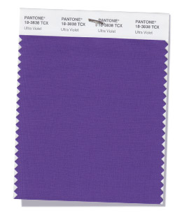
Alongside some typical, rich autumnal colours, there’s some great accompanying vibrant shades that sit nicely alongside the colour of the year, Ultra Violet.
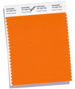
You can feel the warmth of the reds, orange, yellow and brown colours radiating out like the flames of a bonfire on Guy Fawkes night with Red Pear, Valiant Poppy, Ceylon Yellow, Martini Olive, Russet Orange (and Meerkat from the neutrals).
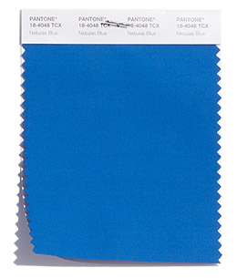
Peacock blooms
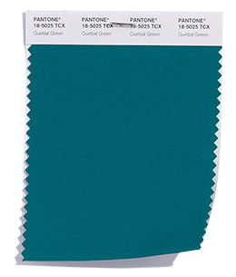
The dark, jewel colours (of Nebulas Blue, Ultra Violet and Quetzal Green) are fitting for my prediction of peacock inspired weddings this year. With the deep teal of Quetzal Green even named after a striking colourful bird.
Many of the names of the colours in this season seem so evocative and conjuror up images of space, sky, sea and land. With the interstellar cloud of dust of Nebulas Blue, Ultra Violet (the colour of the year tipped to suggest the mysteries of the cosmos), the cold, dark North Atlantic water of the Sargasso Sea and the expanse of poppies in Flanders Field reminiscent of Remembrance Day.
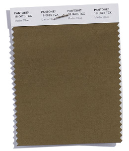
I’d love to have the job of thinking up the names of the colours – any one for a cocktail to accompany Martini Olive?!
Winter transition
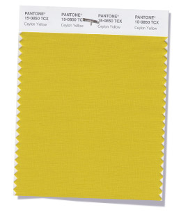
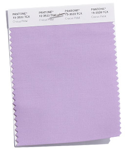
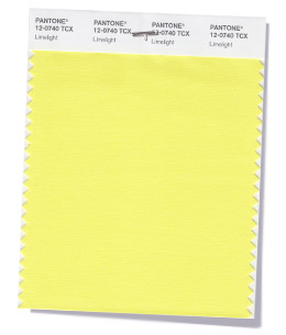
With the start of the Winter Olympics in Pyeongchang today, it’s lovely to see some icy counterparts to take us in to winter with Crocus Petal (a paler version of Ultra Violet) and Limelight (a lighter version of Ceylon Yellow). They’ll make good transition colours to next spring too.
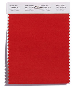
Fall 2018 colours
The top ten colours for Fall 2018 are:
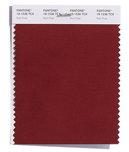
PANTONE 19-1536 Red Pear
PANTONE 18-1549 Valiant Poppy
PANTONE 18-4048 Nebulas Blue
PANTONE 15-0850 Ceylon Yellow
PANTONE 18-0625 Martini Olive
PANTONE 16-1255 Russet Orange
PANTONE 18-3838 Ultra Violet
PANTONE 15-3520 Crocus Petal
PANTONE 12-0740 Limelight
PANTONE 18-5025 Quetzal Green
Fall 2018 extra colours from LFW
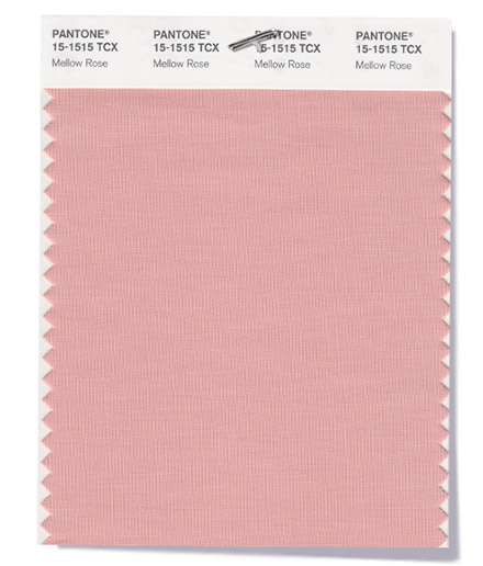
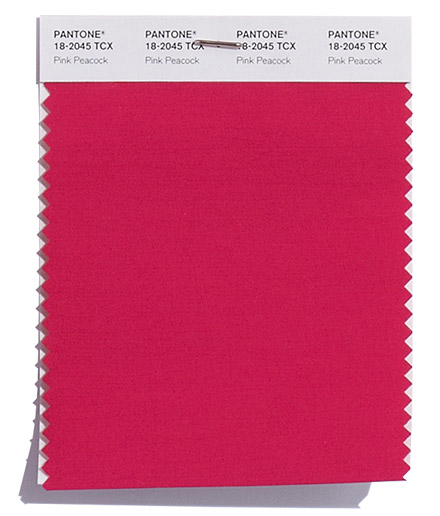
Plus a couple of additional pops of pink from London Fashion Week round off the colours for Fall 2018:
PANTONE 15-1515 Mellow Rose
PANTONE 18-2045 Pink Peacock
Neutral basics
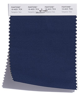
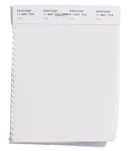
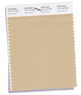
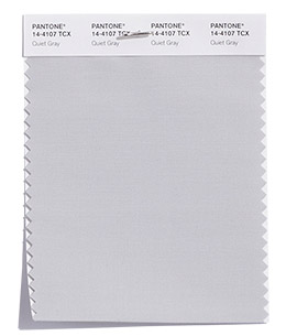
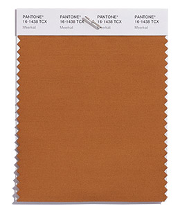
Pantone® have also created a Fall 2018 Classic Colour Palette. These are a group of neutrals that are core basics in the form of navy, white, beige, grey and brown.
You could wrap yourself up in these warm neutral colours. This is hygge at its best – with a great addition of Meerkat brown – so comforting, warm and cosy.
The bonus classic neutral colours for Fall 2018 are:
PANTONE 19-4031 Sargasso Blue
PANTONE 11-4801 Tofu
PANTONE 14-1116 Almond Buff
PANTONE 14-4107 Quiet Grey
PANTONE 16-1438 Meerkat
Colour themes
It’ll be great to see how couples incorporate these colours in to their weddings later this year.
Pantone® is the world-renowned authority on colour and the Pantone® Color of the Year is always really influential in any popular colour themes in fashion, interior design and weddings.
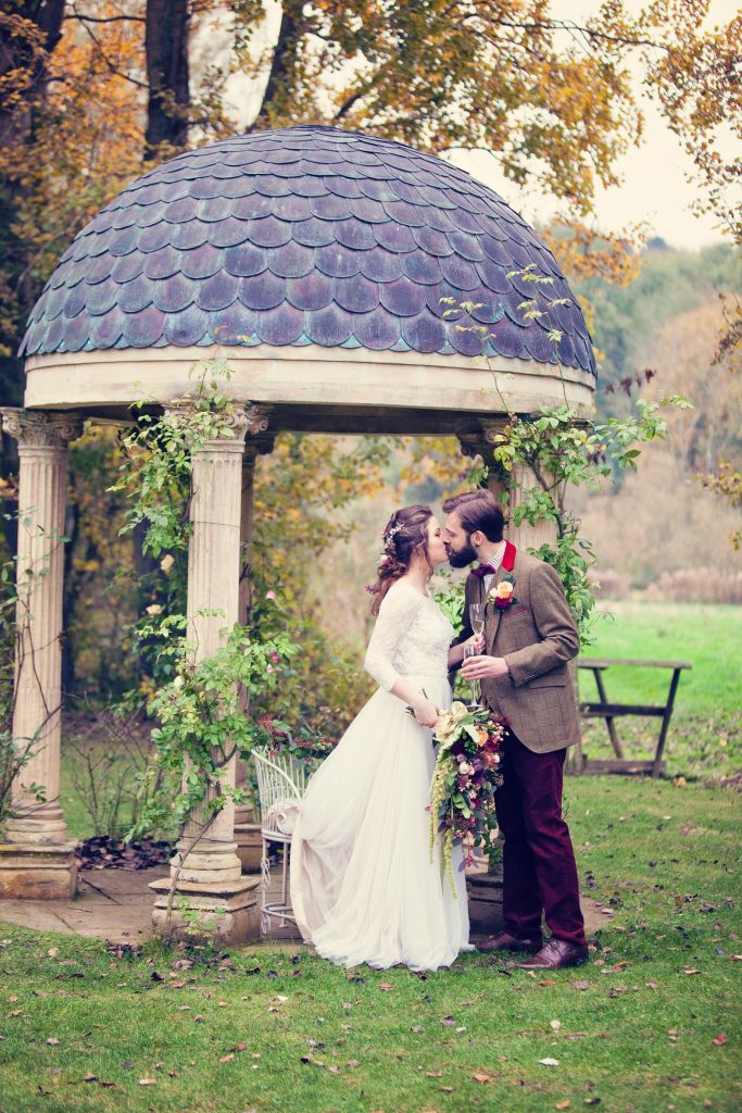
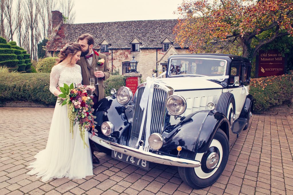
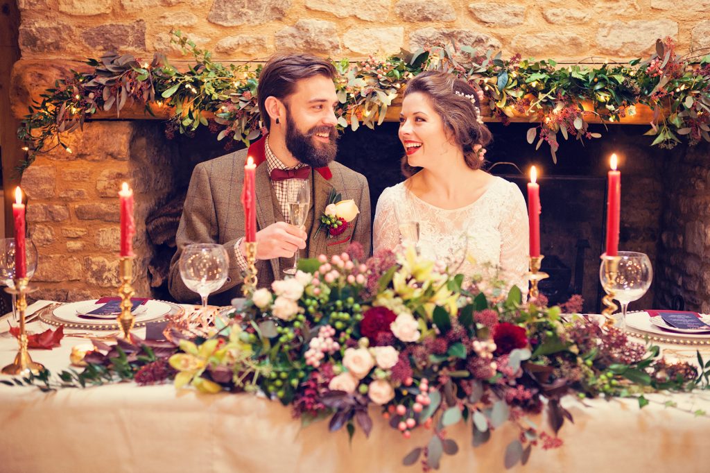
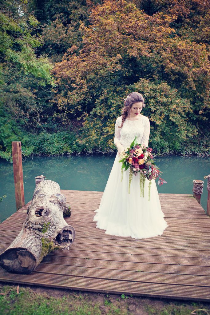
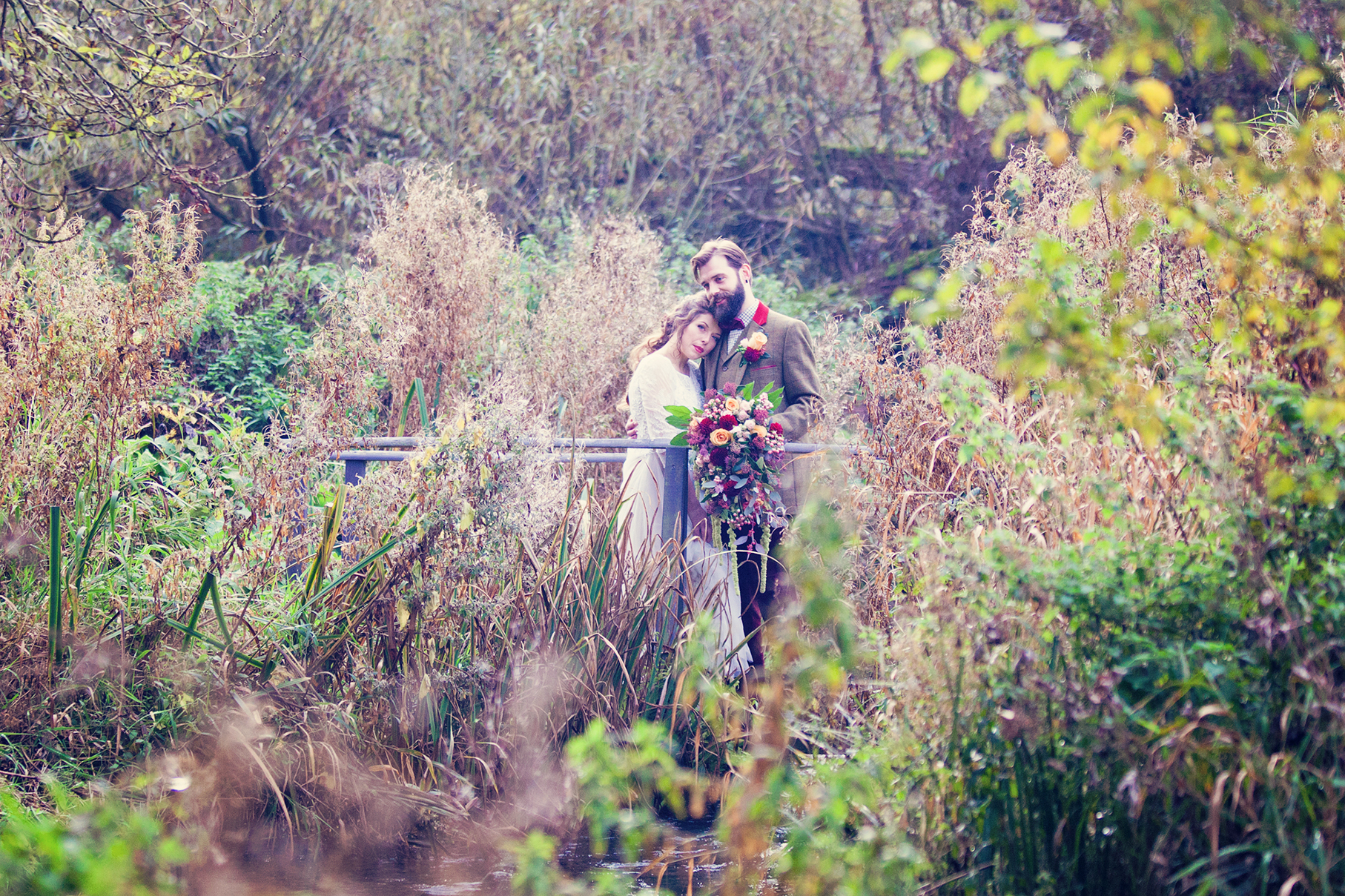
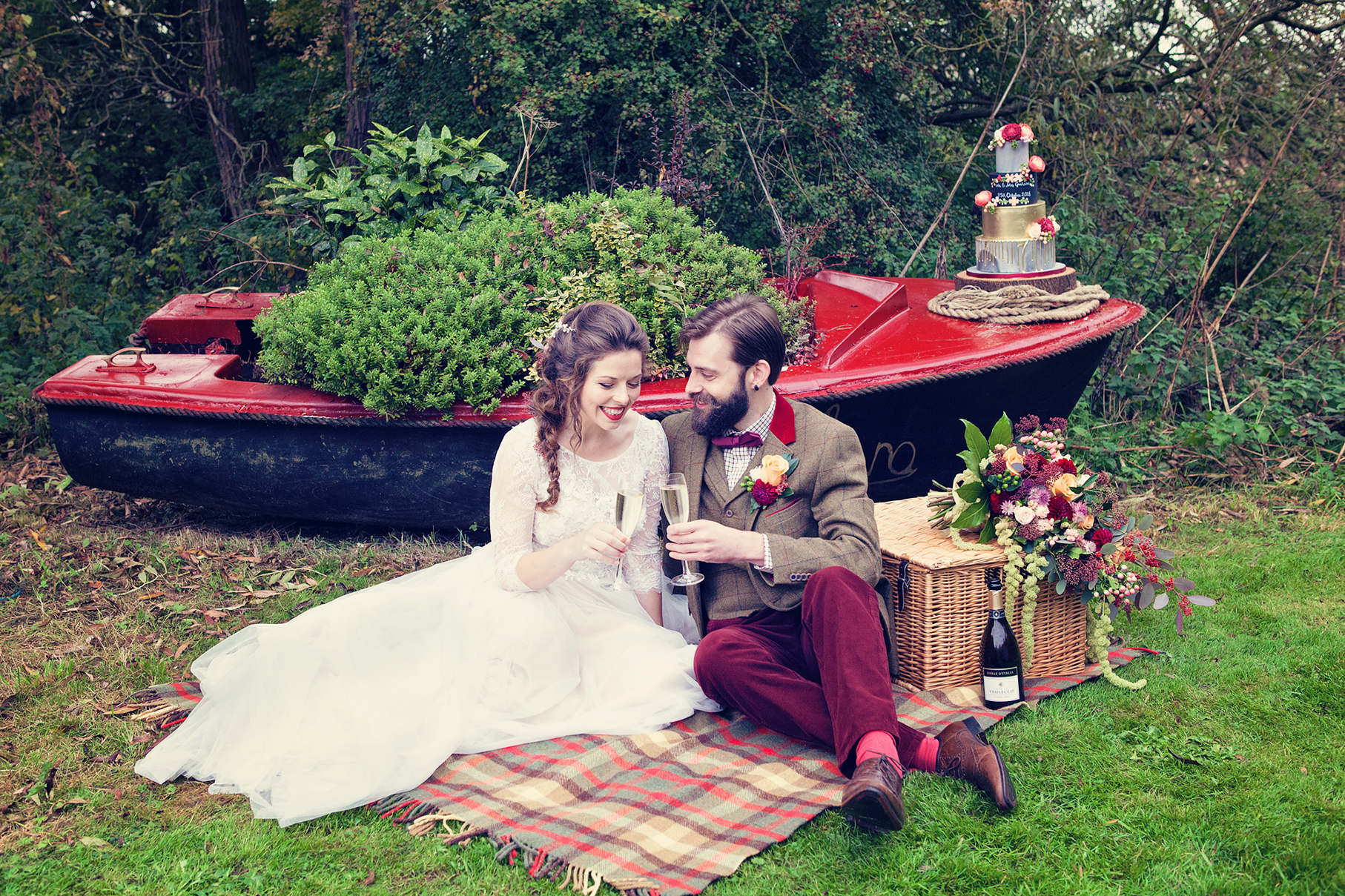
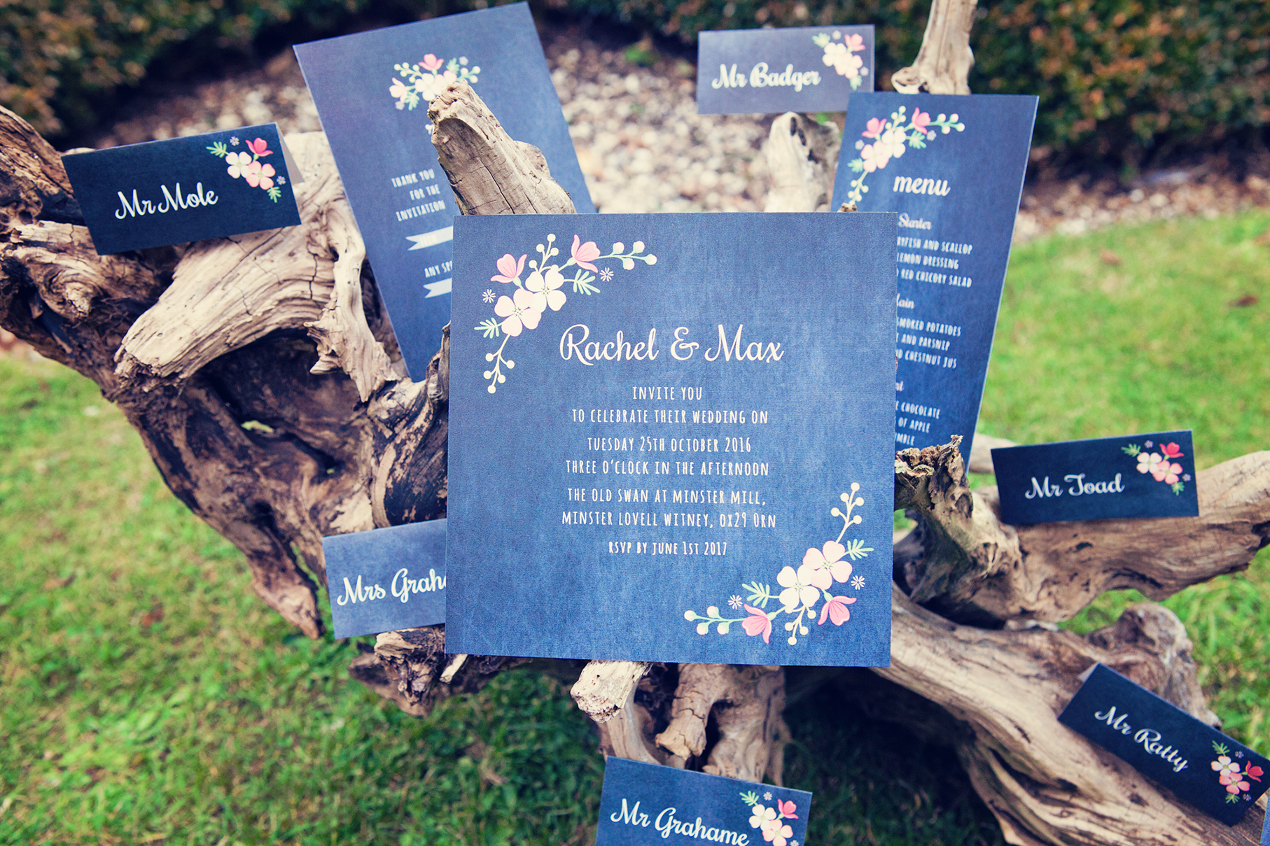
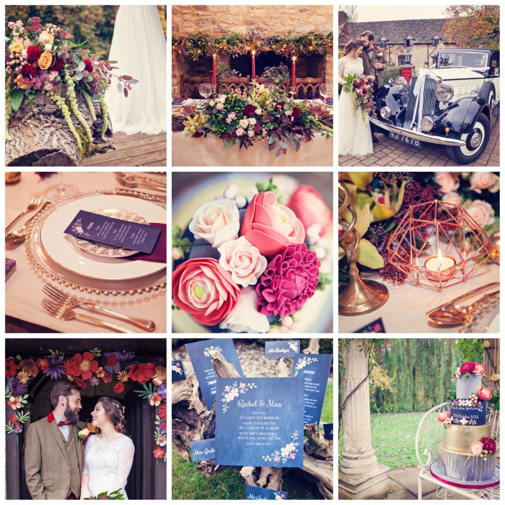
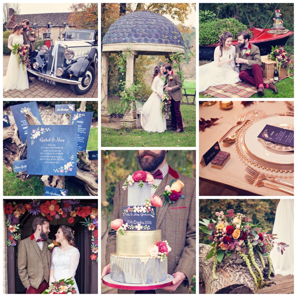
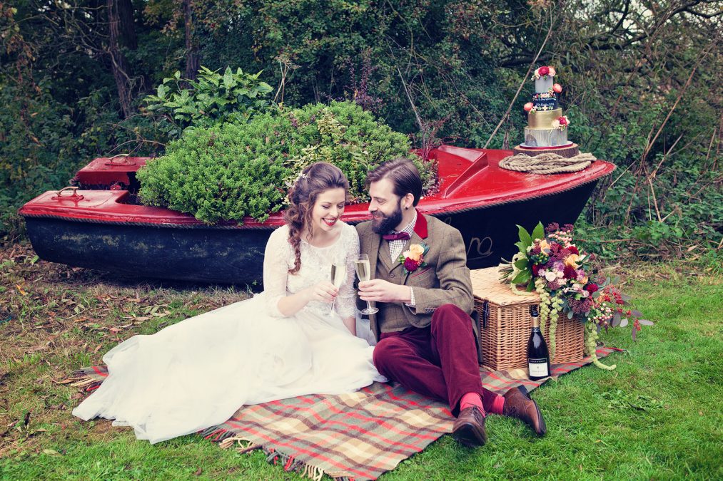
Set in the beautiful Oxfordshire countryside of the Cotswolds, this Wind in the Willows styled bridal shoot is an outdoor, autumnal adventure. Complete with vintage transport alongside a picturesque river, followed by a celebration in a grand hall dressed in marsala and gold, with chalk board and marble design features plus tactile fabrics like tweed, corduroy and suede. Planned and designed by Hanami Dream and wonderfully captured by Farrow Photography.
It is a true celebration of the beauty of nature and encapsulates the sense of an outdoors adventure as typified by the Wind in the Willows book by Kenneth Grahame. This is a chance to get away from the hectic, crowded city to a stunning and tranquil setting. Mole, Ratty, Toad and Badger would be proud to attend this relaxed bohemian wedding.
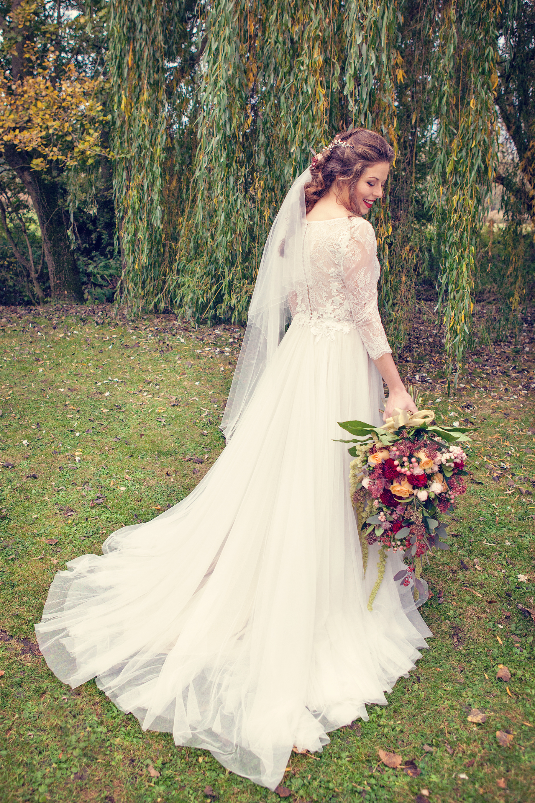
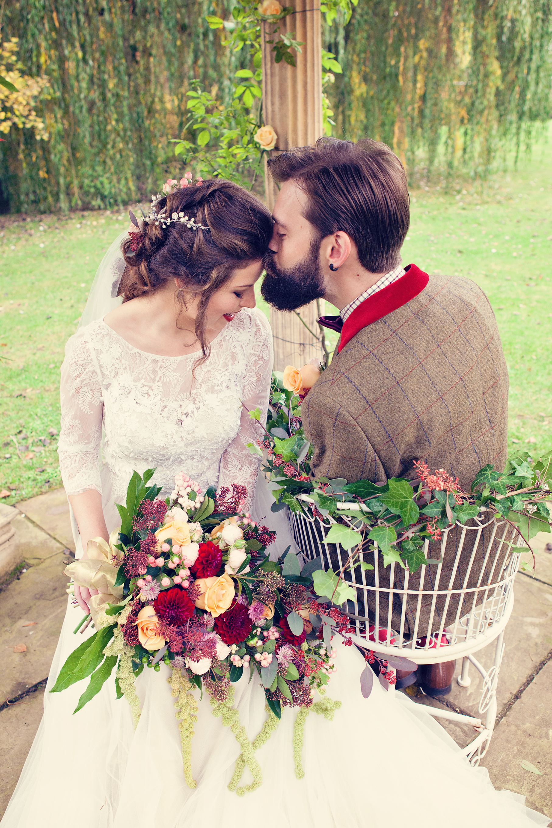
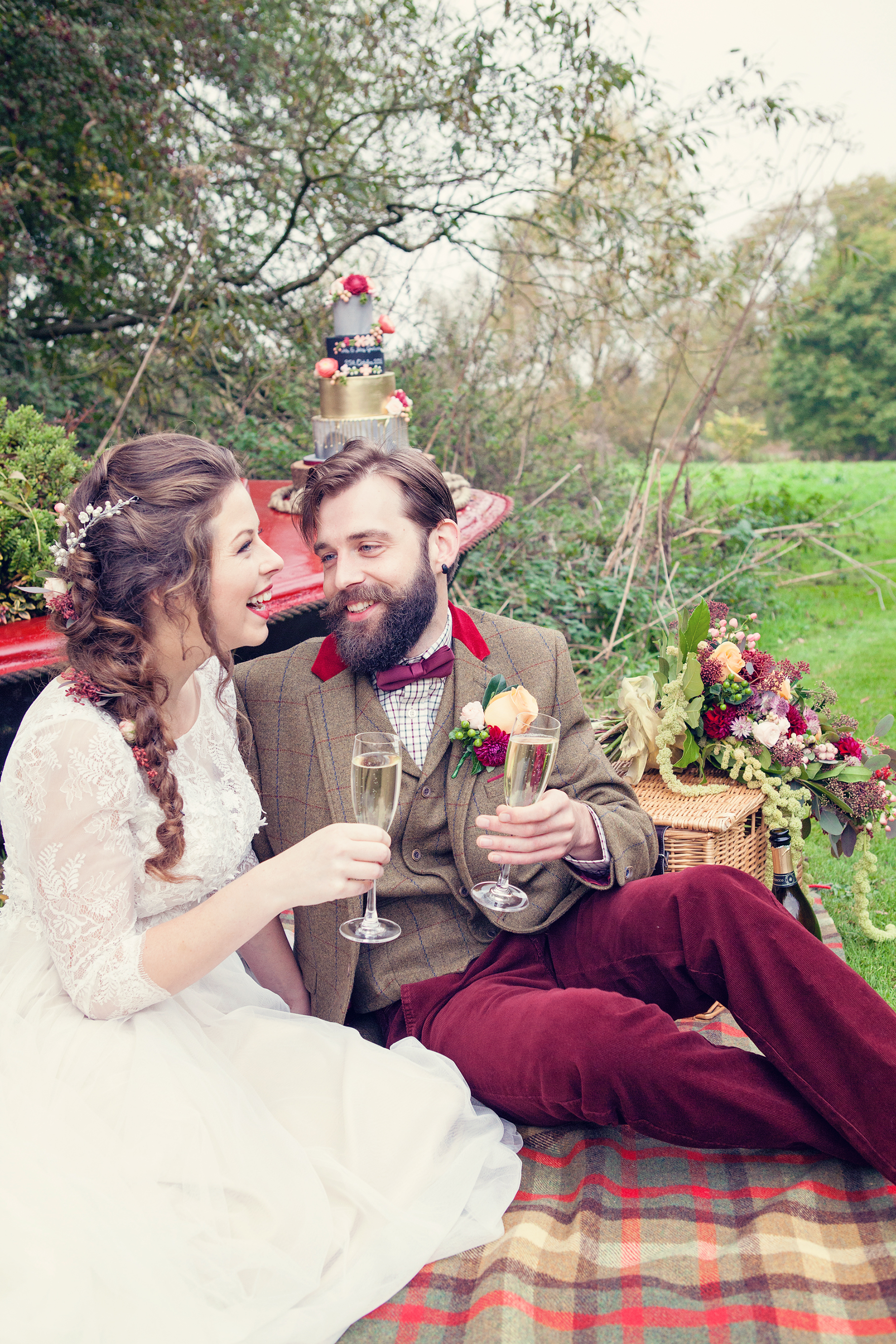
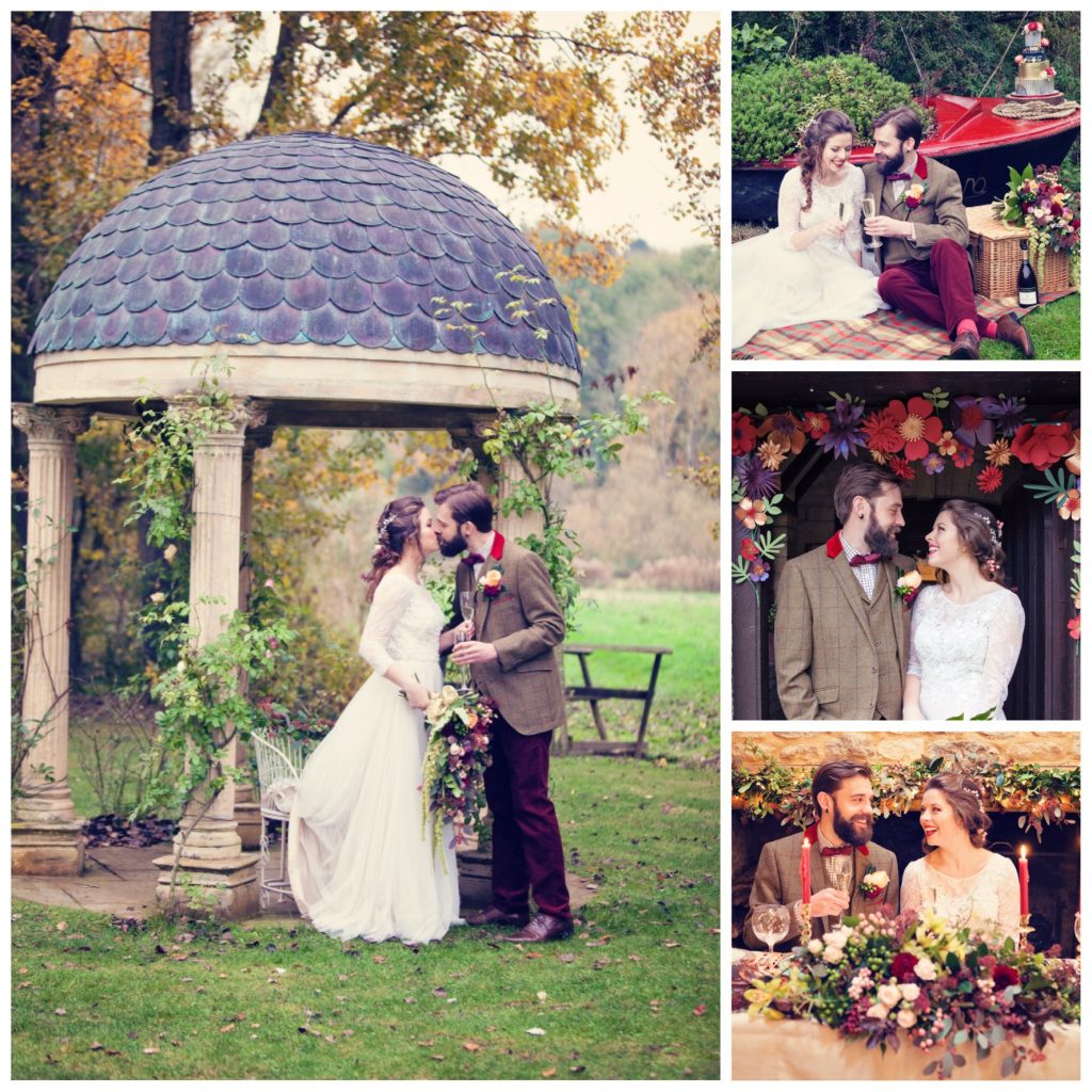
The Old Swan and Minster Mill was a perfect location for this wedding where the bride and groom gazed at one another during their wedding ceremony whilst on the love seats under the Temple Garden. This had the amazing backdrop of a splendid willow tree draping it’s branches in to the River Windrush, flowing on it’s way to join the River Thames.
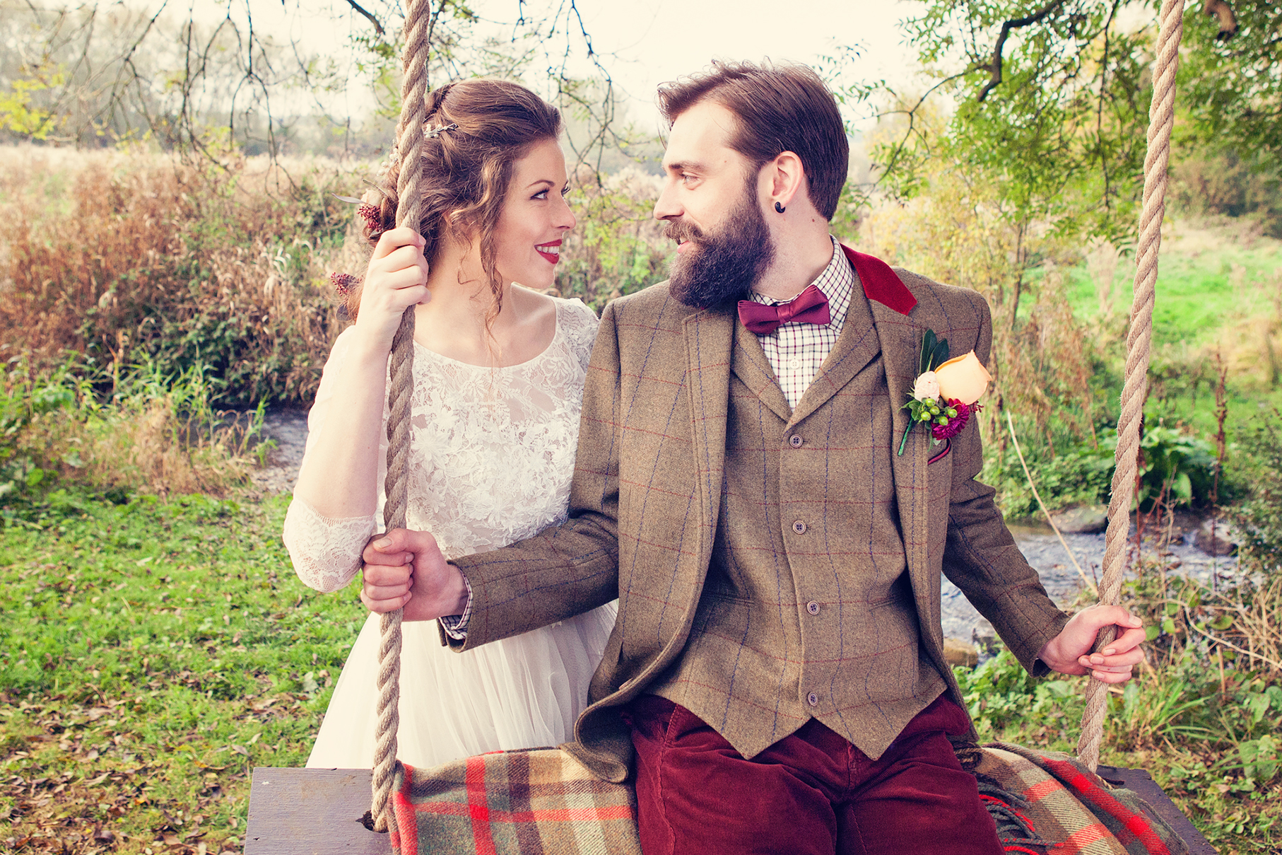
The couple moored their rowing boat by a disused boat house, explored the peaceful setting with treks down the river, over bridges, carefree on a tree swing and enjoyed a sumptuous, rustic picnic sat on a blanket with their hamper on the riverbank.
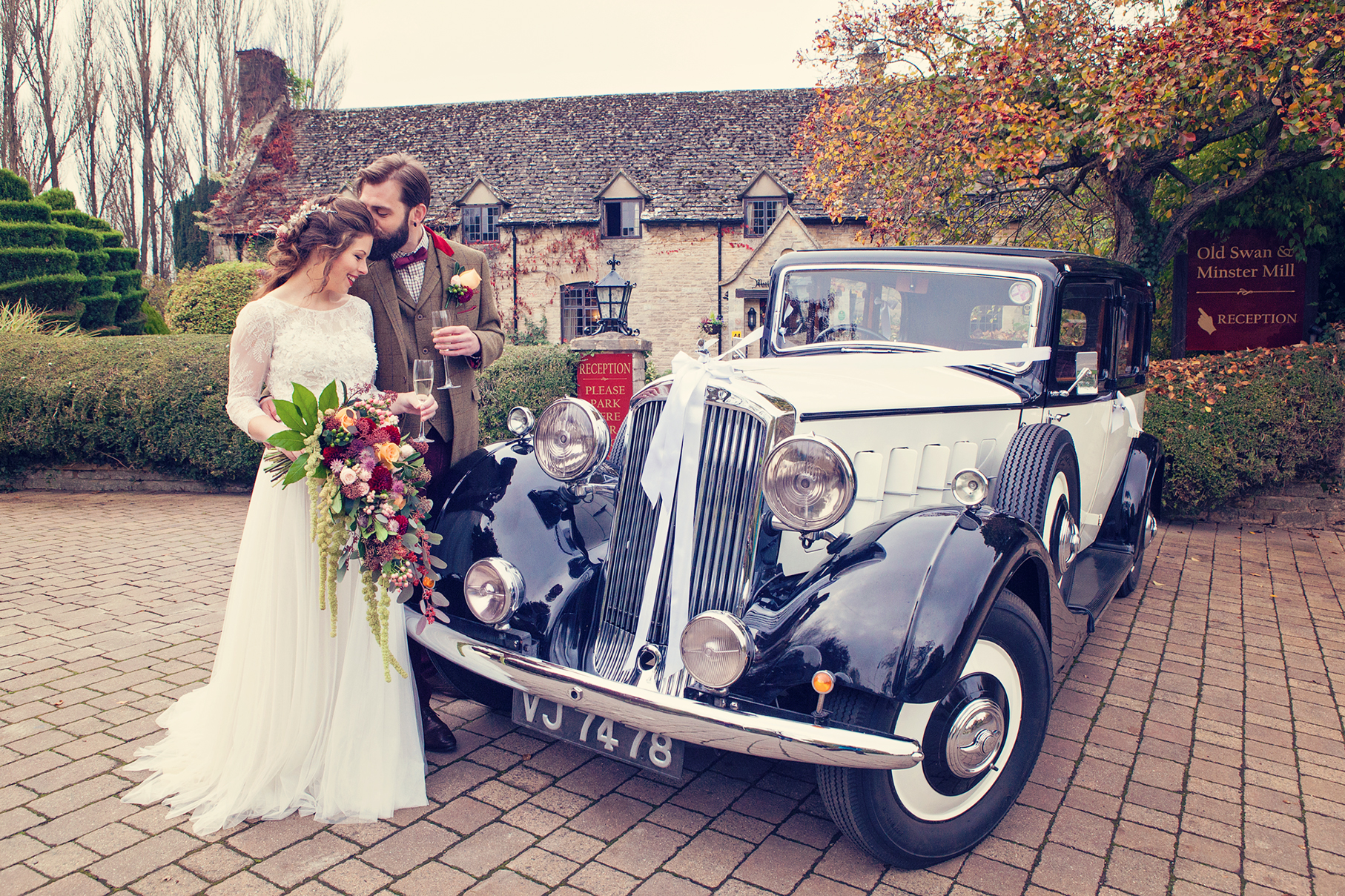
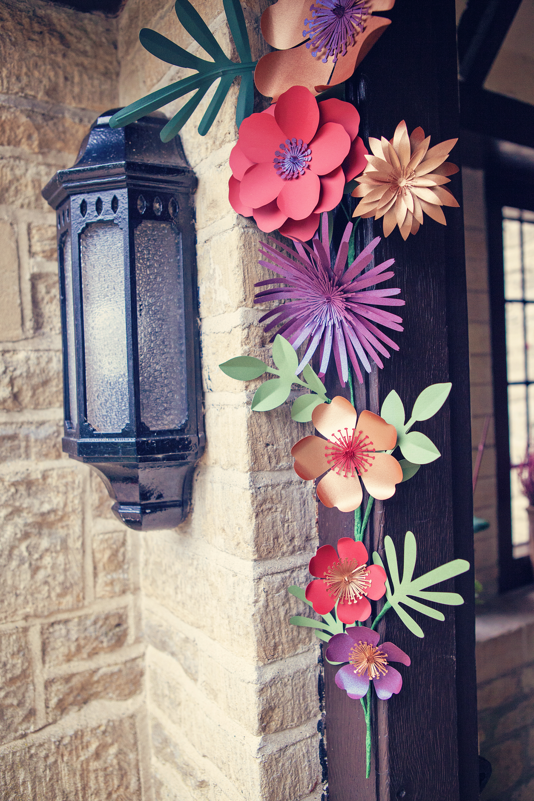
Mr Toad would have approved of the vintage Humber car (from British Classic Car Hire) to experience the open road before entering the Great Hall through a paper floral archway (by Paper Tree Design) to feast on a mouthwatering banquet.
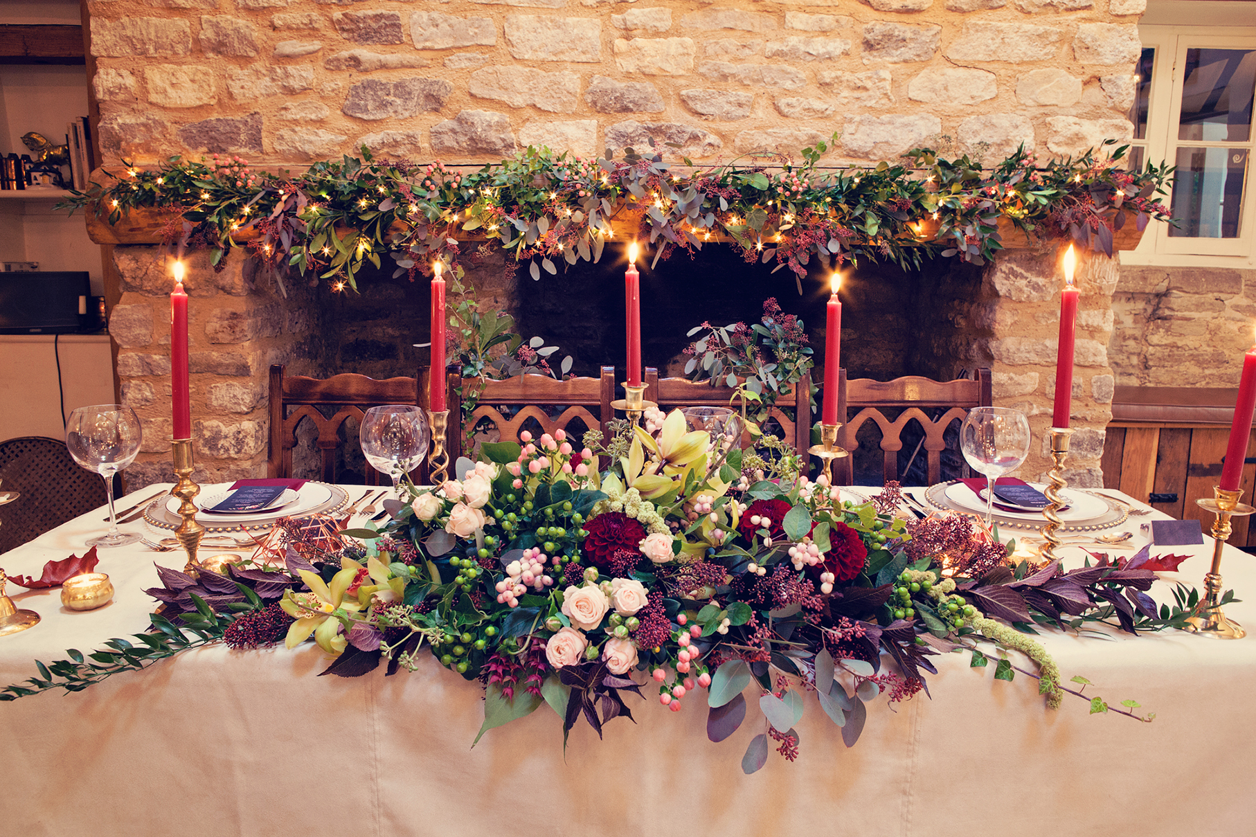
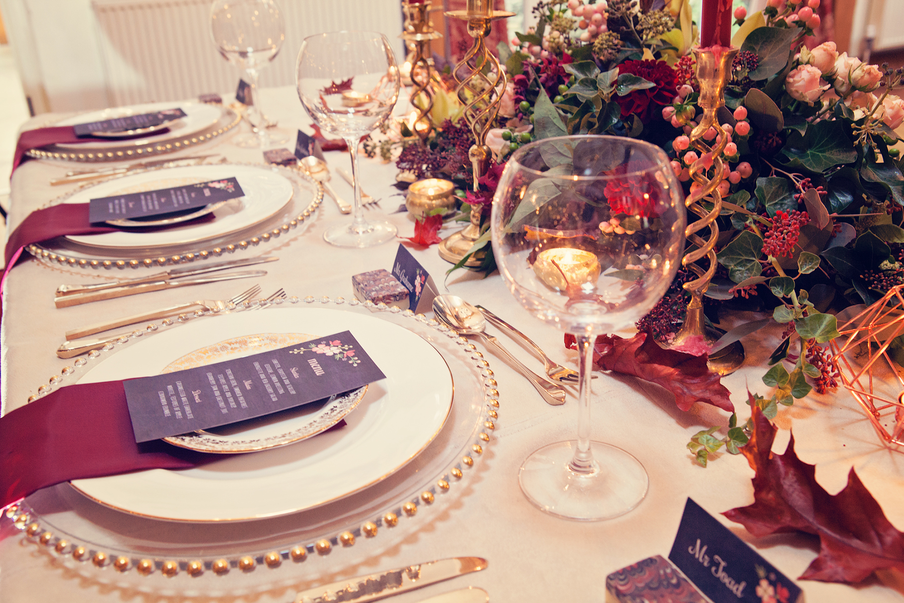
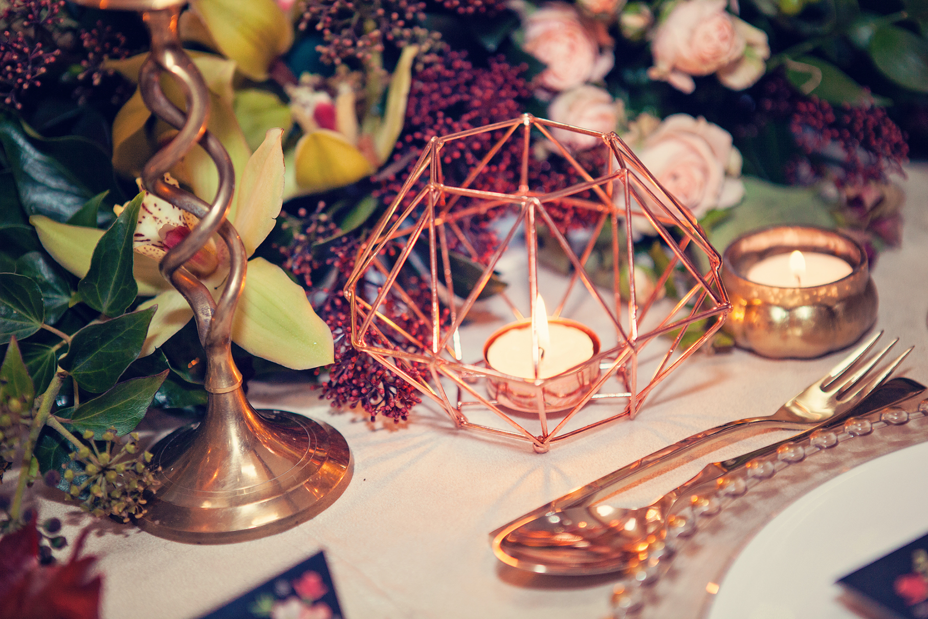
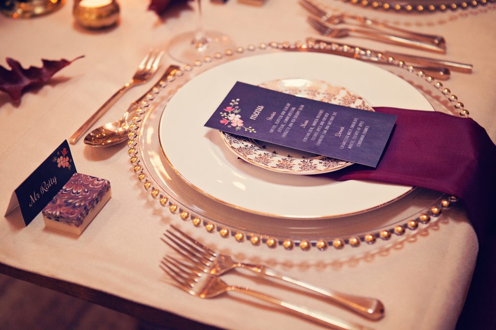
Once inside the happy couple sat in pride of place at the top table, in front of an impressive fireplace with a mantelpiece adorned with swashes of forest green foliage (from Classic Flowers) and fairy lights. The table was luxurious and tactile complete with a suede cream table cloth, copious amounts of marsala coloured candles in gold candlesticks and geometric copper tea light holders (from Talking Tables). Gold beaded charger plates were topped with gold vintage crockery (from Vintage Gold China), marsala coloured silk napkins and a chalk board design menu card (by Paper Tree Design), besides gold vintage cutlery (from Vintage Gold China).
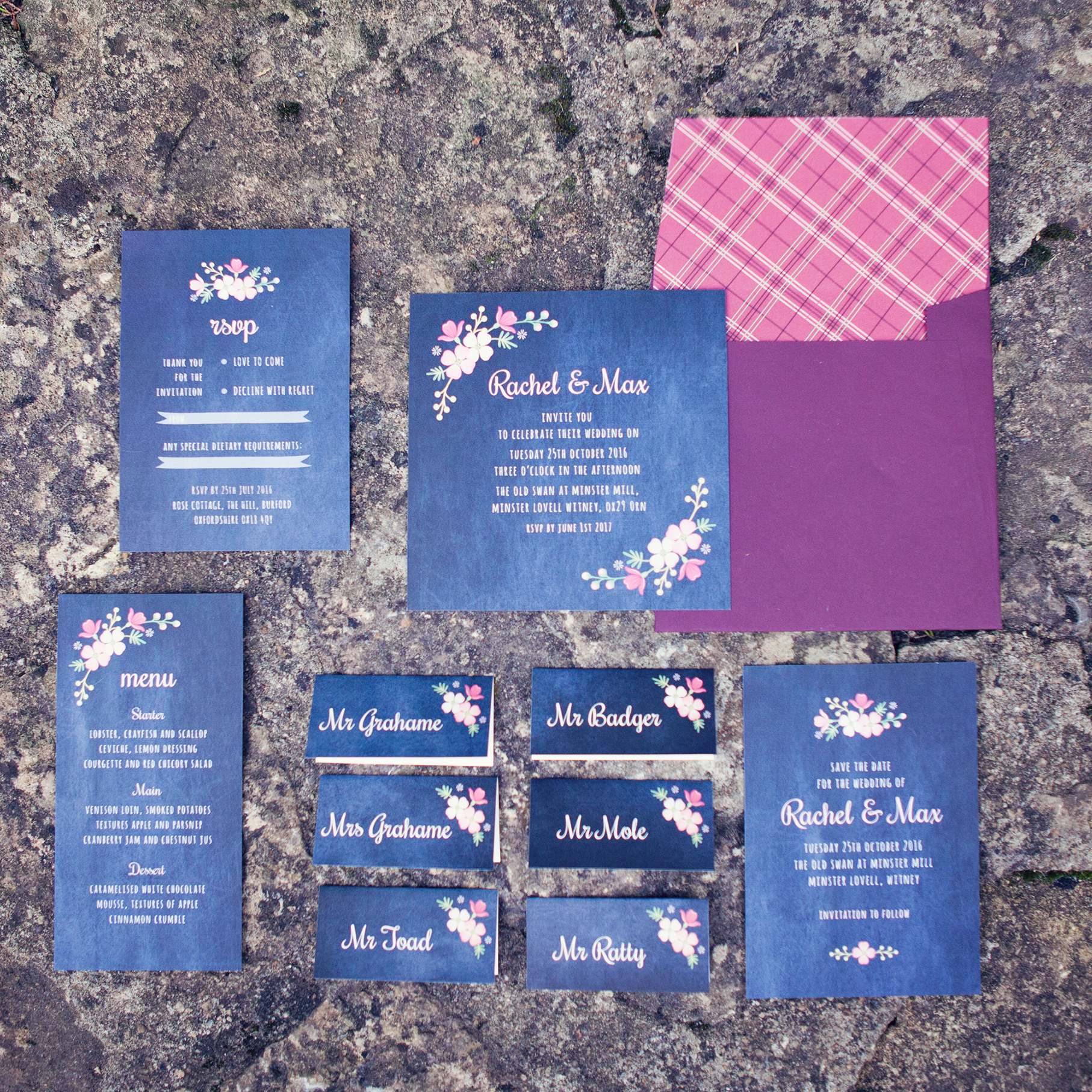
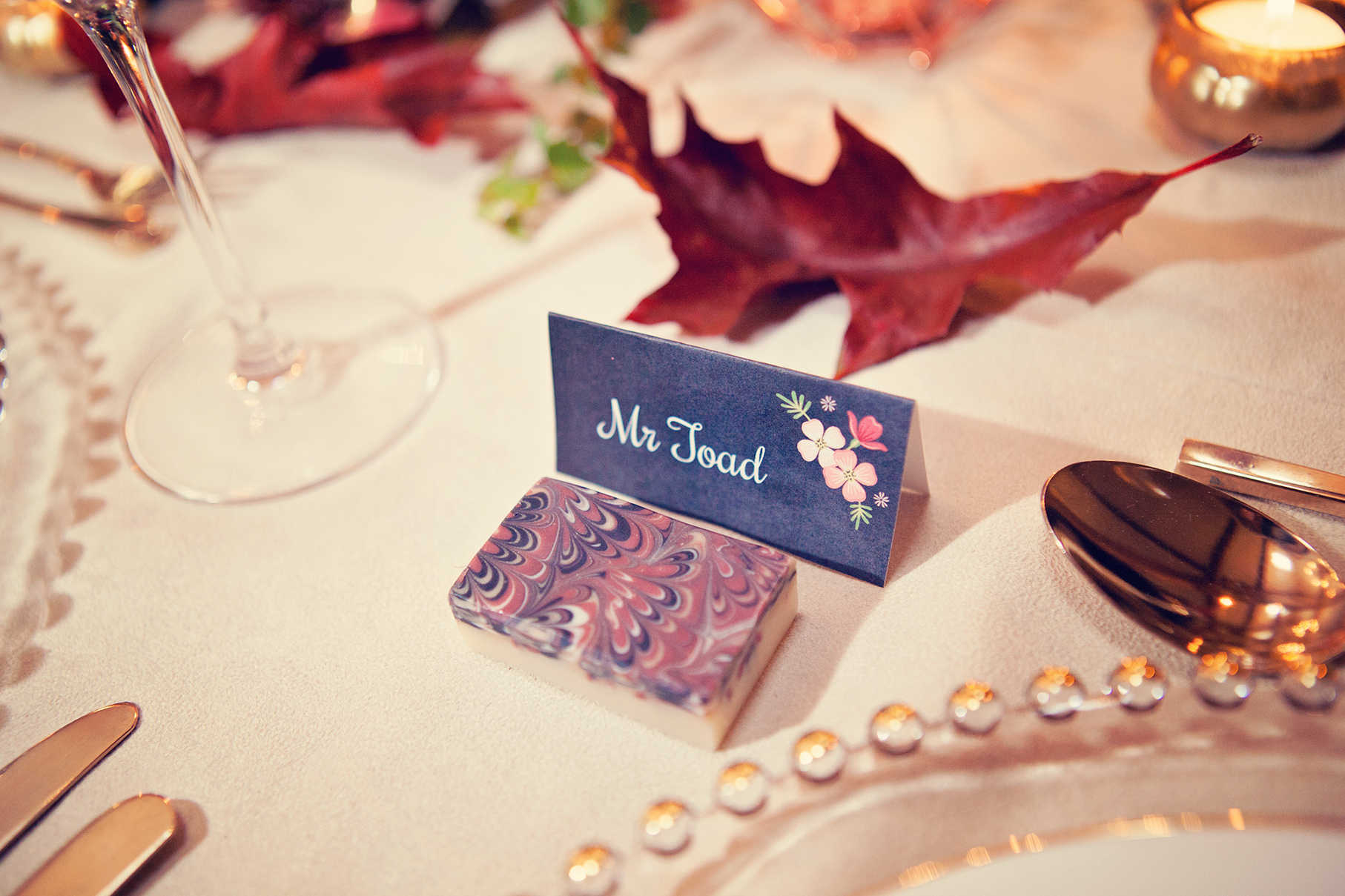
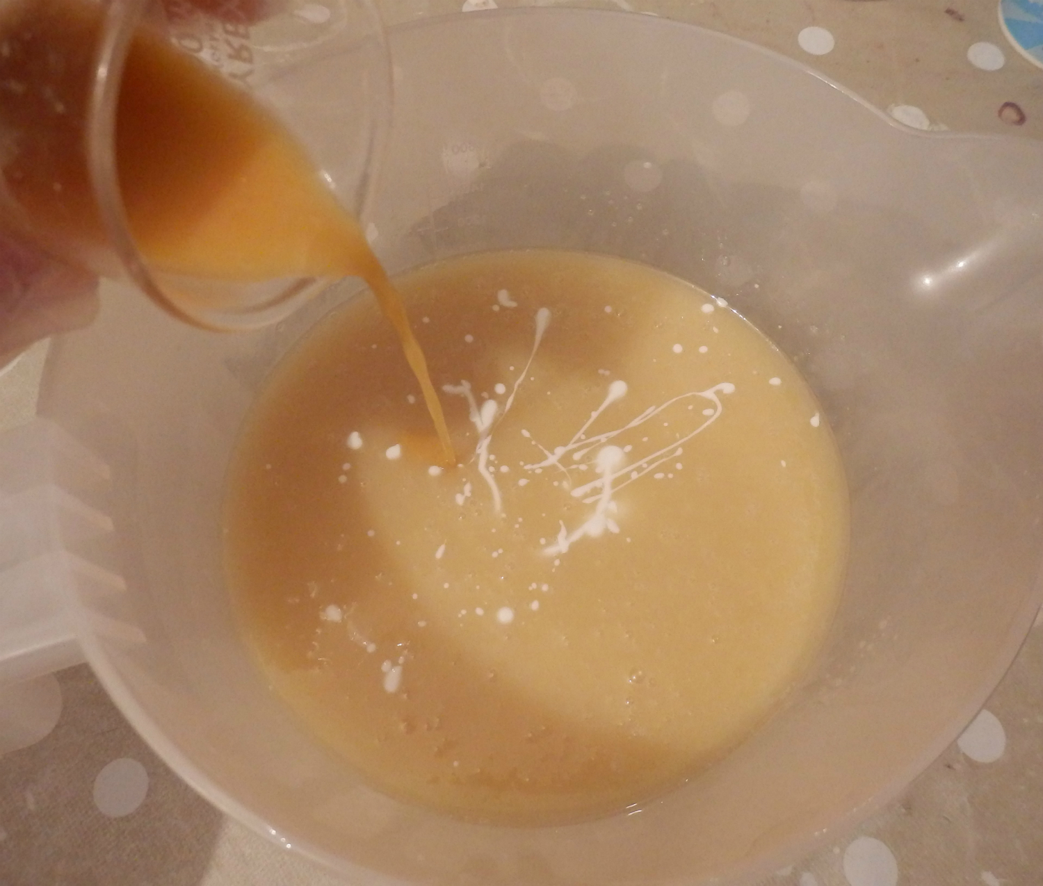
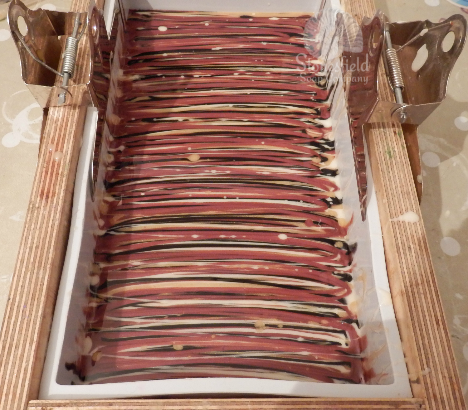
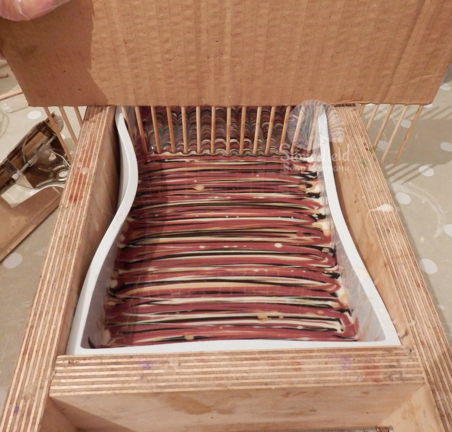
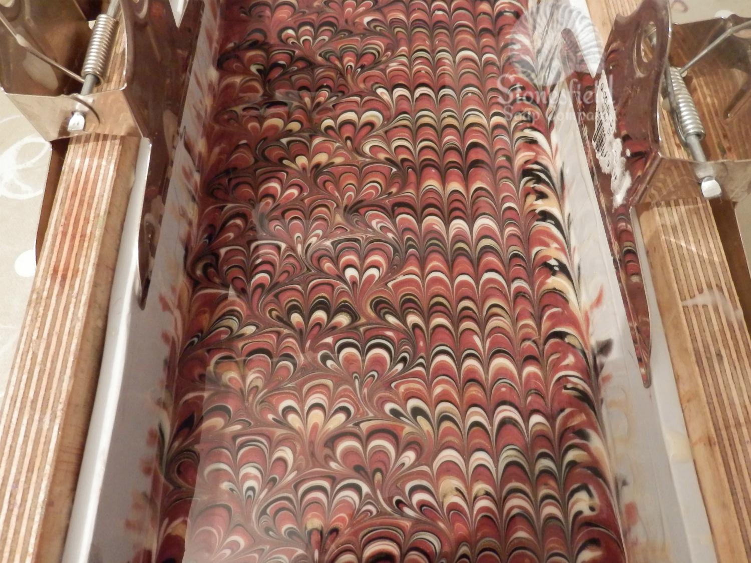
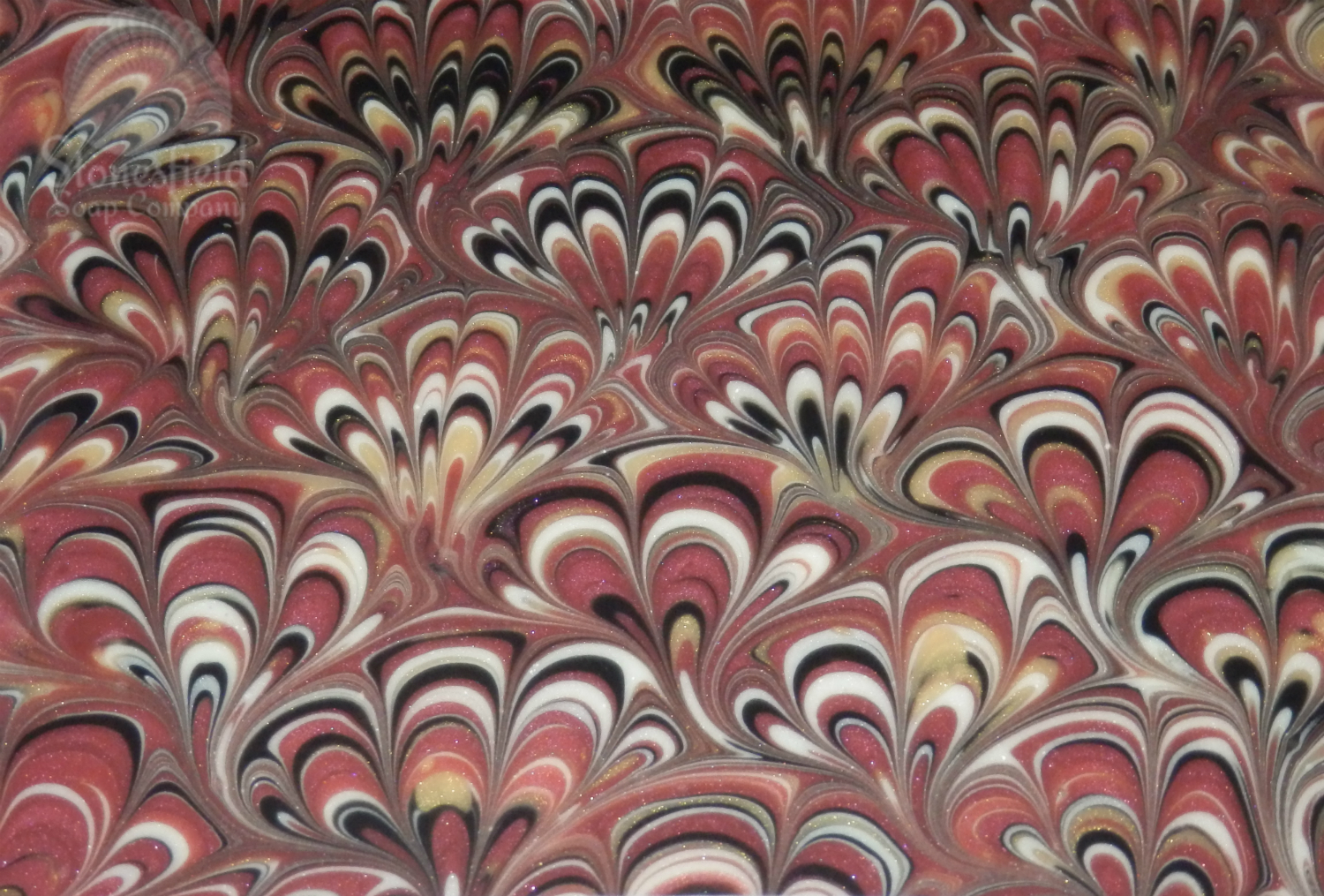
Guests found their places by referencing the chalk board style table plan and name cards (with guest names paying homage to the character names and table were named after chapters from the book by Paper Tree Design) and were given an opulent, marsala marbled soap as their fragrant favour (by Stonesfield Soap Company).
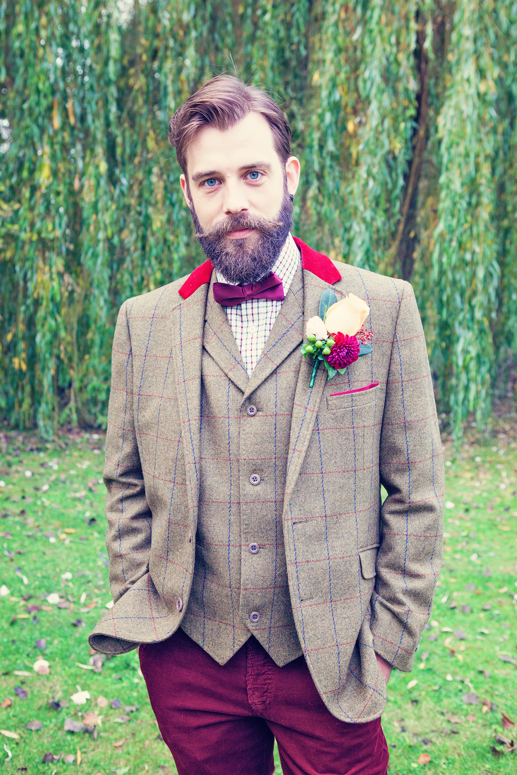
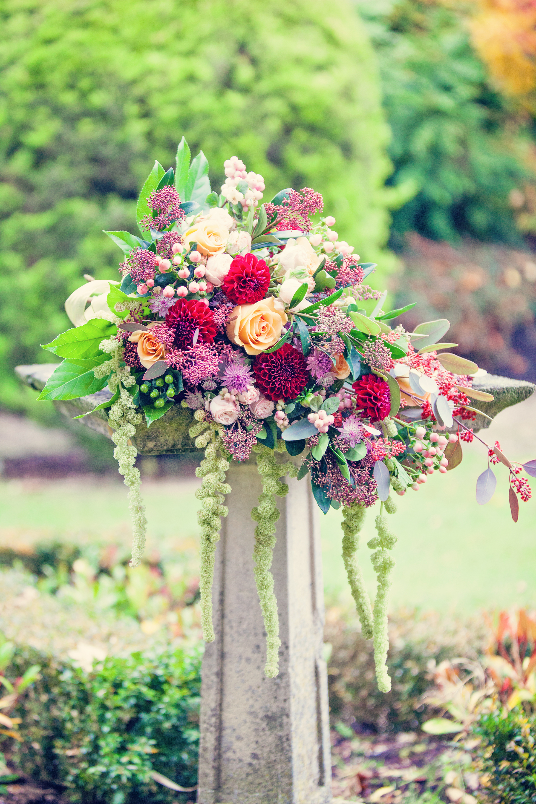
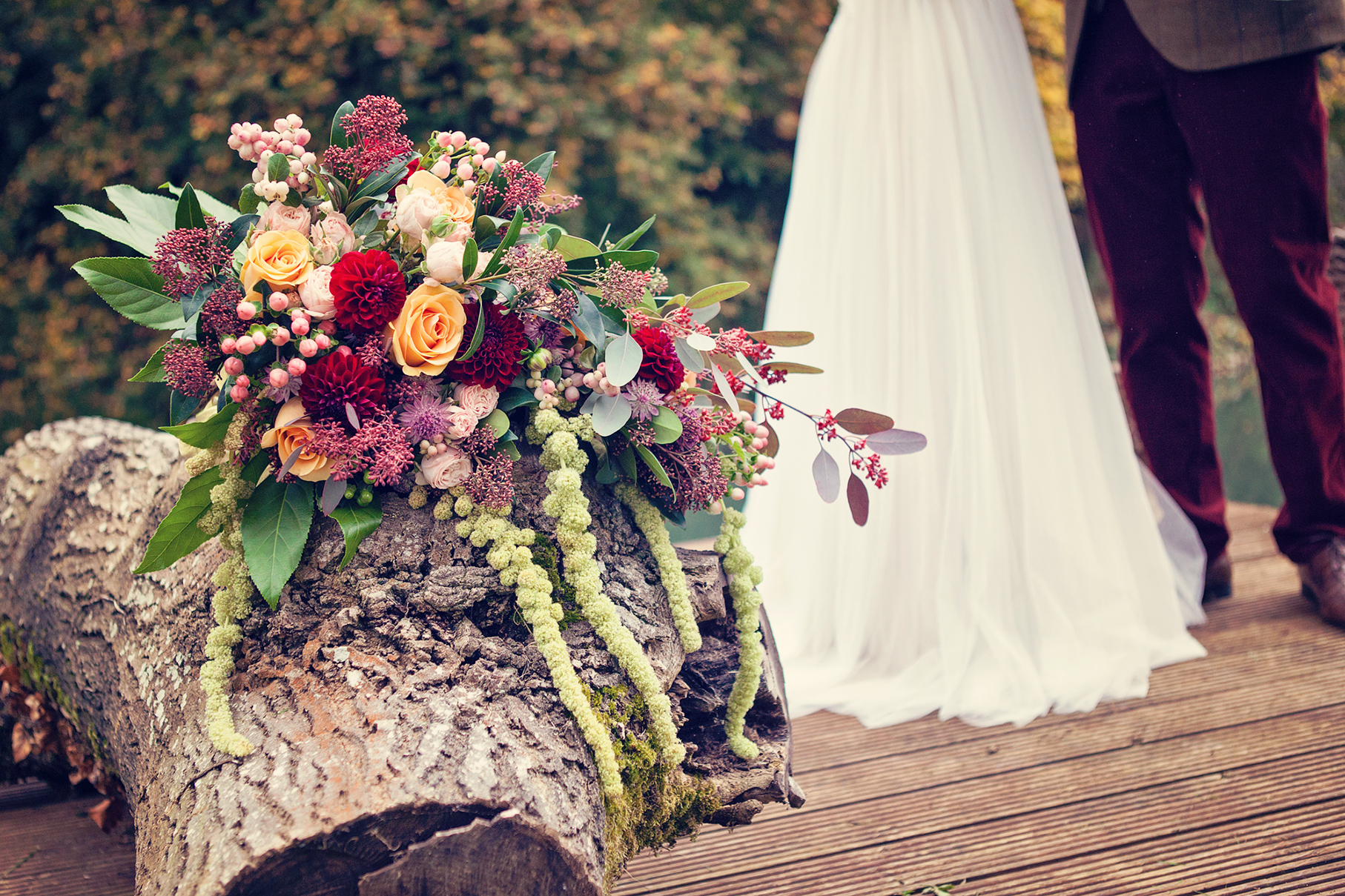
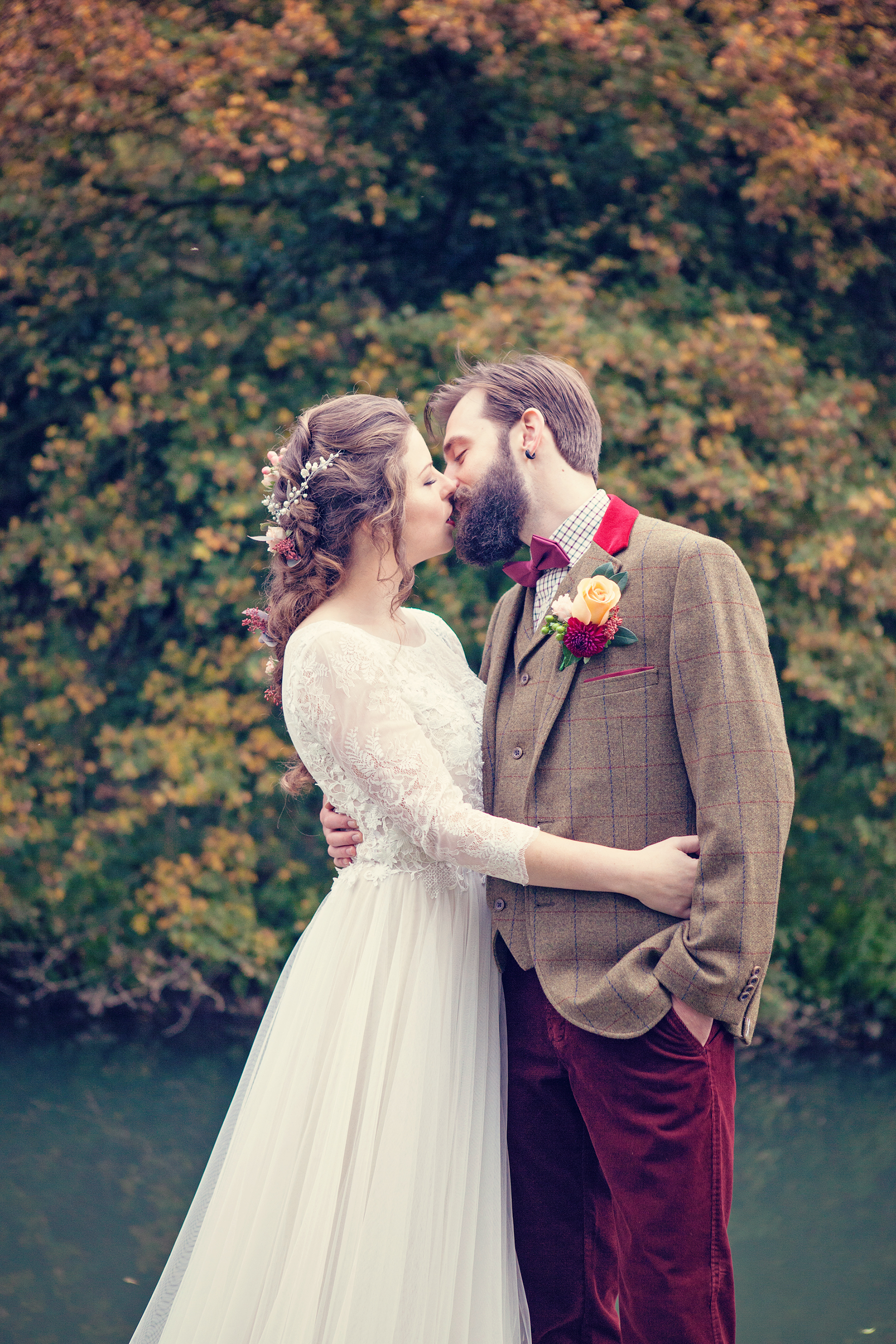
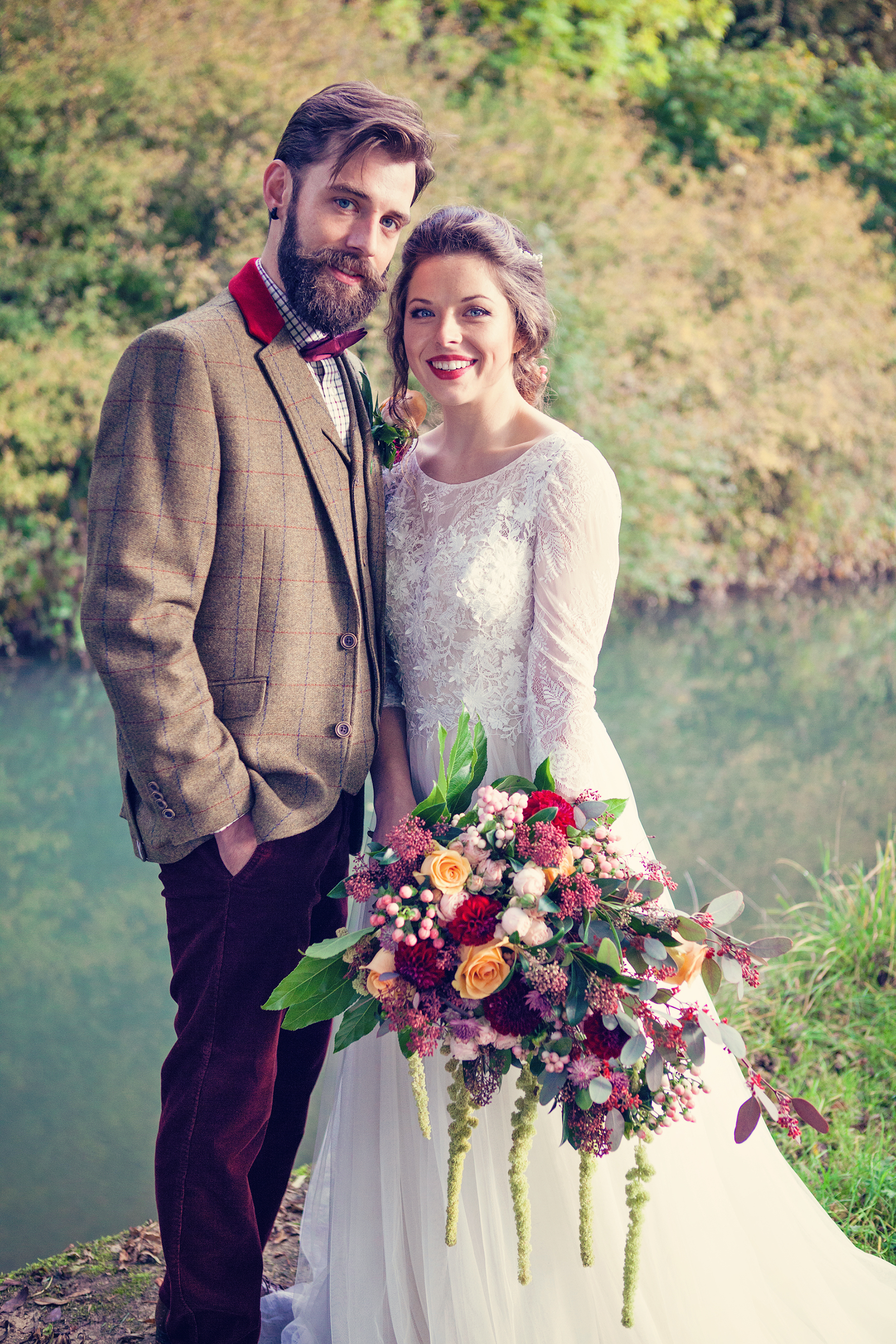
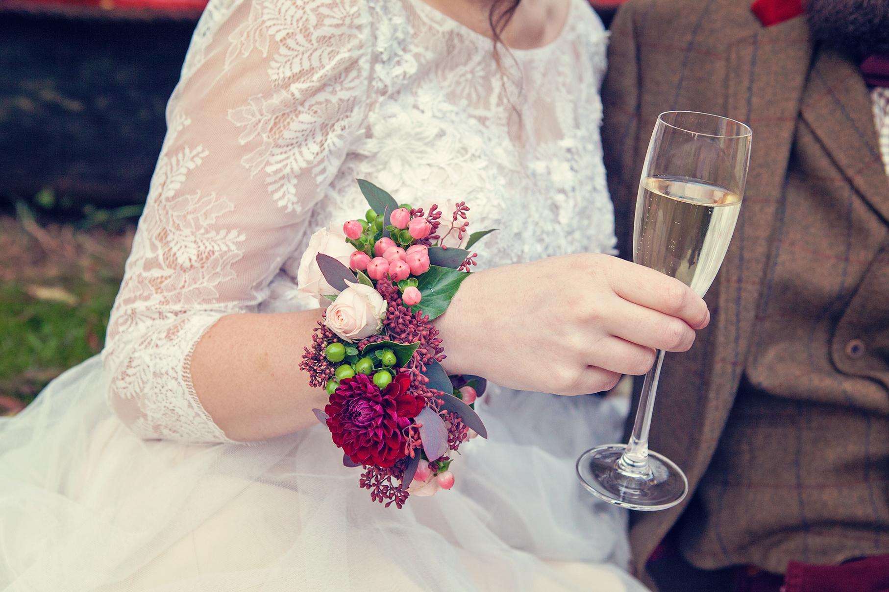
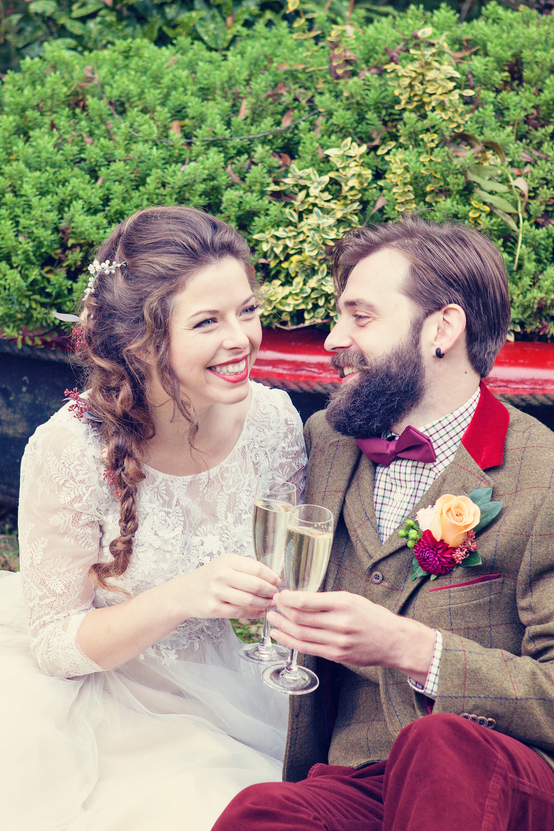
The top table was swathed in a striking floral table runner with a loose relaxed vibe containing lots of greenery along with burgundy dahlias, flowing amaranthus (mirroring the weeping willow tree outside), ranunculas, hypericum berries, snow berries, skimmia and bombastic roses. These flowers (from Classic Flowers) featured in the remarkable bouquet that the bride cradled, as well as in her loose braided hair (by Lucy Beesley Bridal), her corsage and the groom’s buttonhole.
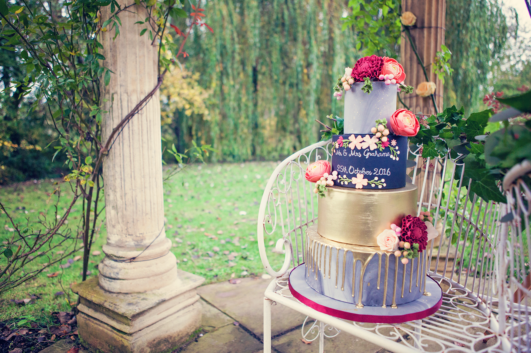
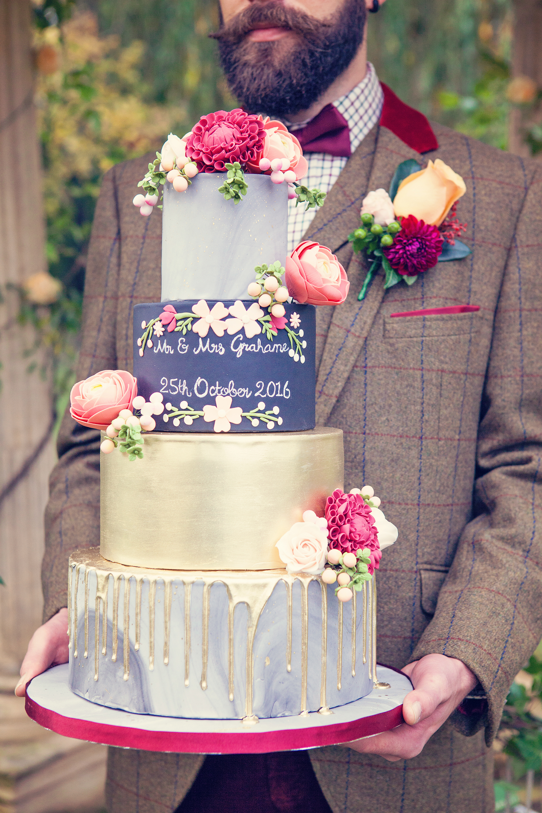
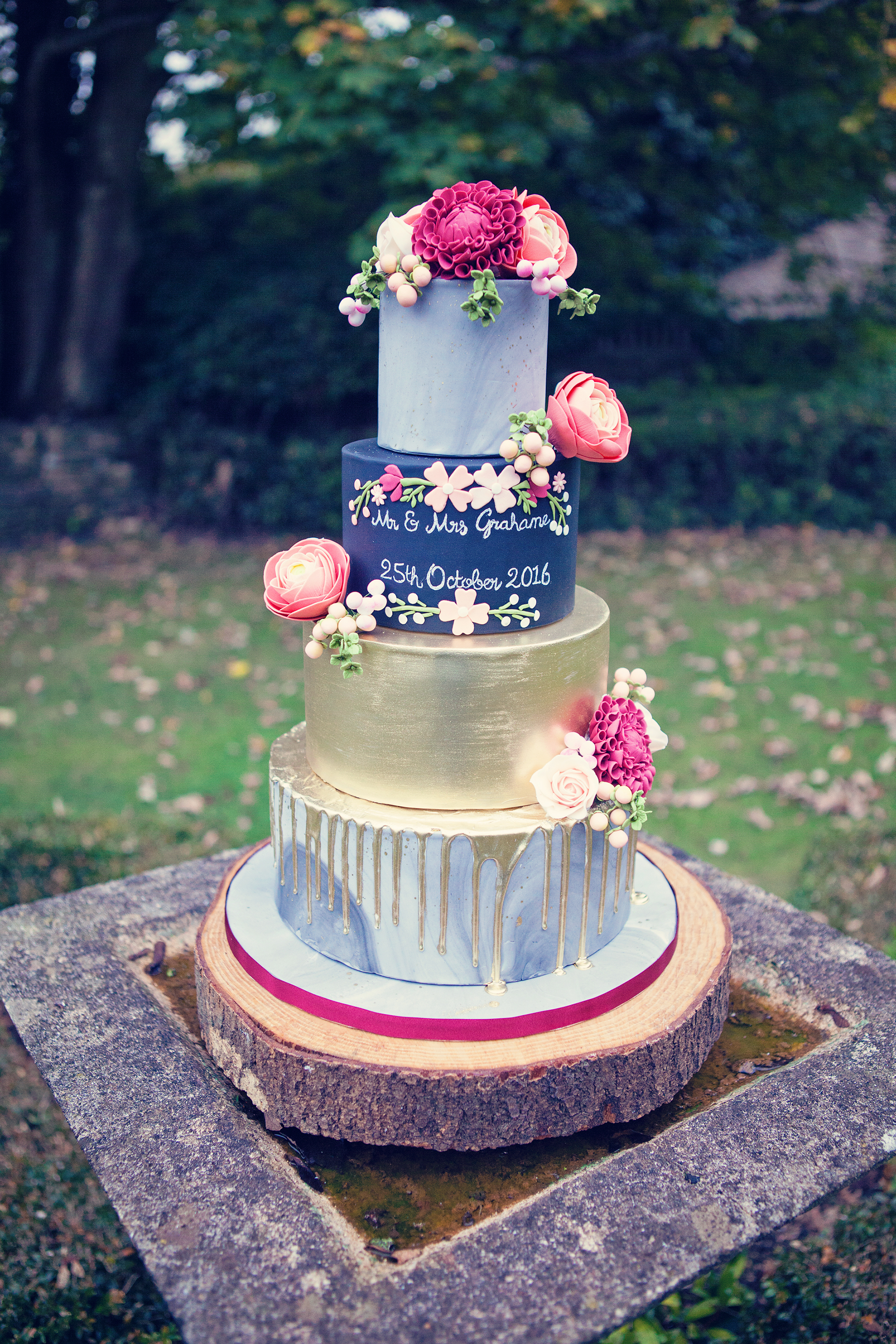
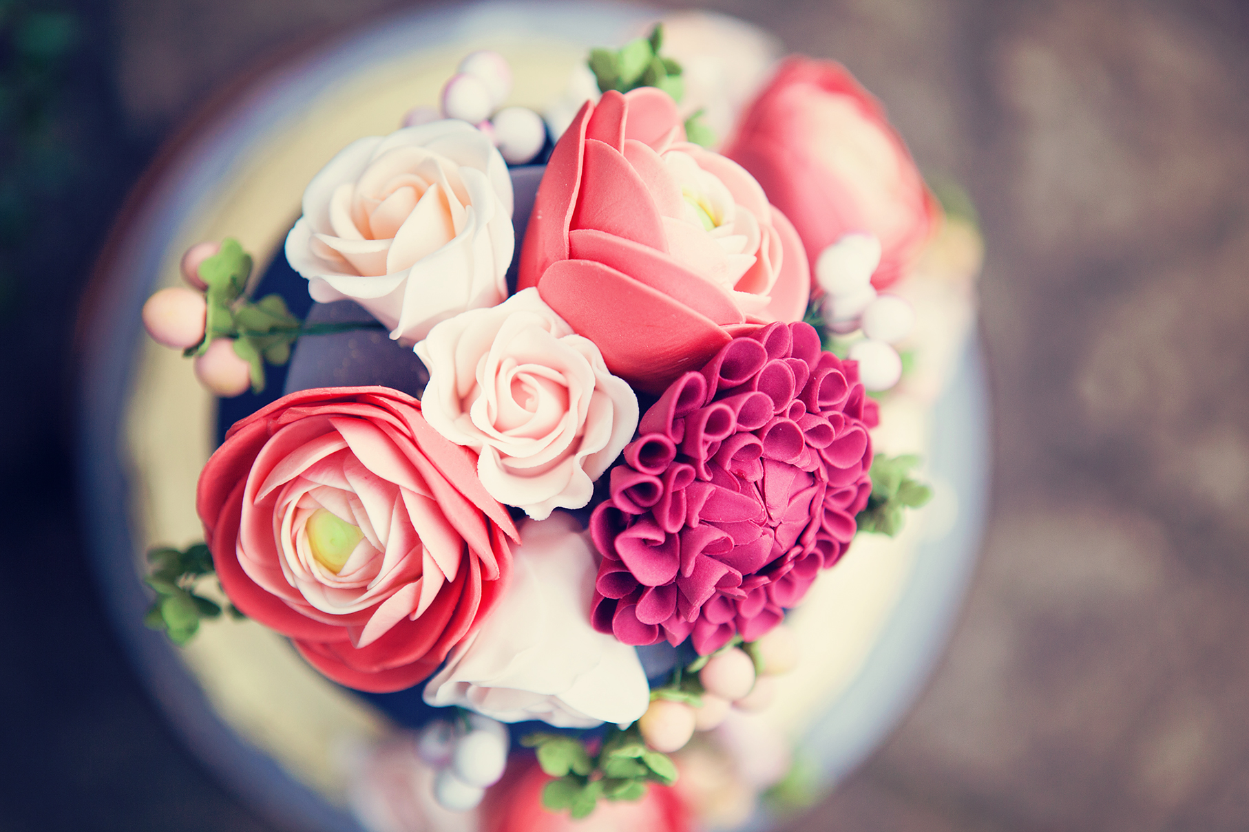
These florals were beautiful replicated on the cake (by The Pretty Cake Company) which also combined other on trend themes such as marbling, metallic gold lustre, drip effects and a chalkboard tier, which was sympathetic to the stationery and a nod to the author of the book.
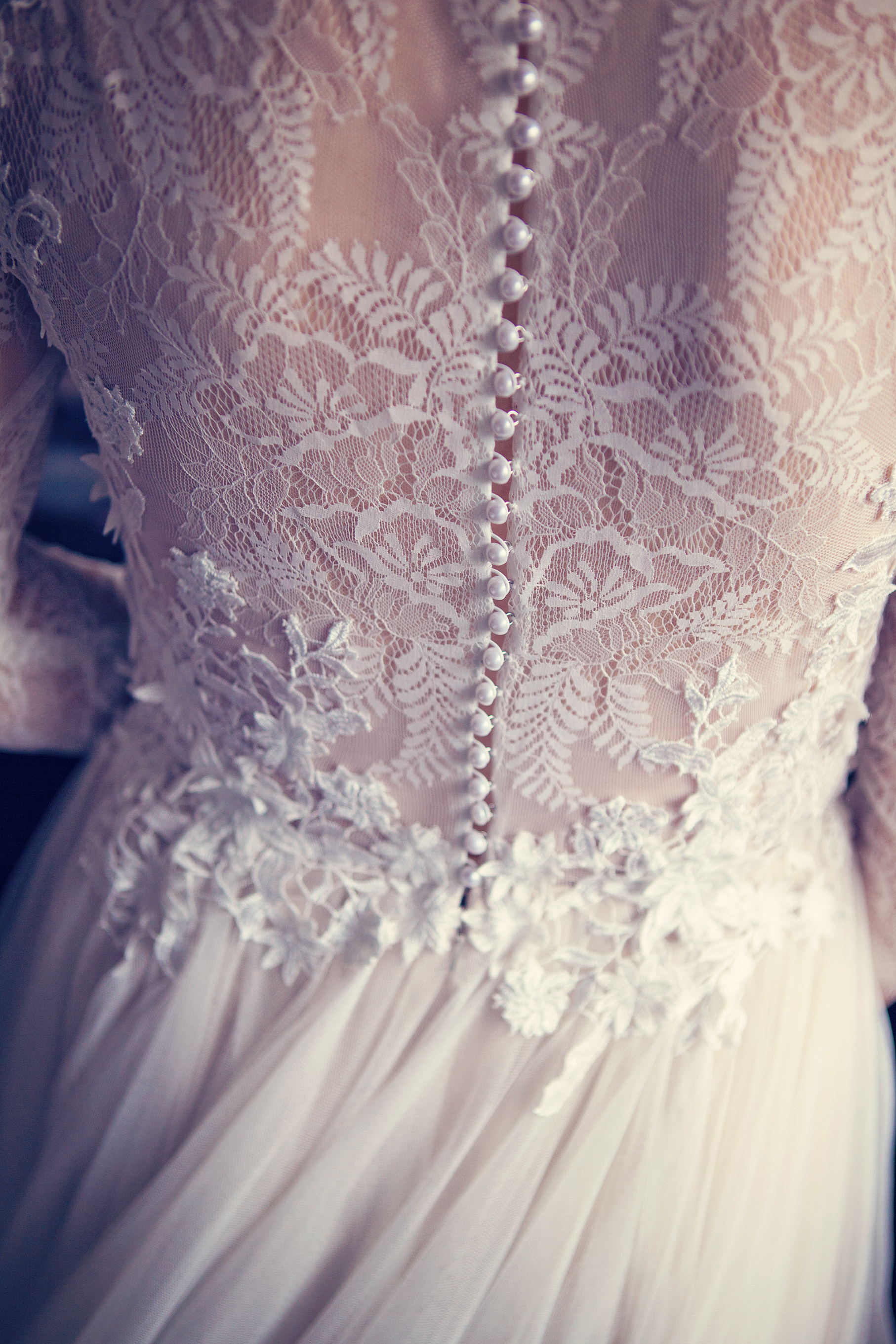
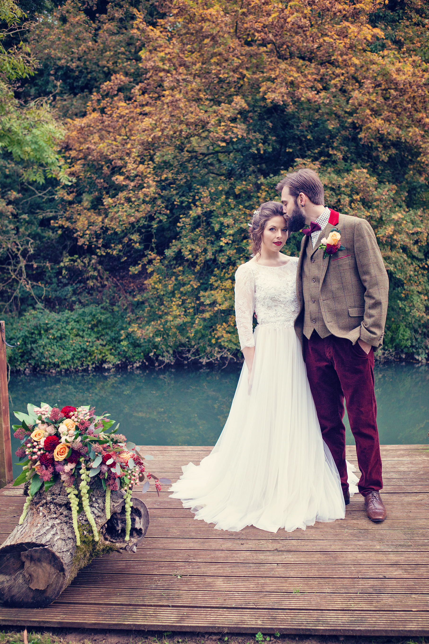
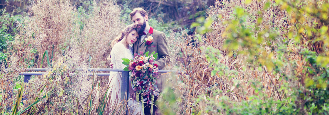
The gorgeous bride braved the cold autumnal weather, with a beautiful smile complete with marsala coloured lipstick (with makeup by Lucy Beesley Bridal) and perfectly fitted the romantic A line wedding gown with lace sleeves, sweeping net train and floral appliqued bodice by Watters (provided by Mae Bridal). She completed her look with a short veil (by Richard Designs) worn low below a delicate hair vine (by Miranda Templeton) and gold coloured Blake shoes (by Benjamin Adams).
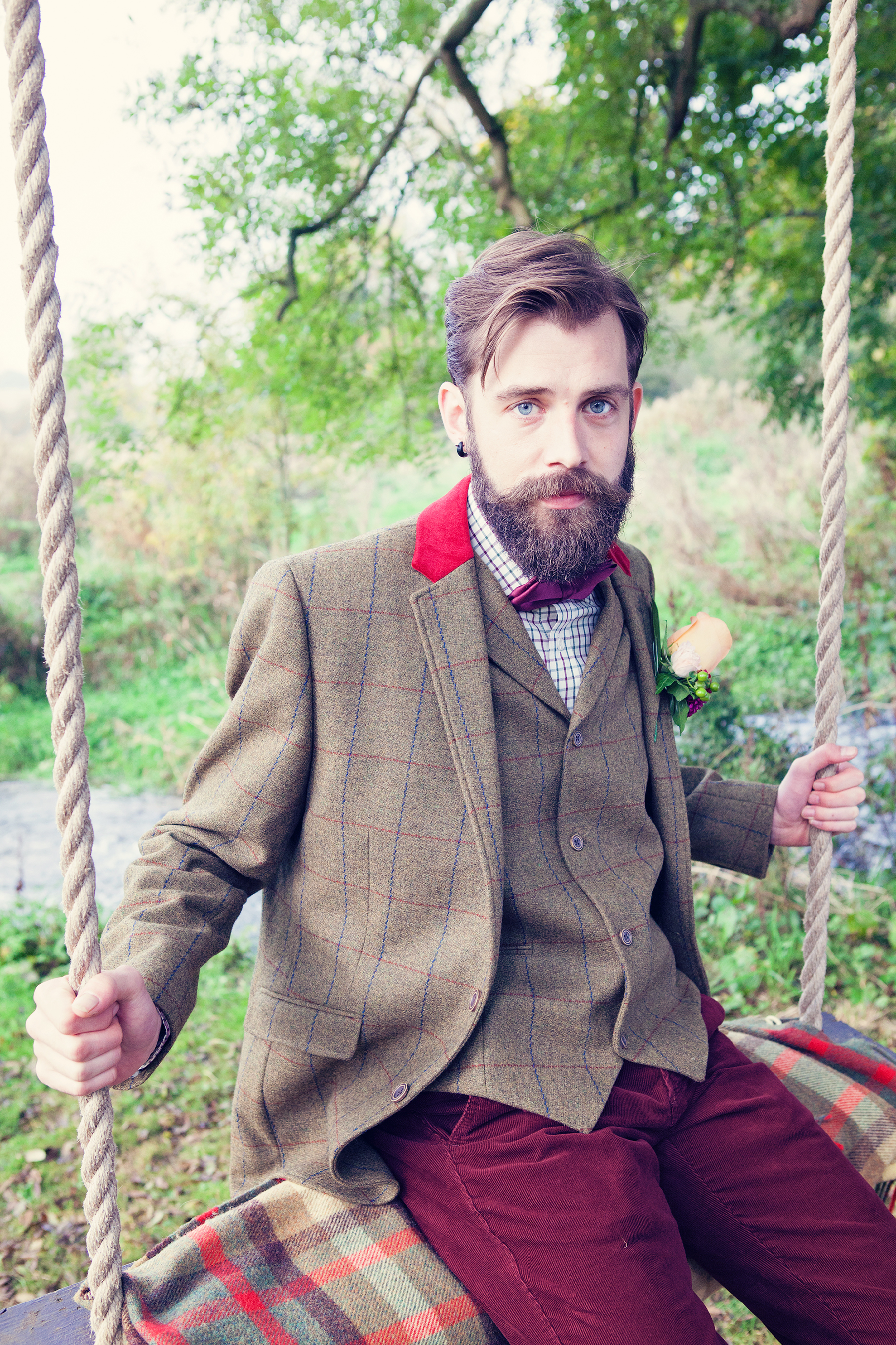
Our handsome, bearded groom suited the countryside surroundings with the dapper tweed jacket and waistcoat, coupled with a checked shirt, marsala bow tie and plush red corduroy trousers that he wore (from Keates of Witney).
It’s the little details that bring any event to life and this was made possible by the wonderful local suppliers who provided their time, services, venue and products for free. Together we have showcased the amazing talent that our part of the UK has to offer the wedding industry.
I was really pleased to work with Farrow Photography on another styled shoot this autumn. We first joined forces in 2014 to bring to life some inspirational themes to show how you can enhance your milestone events. Following the success of our previous themed photo shoots, we collaborated once again to produce an amazing bridal styled shoot based around another well known story, The Wind in the Willows. It was also an honour to be able to showcase some amazing products from some fantastic local suppliers.
Theme I choose the Wind in the Willows theme as it is another classic story with it’s roots firmly based in and around Oxfordshire. The book by Kenneth Grahame was written 108 years ago (published on 15th June 1908) and he took inspiration from the River Thames from his child hood and also from when he lived in Oxford when he was at school. In later life, he lived in Blewbury with his own family and The Wind in the Willows was based on stories that he used to tell to his son Alistair. It is even claimed that Mapeldurham was the vision for Toad Hall.
This book evokes such beautiful natural scenes of being beside the riverbank – a relaxing setting, which allows characters rustic picnics and peaceful treks down the river, all to contrast with hectic, crowded city life. Many cite that the book has a common theme of struggling with a sense of place. Whether it’s being comfortable with where you are or facing things that need to be changed.
For me, it typifies a sense of adventure and the great open road. So initially, I really wanted to focus on getting as many different modes of transport involved in this bridal shoot, including a rowing boat, a vintage car (poop poop!), a colourful old fashioned bow top caravan and even a barge, if possible.
There’s also a running theme of hospitality in the book, so I wanted to get across the feel of a decadent banquet in the Grand Hall as well as a sumptuous picnic.
I wanted to hint at the theme with slight nods to the book in place names, the table plan and on the cake. I certainly didn’t want to focus on the weasels at Toad Hall as their laughs and noises used to scare me when I listened to the cassette story as a child!
The final thing that I really wanted to capture was stunning, rich autumnal colours.
Styled shoot A styled shoot takes almost as much time and effort to produce as a wedding day and entails bringing together the theme from many different suppliers.
The beauty of styled shoots (versus a real life wedding) is that it is a great opportunity to be a little more extravagant and really show off what you’ve always wanted to do. You can indulge your fantasies with new trends or products that couples may not have seen yet or something really unusual.
This styled shoot is a collaboration of like minded people that can create great things together but perhaps don’t have the budgets to produce this kind of work if they all worked independently.
Brief I am very lucky to live in a beautiful part of the UK and am surrounded by some seriously talented wedding venues, professionals and suppliers. I was honoured that so many wanted to be involved in this shoot and they certainly didn’t disappoint with the products that they provided.
I gave them all the same brief that I was trying to achieve:
an outdoors adventure with vintage transport along the beautiful riverside, followed by celebrations in a grand hall dressed in marsala and tweed with chalk board signs
I also provided them with my collated vision and ideas on my Pinterest board.
The themes I wanted to encapsulate included:
Transportation
Autumn
Bo-ho / 1970s
Chalk board
Marbling
Greenery
I wanted to focus on the following autumnal colours:
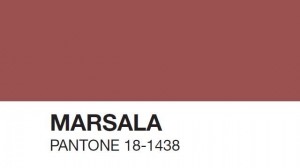
Marsala (colour of the year in 2015 and still going strong)
Pale pink/coral (Rose Quartaz is one of the colours of the year in 2016 and I wanted to have a dress that wasn’t a traditional white dress)
Gold (using the current metallic trend along with copper and a welcome alternative to silver)
Tweed (casual men’s wear perfect for the country setting)
Forest Green (focusing on lots of greenery and foliage)
Designs The creative suppliers worked wonders in transforming my overflowing pot of ideas and pairing it down in to realistic and achievable products for us to showcase.
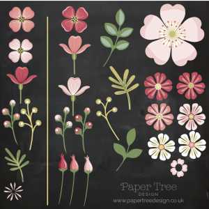
Stationery designs – One of the first ideas for this shoot came from an image that I saw of a floral archway bursting with rich dark coloured flowers. Having spoken to Paper Tree Design about my vision, they were excited about making this floral arch from paper and card including lots of dark green foliage and some metallic and pearlised paper. The stationery had to synchronise up with lots of other elements such as the font and date of the wedding used on the invitation and cake, the flower illustrations used are ladies smock, wild rose and pink, and white campion, the menu used is a sample from the venue, plus the envelope liner was tweed inside a marsala coloured envelope.Then the theme came alive with the inclusion of the author and character names on the place cards (Mr Grahame, Mrs Grahame, Mr Toad, Mr Badger, Mr Mole, Mr Rat), and the seating plan had table names displayed on a chalk board which were named after the first 9 chapters of the book (1. The River Bank, 2. The Open Road, 3. The Wild Wood, 4. Mr Badger, 5. Dulce Domum, 6. Mr Toad, 7. The Piper at the Gates of Dawn, 8. Toad’s Adventures, 9. Wayfarers All).
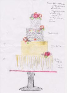
Cake design – The Pretty Cake Company helped to combine a few ‘on trend’ themes for this photo shoot, whilst combining the floral themes too. Marble wedding cakes are a revived trend that are becoming very popular and combined with the ongoing popularity of metallic effects, this shoot was perfect to experiment with both. The top and bottom tier were covered using a hand mixed grey marbled sugarpaste. The top tier had a subtle splattering of edible gold lustre paint and the bottom tier had the gold drip effect which looked like it poured from the second gold lustred tier. The chalkboard effect on the third tier was sympathetic to the stationery used and with a nod to Kenneth Grahame whose book ‘The Wind in The Willows’ inspired this shoot. The cake was finished with a selection of arrangements of sugar flowers such as burgundy dahlias, coral ranunculus, sweet avalanche roses, snowberries and green viburnum.
Flowers – Classic Flowers really went to town with my brief of having loose and flowing displays along with the colour themes running throughout the shoot. The green amaranthus especially in the bouquet worked in beautiful harmony with the weeping willow at the venue.Here are the flowers that were used in the shoot:
Brides bouquet – Mustard roses, Astrantia, Green and Coral Hypericum, Bombastic spray roses, Green Amaranthus, Burgundy Dahlia, Skimmia, flowering eucalyptus, ivy and fatsia leaves.
Buttonhole – Mustard rose, Bombastic spray roses, Burgundy Dahlia, Green and coral hypericum, flowering eucalyptus and skimmia leaves.
Table arrangement – flowers as brides bouquet PLUS green orchids and soft ruscus.
Swag on fireplace – Flowering eucalyptus, ivy, skimmia and soft ruscus.
Temple – Peach roses
Love Seat – ivy, flowering eucalyptus and skimmia
Despite getting stuck in Calais (due to the migrant camp closing), the flowers thankfully made their way from the Dutch supplier in time for the shoot!
Soap favours – the beautiful Marsala Peacock soap favours were an equistite addition to the beautifully laid tablescape in the banquet scene. Stonesfield Soap Company were amazing at making these bespoke soaps to match the colour theme of the shoot and they added a great aroma to the room whilst we were shooting! They are all made by hand and these images give an idea of the amount of processes that go in to making these favours. Here are the ingredients of the soaps that were used on this shoot:
Other inclusions: goat milk yogurt, tapioca starch, kaolin clay
Suppliers I couldn’t have been happier (and luckily) with the products that all the suppliers produced and provided.
Venue – I picked the Old Swan and Minster Mill based on it’s riverside location and it’s glorious weeping willow tree. How fortuitous that we also discovered that they had an old disused boat house and moored rowing boat that just so happened to be painted in red to match our theme perfectly! Also the chairs in the dining room were also a perfect colour match. It seemed like fate to bring the venue and colour palettes together in one amazing venue.
Hair – I was incredibily pleased that Lucy Beesley Bridal were available to do the bride’s hair and make up for this shoot. She actually did my hair at my own wedding 5 years – surely you can’t get a better recommendation! She brilliantly included the colour theme in the marsala lipstick and green/black eye liner and ensured the braided hair followed the loose and flowing themes.
Dress – Originally, I really wanted to use a non-white dress for this shoot – like a pale pink or coral colour. Plus I wanted to get away from the strapless dresses we see all too often. So I briefed Mae Bridal that I wanted to use something that covered the shoulders (which I think our cold bride was appreciative on the day!) and that had embroidery on it. The Watters Amelia dress hit the brief bang on with a nude coloured under skirt, amazing embroidered back and sleeves, plus a nice bo-ho vibe to fit in with the laid back theme.
Menswear – Keates of Witney provided a brilliant tweed jacket and waistcoat with pops of red to bring together the bow tie, cords and red of the checked shirt. Our groom looked like a proper country gent!
Cutlery – I wanted to get away from all the silver cutlery adorning tables and push towards the mixed metallic trends that are appearing. I was also really keen to use local suppliers for this shoot and searched extensively for gold cutlery. I was delighted to find the Vintage Gold China whilst networking on a wedding Twitter hour one night. They seem to be the only supplier locally to have an extensive selection of modern and traditional styled gold cutlery as well as crockery to hire. Plus they were a font of knowledge and extremely happy to help with my quest for finding marsala coloured candles to go in their lovely selection of gold coloured candlesticks. Even after a tiring night washing up the products from the night before, they turned up with such enthusiasm and encouragement that it was a delight to have them involved in the shoot.
Tea light holders – Another trend I wanted to include an element of geometric terrariums or candle holders. Just by chance, I was talking to Larkrise Flowers at the Cogges Wedding Open Day about my search and they were able to very kindly source some brilliant geometric copper candle holders from Talking Tables on my behalf.
Car – The shoot’s main inspiration was always about different modes of transport, so it wouldn’t have been complete without the stunning Humber from British Classic Car Hire. And a stroke of luck that the interior of ‘Hester’ was a luxurious marsala coloured leather – it was meant to be! ‘Hester’ is stunning in Black and White, with her beautiful, almost Art Deco lines, lots of chrome detailing and huge headlights, Hester turns heads wherever she goes. A comfortable ride, sliding sun-roof and lovely drop down tables in the rear, she’s a real beauty.
Models – And lastly the shoot was brought beautifully to life by the stunning models. I advertised for waves and beards and was so pleased that Jess and Henry were not only able to play our bride and groom but fitted the bill perfectly (his beard was so well coiffured!) They are a real life couple and this really showed in the way that they interacted and came across on camera. Not yet married, but very much in love, they were just right as the happy couple (even if it was a fake wedding!) I, for one, can’t wait to hear if playing the parts has sown any seeds and I look forward to hearing any engagement news in due course!


 It is a true celebration of the beauty of nature and encapsulates the sense of an outdoors adventure as typified by the Wind in the Willows book by Kenneth Grahame. This is a chance to get away from the hectic, crowded city to a stunning and tranquil setting. Mole, Ratty, Toad and Badger would be proud to attend this relaxed bohemian wedding.