Select Page
Pantone® announce the Color of the Year 2024

Pantone® announce the Color of the Year 2024

Pantone® Colour of the Year 2024

As always, December is bonkers busy with the build up to Christmas getting earlier and earlier each year, along with all the school events and several birthdays to navigate before we can collapse in a big (usually ill) heap at the end of the year!

Meanwhile, there is also the exciting news of the Pantone® colour of the year. And 2024 is a special year as it marks 25 years of this momentous trend movement.

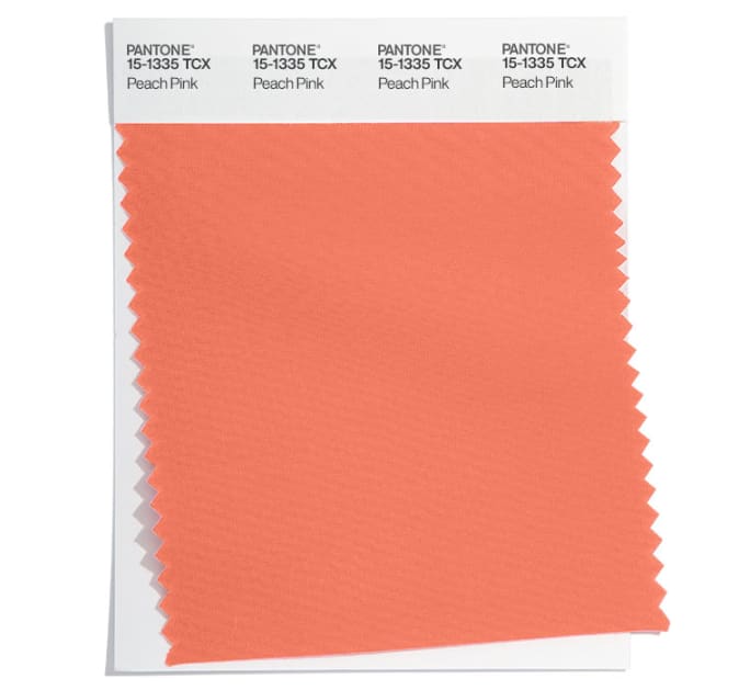
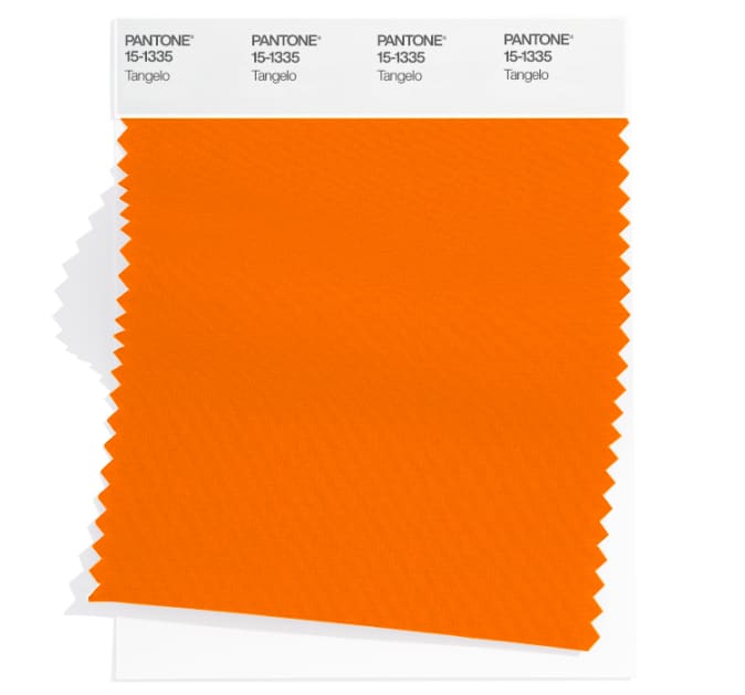
Recently, when the Spring 2024 colours were published, my guess for the colour of the year was for a bold sunny orange (as we haven’t had an orange since 2012). Now whilst this week’s announcement is for a slightly more pastel version, I’m claiming that my prediction for an orange tone was pretty near the mark.
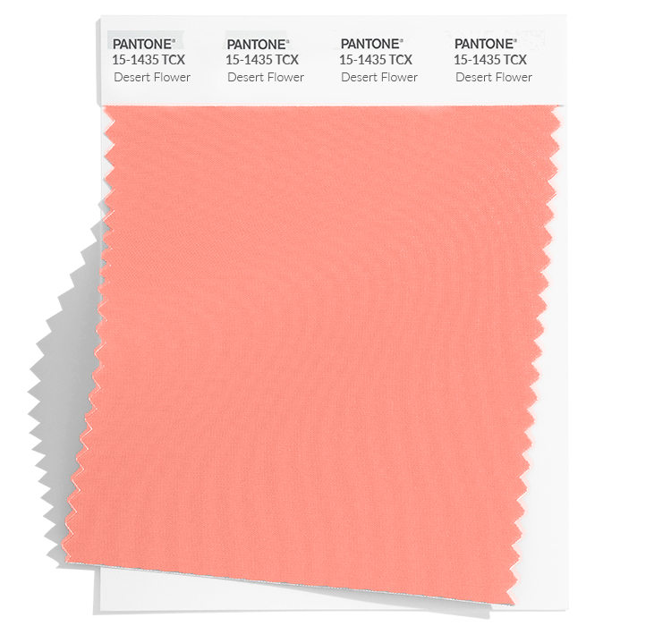
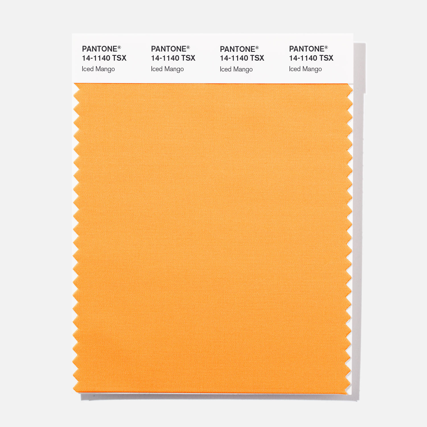
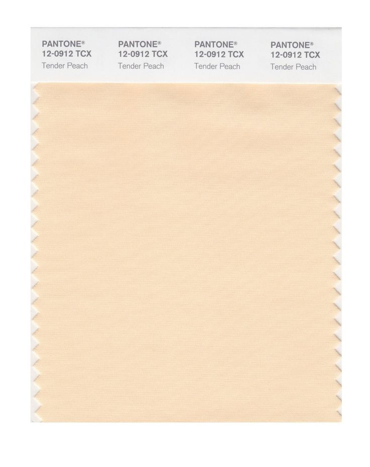
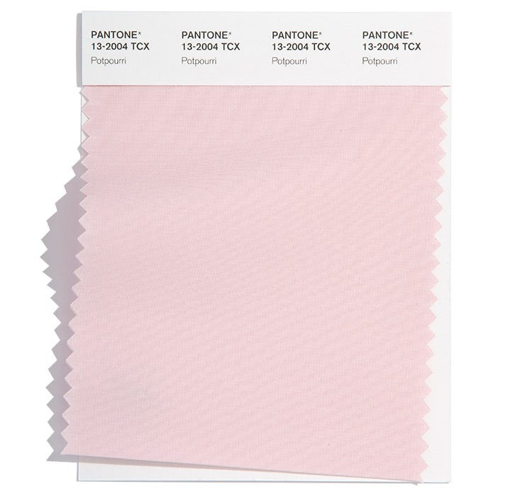
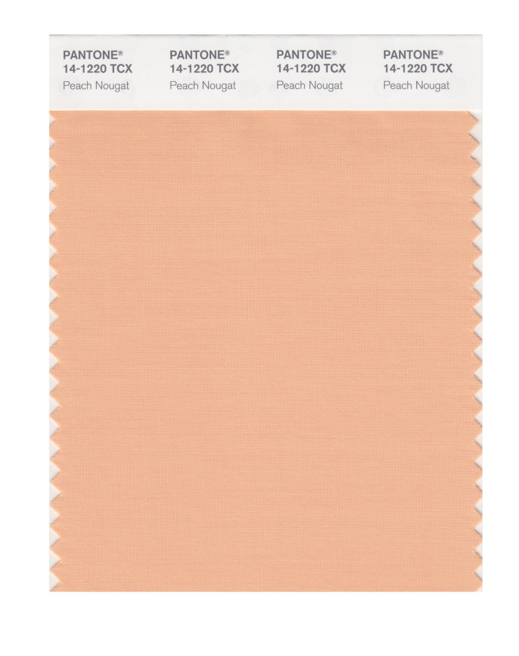
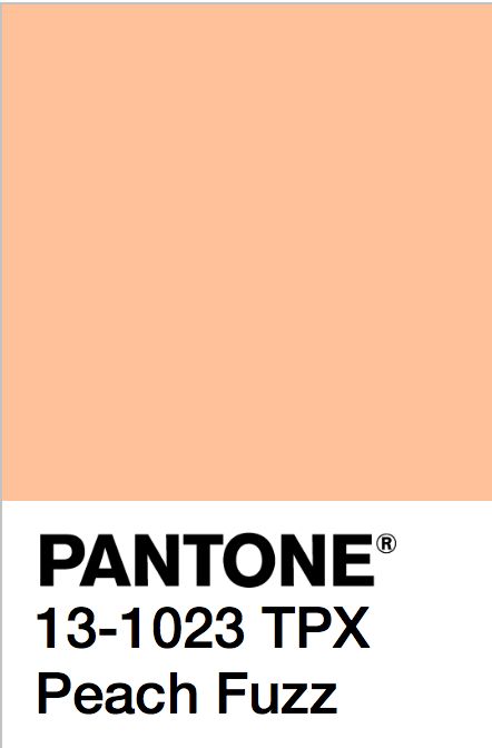
Peach Fuzz 13-1023

Pantone® have announced that Pantone® 13-1023 Peach Fuzz is the colour of the year for 2024, somewhere between a pale pink and orange colour.

Peach Fuzz has been described by Pantone® as “a gentle and nurturing peach shade that serves as a reminder to slow down and care for ourselves and one another. The romantic color’s name reflects the tactile sensuality associated with the hue: velvety peaches, soft marabou feathers, and smooth vintage satins and silks all come to mind when thinking about the pink and orange combo.”

The Pantone Color Institute’s executive director Leatrice Eiseman points out that the “delicate shade summons viewers to the human experience, with an emphasis on the importance of health and wellness for mind, body, and soul. From the warm colors of a sunrise or sunset to the coziness of a fuzzy blanket, the color affirms moments of internal tranquillity with the deep need for community, gathering, and connection.”

25 years of Pantone®

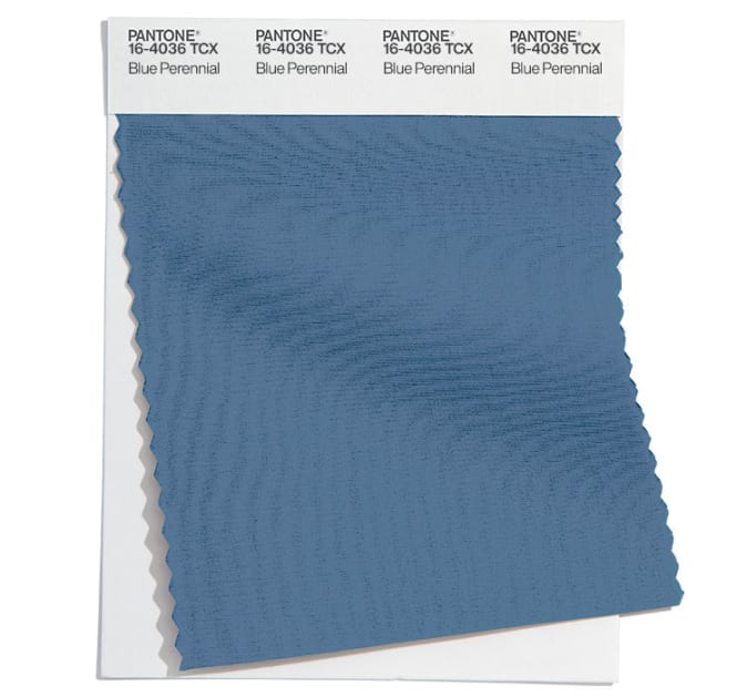
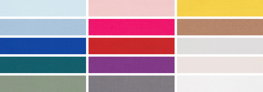
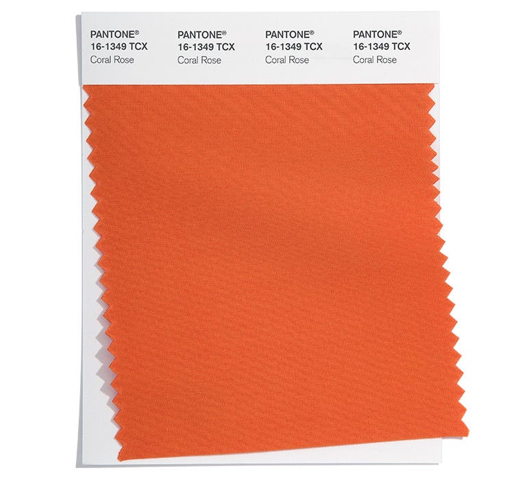
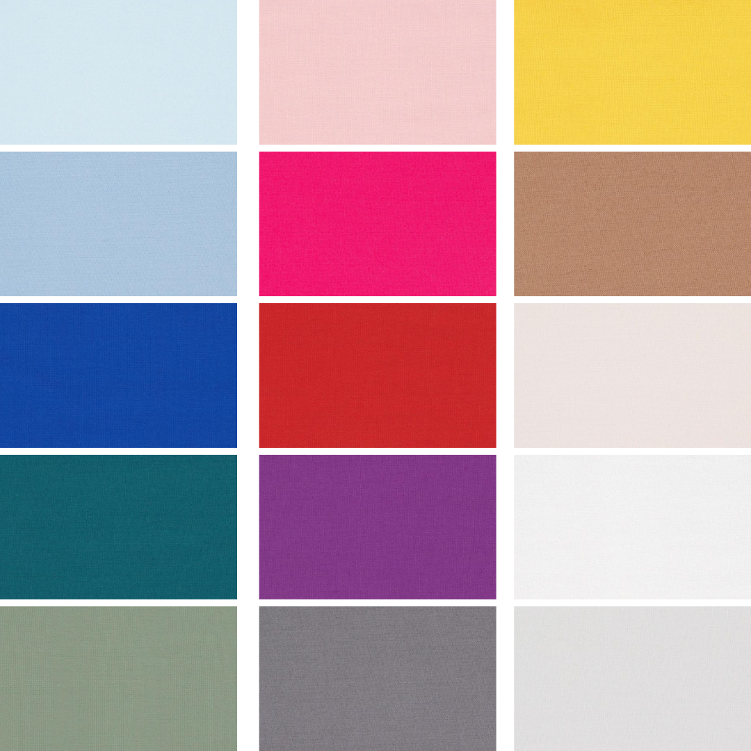
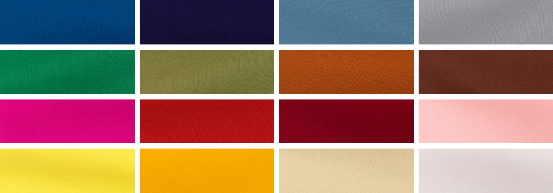
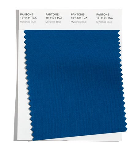
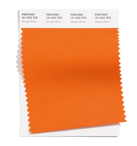
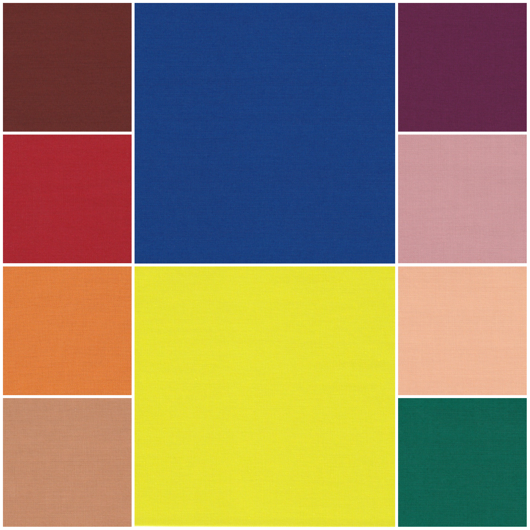
Orange is no stranger to being the colour of the year with a bright shade of Living Coral in 2019, a deeper Tangerine Tango in 2012, a pale Sand Dollar in 2006, plus Tiger Lily back in 2004.

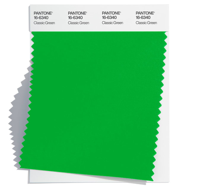
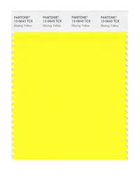
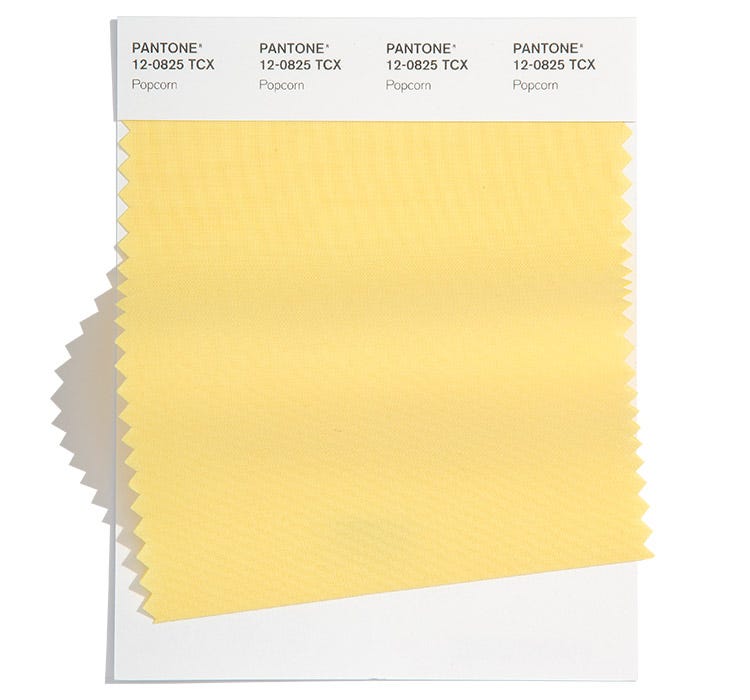
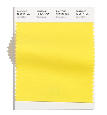
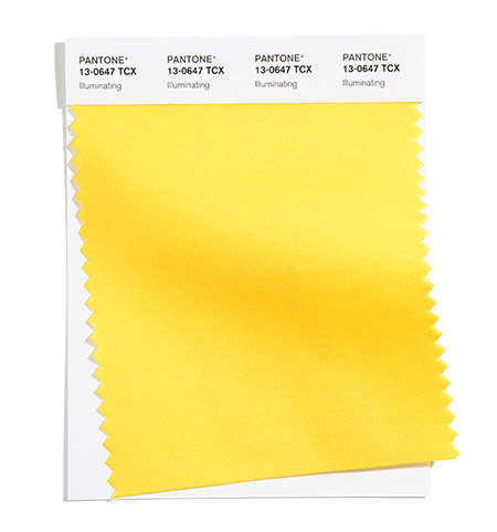
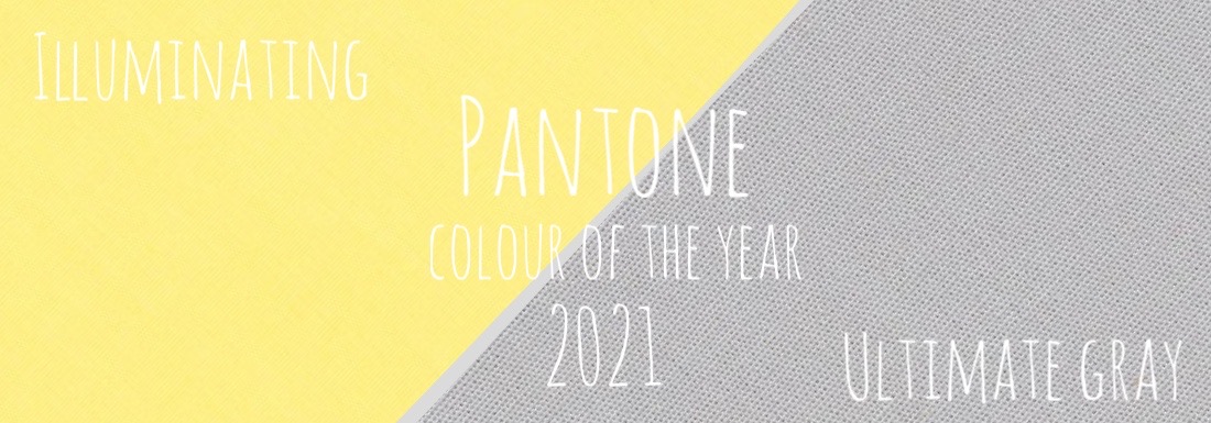
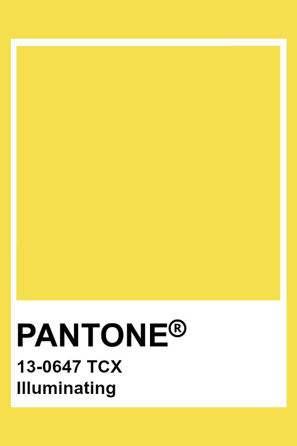
There have also been some sunny yellows over the years in the form of Illuminating in 2021 and Mimosa in 2009.

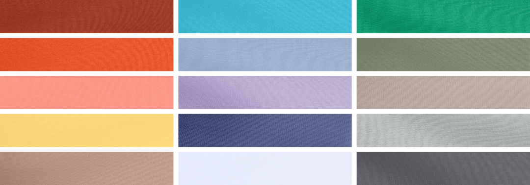
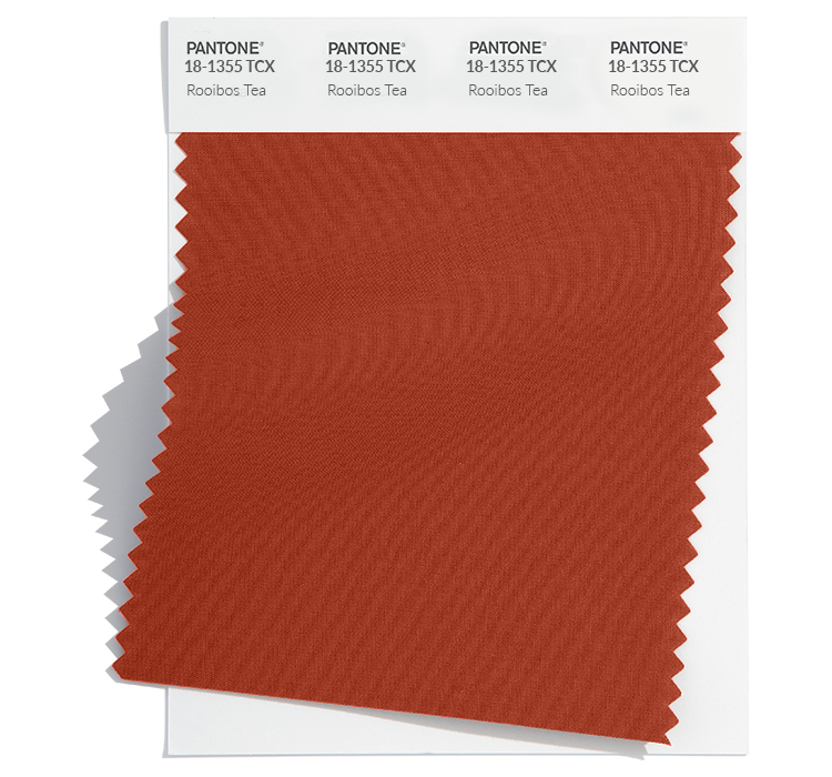
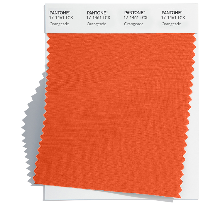
Spring 2024 predictions

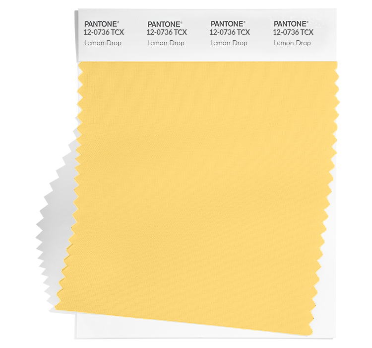
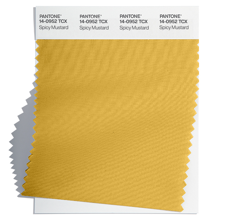
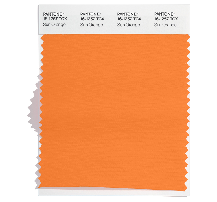
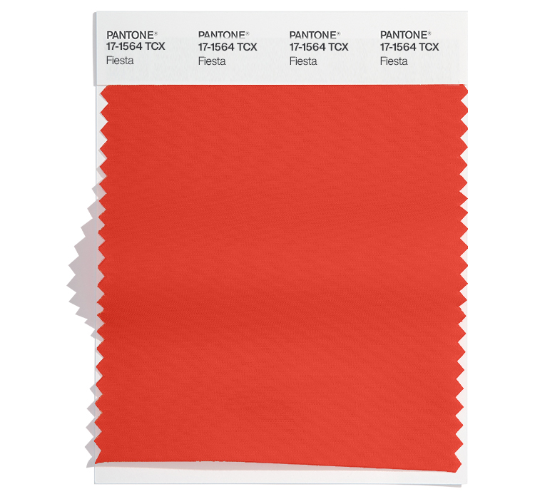
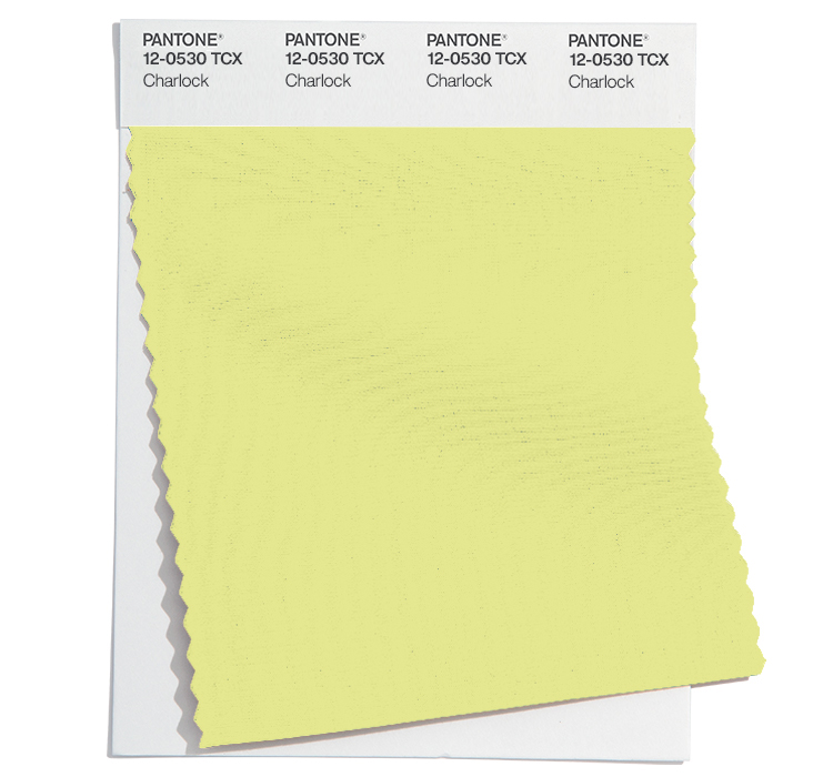
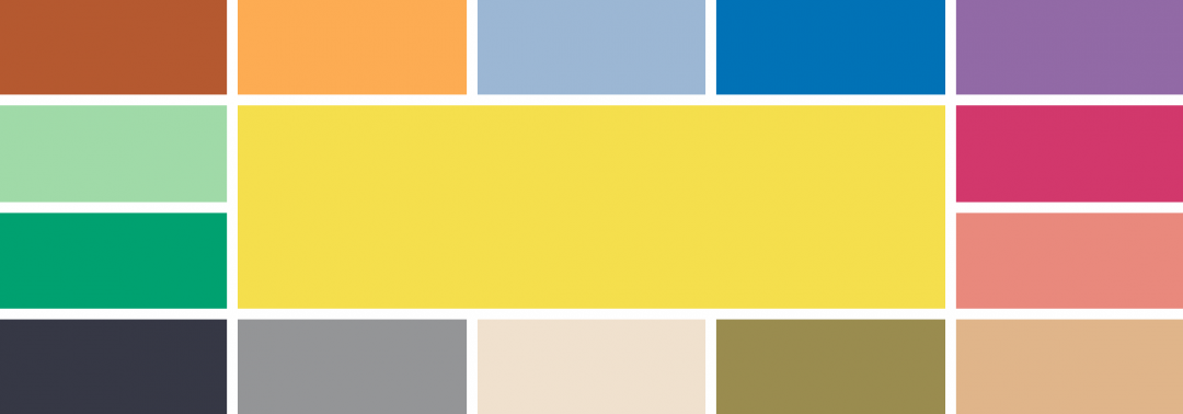
Once again, this colour doesn’t appear exactly in any of their seasonal predictions, although there were a number of yellow and orange sunset colours at both New York and London Fashion Weeks including Rooibos Tea, Orangeade, Lemon Drop, Spicy Mustard, Sun Orange, Fiesta and Charlock.

Protection

What does the name of the colour of the year mean? Well, there are over 300 varieties of peaches. And the fruit is deemed very important in Chinese culture as it can symbolise fertility and long life. The fuzz on peaches is actually a form of protection as it repels excess water away from the skin to stop it rotting prematurely. Additionally the fuzzy texture keeps insects away to stop them from destroying the fruit.

Cheeky

Peach Fuzz wouldn’t be out of place as the name for a cooling peach schnapps drink over a glassful of ice. Likewise, the peach emoji can also signify another way of saying ‘bottom’ on social media. And sometimes it can refer to the soft fine unwanted hair on cheeks.

Blush tones

But to me, this colour of the year for 2024 feels soft, romantic and peaceful. A beautiful warm sunset over clouds. It appears as lights as a feather, like a stick of candy floss at the beach or a full puffball netting skirt billowing in the wind.

Peaches and cream

There are so many wonderful sayings with the word ‘peach’ in them which usually mean something good about life. The expression has come to mean something which is particularly good or sweet, such as ‘Everything is peachy!’

Looks like Peach Fuzz will bring a relaxing and peaceful vibe for 2024 – with a touch of cheekiness!

#COY2024

Top Spring 2024 colours from Pantone®

Top Spring 2024 colours from Pantone®

Spring 2024

Following the recent fashion weeks, Pantone® have revealed the Spring/Summer colours to look out for in 2024 including 10 seasonal colours alongside 5 neutral classics.

The seasonal colours feel like a refreshing palette cleansing selection full of the warming sun, cooling drinks relaxing in tropical climes.

The Pantone Color Institute’s executive director Leatrice Eiseman said “Colours for Spring/Summer 2024 are infused with a hint of nostalgia yet at the same time speak to transformation as we embrace a more positive way of living. A new sense of freedom is reflected in this palette of evocative yet familiar tones that open the door to the exploration of our creative potential to re-visualise the future.”

“Colours for NYFW Spring 2024 inspire feelings of release. Opening the imagination and amplifying and liberating our own unique artistic spirit, they enable us to express ourselves in more inventive ways”.

warming

On a cold autumnal night, sometimes the only thing that is warming is clutching a hot tea in front of the fire and we can only dream of warmer weather.

These Spring colours evoke the sunny weather ahead in the form of fragrant citrus fruits as well as spicy mustards and chutneys to warm from the inside.

cooling 

The pastel palette of greens, pink, blue, lilac and lemon are so cooling and refreshing like a mint filled mojito drink, enjoyed lying in a hammock beside sun bleached houses painted in these faded shades.

tropical  

These Spring colours once again evoke beautiful summer holiday destination aspirations. With bold blues, coral, lavender and blazing sunshine.

Spring 2024 colours

The top ten colours for Spring 2024 from NYFW are:
  • 18-1355 Rooibos Tea
  • 17-1461 Orangeade
  • 17-0220 Watercress
  • 15-1435 Desert Flower
  • 15-4030 Chambray Blue
  • 14-3812 Pastel Lilac
  • 18-3932 Marlin
  • 12-0736 Lemon Drop
  • 16-5938 Mint
  • 15-4722 Capri

Spring 2024 extra colours from LFW

In the main, the colours are repeated at London Fashion Week, albeit with darker shades of blues and greens at LFW.

The focus shifts from the cooling pinks and purples of NYFW to warming yellow and orange colours at London Fashion Week.

Here are the colours from LFW to round off the colours for Spring 2024:

  • 16-4427 Horizon Blue
  • 18-4051 Strong Blue
  • 19-5408 Bistro Green
  • 14-0952 Spicy Mustard
  • 18-1433 Chutney
  • 16-1257 Sun Orange
  • 17-1564 Fiesta
  • 12-0530 Charlock
  • 15-1905 Burnished Lilac
  • 15-0326 Tarragon

Neutral classics

Pantone® have also updated the Classic Colour Palette. These neutrals are core basics in the form of a white, creams, beige, greys and black. They feel like rainy day classics – perfect grounding colours and peaceful additional accompanying colours.

The bonus classic neutral colours for Spring 2024 are: 

  • 11-4001 Brilliant White
  • 14-1305 Mushroom
  • 14-4104 Northern Droplet
  • 18-4006 Quiet Shade
  • 16-1317 Brush

And at LFW these are:

  • 11-4001 Brilliant White
  • 18-3906 Boulevard
  • 13-0611 Moth
  • 19-3713 Deep Well
  • 14-4804 Blue Fox

Colour themes

Colour plays an important part in our lives and it’ll be interesting to see how these colours filter through to influence things around us.

Pantone® is the world-renowned authority on colour and the Pantone® Color of the Year is always really influential in any popular colour themes in fashion, interior design and weddings.

Look out for my report when the 2024 colour of the year is released later in the year. My guess is for a bold sunny orange – we haven’t had an orange since 2012.

Pantone® announce the Color of the Year 2023

Pantone® announce the Color of the Year 2023

Pantone® Colour of the Year 2023

December is a super busy month in our household, with all the obvious build up to Christmas and all that entails (like several Christmas concerts today) but it is also birthday for two of my children!

In amongst all that craziness, is the excitement of the announcement of the Pantone® colour of the year.

Back when the Spring colours were published during the fashion weeks in September, my guess was for a bright green like Love Bird to be the colour of the year for 2023. After all we haven’t had a green since 2017.

Viva Magenta 18-1750

Instead, Pantone® have announced that Pantone® 18-1750 Viva Magenta will be the colour of the year for 2023, a bold raspberry pink colour. Ironically, on the day it was announced that was also the colour that my nails were painted. Maybe I subliminally knew anyway!

It feels like an evolution from the calming, Classic Blue of 2020, to the vibrant Very Peri purple of 2022, and now a vivacious bright red/pink colour for 2023.

Pink is no stranger to the colour of the year with a pale pink of Rose Quartz in 2016, and two more daring pinks as Honeysuckle in 2011 and Fuchsia Rose in 2001.

There have also been no shortage of red shades to boost our confidence over the years in the form of Marsala in 2015, Chilli Pepper in 2007 and True Red in 2002.

Spring 2023 predictions

Once again, this exact colour doesn’t appear in any of their seasonal predictions, although there were a number of bright red, purple and pink colours at both New York and London Fashion Weeks (including Beetroot Purple 18-2143).

Full of life

Viva Magenta has been described by colour company Pantone® as “a shade rooted in nature descending from the red family and expressive of a new signal of strength”. Leatrice Eiseman, executive director of Pantone® Color Institute said that the Colour of the Year for 2023 “vibrates with vim and vigor. Viva Magenta is brave and fearless, and a pulsating color whose exuberance promotes a joyous and optimistic celebration, writing a new narrative.”


“Pantone’s Color of the Year, Viva Magenta 18-1750 is powerful and empowering. It is a new animated red that revels in pure joy, encouraging experimentation and self-expression without restraint, an electrifying, and a boundaryless shade that is manifesting as a stand-out statement. Viva Magenta welcomes anyone and everyone with the same verve for life and rebellious spirit. It is a color that is audacious, full of wit and inclusive of all.”


“Viva Magenta descends from the red family, and is inspired by the red of cochineal, one of the most precious dyes belonging to the natural dye family as well as one of the strongest and brightest the world has known.”

At this time of the year, I’d be quite happy to hibernate and hide away but maybe it is time for a renewed vitality and to get back out there and enjoy life again. Looks like Viva Magenta will give us the much needed boost of energy for 2023.

#COY2023

Top Spring 2023 colours from Pantone®

Top Spring 2023 colours from Pantone®

Grey clouds 

It has been a strange start to the new academic year. I’m usually fired up and ready to start afresh with new vigour and enthusiasm. I was all raring to go when the children when back to school (even though the weather had taken a sudden noise dive towards autumn without the usual tailing out of sunny days.) It was strange to be by myself after having someone around me for the last 11 weeks (due to a string of illnesses before the summer holidays) so I was determined to crack on with the ever expanding to do list. 

And then came the very sad news out of the blue that our Queen, of 70 years, had sadly passed away.

Rainbows in the sky 

I was surprised by how I felt about the news and the emotions that I went through. It makes me so sad thinking about there being no Queen and it was like losing another Nan all over again.  The weather was dull, grey and rainy on the day that she died and then somewhat symbolically a double rainbow arched the sky that evening.  

And a beautiful array of rainbow colours pretty well sums up the latest Pantone® announcement that predicts the colours for next year’s Spring and Summer. 

Spring 2023 

Following the fashion weeks, Pantone® have revealed the Spring/Summer colours to look out for in 2023 including 10 seasonal colours alongside 5 neutral classics.  

There is an abundance of bright rainbow colours with a wonderful tropical vibe, alongside some soothing pastels.  

The Pantone Color Institute’s executive director Leatrice Eiseman said “Colours for Spring/Summer 2023 are recalibrated for the new era we are entering. Blending escapism with reality, wholesomeness, and joy, we embrace the exploration of extreme contrast in mood and colour”. 

Send her victorious  

For me, many of the colours remind me of how bold the Queen always used to dress in her matching hats and jackets in bright colours. She often wore a solid colour from head to toe so that she stood out and was easily visible. You never caught her wearing a depressing colour.  

Colours like Empire Yellow, Classic Green, and Beetroot Purple are perfect examples of colours that would have been great as outfits fit for the Queen. 

Queen Elizabeth II was famed for saying, “If I wore beige, nobody would know who I am.” 

Stand out rainbow colours 

The rainbow colours give such a positive outlook for next year and you can clearly spot a complete rainbow in the Spring line up of colours: 

  • Red – Fiery Red
  • Orange – Tangelo
  • Yellow – Empire Yellow
  • Green – Classic Green
  • Blue – Summer Song
  • Indigo – Blue Perennial
  • Violet – Spring Crocus

Tropical island 

Having had a wonderful summer this year, I can’t wait for another holiday next year and these colours exude travels to an exotic island far away. With clear blue waters, coral reefs, cloudless skies and the sun blazing down.

With colours such as Iced Mango as a mouth-watering sorbet and the vibrant feathers of a Love Bird or Andean Toucan. Paired alongside some neutral colours for a true coastal chic look.  

Spring 2023 colours

The top ten colours for Spring 2023 from NYFW are:
  • Beetroot Purple 18-2143
  • Empire Yellow 14-0756
  • Crystal Rose 12-1708
  • Fiery Red 18-1664
  • Blue Perennial 16-4036
  • Classic Green 16-6340
  • Peach Pink 15-1530
  • Tangelo 15-1335
  • Summer Song 14-4316
  • Love Bird 13-0443

Spring 2023 extra colours from LFW

In the main the colours are repeated at London Fashion Week, albeit in lighter shades of yellow, red, orange and pale blue. However the emphasis shifts from the pink of New York Fashion Week to purple at London Fashion Week in the shape of Spring Crocus. The blues of LFW are also much more vibrant than those at NYW with Electric Blue Lemonade.

Here are the colours from LFW to round off the colours for Spring 2023:

  • Cherry Tomato 17-1563
  • Persimmon 16-1544
  • Iced Mango 14-1140
  • Blazing Yellow 12-0643
  • Titanite 16-0229
  • Andean Toucan 16-6230
  • Airy Blue 14-4122
  • Electric Blue Lemonade 18-4245
  • Spring Crocus 17-3020
  • Pink Cosmos 16-2122


Neutral classics

Pantone® have also updated the Classic Colour Palette. These are a group of neutrals that are core basics in the form of a coffee, khaki green, light grey, cream and blue. Perfect grounding colours and perfect peaceful additional colours for weddings. 

The bonus classic neutral colours for Spring 2023 are: 

  • Macchiato 17-1221
  • Leek Green 15-0628
  • Gray Lilac 13-3804
  • Vanilla Cream 12-1009
  • Skylight 12-4604

And at LFW these are:

  • Oyster Mushroom 13-4201
  • Grayed Jade 14-6011
  • Tender Peach 12-0912
  • Mocha Mousse 17-1230
  • Bluing 19-3954

Colour themes

Colour plays an important part in our lives and it’ll be interesting to see how these colours filter through to influence things around us.

Pantone® is the world-renowned authority on colour and the Pantone® Color of the Year is always really influential in any popular colour themes in fashion, interior design and weddings.

Look out for my report when the 2023 colour of the year is released later in the year. My guess is for a bright green of Love Bird – we haven’t had a green since 2017 so feels fitting. And definitely a colour the Queen would have worn.  

“We should take comfort that while we may have more still to endure, better days will return. We will be without friends again. We will be with our families again. We will meet again.” Queen Elizabeth II 2020 

Pantone® announce the Color of the Year 2022

Pantone® announce the Color of the Year 2022

Pantone® Colour of the Year 2022

Aside from the obvious big occasion on the horizon, the other thing I look forward to in December is the announcement of the Pantone® colour of the year.

I must admit, I was expecting a light and airy colour – perhaps a pale pink that would act like a breath of fresh air, so I had plumped for a gossamer pale pink.

Very Peri 17-3938 

Instead, Pantone® have announced that Very Peri will be the colour of the year for 2022, a lavender purple colour.

It’s not that long since another purple (in the form of Ultra Violet) took the top spot in 2018. And purple is no stranger to the colour of the year with Radiant Orchid in 2014 and Blue Iris from 2008.

A bit of a happy, unexpected surprise as this colour doesn’t appear in any of their seasonal predictions. Instead they’ve created a brand new colour combining a cool blue and vibrant red. And purple just happens to be one of my favourite (and company brand) colours!

Spring 2022 predictions

Aside from two grey colours in the neutral section, the colour predicitons from New York and London fashion weeks differed greatly which made it hard to see a clear winner for colour of the year for 2022.

Pantone® are certainly not afraid of breaking or even making the rules. In the past, they’ve picked not one, but two colours such as this year (with Illuminating and Ultimate Gray in 2021) as well as in 2016 with Rose Quartz and Serenity.

So they are perfectly within their rights to just create a brand new colour if the right shade isn’t already in their catalogue of colours.

“It was really important for us to come up with a new color, because we have a very new vision of the world now,” said Pantone® Color Institute’s Executive Director Leatrice Eiseman.

Merging and emerging

Very Peri, has been described by colour company Pantone® as “a periwinkle shade of blue”. Leatrice Eiseman, executive director of Pantone® Color Institute said that the Colour of the Year for 2022 encompasses “the qualities of the blues, yet at the same time possesses a violet-red undertone. Pantone® 17-3938 Very Peri displays a spritely, joyous attitude and dynamic presence that encourages courageous creativity and imaginative expression.”

“Pantone® 17-3938 Very Peri is a symbol of the global zeitgeist of the moment and the transition we are going through,” the brand explained. “As we emerge from an intense period of isolation, our notions and standards are changing, and our physical and digital lives have merged in new ways.”

I’m surprised at myself that I wished for a pastel colour. But maybe we need something comforting, rich and warm like a heavy velvet blanket right now to see us through the winter and into 2022.

#COY2022

wonderful wedding wares

Top Spring 2022 colours from Pantone®

Top Spring 2022 colours from Pantone®

Late sunshine 

I have loved the late summer sunshine this week. With the children all back at school, I’ve actually felt like I’ve been on holiday as I have managed to eat my lunch sat in the garden in the sunshine with peace and quiet. It’s been lovely to extend that summer vibe for a little longer. We had such a wonderful summertime that I didn’t want it to end. We managed our first holiday in 2 years and got to relax and breathe in the sea breeze.

But seasons come and seasons go and I know that the nights drawing in is a signal of the entrance of autumn – quick on the heels of a glorious summer break.

However, my thoughts are being drawn to the lighter Spring days already and dreams of holidays, as the latest Pantone® announcement predicts that the colours that will dominate the scene for next year’s Spring and Summer are calming and evocative for travels further afield.

Spring 2022

With the fashion weeks just kicking off, Pantone® have revealed the Spring/Summer colours to look out for in 2022 including 10 seasonal colours alongside 5 neutral classics.

There is an abundance of blues in the mix for next year, alongside a vibrant collections of bold colours. To me, they encapsulate two of my favourite things – being by the seaside, plus a joyous celebrations of colourful florals in my garden.

The Pantone Color Institute’s executive director Leatrice Eiseman said “Half are in calming colors. Obviously, everyone wants to feel they’re in a safe haven. On the other hand, there is the very human proclivity of wanting to get out and be active again. That’s where the more energetic colors come in. The latter offer more experimentation.” Eiseman added. “Brighter colors lift your spirits and let you abandon the rules about color that you learned, when you were older. They bring you back to being a kid again and teach you to celebrate something in your life that will give you pleasure.”

I do like to be besides the seaside

We were so pleased to make it to a few beaches in both Scotland and Wales over the summer. With some wonderful coastal walks, harbour visits and simply playing on the sand. Eating fish and chips or ice creams always taste better when sitting by the seaside. The change of scene and pace of life are certainly relaxing. Just watching the rhythm of the sea washing in and out provides a real sense of escapism.

I’m delighted that blues seem to be centre stage in the mix of colours for next year (perhaps eluding to one of them being the Colour of the Year 2022?). The beautiful seascape includes Spun Sugar, Glacier Lake, and Skydiver, along with a teal blue of Harbour Blue.

Cool pastel colours

The fragility of things at the moment couldn’t be described better than the name of the pale pink colour in Gossamer Pink – conjuring up images of dewy spiders’ webs glistening in the early spring sunrises.

Teamed with a warming Coca Mocha and the earthy and pale neutral colours – it feels as fresh as newly washed sheets on the washing line in the summer breeze. The refreshing feeling we all need for our health and wellness.

Gardening companions 

Even before lock down, I had got the gardening bug and had started growing and propagating my own flowers and vegetables. It started with an obsession for succulents and indoor plants (I daren’t say the number out loud of how many house plants I have at the moment!) which spilled out in to the outdoors.

We have loved growing our own fruit and vegetables and now filling the garden with more home grown flowers too. Gardening is such a relaxing and a very worthwhile past time that is currently seeing a soar in popularity. The lock down has certainly made everyone appreciate being outside and enjoying improving their natural surroundings.

So the vibrant names of some of the colours conjure up joyful colours of spring and summer flowers just as I’m planning and planting my bulb lasagne for next year (such as the bright Daffodil colour). I’ve tried growing dahlias this year and can’t wait to try more in 2022 perhaps in the purple of Dahlia, or vibrant pink Innuendo. Along with the travel inducing flamboyant Poinciana tropical tree from Madagascar.

Old favourites 

It’s reassuring to also see the current colours of the year 2021 still showing their prescience and easing us through the transition to another year. Although with different names, you can still identify the yellow of Illuminating (which I correctly tipped this time last year as the Colour of the Year 2021) and also Ultimate Gray in the neutral classics.

Spring 2022 colours

The top ten colours for Spring 2022 are:
  • Spun Sugar 12-4401
  • Gossamer Pink 13-1513
  • Daffodil 14-0850
  • Glacier Lake 16-4118
  • Poinciana 18-1564
  • Coca Mocha 18-1019
  • Innuendo 18-2042
  • Dahlia 18-3324
  • Harbor Blue 18-4728
  • Skydiver 19-4151

Spring 2022 extra colours from LFW

In the main the colours are repeated at London Fashion Week, albeit in different shades of browns and pinks. However the emphasis shifts from the blues and bright red of NYFW to more rusty orange colours at London Fashion Week in the shape of Coral Rose and Sudan Brown. There is also an additional neon lime green and a really striking turquoise of Cascade.

Here are the colours from LFW to round off the colours for Spring 2022:

  • Cascade 14-5713
  • Coral Rose 16-1349
  • Super Sonic 18-4143
  • Popcorn 12-0825
  • Potpourri 13-2004
  • Bubblegum 17-1928
  • Sudan Brown 18-1160
  • Fragile Sprout 15-0549
  • Orchid Bloom 14-3612
  • Coffee Quartz 18-1307

Aside from two grey colours in the neutral section, the colours differ greatly which makes it hard to see a clear winner for colour of the year in 2022.

Neutral classics

Pantone® have also updated the Classic Colour Palette. These are a group of neutrals that are core basics in the form of a white, cream, khaki green, plus light and dark grey. Perfect grounding colours and perfect peaceful additional colours for weddings.

The bonus classic neutral colours for Spring 2022 are: 

  • Snow White 11-0602
  • Perfectly Pale 13-0003
  • Northern Droplet 14-4104
  • Basil 16-6216
  • Poppy Seed 18-4004

And at LFW these are:

  • White Alyssum 11-1001
  • Humus 15-1304
  • Fair Green 15-6316
  • Northern Droplet 14-4104
  • Poppy Seed 18-4004

Colour themes

It’ll be great to see how couples incorporate these colours in to their weddings next year. There’s plenty of scope for unique colour combinations and personalisation.

Pantone® is the world-renowned authority on colour and the Pantone® Color of the Year is always really influential in any popular colour themes in fashion, interior design and weddings.

Look out for my report when the 2022 colour of the year is released later in the year.

Sign up to receive the latest wedding planning tips, tools, trends and traditions straight to your inbox.

wonderful wedding wares

Top Fall 2021 colours from Pantone® for autumn weddings

Top Fall 2021 colours from Pantone® for autumn weddings

Autumn 2021 colours

We await the roadmap announcement next week, when we hope that there is clearer guidance on the way out of lockdown including what will happen to weddings in 2021. We can assume that weddings may not include receptions for a while and then may remain in quite small numbers for a while.

Hopefully by autumn, we will be in a better position to think about weddings again. I’m thinking ahead for later in the year as Pantone® have announced the colours for the autumnal and winter months of 2021/22.

Fashion weeks have been taking place virtually this year with New York last week, London this week and Milan and Paris later this month. Pantone® have predicted 10 colours that they think will be prevalent in Fall/Winter 2021/22.

bold

There are some bright and bold of colours to really make a statement this autumn. Leading the way, the yellow colour of the year (Illuminating) brightens the mood and provides a glimmer of sunny days ahead.

the blues

We may be feeling a bit blue at the moment, but the calming blues will relax us by a Spring Lake or under the Clear Sky, lazing by the pool of Mykonos or Ibiza Blue. With reliable and stable navy (Rhodonite or After Midnight).

bonfires

Rich, earthy, autumnal fiery colours are reminiscent of bonfires and sitting from a firepit toasting marshmallows, including Fire Whirl, Adobe, Root Beer, Red Alert, Tomato Cream, Daylily, Downtown Brown.

Fall 2021 colours

The top ten colours for Fall 2021 are:

  • Pantone 18-4434 Mykonos Blue
  • Pantone 13-0647 Illuminating
  • Pantone 18-6022 Leprechaun
  • Pantone 18-2330 Fuchsia Fedora
  • Pantone 13-1716 Pale Rosette
  • Pantone 17-1340 Adobe
  • Pantone 18-1453 Fire Whirl
  • Pantone 19-3838 Rhodonite
  • Pantone 18-4221 Spring Lake
  • Pantone 19-1228 Root Beer

Neutral basics

Pantone® have also created a Fall 2021 Classic Colour Palette. These are a group of neutrals that are core basics in the form of off-white, grey, cream and olive green.

The bonus classic neutral colours for Fall 2021 are:

  • Pantone 11-1007 Coconut Cream
  • Pantone 17-5104 Ultimate Gray
  • Pantone 13-0919 Soybean
  • Pantone 18-0527 Olive Branch

Fall 2021 extra colours from LFW

They may have different names but in the main the colours are repeated at London Fashion Week, along with a couple of additional colours (instead of the bright cerise pink and cream colours) to round off the colours for Fall 2021. There’s also a bit of a rejig of whether some colours sit in the neutrals or the main set (as navy gets demoted at LFW to the neutral basics). Here are the extra orange and burgundy shades:

  • Pantone 19-1537 Winery
  • Pantone 15-0956 Daylily

Colour themes

It’ll be great to see how couples incorporate these colours in to their weddings (hopefully) later this year.

Pantone® is the world-renowned authority on colour and the Pantone® Color of the Year is always really influential in any popular colour themes in fashion, interior design and weddings.


sign up to receive the latest posts straight to your inbox

wonderful wedding wares

Pantone® announce the Color of the Year 2021

Pantone® announce the Color of the Year 2021

Pantone® have picked not one but two colours of the year for 2021. It’s only the second time they’ve picked more than one colour (since 2016 when it was Rose Quartz and Serenity).

The Pantone® Color of the Year 2021 is Illuminating 13-0647 AND Ultimate Gray 17-5104.

I’m over the moon that my top tip for the colour of the year has hit the mark (take a look at my review of the Spring/Summer 2020 colours) although a little disappointed that Illuminating wasn’t strong enough to be one colour on it’s own.

However, I think that the bright and fresh yellow of Illuminating is the ray of sunshine that we need after 2020. A spark of warm hope. Whilst the neutral grey provides stability and a reassuring foundation.

Sunshine on a rainy day.

I look forward to seeing couples incorporating Illuminating and Ultimate Gray into their wedding colour schemes in 2021.

#COY2021


sign up to receive the latest posts straight to your inbox

wonderful wedding wares

Top Spring 2021 colours from Pantone®

Top Spring 2021 colours from Pantone®

Some normality

2020 has been nothing like normal. So it is almost reassuring to have some familiarity appear in the calendar this week, with the fashion weeks starting and the announcement of colours for the forthcoming seasons.

In light of new government laws, it seems that things are going to tighten again and we should strap ourselves in for a rocky winter time. So thinking forward to next Spring (when experts suggest we may start to hopefully emerge on the other side) is not only apt but a ray of sunlight to yearn for.

Spring normally brings new hope and the start of the growing season. And next year also brings new promise and a chance for us to finally breathe again (please forgive the unintentional pun) after, what we pray, is the worst of Covid-19. By Spring 2021, I’m hopeful that we will be able to hit refresh and the mood can finally be lightened. 

The latest Pantone® announcement predicts that the colours that will dominate the scene for next year’s Spring and Summer are light, bright, fresh and soothing. Just what we’ll need after a dark few months.

Spring 2021

So with the fashion weeks kicking off, Pantone® have revealed the Spring/Summer colours to look out for in 2021. And it’ll be great to see the colours appearing in (possibly postponed) weddings next year. 

I’m not usually a massive fan of pastel colours, but this set of colours seems so calming. To me, they paint a wonderful picture of being by the seaside with bright colours of the sun, calming colours of the sea and sky, along with pale ice cream colours, cheerful beach hut bunting colours, plus some grounding sand colours. 

There is the chance to have fun with these colours and create some beautiful and unique combinations. The Pantone® Color Institute’s executive director Leatrice Eiseman said “What it’s playing to is this whole idea of more choices for people. The idea is that they have had so little choice in so many other areas of their lives in the last several months, let’s try to have some fun again. That’s what we’re looking for and fashion gives us that opportunity.”

Seaside

It’s no secret that I love being by the seaside. In fact, I also dreamed of living by the sea which has bubbled up more to the surface during lockdown. We live in probably one of the parts of the UK that is frustratingly furthest away from the seaside. During lockdown we longed to be more remote and get away from the same four walls.

Thankfully over the summer we had a couple of day trips to a wonderful secluded beach and it felt like complete escapism. It was great to be by the wild sea, where the kids could run free on the beach, and we could feel energised by the sun. The change of scene gave the opportunity to relax and forget. 

So I’m pleased to see that blues (of Cerulean, Colour of the Year in 2000, and French Blue) will continue to feature in the colours for next year. Creating a great seascape of the sky and sea. 

Sunny colours

Despite the current autumnal mornings and evening becoming a bit chillier, there’s some more sunny weather on the way next week. Hopefully this will keep us going until the longer days return in the spring.

In the meantime, the page lights up with the sunny shades of Marigold and Illuminating leading the way in the Spring 2021 colours (which are my hot tip for Colour of the Year 2021).

Beach huts 

The glorious shades of Green Ash, Burnt Coral and Amethyst Orchid (not a million miles away from Radiant Orchid the Colour of the Year in 2014 and one of my favourite colours) could easily be the frontage of beach huts, all butted up next to each other on the sea front. Or perhaps adorning bunting blowing in the sea breeze.

They are beautifully unique and make a statement which is exactly the personalised way weddings will be next year.

Ice cream 

Even the names of some of the colours conjure up mouth watering fantasies of dripping ice creams, ate in deckchairs on the beach. Delicious Raspberry Sorbet or palette cleansing Mint could easily be scooped in to a cone and enjoyed watching the waves crash in.

Or perhaps you’d prefer some sugary candyfloss that is evoked by one of the pastel colours. 

Sand

Nothing quite beats taking off your shoes and getting the sand between your toes and walking along the beach with the sea lapping around your ankles, avoiding seaweed and tidal driftwood. It is grounding and feels likes getting back to nature.

A number of the Spring 2021 colours such as Rust (along with the neutral colours like Buttercream, Desert Mist and Willow) are natural, subtle and far from over powering.

Spring 2021 colours

The top ten colours for Spring 2021 are:
  • Marigold 14-1050
  • Cerulean 15-4020
  • Rust 18-1248
  • Illuminating 13-0647
  • French Blue 18-4140
  • Green Ash 13-0117
  • Burnt Coral 16-1529
  • Mint 16-5938
  • Amethyst Orchid 17-3628
  • Raspberry Sorbet 18-2043 

Spring 2021 extra colours from LFW

Plus a few additional colours from London Fashion Week round off the colours for Spring 2021; paler variations of pink and green (in Piroutte and Pickled Pepper), and a brighter orange and turquoise (with Orange Ochre and Blue Atoll).

Neutral classics

Pantone® have also updated the Classic Colour Palette. These are a group of neutrals that are core basics in the form of a black, grey, cream, taupe and khaki green. Perfect grounding colours. 

The bonus classic neutral colours for Spring 202 are: 
  • Inkwell 19-4016
  • Ultimate Gray 17-5104
  • Buttercream 11-0110
  • Desert Mist 14-1127
  • Willow 16-0632

Colour themes

It’ll be great to see how couples incorporate these colours in to their weddings next year. Especially as there could be some couples having to rearrange their weddings in 2021 and perhaps in a different season than they first planned. 

I can see how the classic neutrals will play a big part in coupling up with some of the brighter choices. Plus, there’s plenty of scope for unique colour combinations and personalisation. 

Pantone® is the world-renowned authority on colour and the Pantone® Color of the Year is always really influential in any popular colour themes in fashion, interior design and weddings.

Look out for my report when the 2021 Colour of the Year is released later in the year. 

Sign up to receive the latest wedding planning tips, tools, trends and traditions straight to your inbox.

sign up to receive the latest posts straight to your inbox

wonderful wedding wares

Top Fall 2020 colours from Pantone® for autumn weddings

Top Fall 2020 colours from Pantone® for autumn weddings

Autumn 2020 colours

After what seemed like the slowest and longest starts to the year, February now seems to be zipping away. And the blossom buds on the trees remind us that spring is just around the corner.

But I’m already thinking about forthcoming seasons later in the year, as Pantone® have announced the colours for the autumn and winter months of 2020/21.

With fashion weeks just kicking off in New York yesterday (before moving on to London on Valentine’s Day, Milan on the 18th and Paris on the 24th), Pantone® have predicted 10 colours that they think will be prevalent in Fall/Winter 2020/21. And it’ll be great to see these colours appearing in autumn weddings this year.

It’s no surprise to see half of the colours in earthy and typically autumnal colours. They are also joined by some rich jewel colours, some dusty pastel colours and a pop of statement neon.

Greatest hits of colours 

This line up feels a bit like the greatest hits tour for Pantone®, covering all their number one hits in the form of previous colours of the year (such as a peach for Living Coral from 2019, a purple for Ultra Violet of 2018, a strong green for Greenery in 2017, a pastel pink for 2016 and of course Classic Blue, the current 2020 colour of the year). And then there’s a new unheard of song that none of the fans know all the words to yet and don’t quite know what to make of it.

Pantone® Color Institute executive director Leatrice Eiseman wants consumers ‘to feel at ease with a spectrum of colors’ and this season offers ‘traditional tones and surprising ones that offer plenty of room for experimentation.’

Potter’s wheel

Fitting with the current more sustainable ‘make, do and mend’ way of life, our nation’s obsession has gone from baking, sewing and now to pottery. (I can’t get enough of the Great Pottery Throw Down at the moment especially when the judge gets so emotional over the makes the potters produce).

So the earthy palette of the Fall 2020 colours reminds me of the range of clay colours you’d find in a pottery. With the brown Fired Brick and Sandstone being placed in the hot orange and red fire of Amberglow and Samba.

90s inspired neon

I’m pleased to see the pop of the neon Green Sheen appearing amongst the colours. Neon signage, perhaps with a personalised pun, is popular at the moment as wedding décor, along with a nostalgic nineties injection of vibrant colour.

Lots of nineties babies are tying the knot. So nods to the nineties will be found in holographic stationery, glow in the dark elements, as well as lace seeing a revival.

And it’s all about unique lighting with vintage lampshades, statement chandeliers and 90s inspired neon.

Rich jewels

The inclusion of some rich colours in the mix are almost tactile and velvety. Ultramarine Green, Magenta Purple and the colour of the year, Classic Blue, almost feel regal and would be very fitting for a medieval banquet style wedding.

Muted pastels

In addition, the subtle Rose Tan and Peach Nougat are lovely transitional pastel colours to lead us in to spring next year.

Fall 2020 colours

The top ten colours for Autumn/Winter 20/21 are:

  • Amberglow PANTONE 16-1350
  • Samba PANTONE 19-1662
  • Sandstone PANTONE 16-1328
  • Classic Blue PANTONE 19-4052
  • Green Sheen PANTONE 13-0648
  • Rose Tan PANTONE 16-1511
  • Ultramarine Green PANTONE 18-5338
  • Fired Brick PANTONE 19-1337
  • Peach Nougat PANTONE 14-1220
  • Magenta Purple PANTONE 19-2428

Neutral basics

Pantone® have also updated the Classic Colour Palette. These are a group of neutrals that are core basics, this time in the form of a white, navy blue, grey and olive green. The bonus classic neutral colours for Fall 2020 are:
  • Almond Oil PANTONE 12-0713
  • Blue Depths PANTONE 19-3940
  • Sleet PANTONE 16-3916
  • Military Olive PANTONE 19-0622

Fall 2020 extra colours from LFW

They may have different names but in the main the colours are repeated at London Fashion Week, along with a couple of additional colours (instead of the pastel pink and purple colours) to round off the colours for Fall 2020. There’s also a bit of a rejig of whether some colours sit in the neutrals or the main set (as Military Olive gets promoted at LFW) along with a purer white in the neutral basics. Here are the extra red, white and blue shades:

  • Mandarin Red PANTONE 17-1562
  • True Blue PANTONE 19-4057
  • Jet Stream PANTONE 11-0605

Colour themes

It’ll be great to see how couples incorporate these colours in to their weddings later this year. I can see how the classic neutrals will play a big part in coupling up with some of the more vibrant choices.

Pantone® is the world-renowned authority on colour and the Pantone® Color of the Year is always really influential in any popular colour themes in fashion, interior design and weddings.

See some of my wedding styling trends for weddings in 2020.

sign up to receive the latest posts straight to your inbox

wonderful wedding wares