 We’ve had a gloriously sunny (albeit a bit chilly) day today. What a welcome change after all the recent wet and windy weather in the UK. Whilst it might still officially be winter, the blossom on the trees and the daffodils certainly think it’s Spring already here! Plus, every day we are gaining 6 more minutes of daylight and it’s not long until the clocks change and then we’re in the home straight to summer! Not that we’re wishing the year away but our thoughts have been drawn to the autumnal months already with the exciting announcement from Pantone® today.
Released to coincide with New York Fashion Week, Pantone® have announced their colour report for Fall 2016 with some more soothing colours following the trend of their predictions for Spring/Summer 2016.
Before you read any further, I want to get across how much of a huge fan of Pantone® I am. Maybe this is why I’m so disappointed and how I feel a bit short changed from this latest report. After the shock of getting two colours of the year in 2016, I was full of anticipation to see what the next big twist would be and what excitement was in store. But I’ve been left a little flat. It seems that half of the ten colours for Fall 2016 are duplicates from the Spring/Summer 2016 predictions. I feel like I’ve seen this before.
Forgive me, but to me the first 5 colours (of Riverside, Airy Blue, Sharkskin, Aurora Red and Warm Taupe) could easily be mistaken for Snorkel Blue, Serenity, Lilac Grey, Fiesta and Iced Coffee announced in the Spring 2016 report.
Don’t get me wrong, I really like these 5 colours, which (with the exception of Aurora Red) are beautifully delicate and calming – perfect for a wedding palette at any time of the year.
In addition, the other five colours are earthy, rich and grounding. They remind me of a fantastic laid back holiday in the autumn sunshine of Marrakech. Exploring the souks, relaxing on the terrace of a riad and looking out at the Atlas Mountains on the horizon as the sun sets. They take in all the varied beauty of Morocco including its coast, the lush valleys, stunning mountains and all the way to the desert. Isn’t it amazing how colour evokes so much feeling and memories as well as a sense of escapism!
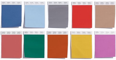
The top ten colours for Fall 2016 are:
- Riverside (PANTONE 17-4028)
- Airy Blue (PANTONE 14-4122)
- Sharkskin (PANTONE 17-3914)
- Aurora Red (PANTONE 18-1550)
- Warm Taupe (PANTONE 16-318)
- Dusty Cedar (PANTONE 18-1630)
- Lush Meadow (PANTONE 18-5845)
- Potter’s Clay (PANTONE 18-1340)
- Spicy Mustard (PANTONE 14-0952)
- Bodacious (PANTONE 17-3240)
Pantone® is the world-renowned authority on colour and the Pantone® Color of the Year is always really influential in any popular colour themes in fashion, interior design and weddings.
I can’t wait to see these autumnal colours featuring in couples’ colour schemes and personally love the combination of Potter’s Clay, Spicy Mustard and Bodacious for being a bit different.
It’s always great to see fresh new colours and combinations, so this time I guess I’ve been left wanting (and maybe expecting) just a little bit more.
See some of our trend predictions for weddings in 2016.