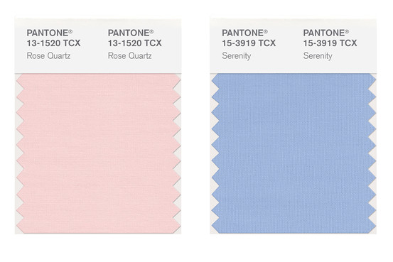
The Pantone® Color of the Year 2016 is Rose Quartz AND Serenity. Yes, we get two colours for the price of one next year. It’s the first time Pantone® have ever announced two colours and a long time since a pastel colour has hit the top spot. They are a nice calm change to the recent bold jewel colours of the last ten years. We can already see these colours featuring singly in couples’ colour schemes and look forward to seeing people using them in tandem too.
Pantone® is the world-renowned authority on colour and the Pantone® Color of the Year is always really influential in any popular colour themes in fashion, interior design and weddings.
Our guess for the Color of the Year 2016 was for Peach Echo, Buttercup or a great neutral colour like Iced Coffee. However we we didn’t see two colours coming! Nor a pastel colour. What we have got is something more relaxing and more choice.