by Hanami Dream | 14, December, 2016 | #UKWedLunch
#UKWedLunch – Wednesday 14th December 2016
As well as general wedding planning chat, this week’s theme is ‘2017 wedding trends’ #UKWedLunch
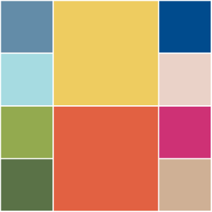
QUESTION 1: What do you think of the @pantone #coloroftheyear for 2017? https://www.hanamidream.co.uk/pantone-announce-the-color-of-the-year-2017/ #UKWedLunch
QUESTION 2: Which films and tv progs do you think will influence 2017 wedding trends? Like Beauty & the Beast #UKWedLunch
QUESTION 3: Which celebrity weddings do you think will influence 2017 wedding trends? Like Pippa Middleton #UKWedLunch
QUESTION 4: What fashion trends do you think will influence 2017 weddings? Like capes, embellished necklines & tailored separates #UKWedLunch
QUESTION 5: What catering trends do you think will influence 2017 weddings? Like donut walls & cakes with image projections #UKWedLunch
QUESTION 6: Which momentous occasion do you think will influence 2017 wedding trends? Like 1970s themes with the 40th anniversary of Elvis’s death #UKWedLunch
See more wedding trends and predictions on Hanami Dream blog https://www.hanamidream.co.uk/category/trends/#UKWedLunch
JOIN US EVERY WEDNESDAY! on Twitter between 1-2pm GMT
As well as general wedding planning chat, there will be a ‘Wedding traditions quiz’ next week #UKWedLunch
by Hanami Dream | 8, December, 2016 | blog, trends
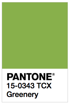
We are going green next year as the Pantone® Color of the Year 2017 is Greenery.
What a wonderful, fresh and vibrant colour that I can’t wait to see couples incorporating into their wedding colour schemes next year.
Greenery will look stunning alongside pure white as well as partnering perfectly with other colours. Plus it sits nicely with trends for more foliage and bringing the garden inside.
I love that the colour of the year is not subtle and withdrawn – its out with pastel and in with a vibrant splash of citrus colour! It makes me think of long cool glasses of mojitos brimming with fresh mint with a slice of lime on the top! I can hear the ice chinking as I write!
And it’s that sense of relaxing and getting away from the stresses of the world that Pantone® emphasis this colour will embody in 2017.
Leatrice Eiseman, the executive director of the Pantone Color Institute describes it as: “the color of hopefulness, and of our connection to nature. It speaks to what we call the ‘re’ words: regenerate, refresh, revitalize, renew. Every spring we enter a new cycle and new shoots come from the ground. It is something life affirming to look forward to.”
Pantone® is the world-renowned authority on colour and the Pantone® Color of the Year is always really influential in any popular colour themes in fashion, interior design and weddings.
I’ve been desperate for a yellow or an orange colour to get top billing for a couple of years and my guess for the Color of the Year 2017 was for Primrose Yellow (see my Spring 2017 report). So I’m so pleased to see a vibrant, bright colour leading the way in 2017.
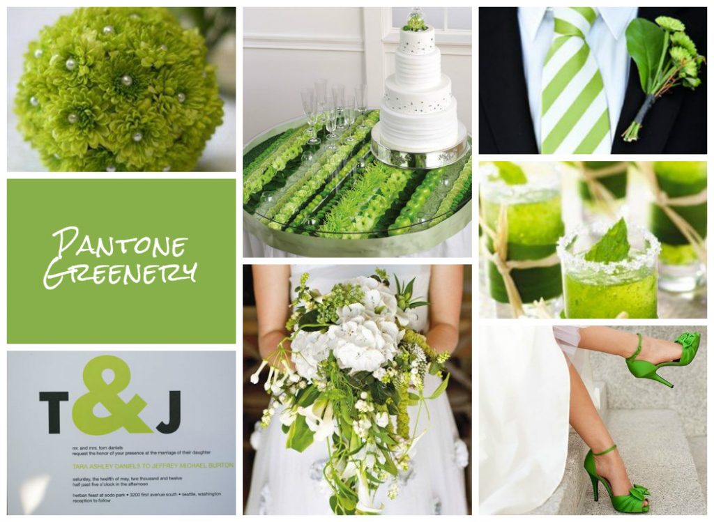
See more about my winning Greenery mood board from the UK Academy of Wedding and Event Planning’s SS17 Pantone® mood board competition from earlier this year.
#COY2017