I’m always excited to see the next Pantone® announcement for their predictions of colours that will dominate the scene for forthcoming seasons. So with the fashion weeks kicking off (this month is New York, London, Milan and then Paris) we start to think about this year’s autumnal months.
This week saw Pantone® showing their hand for the Fall/Winter colours to look out for later in 2019. And it’ll be great to see which colours will appear in autumn weddings this year.
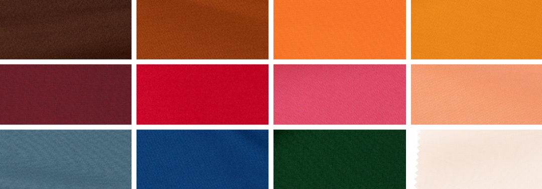
There’s an array of rich vibrant earthy colours. Out of the 12 main colours, 8 of them are from the red palette. There are 3 orange colours and 5 reddy/browns, with some of the peach colours paying a slight nod to Living Coral, the colour of the year. What is great is that a juicy green has made it alongside the neutral and core basic colours too.
Seventies festival vibe
Perhaps to match the festival and eco friendly vibe on trend at the moment, there is a plethora of reds, oranges and browns that dominate the Fall 2019 colours.
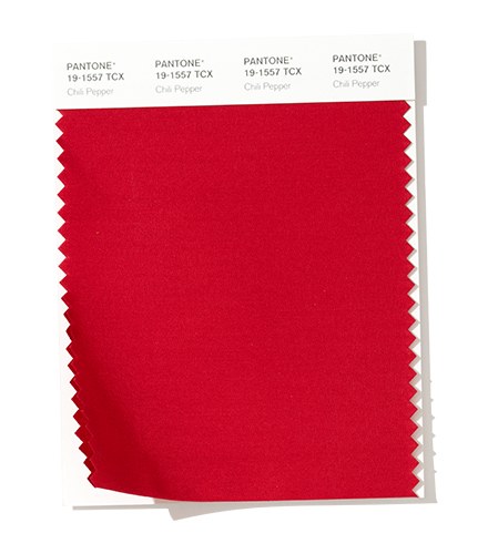
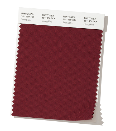
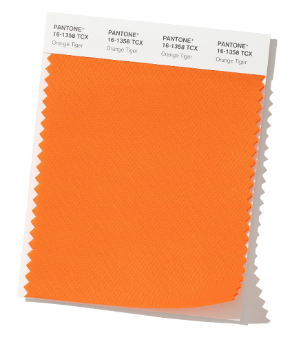
There’s a real sense of being grounded and at one with the world. With the feeling of the warmth coming from Chili Pepper, Biking Red, Peach Pink, Rocky Road, Fruit Dove, Sugar Almond, Dark Cheddar and Orange Tiger.
For me, it’s like someone has opened a door on the décor of my childhood house with memories of all the orange and brown on wallpaper.
Mouth watering food
There are lots of culinary references in the colour names that make my mouth water just thinking about them. Perhaps this in light of the importance that we are being made more aware of nowadays to cook fresh and sustainable food.
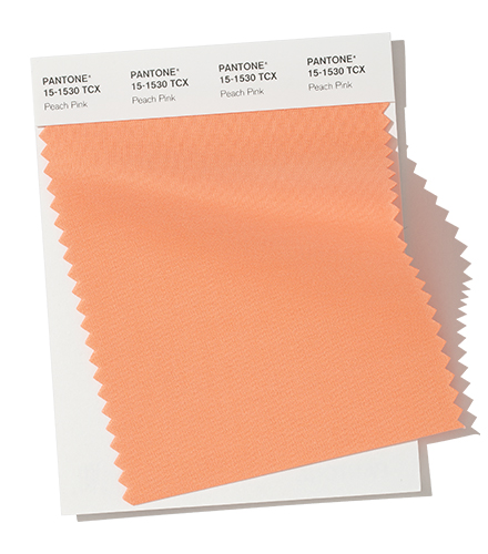
There are strong flavours in these colours that pack a punch both to taste and also visually. This plays on the trend to appeal to all 5 senses at a wedding or any event. Such as Chili Pepper, Crème de Pêche, Peach Pink, Rocky Road, Fruit Dove, Sugar Almond, Dark Cheddar (plus Vanilla Custard and Guacamole from the neutrals).
This evokes amazing memories of seeing guacamole being prepared by the side of our table in Mexico – the fresh, spicy and warming flavours produced by one small dish of food.
Succulent foliage
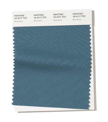
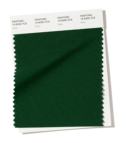
Alongside these earthy colours are greens conjuring up an amazing garden image with the forest green of Eden. Plus the bluey green of Bluestone makes me think of amazing succulent plants accenting and dotted about on the dry earthy ground.
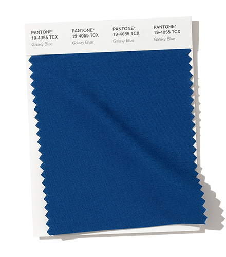
The blues will certainly make good transition colours to next spring too.
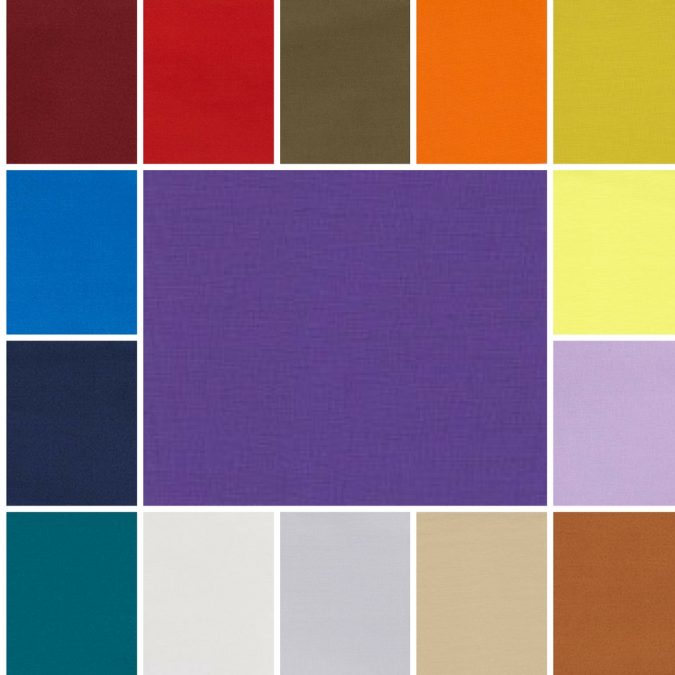
Fall 2019 colours
The top colours for Fall 2019 are:
PANTONE 19-1557 Chili Pepper
PANTONE 19-1650 Biking Red
PANTONE 12-1110 Crème de Pêche
PANTONE 15-1530 Peach Pink
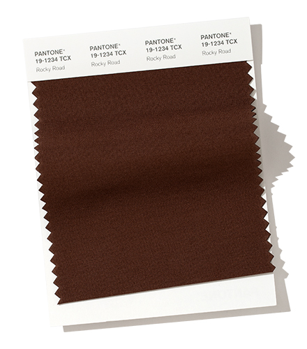
PANTONE 19-1234 Rocky Road
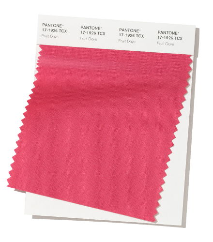
PANTONE 17-1926 Fruit Dove
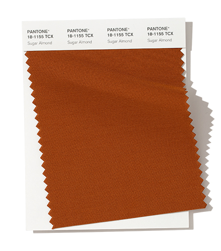
PANTONE 18-1155 Sugar Almond
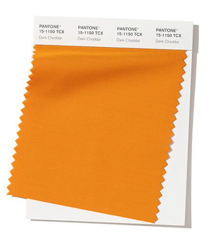
PANTONE 15-1150 Dark Cheddar
PANTONE 19-4055 Galaxy Blue
PANTONE 18-4217 Bluestone
PANTONE 16-1358 Orange Tiger
PANTONE 19-6050 Eden
Fall 2019 extra colours from LFW
Plus a couple of additional colours (instead of the peach and orange colours) from London Fashion Week round off the colours for Fall 2019:
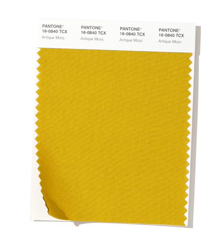
PANTONE 16-0840 Antique Moss
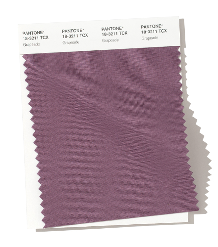
PANTONE 18-3211 Grapeade
Neutral basics
Pantone® have also created a Fall 2019 Classic Colour Palette. These are a group of neutrals that are core basics in the form of cream, navy, grey and the addition of a green.
The bonus classic neutral colours for Fall 2019 are:
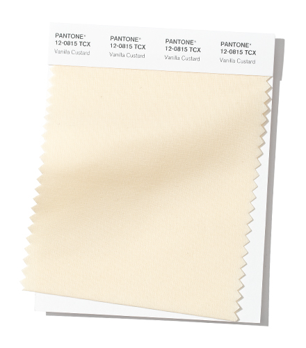
PANTONE 12-0815 Vanilla Custard
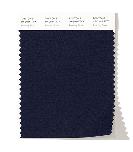
PANTONE 19-3815 Evening Blue
PANTONE 16-0000 Paloma
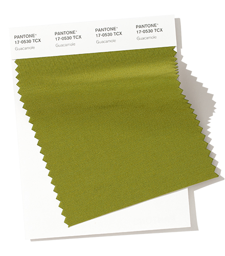
PANTONE 17-0530 Guacamole
Colour themes
It’ll be great to see how couples incorporate these colours in to their weddings later this year.
Pantone® is the world-renowned authority on colour and the Pantone® Color of the Year is always really influential in any popular colour themes in fashion, interior design and weddings.
The current back to school vibe always makes me feel a little sad and melancholy. It’s the end of the summer and the seasons are beginning to change. It is back to work and back to reality, after a summer of fun. The lyrics of ‘Zorbing’ by Stornoway sum up what this time of year makes me think about
Conkers shining on the ground, The air is cooler. And I feel like I just started Uni.
But the exciting news from Pantone® ahead of New York Fashion Week about the Spring 2019 colours has certainly lifted my mood.
We’ll be seeing red next spring if the latest trend predictions from Pantone® this week are anything to go by.
The colours for next Spring certainly make a huge bold statement. They are rich, vibrant and indulgent yet not over powering. They are like a ray of golden light on a colourful kaleidoscope.
Autumnal evolution
You’d be forgiven in thinking that this is the fall report and not the spring one. There seems to be quite a lot of crossover with the current Fall/Winter 2018/19 colour palette with some rich earthy tones, though by Spring 2019 we will have lost the purples (and the Colour of the Year), neons and silver grey.
It is great to see such earthy colours featuring in Spring 2019 and hardly a pastel shade in there! These are all great transitional colours to take us in and out of seasons.
Confident red
The abundance of red related colours is over whelming and runs in to the oranges, yellows and pinks too. This set of colours are empowering, confident, bold, uplifting, fun, playful, cheerful and joyful. Plus I can’t fail to see the energy, passion and excitement that these colours evoke.
My best friend always advises to wear red to an interview or an important date (even if it’s just your underwear!) so that you feel strong and confident. There will be lots around next Spring to feel like you can rule the world.
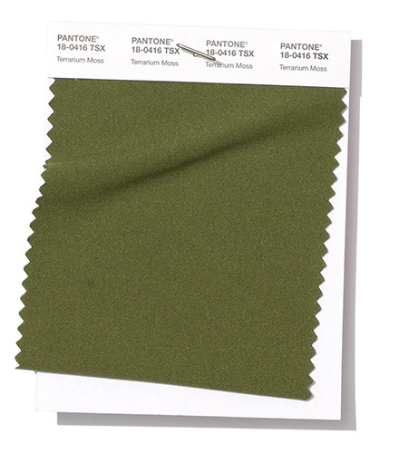
Foliage and succulents
That warm feeling is translated in the addition of the deep greens that conjure up a terrarium full of succulents and foliage. Continuing that sense of bringing nature inside.
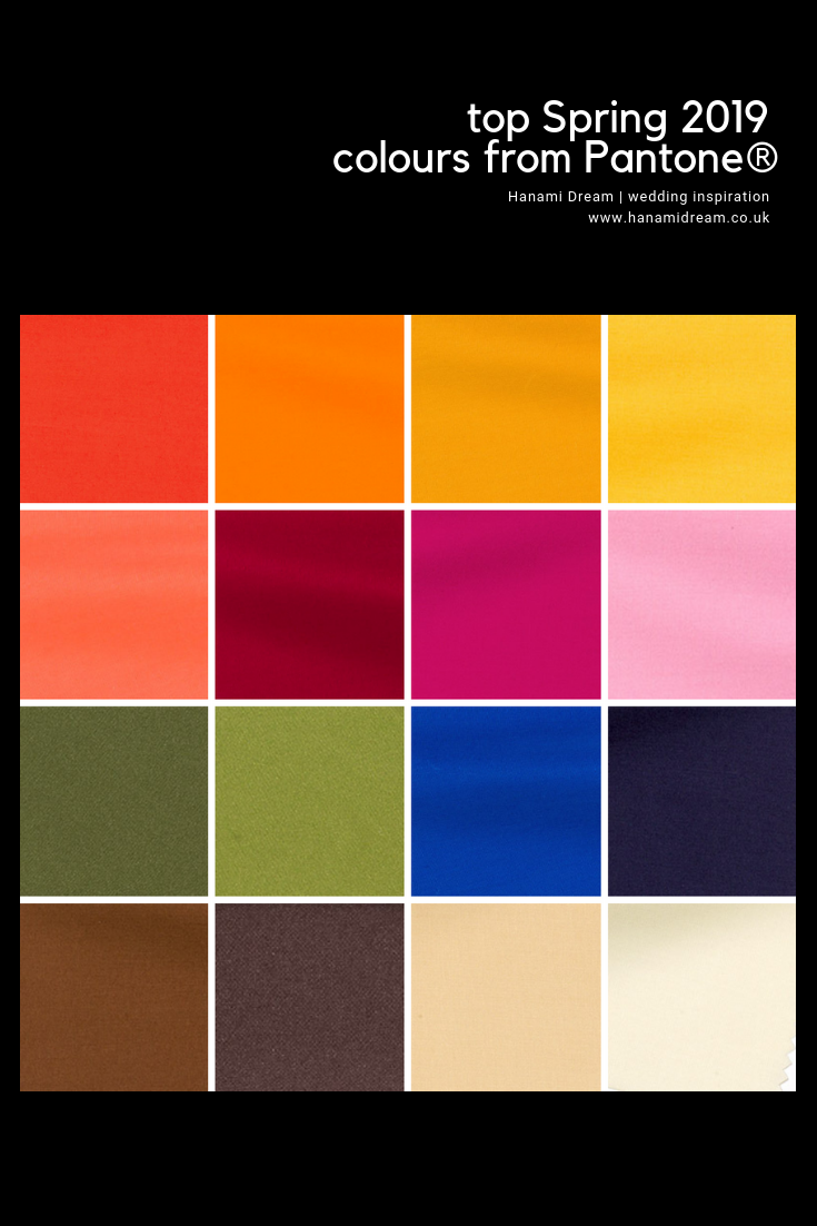
Spring 2019 colours
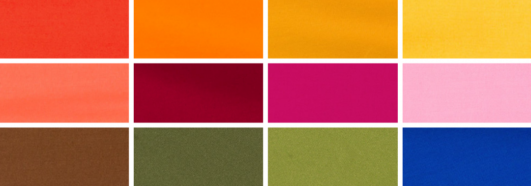
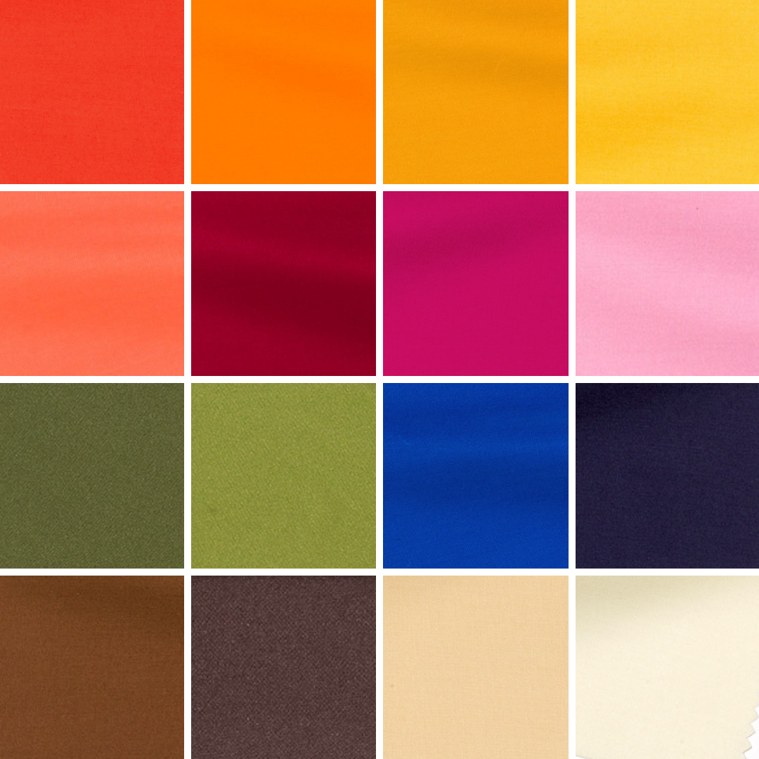
The top twelve colours for Spring 2019 are:
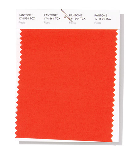
Fiesta PANTONE 17-1564
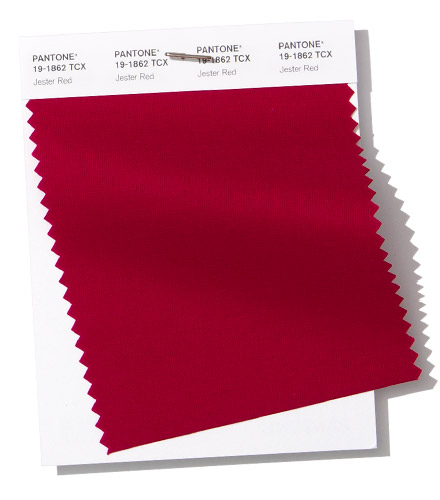
Jester Red PANTONE 19-1862
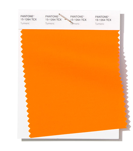
Turmeric PANTONE 15-1264
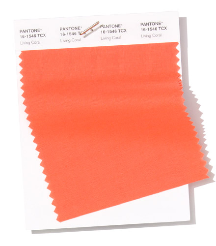
Living Coral PANTONE 16-1546
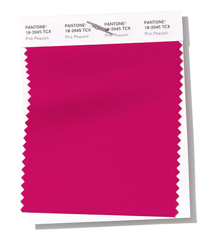
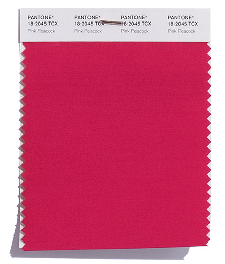
Pink Peacock PANTONE 18-2045
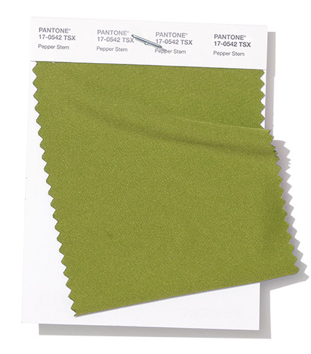
Pepper Stem PANTONE 17-0542
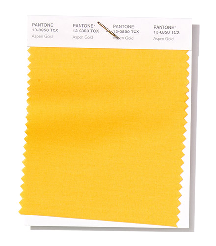
Aspen Gold PANTONE 13-0850
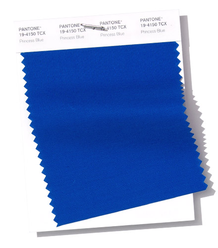
Princess Blue PANTONE 19-4150
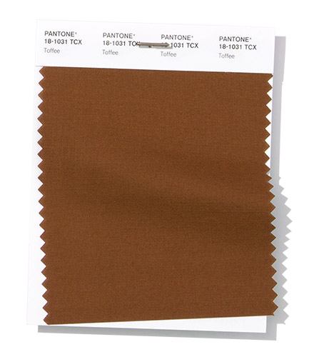
Toffee PANTONE 18-1031
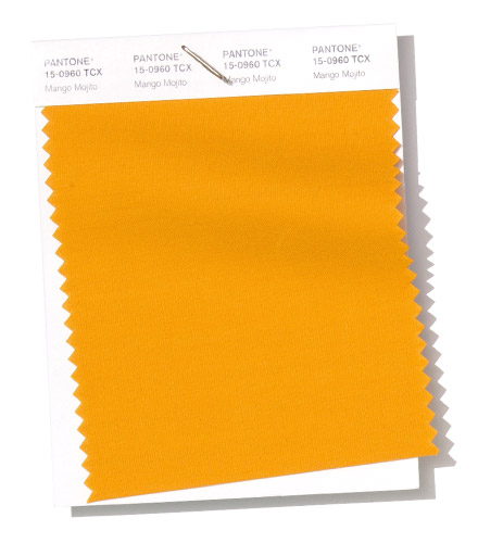
Mango Mojito PANTONE 15-0960
Terrarium Moss PANTONE 18-0416
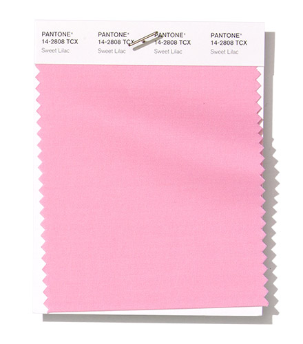
Sweet Lilac PANTONE 14-2808
Spring 2019 extra colours from LFW
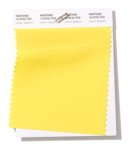
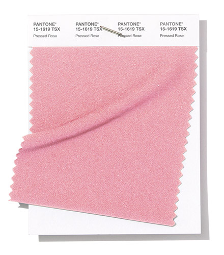
Plus a couple of paler substitutes of yellow (instead of Aspen Gold) and pink (instead of Sweet Lilac) from London Fashion Week round off the colours for Spring 2019:
Lemon Verbena PANTONE 12-0742
Pressed Rose PANTONE 15-1619
Neutral basics
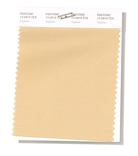
Pantone® have also updated the Classic Colour Palette. These are a group of neutrals that are core basics in the form of a taupe, navy blue, cream and brown.
The bonus classic neutral colours for Spring 2019 are:
Soybean PANTONE 13-0919
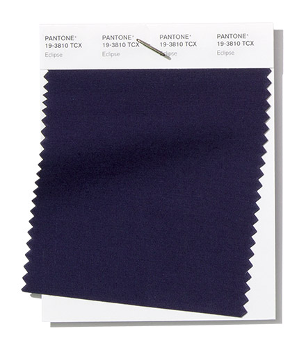
Eclipse PANTONE 19-3810
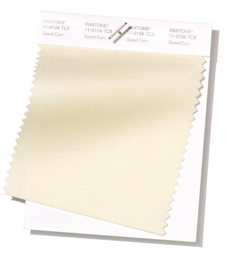
Sweet Corn PANTONE 11-0106
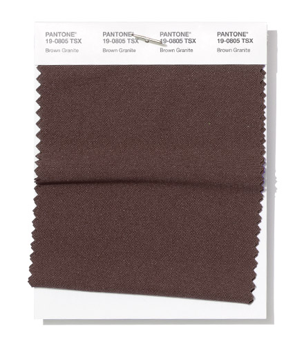
Brown Granite PANTONE 19-0805
Colour themes
It’ll be great to see how couples incorporate these colours in to their weddings later this year. I can see how the classic neutrals will play a big part in coupling up with some of the more vibrant choices.
Pantone® is the world-renowned authority on colour and the Pantone® Color of the Year is always really influential in any popular colour themes in fashion, interior design and weddings.
I’m pleased we didn’t have to wait as long as last year for the Pantone® announcement of the Fall/Winter colours to look out for in 2018. In fact, it even took me a bit by surprise!
With the fashion week season just kicking off (this month is New York, London, Milan and then Paris) we start to think about those autumnal months.
And it seems that Pantone® are back in their stride, as we return to a top ten of colours (rather than a dozen that we saw for spring 2018). Plus I’m pleased to see the report continuing to be predictions again rather than a counting colours exercise from the catwalks.
It’s great to see an increase and update to the bonus colours that act as neutrals and core basics too.
Bonfire night warmth
I love this collection of bold colours that will trend in Autumn. They certainly pack a punch and make a huge statement.
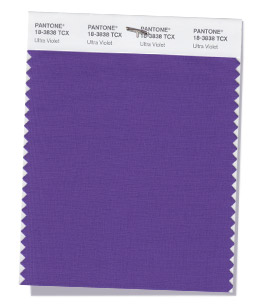
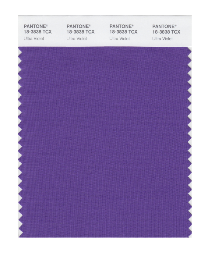
Alongside some typical, rich autumnal colours, there’s some great accompanying vibrant shades that sit nicely alongside the colour of the year, Ultra Violet.
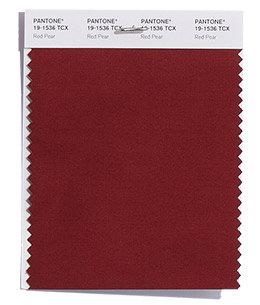
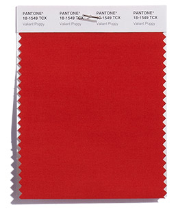
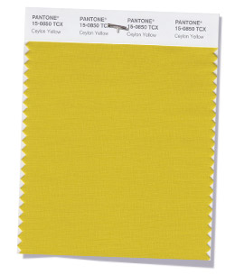
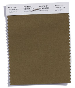
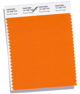
You can feel the warmth of the reds, orange, yellow and brown colours radiating out like the flames of a bonfire on Guy Fawkes night with Red Pear, Valiant Poppy, Ceylon Yellow, Martini Olive, Russet Orange (and Meerkat from the neutrals).
Peacock blooms
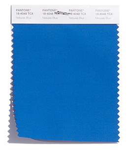
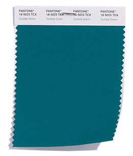
The dark, jewel colours (of Nebulas Blue, Ultra Violet and Quetzal Green) are fitting for my prediction of peacock inspired weddings this year. With the deep teal of Quetzal Green even named after a striking colourful bird.
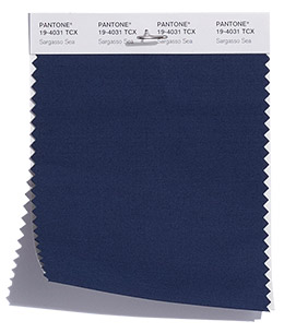
Many of the names of the colours in this season seem so evocative and conjuror up images of space, sky, sea and land. With the interstellar cloud of dust of Nebulas Blue, Ultra Violet (the colour of the year tipped to suggest the mysteries of the cosmos), the cold, dark North Atlantic water of the Sargasso Sea and the expanse of poppies in Flanders Field reminiscent of Remembrance Day.
I’d love to have the job of thinking up the names of the colours – any one for a cocktail to accompany Martini Olive?!
Winter transition
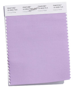
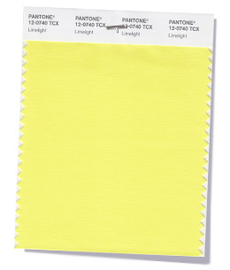
With the start of the Winter Olympics in Pyeongchang today, it’s lovely to see some icy counterparts to take us in to winter with Crocus Petal (a paler version of Ultra Violet) and Limelight (a lighter version of Ceylon Yellow). They’ll make good transition colours to next spring too.
Fall 2018 colours
The top ten colours for Fall 2018 are:
PANTONE 19-1536 Red Pear
PANTONE 18-1549 Valiant Poppy
PANTONE 18-4048 Nebulas Blue
PANTONE 15-0850 Ceylon Yellow
PANTONE 18-0625 Martini Olive
PANTONE 16-1255 Russet Orange
PANTONE 18-3838 Ultra Violet
PANTONE 15-3520 Crocus Petal
PANTONE 12-0740 Limelight
PANTONE 18-5025 Quetzal Green
Fall 2018 extra colours from LFW
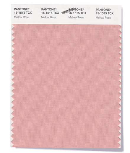
Plus a couple of additional pops of pink from London Fashion Week round off the colours for Fall 2018:
PANTONE 15-1515 Mellow Rose
PANTONE 18-2045 Pink Peacock
Neutral basics
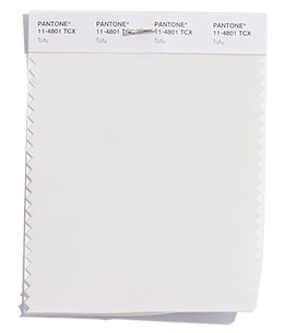
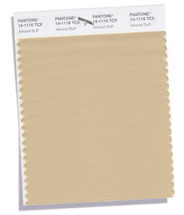
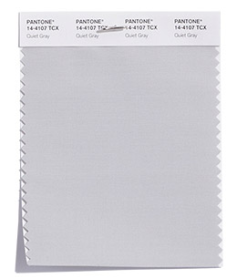
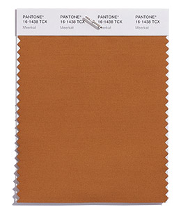
Pantone® have also created a Fall 2018 Classic Colour Palette. These are a group of neutrals that are core basics in the form of navy, white, beige, grey and brown.
You could wrap yourself up in these warm neutral colours. This is hygge at its best – with a great addition of Meerkat brown – so comforting, warm and cosy.
The bonus classic neutral colours for Fall 2018 are:
PANTONE 19-4031 Sargasso Blue
PANTONE 11-4801 Tofu
PANTONE 14-1116 Almond Buff
PANTONE 14-4107 Quiet Grey
PANTONE 16-1438 Meerkat
Colour themes
It’ll be great to see how couples incorporate these colours in to their weddings later this year.
Pantone® is the world-renowned authority on colour and the Pantone® Color of the Year is always really influential in any popular colour themes in fashion, interior design and weddings.
The children are only just back to school today so I was surprised to see the news from Pantone® about Spring 2018 colours landing on my desk already – how exciting!
Their timing to announce the next season’s colours has been much earlier this time around and ahead of all the fashion weeks. In February, we were left waiting until after both New York and London Fashion week to announce their Fall 2017 fashion report. But the Spring Summer 2018 New York fashion week isn’t due to kick off until tomorrow so I wasn’t expecting Pantone® to announce their colour forecast just yet. It’s great to see their report is going back to being a forecast rather than a colour counting exercise from the catwalks though.
So not only is their timing unexpected but so are the colours – both in quantity and palette.
This season, instead of the usual 10 colours, we’ve been given an extra 2 to make 12 colours that Pantone® forecast to be the colours for Spring/Summer 2018. As if that wasn’t enough, they’ve also thrown in 4 bonus colours that act as neutrals and core basics.
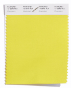
I am so pleased to see yellow featuring high on their list – it’s such a comforting ray of sunshine. Does this mean that we’ll finally see a yellow as the colour of the year in 2018? I’ve been desperate for a yellow (or an orange colour) to get top billing for a couple of years and I cross everything for a bright colour like Meadowlark to take the top slot.
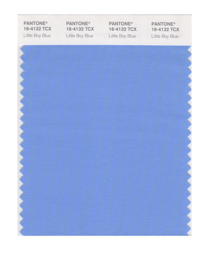
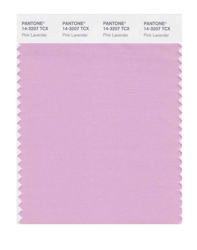
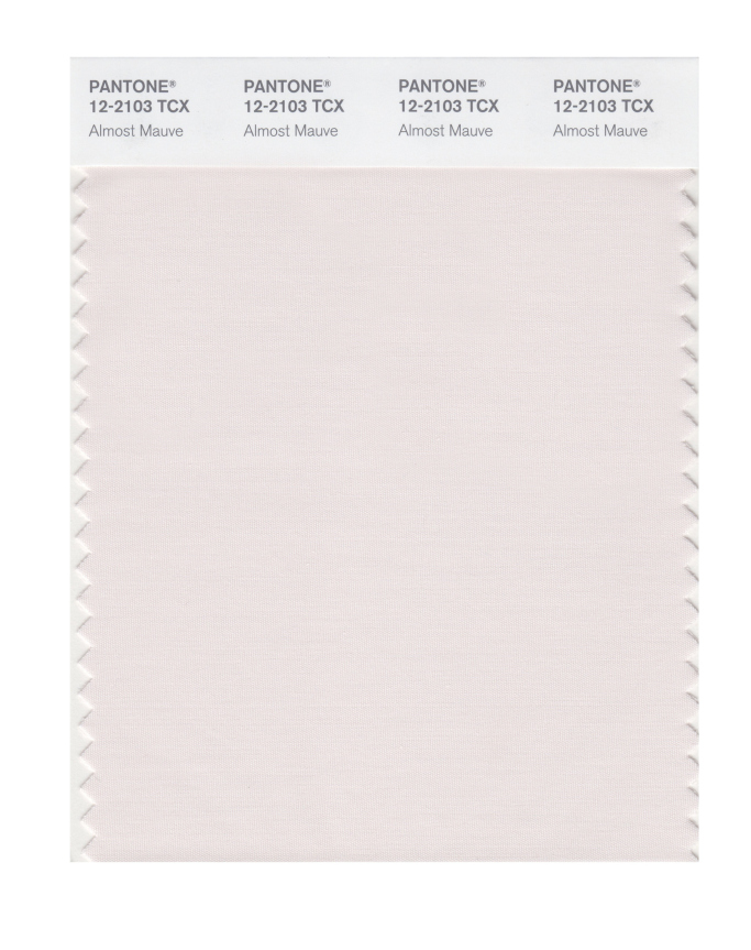
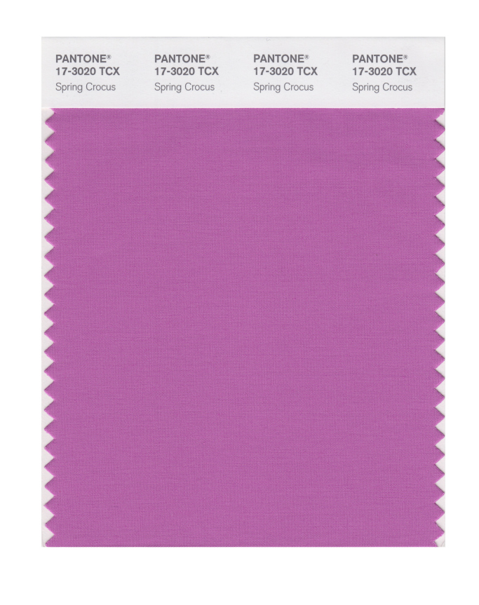
These Spring colours are certainly attention grabbing and there’s even a neon yellow amongst them. For me, I love that they are continuing the Spring 2017 trend away from pale pastels. This palette is right up my street! I love the blues (Little Boy Blue and Sailor Blue) and how these evolve in to my favourite colour of purple. With Pink Lavender, Ultra Violet, Almost Mauve and Spring Crocus.
The pastels that are used are barely-there colours and really work with the trend for gentle, ethereal and floaty materials and textures that are featuring in bridal attire at the moment.
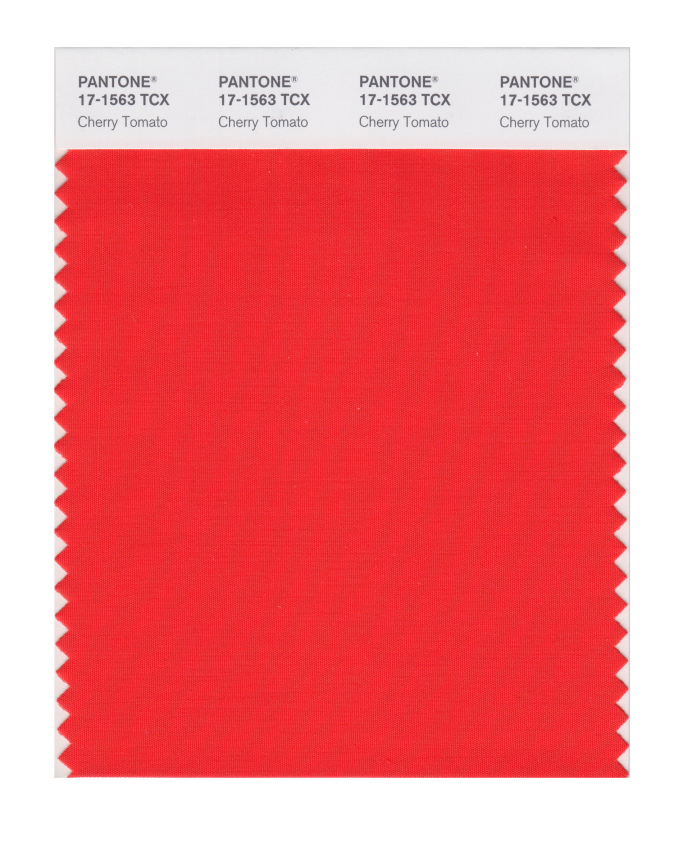
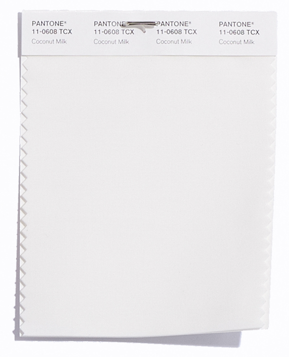
I also like the food based colours that show a real culinary influence of Cherry Tomato and Coconut Milk, with a bit of added spice from Chili Oil.
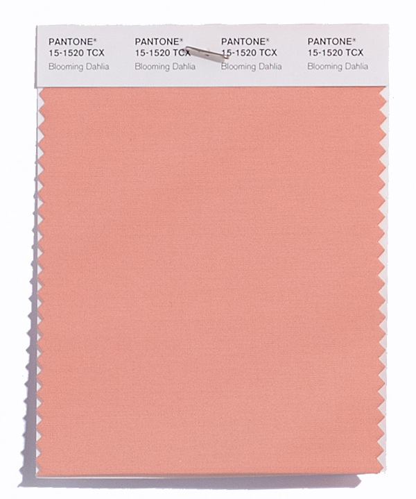
Along with this is some wonderful floral inspiration for a beautiful spring meadow such as Blooming Dahlia, Spring Crocus, and Pink Lavender.
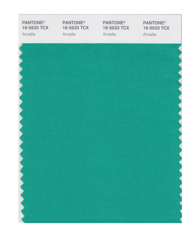
Plus the evolution of green continues in to this season. From the freshness of Greenery for Spring/Summer 2017 (and colour of the year in 2017), to the evergreen foliage of Shaded Spruce from Fall/Winter 2017, to a wonderful teal colour in Arcadia next Spring/Summer 2018 that mixes calming blue in to the green mix.
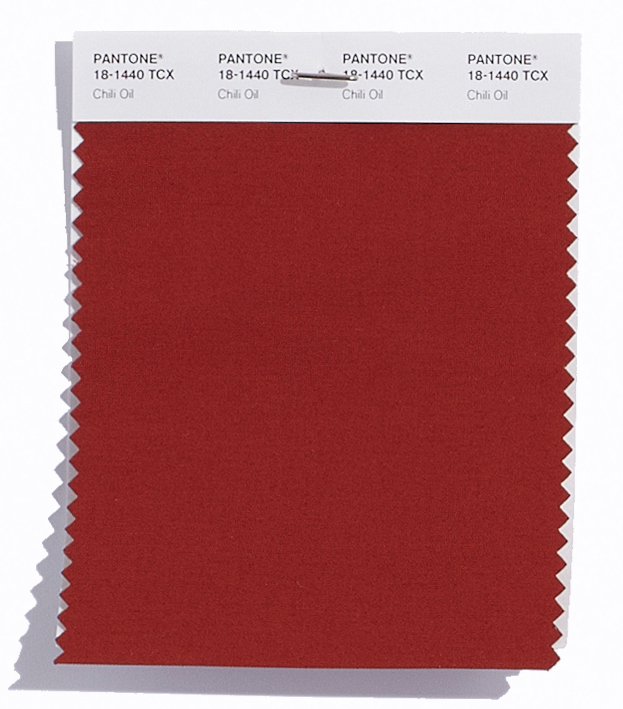
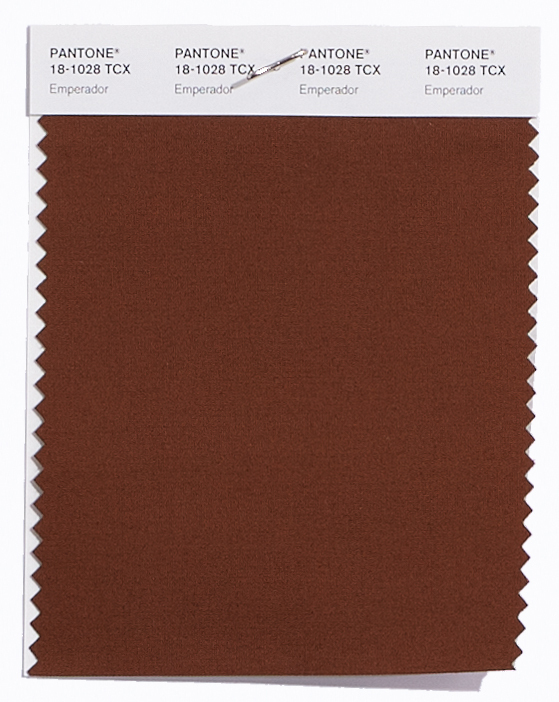
There’s also some unexpected earthy autumnal colours (like Chili Oil and the rich chocolatey brown of Emperador) that seem a little out of place from a traditional Spring palette but will act as great transitional colours to take us in and out of seasons.
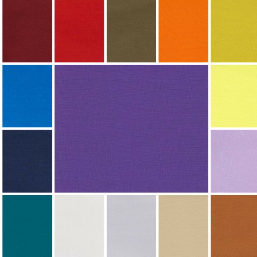
The top twelve colours from NYFW for Spring 2018 are:
Meadowlark 13-0646
Cherry Tomato 17-1563
Little Boy Blue 4132
Chili Oil 18-1440
Blooming Dahlia 15-1520
Pink Lavender 14-3207
Arcadia 16-5533
Ultra Violet 18-2828
Emperador 18-1028
Almost Mauve 12- 2103
Spring Crocus 17-3020
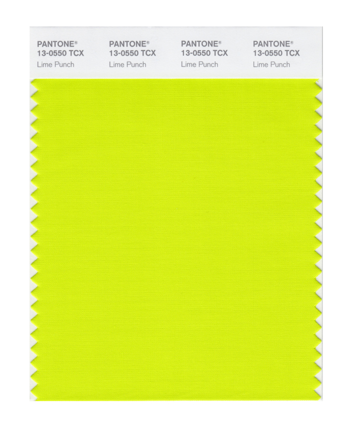
Lime Punch 13-0550
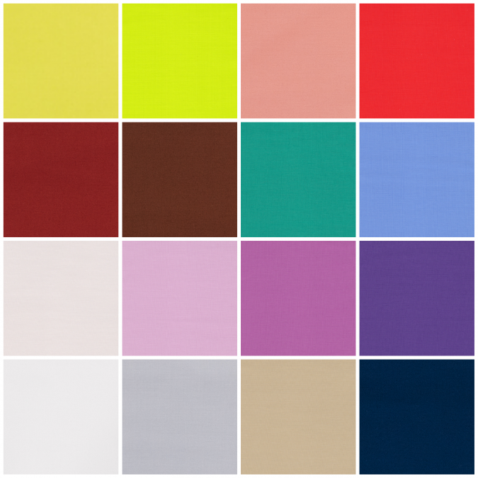
Plus these from LFW (which are pretty similar to the ones from New York apart from the addition of another blue, a couple of wonderful dusky pinks, a warm burgundy and a fresh green):
Cherry Tomato 17-1563
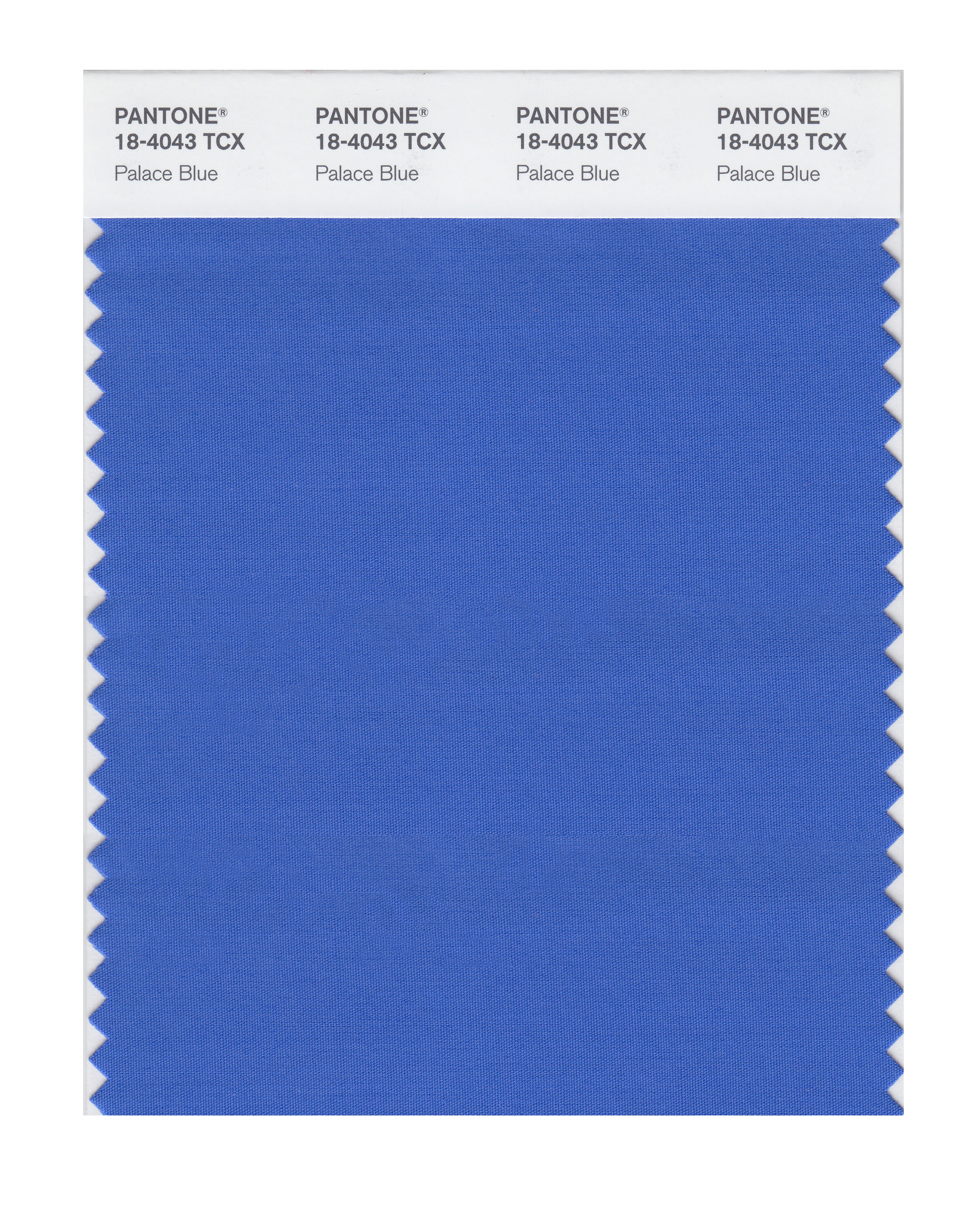
Palace Blue 18-4043
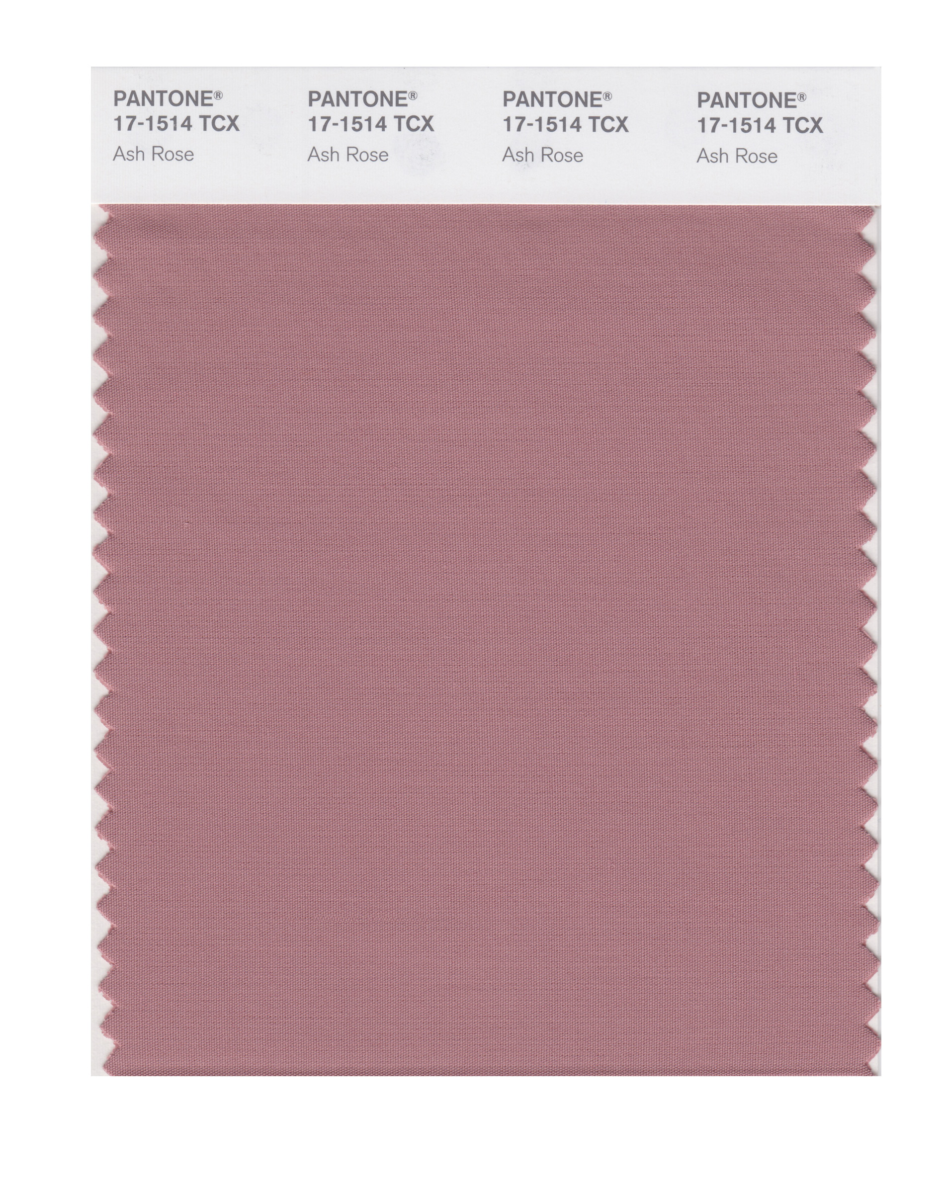
Ash Rose 17-1514
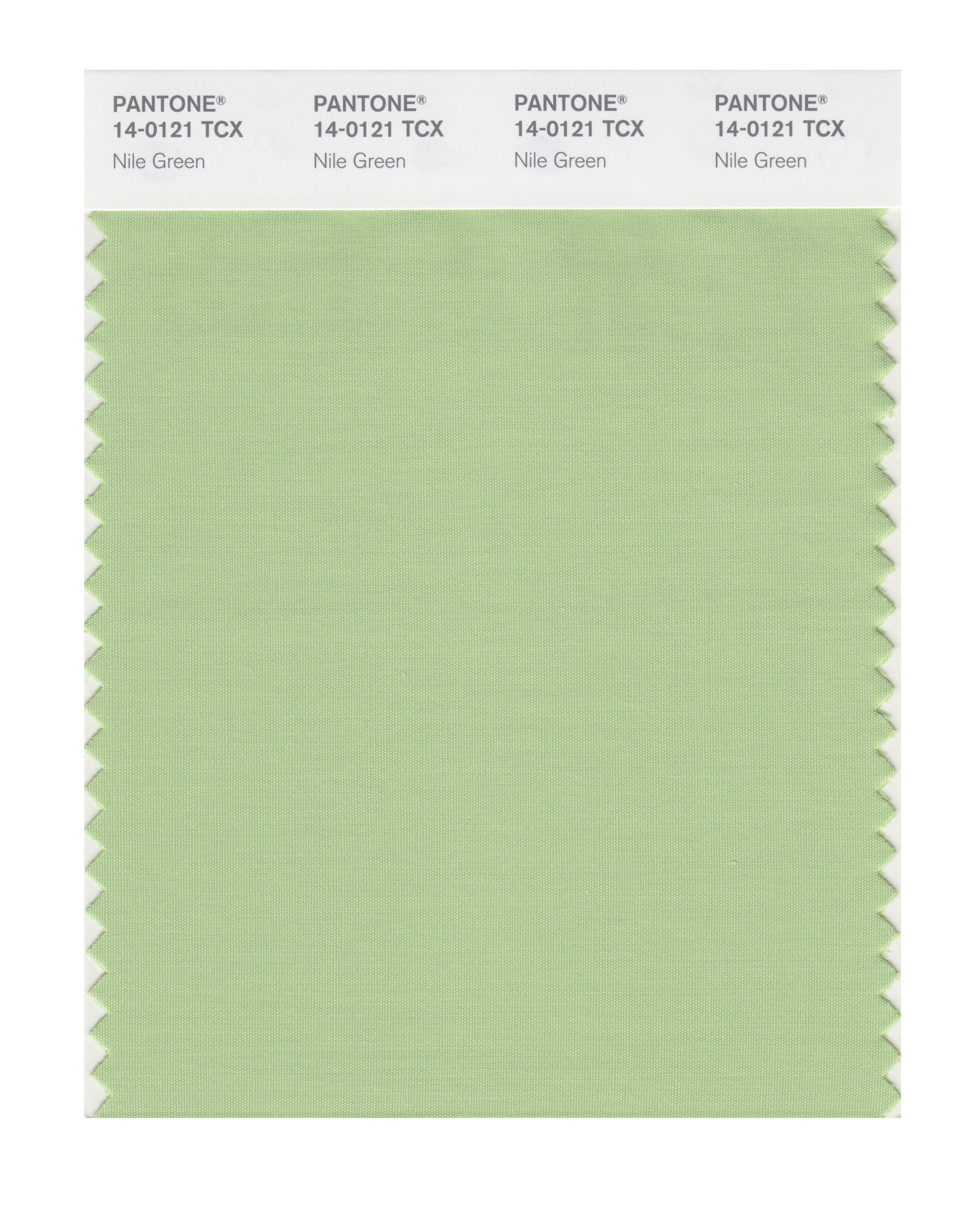
Nile Green 14-0121
Meadowlark 13-0646
Blooming Dahlia 15-1520
Ultra Violet 18-2828
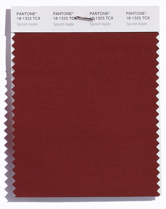
Spiced Apple 18-1325
Pink Lavender 14-3207
Almost Mauve 12- 2103
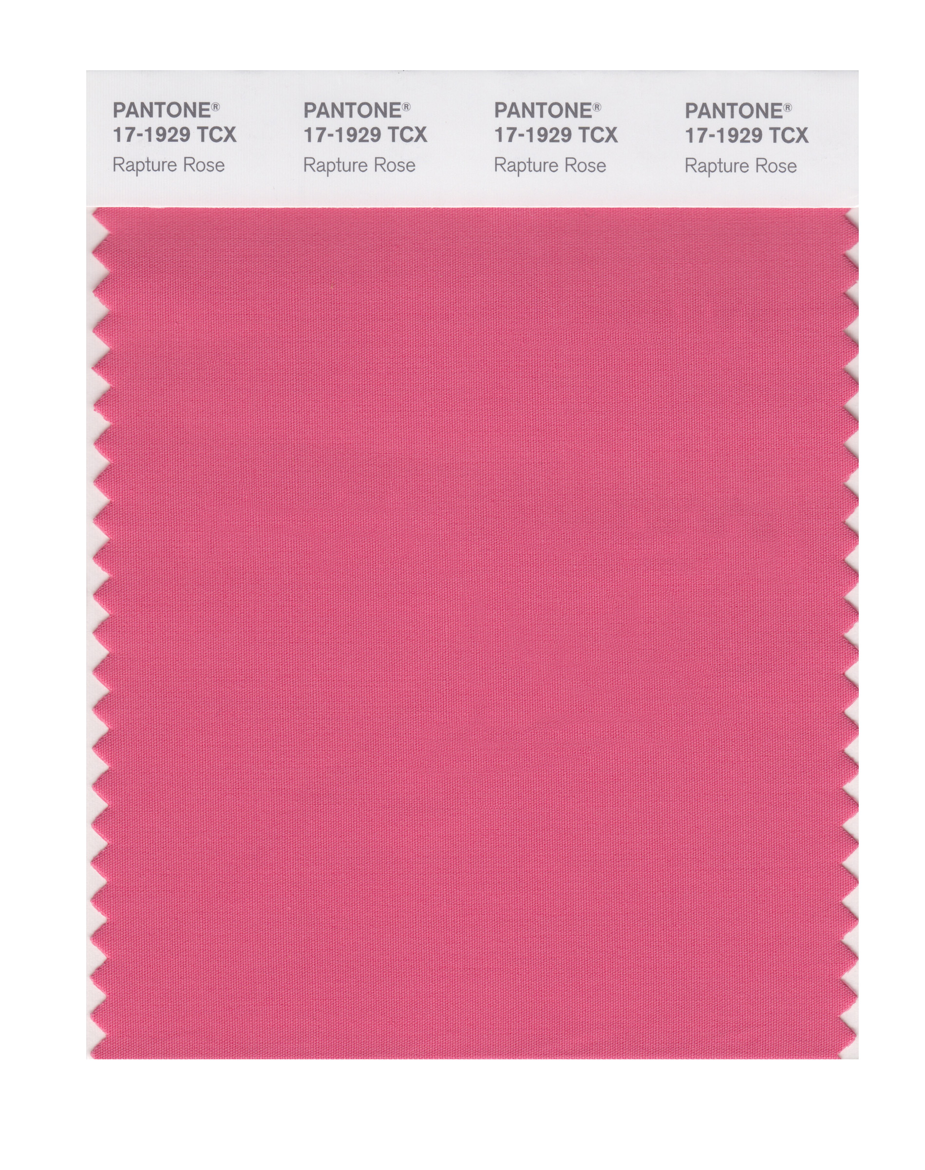
Rapture Rose 17-1929
Lime Punch 13-0550
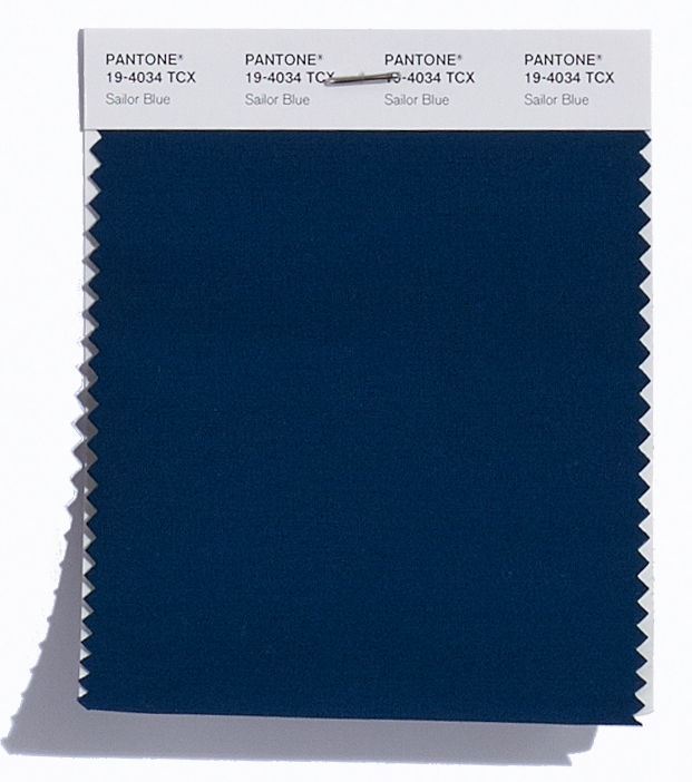
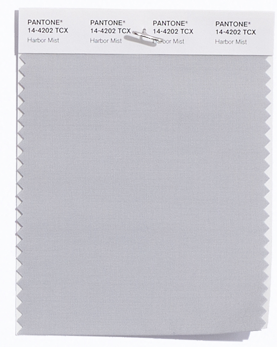
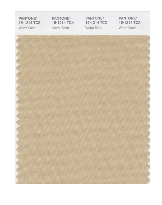
Pantone® have also created a Spring 2018 Classic Colour Palette. These are a group of neutrals that are core basics in the form of navy, grey, beige and off white (of Sailor Blue, Harbor Mist, Warm Sand and Coconut Milk respectively).
The bonus classic neutral colours for Spring 2018 are:
Sailor Blue 19-4034
Harbor Mist 14-4202
Warm Sand 15-1214
Coconut Milk 11-0608
It’ll be great to see how couples incorporate these colours in to their weddings next year. I can see how the classic neutrals will play a big part in coupling up with some of the more vibrant choices.
Pantone® is the world-renowned authority on colour and the Pantone® Color of the Year is always really influential in any popular colour themes in fashion, interior design and weddings.
I’m not going to lie, I’m like a kid on Christmas Eve when I’m waiting with baited breath for the Pantone® announcements. For three times a year, I feel like a proper journalist waiting for the news to break about the next season’s top colours. (And I’m nearly beside myself waiting for the colour of the year announcement in December!)
Yes, I get excited! So when the fashion week season kicks off (this month is New York, London, Milan and then Paris) I’m on stand by waiting for Pantone® to make their declaration.
And it was quite a delay this time, as Pantone® waited until not only after New York Fashion Week to finish, but London as well. Whilst the fashion crowd have now moved on to Milan, I was beginning to think that Pantone® weren’t going to reveal a colour report at all this time. And if I may moan about Pantone® for one minute, I must say that I’m disappointed that it is less about their predictions now and more just about counting colours that designers have used. Don’t get me wrong, their report is comprehensive and incredibly impressive (blimey, there were around 180 shows at NYFW alone!) but I guess I feel it’s less about foresight in advance now.
However, it is good that their analysis is taking more of an international view for the first time and this report is a great overview of fashion designers’ use of colour in their Autumn/Winter 2017/2018 collections.
Plus I’ve already fallen deeply in love with the collection of colours that will trend this Autumn. Don’t get too excited. There’s no huge surprises. In fact, I probably could’ve written this article without even seeing the colours as they’re fairly typical and what you’d expect.
But they are a beautiful, rich collection of classic autumnal colours.
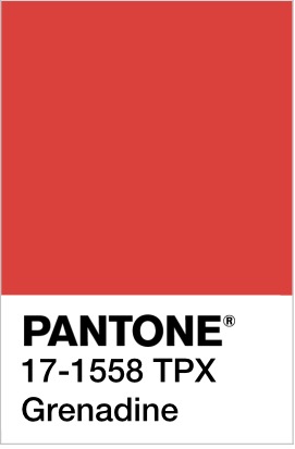
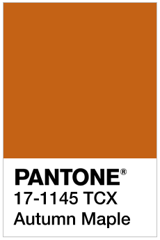
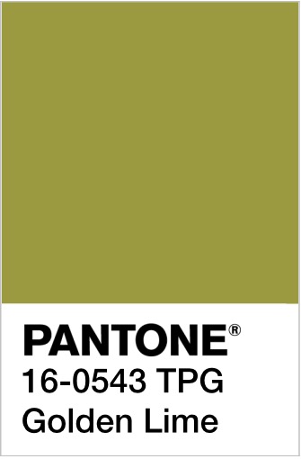
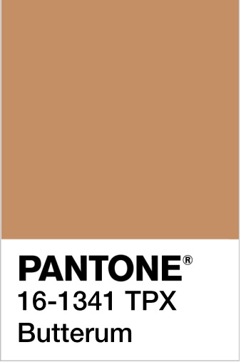
Looking at them makes me want to run, jump, kick and roll in a pile of crunchy fallen leaves all in the vibrant hues of Grenadine, Autumn Maple, Golden Lime and Butterum.
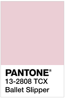
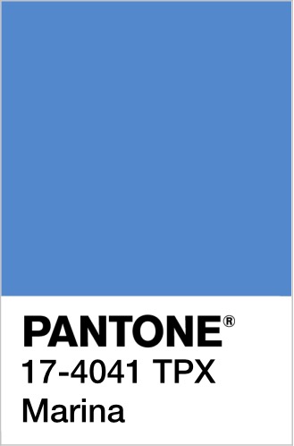
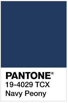
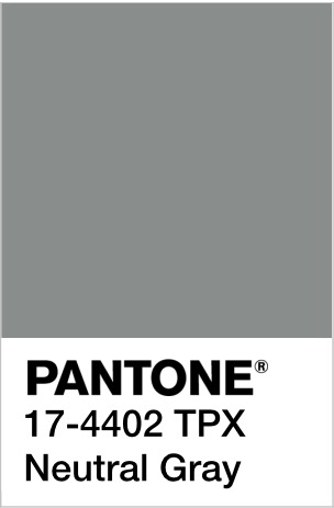
Even the distinctive, pale pink Ballet Slipper sits well with the cooler, wintry colours of Marina, Navy Peony and Neutral Gray.
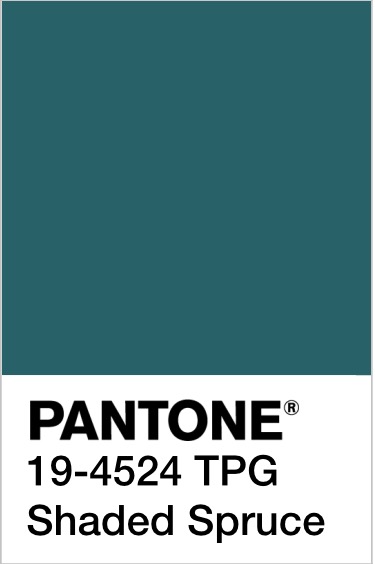
For me, the stand out colour is Shaded Spruce, a rich warm dark teal colour, which is a wonderful evolution of the Greenery colour of the year. It will take us from the freshness of spring/summer to the evergreen foliage of the winter.
Pantone® Color Institute Executive Director Leatrice Eiseman was right when she said that, “Cocooning colors are something you just want to wrap around yourself and feel comforted.”
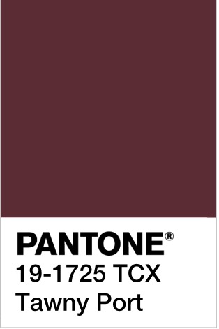
New York and London fashion weeks were full of tactile fabrics such as fur, velvet, quilting and tweed with a bit of Hollywood glam. These Fall/Winter 2017/2018 colours are Hygge at its best – comforting and cosy. How warming would that glorious and rich Tawny Port be to sup apres ski!
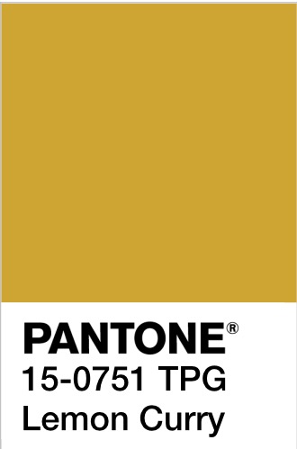
I also love the combination of the grey and yellow (maybe next year we’ll finally have a yellow as the colour of the year!) as it feels like such a comforting ray of sunshine.
The top ten colours from NYFW for Fall 2017 are:
PANTONE 19-4524 TCX Shaded Spruce
PANTONE 17-1558-TPX Grenadine
PANTONE 17-1145-TCX Autumn Maple
PANTONE 13-2808 TCX Ballet Slipper
PANTONE 16-0543 TPG Golden Lime
PANTONE 17-4041 TPX Marina
PANTONE 19-4029 TCX Navy Peony
PANTONE 17-4402-TPX Neutral Gray
PANTONE 16-1341 TCX Butterum
PANTONE 19-1725 TCX Tawny Port
Plus these from LFW (which are pretty similar to the ones from New York apart from a very welcome addition of a purple, a dark neutral brown and a fabulous yellow in the mix):
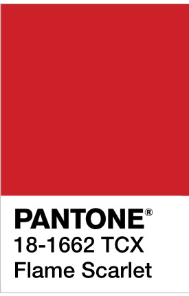
PANTONE 18-1662 TCX Flame Scarlet
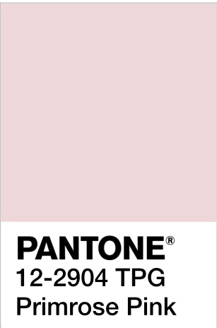
PANTONE 12-2904 TPG Primrose Pink
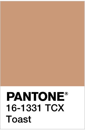
PANTONE16-1331 TCX Toast
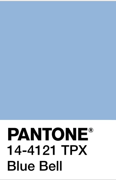
PANTONE 14-4121 TPX Blue Bell
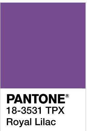
PANTONE 18-3531 TPX Royal Lilac
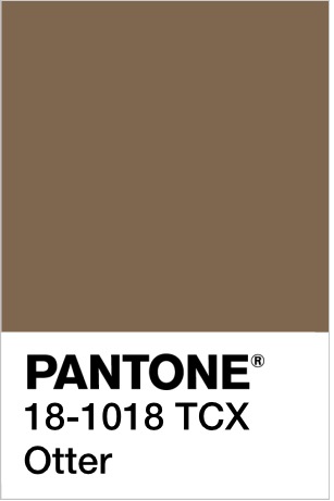
PANTONE 18-1018 TCX Otter
PANTONE 18-4028 TCX Navy Peony
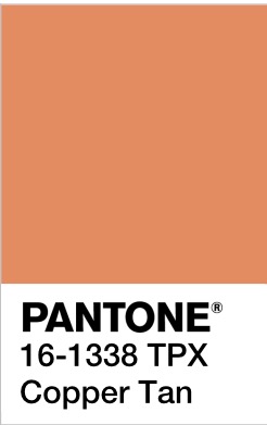
PANTONE 16-1338 TPX Copper Tan
PANTONE 15-0751 TPG Lemon Curry
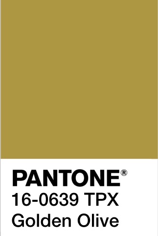
PANTONE 16-0639 TPX Golden Olive
It’ll be great to see how couples incorporate these colours in to their weddings later this year (and whether the luxurious fabrics and sheer tops will influence wedding dress designs).
Pantone® is the world-renowned authority on colour and the Pantone® Color of the Year is always really influential in any popular colour themes in fashion, interior design and weddings.