by Hanami Dream | 8, March, 2017 | #UKWedLunch
#UKWedLunch – Wednesday 8th March 2017
As well as general wedding planning chat, this week we look at colour trends in 2017 #UKWedLunch
Are you getting married in 2017? What is the colour scheme for your wedding? #UKWedLunch
TOP TIP 1: Consider the season of your wedding when picking a colour theme to match flowers and trends #UKWedLunch
TOP TIP 2: Spring and summer colour trends tend to be brighter, lighter and often pastel shades – see 2017 trends here https://www.hanamidream.co.uk/top-10-spring-2017-colours-from-pantone/#UKWedLunch
TOP TIP 3: Autumn and winter colour trends tend to be cooler, richer and darker shades – see 2017 trends here https://www.hanamidream.co.uk/top-10-fall-2017-colours-from-pantone/ #UKWedLunch
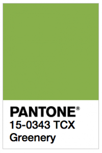
TOP TIP 4: Consider the colour of the year in your colour scheme – it’s greenery in 2017 https://www.hanamidream.co.uk/pantone-announce-the-color-of-the-year-2017/ #UKWedLunch
TOP TIP 5: Think about what your colour scheme needs to work with: venue, attendants, accessories, stationery. Use neutrals too. #UKWedLunch
This week’s top tips are taken from www.hanamidream.co.uk/category/trends/ #UKWedLunch
As well as general wedding planning chat, next week’s theme will be on ‘wedding anniversaries‘ #UKWedLunch
JOIN US EVERY WEDNESDAY! on Twitter between 1-2pm GMT

by Hanami Dream | 1, November, 2016 | testimonials
“Nicola’s consistent use of images featuring mums throughout her board lends a wonderful cohesive feel—it feels like all of these images could have come from one wedding. (Sometimes, mood boards can feel disjointed because images are pulled from so many different sources. This one didn’t have that issue at all.)
The even balance of colors feels professional. Greens, whites, and blacks are all placed well throughout the board—there’s no “too much” of any one color in any one spot.
This board’s imagery helps to convey a number of different aspects of a wedding. We love that Nicola included everything from cake design to typography inspiration. Overall, her board communicates a wedding that is fun, modern, and organic.
Christina Farrow, Aisle Planner – October 2016
http://community.aisleplanner.com/pantone-mood-board-competition/
by Hanami Dream | 1, November, 2016 | news
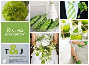
Very proud to have won the greenery mood board in the recent UKAWEP SS17 Pantone® competition.
Aisle Planner, picked the winners for each colour and shared their thoughts on their blog –
http://community.aisleplanner.com/pantone-mood-board-competition/
Many thanks to Aisle Planner for their kind words:
“Nicola’s consistent use of images featuring mums throughout her board lends a wonderful cohesive feel—it feels like all of these images could have come from one wedding. (Sometimes, mood boards can feel disjointed because images are pulled from so many different sources. This one didn’t have that issue at all.)
The even balance of colors feels professional. Greens, whites, and blacks are all placed well throughout the board—there’s no “too much” of any one color in any one spot.
This board’s imagery helps to convey a number of different aspects of a wedding. We love that Nicola included everything from cake design to typography inspiration. Overall, her board communicates a wedding that is fun, modern, and organic.”
by Hanami Dream | 19, September, 2016 | blog, trends
It’s almost ironic that as soon as the weather is taking a more autumnal direction that I should start to think about next year’s springtime! Yes, the leaves might be changing colour, there may be conkers on the ground and I have even spotted mince pies in the shops today! But this is the exciting time of year when those lovely folks at Pantone® compile their top ten colours for the following spring.
We are in the throes of London Fashion Week at the moment in the UK, which is hot on the heels of New York Fashion Week (NYFW). The experts at Pantone® watched the colour trends as they happened at NYFW, with the Council of Fashion Designers of America (CFDA), and compiled their top 10 colour fashion report as a result of what they saw on the catwalks. There were about 119 different shows to watch at NYFW so it’s no mean feat for them to record how many people are using variants of colours. Interestingly there were a number of collections that grouped lots of colours together and gave some amazing combinations.
So, after I was left quite disappointed with the Fall 2016 report, I needed something to regain my faith and the Spring 2017 colours have done this in abundance!
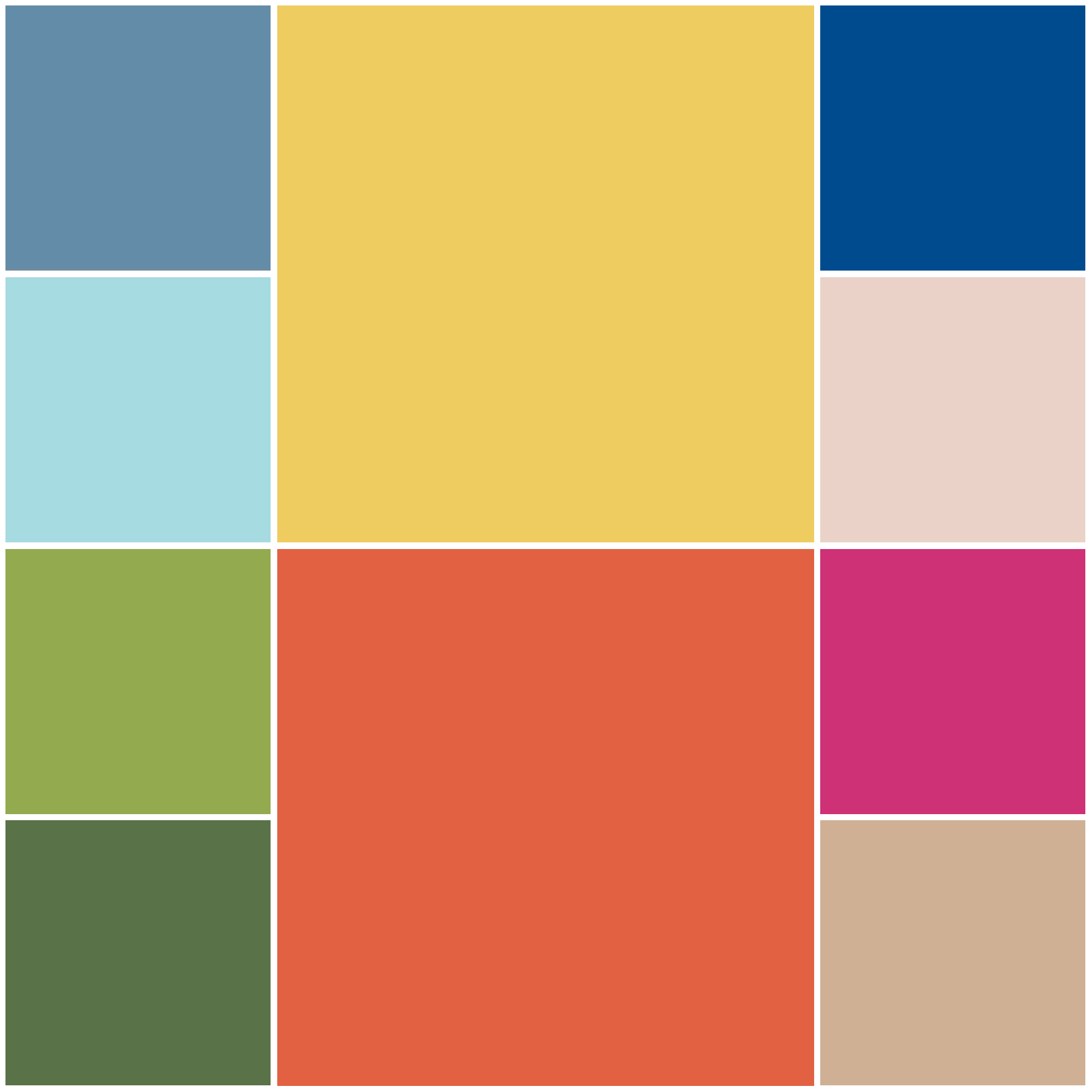
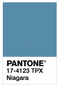
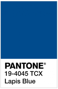
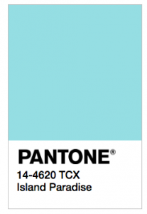
Don’t get me wrong they haven’t reinvented the wheel – its a happy evolution from the 2016 Spring colour palette. What is really striking though is the dominance and prevalence of one colour in particular. Blue appears in varying shades, such as Niagara (a denim blue), Lapis Blue (a great navy colour named after a stunning semi precious gemstone) and Island Paradise (a cooling turquoise). These take the 1st, 3rd and 5th spots respectfully on the list and are beautifully relaxing, calming and proving that, according to Pantone®, these colours ‘offer options that are not just typical of seasons’ but a great transition between the seasons.
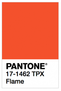
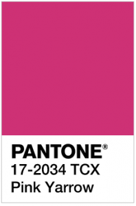
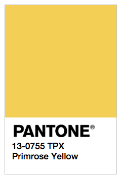
Plus it’s great to see that the supporting, accent colours are not subtle and withdrawn – its out with pastel and in with party pops of vibrant citrus colours in the form of Primrose Yellow, Flame, Greenery and Pink Yarrow. You’d be forgiven to picture slices of lemon, orange, lime or watermelon adorning glasses of long, cool summer cocktails, enjoyed whilst laying in a hammock on a tropical island paradise.
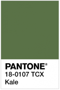
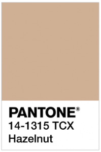
This palette of ten fresh and vibrant colours brings bright, light and sunny colours to help us get through the next few darker months! The names of the colours also add to the vision of spring flowers popping up with primroses, yarrow, dogtooth and luscious foliage (in the form of Kale). Teamed up nicely with a lovely neutral (Hazelnut) for a real flavour of nature.
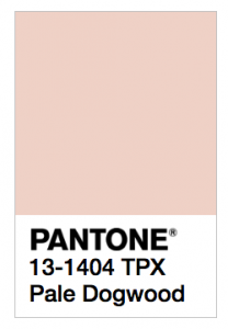
There’s still some influence of the 2016 colours of the year and Pale Dogtooth is certainly reminiscent of Rose Quartz.
The top ten colours for Spring 2017 are:
- PANTONE 17-4123 Niagara
- PANTONE 13-0755 Primrose Yellow
- PANTONE 19-4045 Lapis Blue
- PANTONE 17-1462 Flame
- PANTONE 14-4620A Island Paradise
- PANTONE 13-1404 Pale Dogwood
- PANTONE 15-0343 Greenery
- PANTONE 17-2034 Pink Yarrow
- PANTONE 18-0107 Kale
- PANTONE 14-1315 Hazelnut
It’ll be great to see how couples incorporate these colours in to their weddings next spring. If some of the unusual colour combinations from NYFW are anything to go by then we are in for some vibrant and tropical colour partnerships plus perhaps some beautiful blue gemstone décor.
Pantone® is the world-renowned authority on colour and the Pantone® Color of the Year is always really influential in any popular colour themes in fashion, interior design and weddings.
I’ve been desperate for a yellow or an orange colour to get top billing for a couple of years and I cross everything that Primrose Yellow (or even Flame) could even be the Colour of the Year in 2017 (or will it be two colours again?!) I can’t wait for the release of the news in December to find out!