by Hanami Dream | 22, November, 2016 | inspiration
An outdoors adventure with vintage transport along the beautiful riverside, followed by celebrations in a grand hall dressed in marsala and tweed with chalk board and marble design features.

See more images in our gallery and the amazing local suppliers who came together to make this shoot possible in this blog post
Photography by Farrow Photography

by Hanami Dream | 1, November, 2016 | testimonials

“Nicola’s consistent use of images featuring mums throughout her board lends a wonderful cohesive feel—it feels like all of these images could have come from one wedding. (Sometimes, mood boards can feel disjointed because images are pulled from so many different sources. This one didn’t have that issue at all.)
The even balance of colors feels professional. Greens, whites, and blacks are all placed well throughout the board—there’s no “too much” of any one color in any one spot.
This board’s imagery helps to convey a number of different aspects of a wedding. We love that Nicola included everything from cake design to typography inspiration. Overall, her board communicates a wedding that is fun, modern, and organic.
Christina Farrow, Aisle Planner – October 2016
http://community.aisleplanner.com/pantone-mood-board-competition/
by Hanami Dream | 1, November, 2016 | news
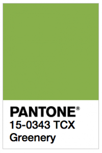
Very proud to have won the greenery mood board in the recent UKAWEP SS17 Pantone® competition.
Aisle Planner, picked the winners for each colour and shared their thoughts on their blog –
http://community.aisleplanner.com/pantone-mood-board-competition/
Many thanks to Aisle Planner for their kind words:
“Nicola’s consistent use of images featuring mums throughout her board lends a wonderful cohesive feel—it feels like all of these images could have come from one wedding. (Sometimes, mood boards can feel disjointed because images are pulled from so many different sources. This one didn’t have that issue at all.)
The even balance of colors feels professional. Greens, whites, and blacks are all placed well throughout the board—there’s no “too much” of any one color in any one spot.
This board’s imagery helps to convey a number of different aspects of a wedding. We love that Nicola included everything from cake design to typography inspiration. Overall, her board communicates a wedding that is fun, modern, and organic.”
by Hanami Dream | 1, November, 2016 | news
Really proud to have won the UK Academy of Wedding and Event Planning’s greenery SS17 Pantone® mood board competition judged by Aisle Planner this year.
http://www.weddingacademylive.com/2016/10/24/announcing-pantone-design-competition-winners/
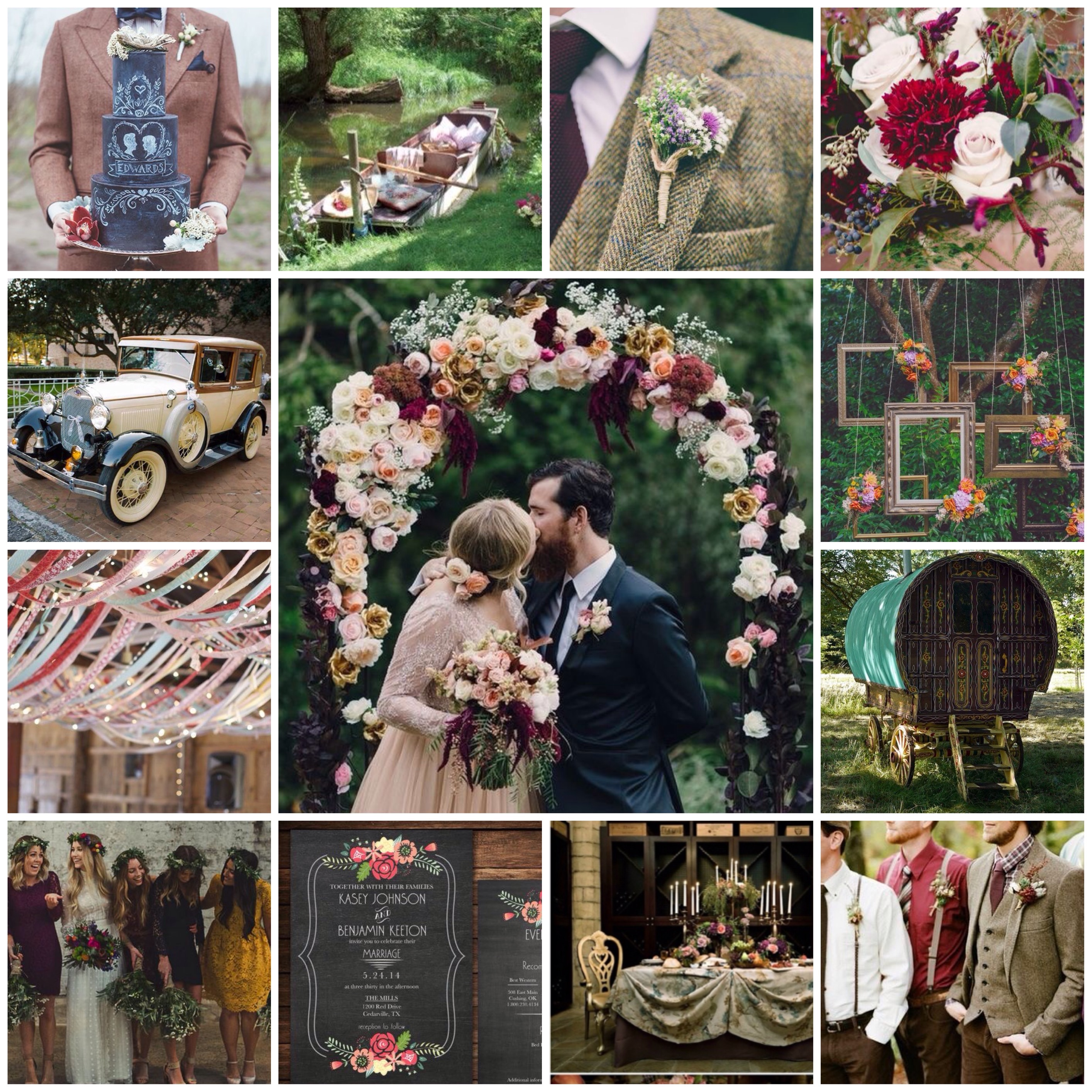
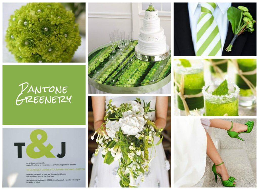 Image Credits (clockwise):
Bouquet via Intimate Weddings
Tablescape and Cake via Blooms By The Box
Tie & Buttonhole: Photographer Jaime Y Photography via Wedding Loft
Drinks: via Classic Bride
Shoes via Marriage.com
Bouquet: Photographer Will Hartl via Brides Magazine
Stationery: Photographer Jenny GG Photography via Modernly Wed
by Hanami Dream | 19, September, 2016 | blog, trends
It’s almost ironic that as soon as the weather is taking a more autumnal direction that I should start to think about next year’s springtime! Yes, the leaves might be changing colour, there may be conkers on the ground and I have even spotted mince pies in the shops today! But this is the exciting time of year when those lovely folks at Pantone® compile their top ten colours for the following spring.
We are in the throes of London Fashion Week at the moment in the UK, which is hot on the heels of New York Fashion Week (NYFW). The experts at Pantone® watched the colour trends as they happened at NYFW, with the Council of Fashion Designers of America (CFDA), and compiled their top 10 colour fashion report as a result of what they saw on the catwalks. There were about 119 different shows to watch at NYFW so it’s no mean feat for them to record how many people are using variants of colours. Interestingly there were a number of collections that grouped lots of colours together and gave some amazing combinations.
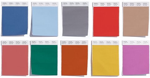
So, after I was left quite disappointed with the Fall 2016 report, I needed something to regain my faith and the Spring 2017 colours have done this in abundance!
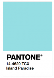
Don’t get me wrong they haven’t reinvented the wheel – its a happy evolution from the 2016 Spring colour palette. What is really striking though is the dominance and prevalence of one colour in particular. Blue appears in varying shades, such as Niagara (a denim blue), Lapis Blue (a great navy colour named after a stunning semi precious gemstone) and Island Paradise (a cooling turquoise). These take the 1st, 3rd and 5th spots respectfully on the list and are beautifully relaxing, calming and proving that, according to Pantone®, these colours ‘offer options that are not just typical of seasons’ but a great transition between the seasons.
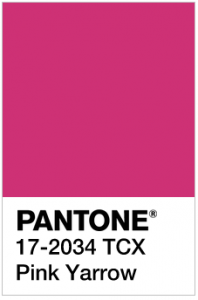
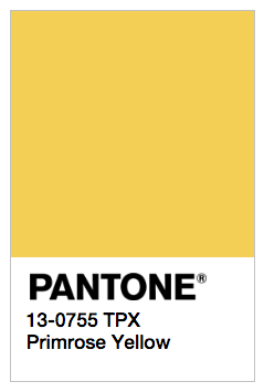
Plus it’s great to see that the supporting, accent colours are not subtle and withdrawn – its out with pastel and in with party pops of vibrant citrus colours in the form of Primrose Yellow, Flame, Greenery and Pink Yarrow. You’d be forgiven to picture slices of lemon, orange, lime or watermelon adorning glasses of long, cool summer cocktails, enjoyed whilst laying in a hammock on a tropical island paradise.
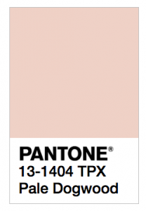
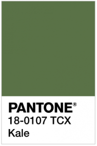
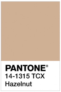
This palette of ten fresh and vibrant colours brings bright, light and sunny colours to help us get through the next few darker months! The names of the colours also add to the vision of spring flowers popping up with primroses, yarrow, dogtooth and luscious foliage (in the form of Kale). Teamed up nicely with a lovely neutral (Hazelnut) for a real flavour of nature.
There’s still some influence of the 2016 colours of the year and Pale Dogtooth is certainly reminiscent of Rose Quartz.
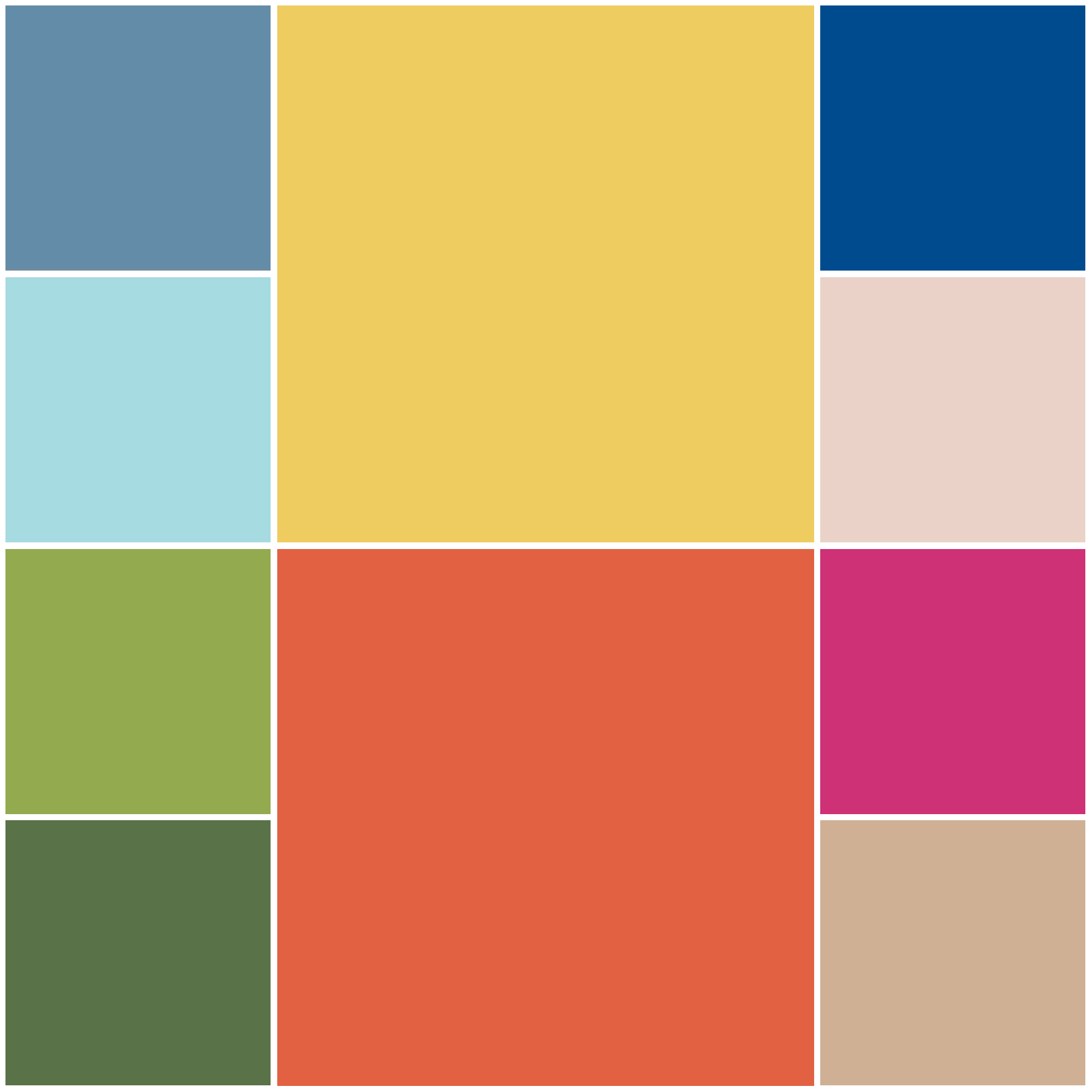
The top ten colours for Spring 2017 are:
- PANTONE 17-4123 Niagara
- PANTONE 13-0755 Primrose Yellow
- PANTONE 19-4045 Lapis Blue
- PANTONE 17-1462 Flame
- PANTONE 14-4620A Island Paradise
- PANTONE 13-1404 Pale Dogwood
- PANTONE 15-0343 Greenery
- PANTONE 17-2034 Pink Yarrow
- PANTONE 18-0107 Kale
- PANTONE 14-1315 Hazelnut
It’ll be great to see how couples incorporate these colours in to their weddings next spring. If some of the unusual colour combinations from NYFW are anything to go by then we are in for some vibrant and tropical colour partnerships plus perhaps some beautiful blue gemstone décor.
Pantone® is the world-renowned authority on colour and the Pantone® Color of the Year is always really influential in any popular colour themes in fashion, interior design and weddings.
I’ve been desperate for a yellow or an orange colour to get top billing for a couple of years and I cross everything that Primrose Yellow (or even Flame) could even be the Colour of the Year in 2017 (or will it be two colours again?!) I can’t wait for the release of the news in December to find out!
by Hanami Dream | 17, May, 2016 | inspiration
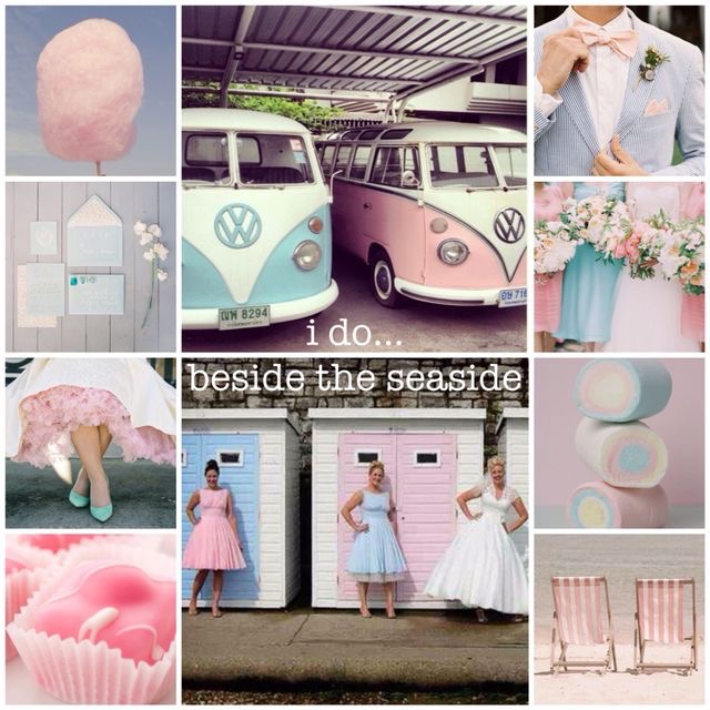
where the brass band plays… a sugary, sweet retro British seaside wedding complete with pink and blue pastels galore plus beach huts, candy floss, a giant french fancy tiered cake, stripy deck chairs, ice creams, marshmallows, mix & match bridesmaid dresses and his & hers camper vans to arrive in style
Oh, I do love to be beside the seaside, beside the prom!
Images curated on Pinterest
credits:
(left from top to bottom)
Candy floss – Tumblr via http://Tumblr via http://bestfriendsforfrosting.com/2014/06/nine-ways-to-celebrate-the-everyday/
Stationery – http://www.postcalligraphy.com/ via http://www.stylemepretty.com/vault/gallery/22688
Dress and shoes – Photography by Tiffany Hughes via http://ruffledblog.com/1950s-inspired-auburn-wedding/
French fancies – Photography by Phil Wood Photo via https://www.flickr.com/photos/philwoodphoto/8464589943/
(middle from top to bottom)
Camper vans – Photography by Katleen via http://www.ministyleblog.com/?offset=1414530000000
Beach huts – via @beccadv1 Pinterest
(right from top to bottom)
Suit – by Kat Braman via http://southernweddings.com/2014/12/30/2014-memorable-menswear/
Bridesmaids’ dresses – Photography by Jen Huang via http://www.greylikesweddings.com/real-weddings/by-style/romantic/nantucket-wedding-the-white-elephant-inn/
Marshmallows – Macaronn via http://macaronn.tumblr.com/post/37109227732
Deckchairs – Snap Ginger via http://www.snapginger.com/blog/2014/6/16/pick-my-up-playlist7-9-14
by Hanami Dream | 11, February, 2016 | blog, trends
We’ve had a gloriously sunny (albeit a bit chilly) day today. What a welcome change after all the recent wet and windy weather in the UK. Whilst it might still officially be winter, the blossom on the trees and the daffodils certainly think it’s Spring already here! Plus, every day we are gaining 6 more minutes of daylight and it’s not long until the clocks change and then we’re in the home straight to summer! Not that we’re wishing the year away but our thoughts have been drawn to the autumnal months already with the exciting announcement from Pantone® today.
Released to coincide with New York Fashion Week, Pantone® have announced their colour report for Fall 2016 with some more soothing colours following the trend of their predictions for Spring/Summer 2016.
Before you read any further, I want to get across how much of a huge fan of Pantone® I am. Maybe this is why I’m so disappointed and how I feel a bit short changed from this latest report. After the shock of getting two colours of the year in 2016, I was full of anticipation to see what the next big twist would be and what excitement was in store. But I’ve been left a little flat. It seems that half of the ten colours for Fall 2016 are duplicates from the Spring/Summer 2016 predictions. I feel like I’ve seen this before.
Forgive me, but to me the first 5 colours (of Riverside, Airy Blue, Sharkskin, Aurora Red and Warm Taupe) could easily be mistaken for Snorkel Blue, Serenity, Lilac Grey, Fiesta and Iced Coffee announced in the Spring 2016 report.
Don’t get me wrong, I really like these 5 colours, which (with the exception of Aurora Red) are beautifully delicate and calming – perfect for a wedding palette at any time of the year.
In addition, the other five colours are earthy, rich and grounding. They remind me of a fantastic laid back holiday in the autumn sunshine of Marrakech. Exploring the souks, relaxing on the terrace of a riad and looking out at the Atlas Mountains on the horizon as the sun sets. They take in all the varied beauty of Morocco including its coast, the lush valleys, stunning mountains and all the way to the desert. Isn’t it amazing how colour evokes so much feeling and memories as well as a sense of escapism!
The top ten colours for Fall 2016 are:
- Riverside (PANTONE 17-4028)
- Airy Blue (PANTONE 14-4122)
- Sharkskin (PANTONE 17-3914)
- Aurora Red (PANTONE 18-1550)
- Warm Taupe (PANTONE 16-318)
- Dusty Cedar (PANTONE 18-1630)
- Lush Meadow (PANTONE 18-5845)
- Potter’s Clay (PANTONE 18-1340)
- Spicy Mustard (PANTONE 14-0952)
- Bodacious (PANTONE 17-3240)
Pantone® is the world-renowned authority on colour and the Pantone® Color of the Year is always really influential in any popular colour themes in fashion, interior design and weddings.
I can’t wait to see these autumnal colours featuring in couples’ colour schemes and personally love the combination of Potter’s Clay, Spicy Mustard and Bodacious for being a bit different.
It’s always great to see fresh new colours and combinations, so this time I guess I’ve been left wanting (and maybe expecting) just a little bit more.
See some of our trend predictions for weddings in 2016.
by Hanami Dream | 16, December, 2015 | blog, trends
Weddings are a wonderful celebration of love and marriage. They can blend together families, traditions, cultures, creativity and lots of personal touches. Whether a religious, civil or humanist ceremony, a traditional or themed reception, these special days are about what is important to each individual couple.
Despite some couples’ originality, there are always trends that appear and popular themes that epitomise a particular era (think puff ball sleeves from the eighties). Sometimes fashion, films, television programmes, interior design, celebrity weddings and even current affairs influence these trends. Of course, there are some timeless and classic themes that never seem to go out of favour, and with the latest film in the Bridget Jones series set for release next year we’re sure the romantic theme will continue to be strong.
So what does 2016 hold for us? Well for one thing, it is a leap year. So will it bring about lots of proposals from women on the 29th February and encourage some excited wedding planning as a result?
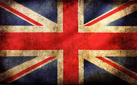
It will be a time of revelry as a nation again as the Queen will be celebrating her 90th birthday on 12th June. This could prompt some street party themes using inspiration from the Union Jack colours. Red, white and blue could also be at the forefront of people’s minds with the culmination of the American elections as well.
Plus, let’s hope we’re also able to mark the achievements of our British footballers in the UEFA Euro 2016 finals in France and Spain, as well as our athletes in the Olympics next year. Maybe some sporting themes could become prevalent as a result of these events or perhaps weddings will be inspired by the Rio party atmosphere of the Brazilian venue of the Olympics.
2016 also marks 350 years since the Great Fire of London, 400 years since the death of William Shakespeare, 950 years since the Battle of Hastings and 50 years since England win the football World Cup.
Take a look at our curation of predictions for wedding trends to look out for in 2016 (and see more of our inspiration at pinterest.com/HanamiDream/):
Venue / themes
- Jungle themes could see an increase next year with the CGI live action release of the Jungle Book film. Think subtle animal prints and loads of greenery. Marry this with the excitement of the Rio Olympics and you’ll be transported to the stunning, relaxing and lush green rainforests of Brazil, surrounded by colourful and vibrant décor in greens, blues and gold. A carnival full of samba dancers, exuberant feathers, magnificent masks and energetic music will get everyone joining in!
- Or perhaps a more civilised tea party could be more up your street, inspired by the release of the film, Alice Through The Looking Glass. This is going to be Tim Burton at his best again so think quirky and extravagant details. Afternoon tea with a twist.
- Perhaps a wild west theme complete with cowboys appeals to you – wanted posters, panning for gold and arriving on horseback just like the Magnificent Seven in the 2016 film remake.
- Comic book inspiration comes in the form of new films of Batman v Superman, X-men: Apocalypse, Angry Birds, Teenage Mutant Hero Turtles: Out of the Shadows and Captain America: Civil War. Your inner child can go to town and have colourful, playful fun with this theme or perhaps you want to use more of a hint of the gothic style comic books. Alternative bouquets made of comic pages, mini action figures instead of button holes, secret identity t-shirts under the groomsmen’s shirts, superhero capes for the guests or cartoon invites can bring this theme together.
- Or perhaps, an outdoors medieval banquet would suit your big day in the same vein as the Knights of the Round Table: King Arthur film directed by Guy Ritchie. With floral crowns, moss, wicker and naked cakes in a beautiful castle setting or in a stunning forest or garden.
Décor
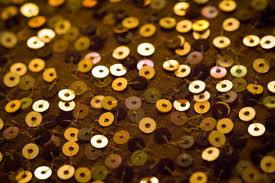
- We are so pleased that the metallic trend seems to be still going strong and not showing any signs of tiring just yet. Sequins are a welcome addition to this trend or pair metallics with cool agate for a contemporary feel.
- By contrast, there’s also a uprising of tribal prints with the influence of Moroccan and Indonesian accents. Dark woods, earthy colours and block prints.
- Romantic themes are still using ruffles and the use of ombré colouring on anything you can and for a cute factor there’s good old polka dots.
- Video booths are seeing a surge in popularity as technology continues to move forward and couples are looking for more unique and original ways to capture and remember their big day. However, some are also using their weddings as a chance to have a break from technology and encouraging their guests not to use their phones during the day.
- This old vs new trend continues as some chose to use classic styled furniture brought up to date such as beautifully designed chalk boards whilst others choose modern styling with Perspex chairs and tables.
- Backdrops were the big news of 2015, but next year is all about aisle runners – whether these are printed, a covering of petals or use clever lighting.
- On top of this suspended décor is all the rage – for an industrial chic style with Edison lighting or floral chandeliers in a rustic theme.
Flowers
- Flowers are a big focus in 2016 not only in the décor but with hair accessories and headwear. Plus a new trend of ring corsages is emerging and the use of wild flowers like daisies.
- It doesn’t all have to be about the flowers as foliage will be as important or instead of flowers in displays.
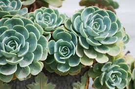
- Alternatives to traditional flowers are seeing the use of succulents in bouquets, on tables and given away as favours.
- Plus instead of the usual confetti, there is now a herb toss as another option which gives such lovely aromas to this part of the day.
 Clothing
- Bridal wear is really seeing a big shift in trends to provide new, innovative and unusual styles to make sure the bride makes a statement and is different to any other on her big day. Trends that appearing on the catwalks (that will surely influence trends next year) include: mix & match separates, crop tops, high necklines, off the shoulder, asymmetric hems, backless dresses and plunging v necks on the back.
- For the more daring and alternative bride perhaps try fringing, jumpsuits, palazzo pants, peakaboo skirt or even a cape.
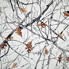
- Rather than a plain dress, some brides are opting for a floral one or even camo print (which is starting to be really popular in the US – not necessarily in classic hunting camo but how about a pink or snow camo, or try accessorising the traditional camo with orange accents).
- Not ready for this kind of statement just yet, then perhaps you can go the extra mile with your footwear. Perhaps using your shoes to highlight the colour of the day or to write your feelings on the soles so everyone can see when you kneel at the alter!
- For the men, it’s all about smartening up next year – go the whole hog with a tuxedo.
 Colours
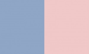
- The Pantone® Color of the Year 2016 will certainly play a big part in influencing colours next year. And next year we get two colours for the price of one in the form of Rose Quartz and Serenity. It’s the first time Pantone® have ever announced two colours and a long time since a pastel colour has hit the top spot. They are a nice calm change to the recent bold jewel colours of the last ten years. We can already see these colours featuring singly in couples’ colour schemes and look forward to seeing people using them in tandem too. There certainly won’t be a shortage of choices for your ‘something blue’!
- So pastels will be big next year and play a big part in the use of non-traditional colours for the wedding dress becoming more popular.
- We predict that there will be more mix and match styling with the bridesmaids – either with different styles in one colour or bridesmaids’ dresses using different colours that all tone in together.
- We look forward to seeing more dark blues, silver, mocha and terracotta.
Cakes & catering
- There’s nothing we like more than cake but next year will see a few alternatives coming to the fire front. Firstly some couples will be using their cake as the pudding so it might not take a tradition guise instead it might be a cheesecake or pancake stack.
- Also making an appearance with be the cake fake – all the style and presence but not actually a cake. Welcome the pork pie stack, cheese ‘cakes’, or three tiers of quiche.
- If it is a real cake then look out for mixed shapes tiers and more ‘free from‘ varieties making an appearance.
- Above everything food will be theatrical in 2016 and take centre stage – we can’t wait for more champagne towers to join the revival!

These are a few of our predictions for wedding trends in 2016. See more of our curation and inspiration at pinterest.com/HanamiDream/
May we take this opportunity to wish you a very happy Christmas and all the best for the New Year.

by Hanami Dream | 3, December, 2015 | blog, trends
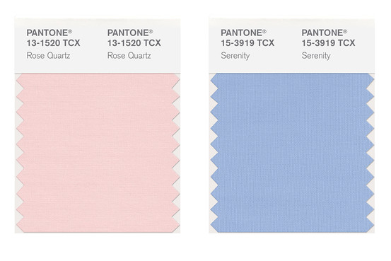
The Pantone® Color of the Year 2016 is Rose Quartz AND Serenity. Yes, we get two colours for the price of one next year. It’s the first time Pantone® have ever announced two colours and a long time since a pastel colour has hit the top spot. They are a nice calm change to the recent bold jewel colours of the last ten years. We can already see these colours featuring singly in couples’ colour schemes and look forward to seeing people using them in tandem too.
Pantone® is the world-renowned authority on colour and the Pantone® Color of the Year is always really influential in any popular colour themes in fashion, interior design and weddings.
Our guess for the Color of the Year 2016 was for Peach Echo, Buttercup or a great neutral colour like Iced Coffee. However we we didn’t see two colours coming! Nor a pastel colour. What we have got is something more relaxing and more choice.
by Hanami Dream | 25, October, 2015 | testimonials

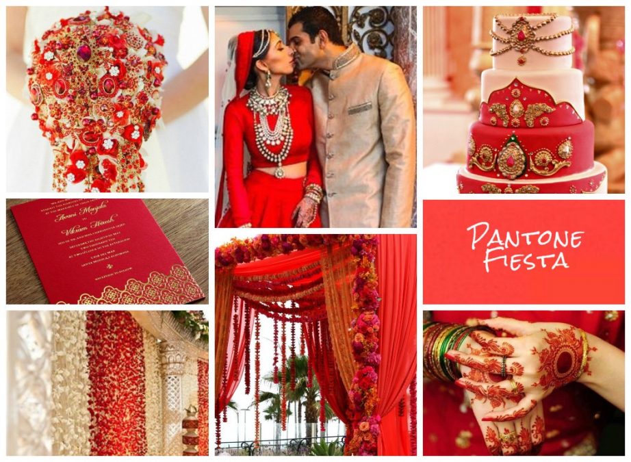
“Fiesta is bold, bright, exciting, and a total party color, which is why Nicola Jackson’s energetically red mood board was the winner for me. Indian weddings are big, colorful, (often) week-long events with a multitude of parties and red is a beautiful color for that amount of enthusiasm. Plus look at that cake – it’s fit for a queen!”
Sara, Burnett’s Boards – October 2015