Late sunshine
I have loved the late summer sunshine this week. With the children all back at school, I’ve actually felt like I’ve been on holiday as I have managed to eat my lunch sat in the garden in the sunshine with peace and quiet. It’s been lovely to extend that summer vibe for a little longer. We had such a wonderful summertime that I didn’t want it to end. We managed our first holiday in 2 years and got to relax and breathe in the sea breeze.
But seasons come and seasons go and I know that the nights drawing in is a signal of the entrance of autumn – quick on the heels of a glorious summer break.
However, my thoughts are being drawn to the lighter Spring days already and dreams of holidays, as the latest Pantone® announcement predicts that the colours that will dominate the scene for next year’s Spring and Summer are calming and evocative for travels further afield.
Spring 2022
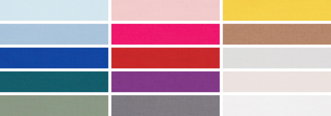
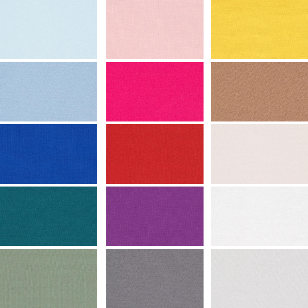
With the fashion weeks just kicking off, Pantone® have revealed the Spring/Summer colours to look out for in 2022 including 10 seasonal colours alongside 5 neutral classics.
There is an abundance of blues in the mix for next year, alongside a vibrant collections of bold colours. To me, they encapsulate two of my favourite things – being by the seaside, plus a joyous celebrations of colourful florals in my garden.
The Pantone Color Institute’s executive director Leatrice Eiseman said “Half are in calming colors. Obviously, everyone wants to feel they’re in a safe haven. On the other hand, there is the very human proclivity of wanting to get out and be active again. That’s where the more energetic colors come in. The latter offer more experimentation.” Eiseman added. “Brighter colors lift your spirits and let you abandon the rules about color that you learned, when you were older. They bring you back to being a kid again and teach you to celebrate something in your life that will give you pleasure.”
I do like to be besides the seaside
We were so pleased to make it to a few beaches in both Scotland and Wales over the summer. With some wonderful coastal walks, harbour visits and simply playing on the sand. Eating fish and chips or ice creams always taste better when sitting by the seaside. The change of scene and pace of life are certainly relaxing. Just watching the rhythm of the sea washing in and out provides a real sense of escapism.
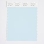
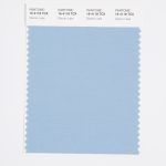
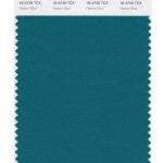
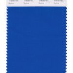
I’m delighted that blues seem to be centre stage in the mix of colours for next year (perhaps eluding to one of them being the Colour of the Year 2022?). The beautiful seascape includes Spun Sugar, Glacier Lake, and Skydiver, along with a teal blue of Harbour Blue.
Cool pastel colours
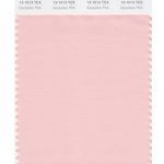
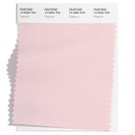
The fragility of things at the moment couldn’t be described better than the name of the pale pink colour in Gossamer Pink – conjuring up images of dewy spiders’ webs glistening in the early spring sunrises.
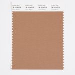
Teamed with a warming Coca Mocha and the earthy and pale neutral colours – it feels as fresh as newly washed sheets on the washing line in the summer breeze. The refreshing feeling we all need for our health and wellness.
Gardening companions
Even before lock down, I had got the gardening bug and had started growing and propagating my own flowers and vegetables. It started with an obsession for succulents and indoor plants (I daren’t say the number out loud of how many house plants I have at the moment!) which spilled out in to the outdoors.
We have loved growing our own fruit and vegetables and now filling the garden with more home grown flowers too. Gardening is such a relaxing and a very worthwhile past time that is currently seeing a soar in popularity. The lock down has certainly made everyone appreciate being outside and enjoying improving their natural surroundings.
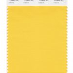
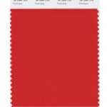
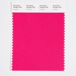
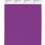
So the vibrant names of some of the colours conjure up joyful colours of spring and summer flowers just as I’m planning and planting my bulb lasagne for next year (such as the bright Daffodil colour). I’ve tried growing dahlias this year and can’t wait to try more in 2022 perhaps in the purple of Dahlia, or vibrant pink Innuendo. Along with the travel inducing flamboyant Poinciana tropical tree from Madagascar.
Old favourites
It’s reassuring to also see the current colours of the year 2021 still showing their prescience and easing us through the transition to another year. Although with different names, you can still identify the yellow of Illuminating (which I correctly tipped this time last year as the Colour of the Year 2021) and also Ultimate Gray in the neutral classics.
Spring 2022 colours
- Spun Sugar 12-4401
- Gossamer Pink 13-1513
- Daffodil 14-0850
- Glacier Lake 16-4118
- Poinciana 18-1564
- Coca Mocha 18-1019
- Innuendo 18-2042
- Dahlia 18-3324
- Harbor Blue 18-4728
- Skydiver 19-4151
- Spun Sugar 12-4401
- Gossamer Pink 13-1513
- Daffodil 14-0850
- Glacier Lake 16-4118
- Poinciana 18-1564
- Coca Mocha 18-1019
- Innuendo 18-2042
- Dahlia 18-3324
- Harbor Blue 18-4728
- Skydiver 19-4151
Spring 2022 extra colours from LFW
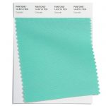
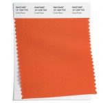
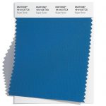
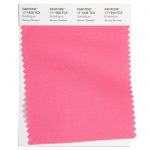
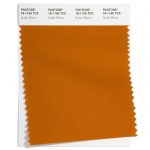
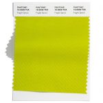
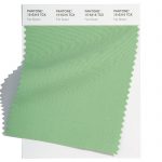
In the main the colours are repeated at London Fashion Week, albeit in different shades of browns and pinks. However the emphasis shifts from the blues and bright red of NYFW to more rusty orange colours at London Fashion Week in the shape of Coral Rose and Sudan Brown. There is also an additional neon lime green and a really striking turquoise of Cascade.
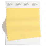
Here are the colours from LFW to round off the colours for Spring 2022:
- Cascade 14-5713
- Coral Rose 16-1349
- Super Sonic 18-4143
- Popcorn 12-0825
- Potpourri 13-2004
- Bubblegum 17-1928
- Sudan Brown 18-1160
- Fragile Sprout 15-0549
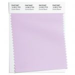
- Orchid Bloom 14-3612
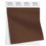
- Coffee Quartz 18-1307
Aside from two grey colours in the neutral section, the colours differ greatly which makes it hard to see a clear winner for colour of the year in 2022.
Neutral classics
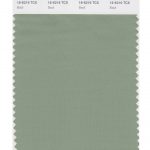
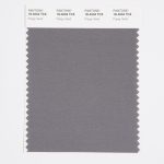
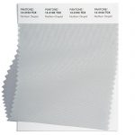
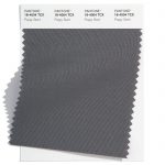
Pantone® have also updated the Classic Colour Palette. These are a group of neutrals that are core basics in the form of a white, cream, khaki green, plus light and dark grey. Perfect grounding colours and perfect peaceful additional colours for weddings.
The bonus classic neutral colours for Spring 2022 are:
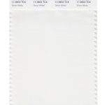
- Snow White 11-0602
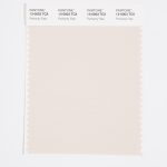
- Perfectly Pale 13-0003
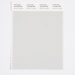
- Northern Droplet 14-4104
- Basil 16-6216
- Poppy Seed 18-4004
- Snow White 11-0602
- Perfectly Pale 13-0003
- Northern Droplet 14-4104
- Basil 16-6216
- Poppy Seed 18-4004
And at LFW these are:
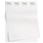
- White Alyssum 11-1001
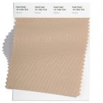
- Humus 15-1304
- Fair Green 15-6316
- Northern Droplet 14-4104
- Poppy Seed 18-4004
Colour themes
It’ll be great to see how couples incorporate these colours in to their weddings next year. There’s plenty of scope for unique colour combinations and personalisation.
Pantone® is the world-renowned authority on colour and the Pantone® Color of the Year is always really influential in any popular colour themes in fashion, interior design and weddings.
Look out for my report when the 2022 colour of the year is released later in the year.
Sign up to receive the latest wedding planning tips, tools, trends and traditions straight to your inbox.

