Back to school
I really didn’t want the summer to end this year. I enjoyed all those long lazy summer days together as a family and loved being by the seaside. There’s just something about being by the sea. And like Moana, the line where the sky meets the sea – it calls me and I come back to the water.
So with a bad dose of the post holiday blues, it has been back to school and routine again this week. But I’m ready for the new term and am feeling rejuvenated with some new (school) year resolutions.
My back to school blues have already been allayed thanks to the latest Pantone® announcement. Their prediction of colours that will dominate the scene for next year’s spring and summer are a wonderful reminder of my recent summer holiday with some calming sea colours, pale ice cream colours, alongside some bold primary colours.
Spring 2020
So with the fashion weeks kicking off (this week is New York, then on to London, Milan and Paris), Pantone® have shown their hand for the Spring/Summer colours to look out for early in 2020. And it’ll be great to see which colours will appear in weddings next year.
At first glance I was disappointed as the colours have a similar look and feel to last year I didn’t expect it to feel so repetitive of what we’ve seen recently. I had imagined that the seascape of blues and greens would be more dominant and there would be more of a pastel palette. So I was surprised to see such a vibrant set of colours that we’ve already seen with red still at the forefront.
However, on closer inspection, I realise that maybe this kind of stability is exactly what we need at the moment in a country of such uncertainty. Perhaps an air of familiarity is calming in a sea of constant change. In times of austerity, reusing and recycling saves not only the pocket but the environment too.
Bold primary colours
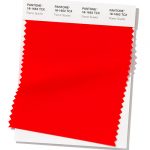
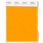
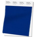
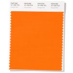
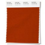
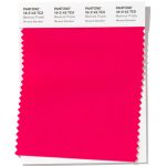
It feels quite fitting at the time of year when the children are going back to school that the top three colours to be announced at NYFW are the bold primary colours of red, yellow and blue (Flame Scarlet, Saffron and Classic Blue respectively). It feels like a big back to basics statement and an education on how you learn colours first at school. And is this a subconscious way of displaying political allegiances too? These are strong, emotive and empowering colours. Take a look at my stance on the colour red in my colour report for Fall 2019 colours.
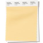
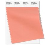
Ice cream pastels
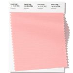
For balance, there are a set of paler tones of each of the main bold colours which provide softer versions. It’s like looking at ice cream cones dripping with vanilla, strawberry and mint ice cream (of Sunlight, Coral Pink and Biscay Green).
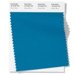
Seascape
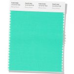
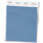
On reflection, I shouldn’t be disappointed at this set of colours as there are actually three blues that have made it in to the Spring list (of Classic Blue, Faded Denim and Mosaic Blue) and some complementary greens of Chive and Biscay Green to make up a beautiful seascape. And blue is my hot tip for the Pantone Colour of the year in 2020.
Transitional warm secondary colours
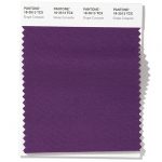
Alongside the primary colours sit the secondary colours of green, orange and purple. A perfect lesson on how to mix colours – keeping the theme of back to (school) basics at the forefront. These are also warm. comforting and remincenct of a nice mug of mulled wine. Even the colour names of Cinnamon Stick, Orange Peel and Grape Compote are fragrant and warming.
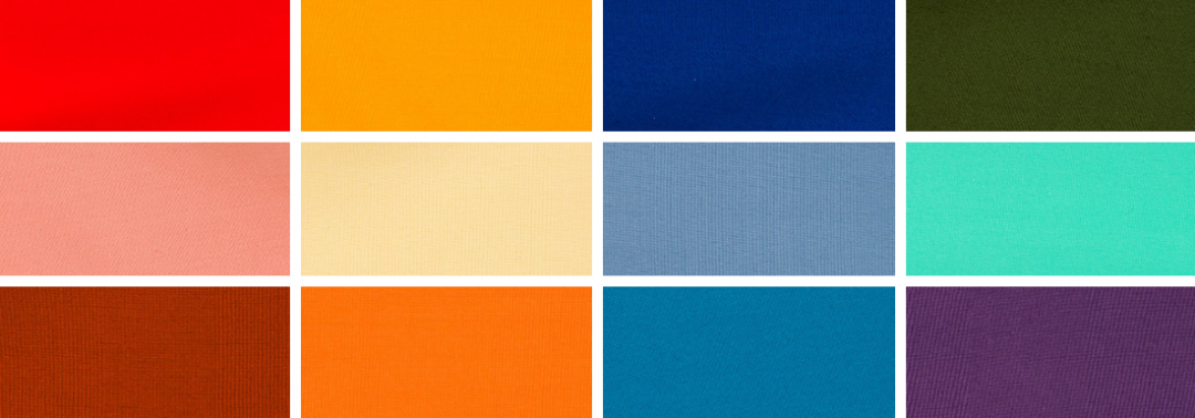
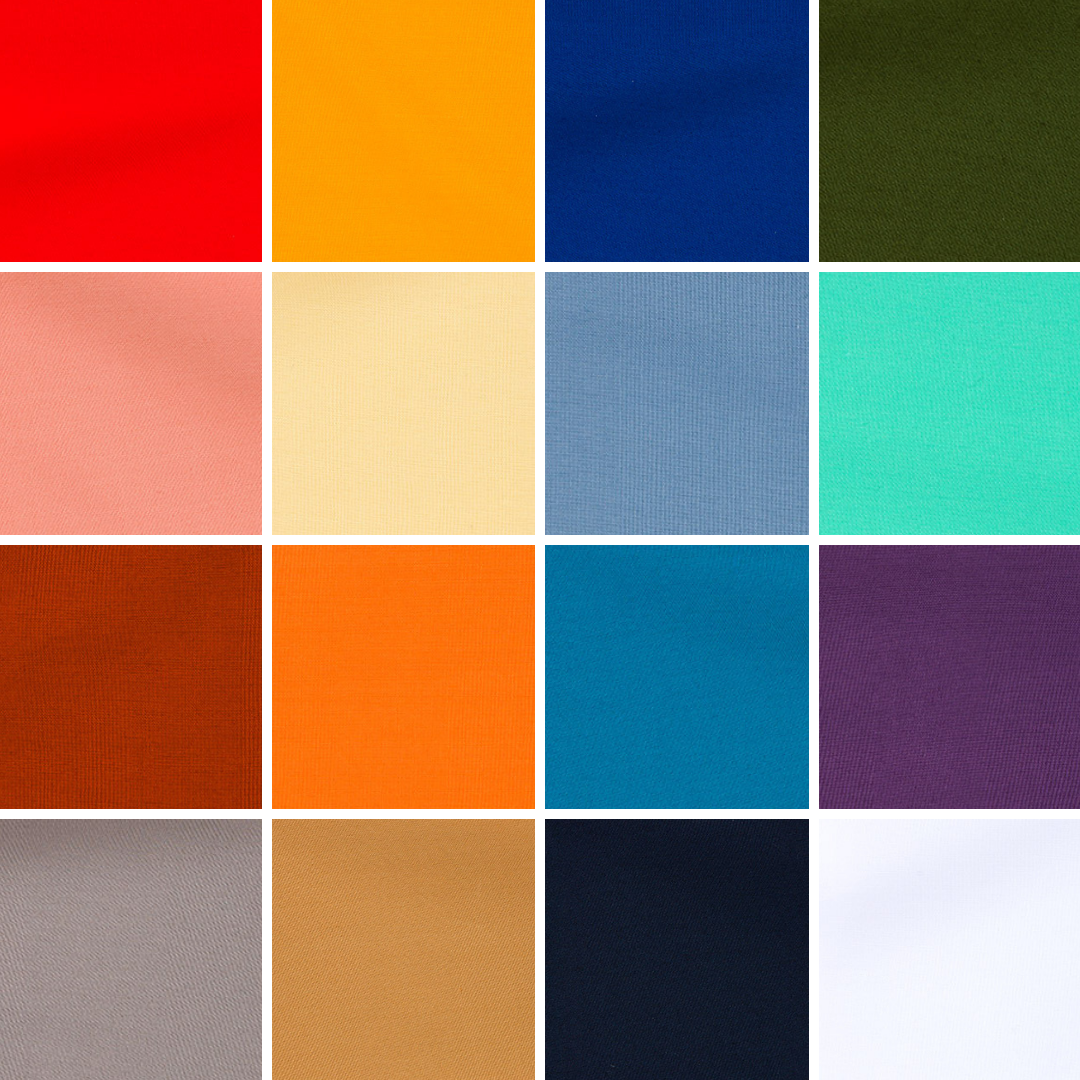
Spring 2020 colours
- Flame Scarlet PANTONE 18-1662
- Saffron PANTONE 14-1064
- Classic Blue PANTONE 19-4052
- Biscay Green PANTONE 15-5718
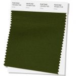
- Chive PANTONE 19-0323
- Faded Denim PANTONE 17-4021
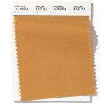
- Orange Peel PANTONE 16-1359
- Mosaic Blue PANTONE 18-4528
- Sunlight PANTONE 13-0822
- Coral Pink PANTONE 14-1318
- Cinnamon Stick PANTONE 18-1345
- Grape Compote PANTONE 18-3513
Spring 2020 extra colours from LFW
Plus a couple of additional pinks (rather than an orange and denim) from London Fashion Week round off the colours for Spring 2020:
- Beetroot Purple PANTONE 18-2143
- Blossom PANTONE 14-1513
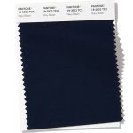
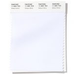
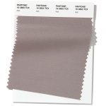
Neutral basics
- Lark PANTONE 16-1324
- Navy Blazer PANTONE 19-3923
- Brilliant White PANTONE 11-4001
- Ash PANTONE 16-3802
Colour themes
It’ll be great to see how couples incorporate these colours in to their weddings next year. I can see how the classic neutrals will play a big part in coupling up with some of the more vibrant choices.
Pantone® is the world-renowned authority on colour and the Pantone® Color of the Year is always really influential in any popular colour themes in fashion, interior design and weddings.
See some of my trend predictions for weddings in 2019 and look out for my report when the 2020 colour of the year is released later in the year.
Sign up to receive the latest wedding planning tips, tools, trends and traditions straight to your inbox.
sign up to receive the latest posts straight to your inbox
wonderful wedding wares