by Hanami Dream | 27, December, 2017 | news
I hope you’ve had a wonderful time celebrating Christmas. At this between and betwixt time, I often take the time to reflect on the past year. And what a fantastic year it’s been for Hanami Dream weddings and special occasions in 2017.

This year, my focus has been on developing the blog commercially, as well as providing inspiration to brides and grooms in the Cotswolds. Plus I’ve continued to combine my marketing experience, with my local knowledge, in the scope of the wedding industry. It has been great to provide marketing consultation to some local, independent wedding businesses in and around Witney, Oxfordshire and the Cotswolds. I’ve been affectionately titled the Wedding Inspector – a bit like the Alex Polizzi of the local wedding industry!
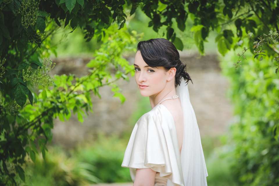
I’ve also organised a festival style wedding open day, along with three styled bridal shoots with some amazing local suppliers this year. These have included The Secret Garden, Festival and Journey to the Centre of the Earth themes (look out for images from the latter of these coming soon). I was chuffed to have these shoots featured on Bride Magazine online and SoGlosWedding too.
#UKWedLunch has been going over a year now and attracts new followers every week. This is a great Twitter hour for wedding planning in your lunch break with other brides to be, grooms to be and wedding professionals in the UK.

I’m delighted to have enquiries for different aspects of the business including venue styling and consultancy, as well as such lovely testimonials from happy couples and suppliers I’ve worked with in 2017.

The blog featured posts on different elements of wedding planning, local wedding venue reviews, wedding fairs, wedding transport, favours, alternatives to bouquets, wedding cakes and some wonderful guest posts from local wedding professionals (with top tips and an insight in to different elements of wedding planning from their area of the wedding industry). Plus my series titled ‘the holy trinity of wedding planning’ looked at wedding budgets. See the top posts of 2017.

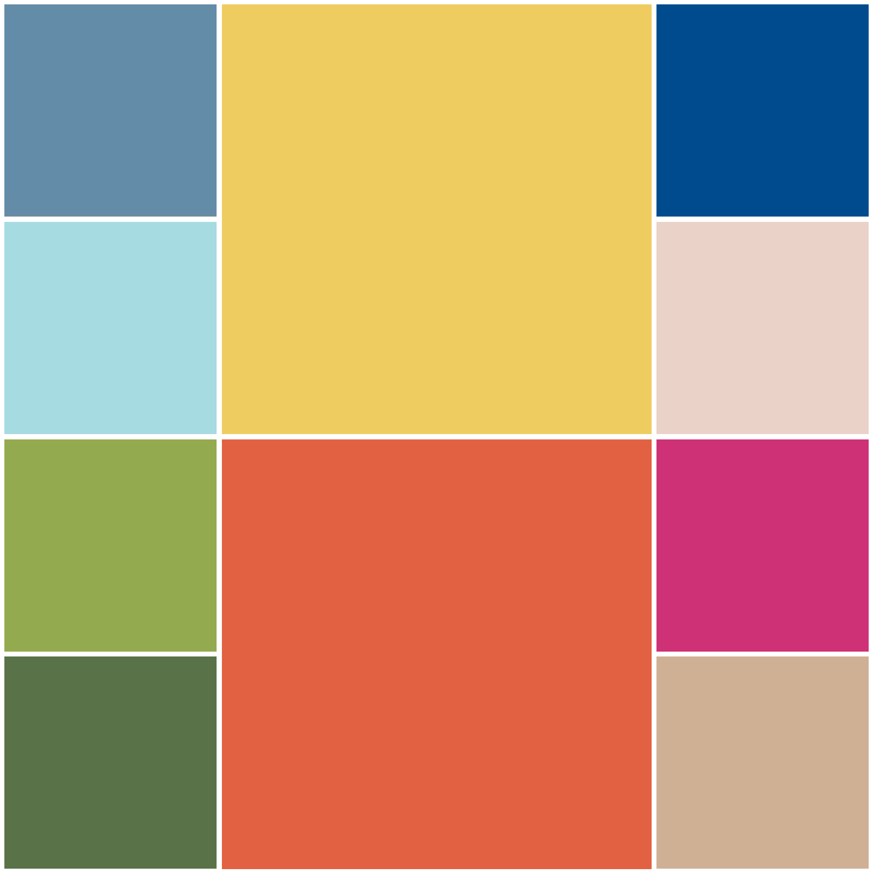
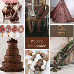
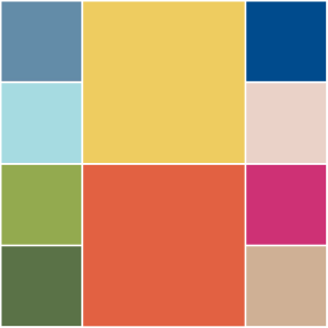
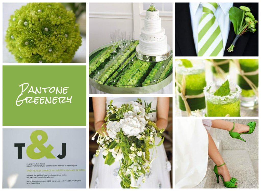
My blog has had an exciting year and continues to go from strength to strength. The highlights of 2017, were being a finalist in the UK Blog Awards in April again, having one of mood boards picked as finalist again in the UK Academy of Wedding and Event Planning SS18 Pantone® colour trend challenge, plus I was proud to win Theo Paphitis’s Small Business Sunday #SBS recently.
Now is also a great time to look forward to working with more local wedding professionals, services and venues in the brand new year ahead. #keepitlocal. And I can’t wait to produce more styled photo shoots and have opportunities to collaborate with local suppliers.
Please get in touch if you’d like to advertise on the blog, submit your own wedding details, would like to collaborate on a shoot, write a guest post or need some marketing advice and guidance. Together we can build the local wedding industry and inspire brides and grooms for their special day.
Many thanks for your support in 2017 and here’s to an exciting and very Happy New Year!


by Hanami Dream | 8, March, 2017 | #UKWedLunch
#UKWedLunch – Wednesday 8th March 2017
As well as general wedding planning chat, this week we look at colour trends in 2017 #UKWedLunch
Are you getting married in 2017? What is the colour scheme for your wedding? #UKWedLunch
TOP TIP 1: Consider the season of your wedding when picking a colour theme to match flowers and trends #UKWedLunch
TOP TIP 2: Spring and summer colour trends tend to be brighter, lighter and often pastel shades – see 2017 trends here https://www.hanamidream.co.uk/top-10-spring-2017-colours-from-pantone/#UKWedLunch
TOP TIP 3: Autumn and winter colour trends tend to be cooler, richer and darker shades – see 2017 trends here https://www.hanamidream.co.uk/top-10-fall-2017-colours-from-pantone/ #UKWedLunch
TOP TIP 4: Consider the colour of the year in your colour scheme – it’s greenery in 2017 https://www.hanamidream.co.uk/pantone-announce-the-color-of-the-year-2017/ #UKWedLunch
TOP TIP 5: Think about what your colour scheme needs to work with: venue, attendants, accessories, stationery. Use neutrals too. #UKWedLunch
This week’s top tips are taken from www.hanamidream.co.uk/category/trends/ #UKWedLunch
As well as general wedding planning chat, next week’s theme will be on ‘wedding anniversaries‘ #UKWedLunch
JOIN US EVERY WEDNESDAY! on Twitter between 1-2pm GMT


by Hanami Dream | 23, February, 2017 | blog, trends
I’m not going to lie, I’m like a kid on Christmas Eve when I’m waiting with baited breath for the Pantone® announcements. For three times a year, I feel like a proper journalist waiting for the news to break about the next season’s top colours. (And I’m nearly beside myself waiting for the colour of the year announcement in December!)
Yes, I get excited! So when the fashion week season kicks off (this month is New York, London, Milan and then Paris) I’m on stand by waiting for Pantone® to make their declaration.
And it was quite a delay this time, as Pantone® waited until not only after New York Fashion Week to finish, but London as well. Whilst the fashion crowd have now moved on to Milan, I was beginning to think that Pantone® weren’t going to reveal a colour report at all this time. And if I may moan about Pantone® for one minute, I must say that I’m disappointed that it is less about their predictions now and more just about counting colours that designers have used. Don’t get me wrong, their report is comprehensive and incredibly impressive (blimey, there were around 180 shows at NYFW alone!) but I guess I feel it’s less about foresight in advance now.
However, it is good that their analysis is taking more of an international view for the first time and this report is a great overview of fashion designers’ use of colour in their Autumn/Winter 2017/2018 collections.
Plus I’ve already fallen deeply in love with the collection of colours that will trend this Autumn. Don’t get too excited. There’s no huge surprises. In fact, I probably could’ve written this article without even seeing the colours as they’re fairly typical and what you’d expect.
But they are a beautiful, rich collection of classic autumnal colours.
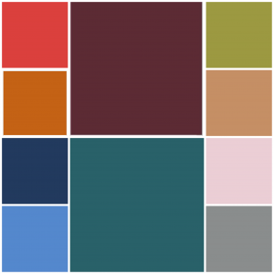
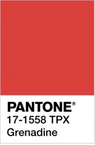
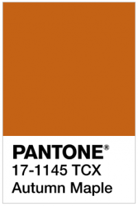
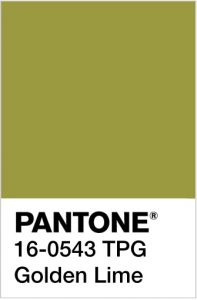
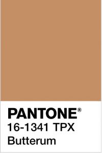
Looking at them makes me want to run, jump, kick and roll in a pile of crunchy fallen leaves all in the vibrant hues of Grenadine, Autumn Maple, Golden Lime and Butterum.
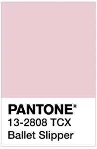
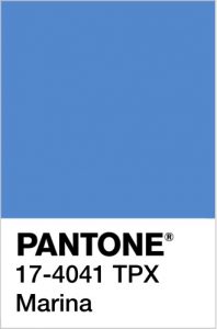
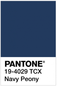
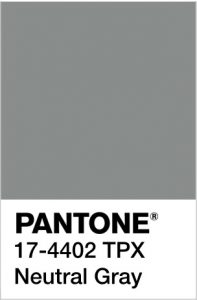
Even the distinctive, pale pink Ballet Slipper sits well with the cooler, wintry colours of Marina, Navy Peony and Neutral Gray.
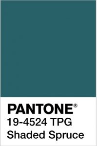
For me, the stand out colour is Shaded Spruce, a rich warm dark teal colour, which is a wonderful evolution of the Greenery colour of the year. It will take us from the freshness of spring/summer to the evergreen foliage of the winter.
Pantone® Color Institute Executive Director Leatrice Eiseman was right when she said that, “Cocooning colors are something you just want to wrap around yourself and feel comforted.”
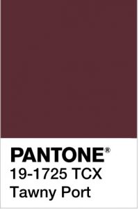
New York and London fashion weeks were full of tactile fabrics such as fur, velvet, quilting and tweed with a bit of Hollywood glam. These Fall/Winter 2017/2018 colours are Hygge at its best – comforting and cosy. How warming would that glorious and rich Tawny Port be to sup apres ski!
I also love the combination of the grey and yellow (maybe next year we’ll finally have a yellow as the colour of the year!) as it feels like such a comforting ray of sunshine.
The top ten colours from NYFW for Fall 2017 are:
- PANTONE 19-4524 TCX Shaded Spruce
- PANTONE 17-1558-TPX Grenadine
- PANTONE 17-1145-TCX Autumn Maple
- PANTONE 13-2808 TCX Ballet Slipper
- PANTONE 16-0543 TPG Golden Lime
- PANTONE 17-4041 TPX Marina
- PANTONE 19-4029 TCX Navy Peony
- PANTONE 17-4402-TPX Neutral Gray
- PANTONE 16-1341 TCX Butterum
- PANTONE 19-1725 TCX Tawny Port
Plus these from LFW (which are pretty similar to the ones from New York apart from a very welcome addition of a purple, a dark neutral brown and a fabulous yellow in the mix):
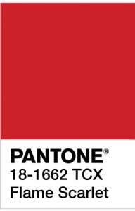
- PANTONE 18-1662 TCX Flame Scarlet
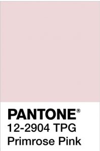
- PANTONE 12-2904 TPG Primrose Pink
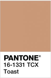
- PANTONE 16-1331 TCX Toast
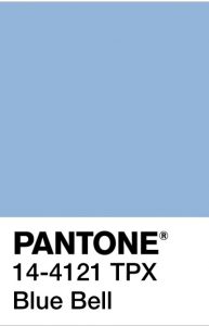
- PANTONE 14-4121 TPX Blue Bell
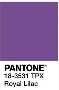
- PANTONE 18-3531 TPX Royal Lilac
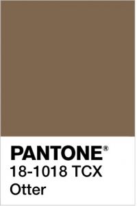
- PANTONE 18-1018 TCX Otter
- PANTONE 18-4028 TCX Navy Peony
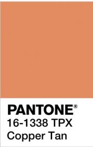
- PANTONE 16-1338 TPX Copper Tan
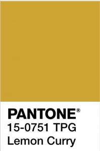
- PANTONE 15-0751 TPG Lemon Curry
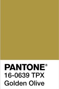
- PANTONE 16-0639 TPX Golden Olive
It’ll be great to see how couples incorporate these colours in to their weddings later this year (and whether the luxurious fabrics and sheer tops will influence wedding dress designs).
Pantone® is the world-renowned authority on colour and the Pantone® Color of the Year is always really influential in any popular colour themes in fashion, interior design and weddings.
See some of my other trend predictions for weddings in 2017.


by Hanami Dream | 14, December, 2016 | #UKWedLunch
#UKWedLunch – Wednesday 14th December 2016
As well as general wedding planning chat, this week’s theme is ‘2017 wedding trends’ #UKWedLunch
QUESTION 1: What do you think of the @pantone #coloroftheyear for 2017? https://www.hanamidream.co.uk/pantone-announce-the-color-of-the-year-2017/ #UKWedLunch
QUESTION 2: Which films and tv progs do you think will influence 2017 wedding trends? Like Beauty & the Beast #UKWedLunch
QUESTION 3: Which celebrity weddings do you think will influence 2017 wedding trends? Like Pippa Middleton #UKWedLunch
QUESTION 4: What fashion trends do you think will influence 2017 weddings? Like capes, embellished necklines & tailored separates #UKWedLunch
QUESTION 5: What catering trends do you think will influence 2017 weddings? Like donut walls & cakes with image projections #UKWedLunch
QUESTION 6: Which momentous occasion do you think will influence 2017 wedding trends? Like 1970s themes with the 40th anniversary of Elvis’s death #UKWedLunch
See more wedding trends and predictions on Hanami Dream blog https://www.hanamidream.co.uk/category/trends/#UKWedLunch
JOIN US EVERY WEDNESDAY! on Twitter between 1-2pm GMT
As well as general wedding planning chat, there will be a ‘Wedding traditions quiz’ next week #UKWedLunch


by Hanami Dream | 8, December, 2016 | blog, trends
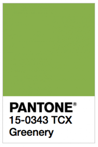
We are going green next year as the Pantone® Color of the Year 2017 is Greenery.

What a wonderful, fresh and vibrant colour that I can’t wait to see couples incorporating into their wedding colour schemes next year.
Greenery will look stunning alongside pure white as well as partnering perfectly with other colours. Plus it sits nicely with trends for more foliage and bringing the garden inside.
I love that the colour of the year is not subtle and withdrawn – its out with pastel and in with a vibrant splash of citrus colour! It makes me think of long cool glasses of mojitos brimming with fresh mint with a slice of lime on the top! I can hear the ice chinking as I write!
And it’s that sense of relaxing and getting away from the stresses of the world that Pantone® emphasis this colour will embody in 2017.
Leatrice Eiseman, the executive director of the Pantone Color Institute describes it as: “the color of hopefulness, and of our connection to nature. It speaks to what we call the ‘re’ words: regenerate, refresh, revitalize, renew. Every spring we enter a new cycle and new shoots come from the ground. It is something life affirming to look forward to.”
Pantone® is the world-renowned authority on colour and the Pantone® Color of the Year is always really influential in any popular colour themes in fashion, interior design and weddings.
I’ve been desperate for a yellow or an orange colour to get top billing for a couple of years and my guess for the Color of the Year 2017 was for Primrose Yellow (see my Spring 2017 report). So I’m so pleased to see a vibrant, bright colour leading the way in 2017.

See more about my winning Greenery mood board from the UK Academy of Wedding and Event Planning’s SS17 Pantone® mood board competition from earlier this year.
#COY2017

by Hanami Dream | 19, September, 2016 | blog, trends
It’s almost ironic that as soon as the weather is taking a more autumnal direction that I should start to think about next year’s springtime! Yes, the leaves might be changing colour, there may be conkers on the ground and I have even spotted mince pies in the shops today! But this is the exciting time of year when those lovely folks at Pantone® compile their top ten colours for the following spring.
We are in the throes of London Fashion Week at the moment in the UK, which is hot on the heels of New York Fashion Week (NYFW). The experts at Pantone® watched the colour trends as they happened at NYFW, with the Council of Fashion Designers of America (CFDA), and compiled their top 10 colour fashion report as a result of what they saw on the catwalks. There were about 119 different shows to watch at NYFW so it’s no mean feat for them to record how many people are using variants of colours. Interestingly there were a number of collections that grouped lots of colours together and gave some amazing combinations.
So, after I was left quite disappointed with the Fall 2016 report, I needed something to regain my faith and the Spring 2017 colours have done this in abundance!
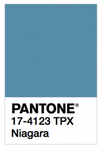
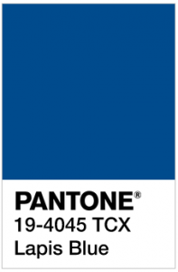
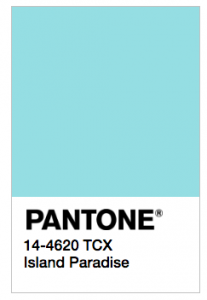
Don’t get me wrong they haven’t reinvented the wheel – its a happy evolution from the 2016 Spring colour palette. What is really striking though is the dominance and prevalence of one colour in particular. Blue appears in varying shades, such as Niagara (a denim blue), Lapis Blue (a great navy colour named after a stunning semi precious gemstone) and Island Paradise (a cooling turquoise). These take the 1st, 3rd and 5th spots respectfully on the list and are beautifully relaxing, calming and proving that, according to Pantone®, these colours ‘offer options that are not just typical of seasons’ but a great transition between the seasons.
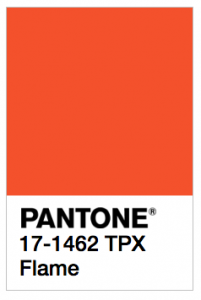
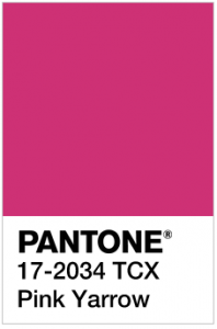
Plus it’s great to see that the supporting, accent colours are not subtle and withdrawn – its out with pastel and in with party pops of vibrant citrus colours in the form of Primrose Yellow, Flame, Greenery and Pink Yarrow. You’d be forgiven to picture slices of lemon, orange, lime or watermelon adorning glasses of long, cool summer cocktails, enjoyed whilst laying in a hammock on a tropical island paradise.
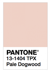
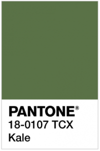
This palette of ten fresh and vibrant colours brings bright, light and sunny colours to help us get through the next few darker months! The names of the colours also add to the vision of spring flowers popping up with primroses, yarrow, dogtooth and luscious foliage (in the form of Kale). Teamed up nicely with a lovely neutral (Hazelnut) for a real flavour of nature.
There’s still some influence of the 2016 colours of the year and Pale Dogtooth is certainly reminiscent of Rose Quartz.
The top ten colours for Spring 2017 are:
- PANTONE 17-4123 Niagara
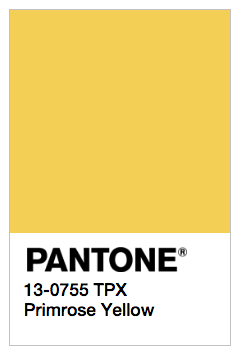
- PANTONE 13-0755 Primrose Yellow
- PANTONE 19-4045 Lapis Blue
- PANTONE 17-1462 Flame
- PANTONE 14-4620A Island Paradise
- PANTONE 13-1404 Pale Dogwood
- PANTONE 15-0343 Greenery
- PANTONE 17-2034 Pink Yarrow
- PANTONE 18-0107 Kale
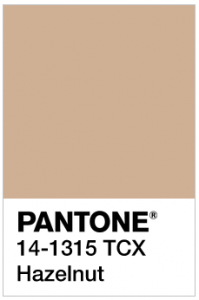
- PANTONE 14-1315 Hazelnut
It’ll be great to see how couples incorporate these colours in to their weddings next spring. If some of the unusual colour combinations from NYFW are anything to go by then we are in for some vibrant and tropical colour partnerships plus perhaps some beautiful blue gemstone décor.
Pantone® is the world-renowned authority on colour and the Pantone® Color of the Year is always really influential in any popular colour themes in fashion, interior design and weddings.
I’ve been desperate for a yellow or an orange colour to get top billing for a couple of years and I cross everything that Primrose Yellow (or even Flame) could even be the Colour of the Year in 2017 (or will it be two colours again?!) I can’t wait for the release of the news in December to find out!
