
Pantone® Colour of the Year 2022
Aside from the obvious big occasion on the horizon, the other thing I look forward to in December is the announcement of the Pantone® colour of the year.
I must admit, I was expecting a light and airy colour – perhaps a pale pink that would act like a breath of fresh air, so I had plumped for a gossamer pale pink.
Very Peri 17-3938
Instead, Pantone® have announced that Very Peri will be the colour of the year for 2022, a lavender purple colour.
It’s not that long since another purple (in the form of Ultra Violet) took the top spot in 2018. And purple is no stranger to the colour of the year with Radiant Orchid in 2014 and Blue Iris from 2008.
A bit of a happy, unexpected surprise as this colour doesn’t appear in any of their seasonal predictions. Instead they’ve created a brand new colour combining a cool blue and vibrant red. And purple just happens to be one of my favourite (and company brand) colours!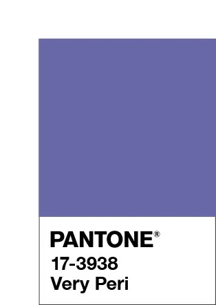
Spring 2022 predictions
Aside from two grey colours in the neutral section, the colour predicitons from New York and London fashion weeks differed greatly which made it hard to see a clear winner for colour of the year for 2022.
Pantone® are certainly not afraid of breaking or even making the rules. In the past, they’ve picked not one, but two colours such as this year (with Illuminating and Ultimate Gray in 2021) as well as in 2016 with Rose Quartz and Serenity.
So they are perfectly within their rights to just create a brand new colour if the right shade isn’t already in their catalogue of colours.
“It was really important for us to come up with a new color, because we have a very new vision of the world now,” said Pantone® Color Institute’s Executive Director Leatrice Eiseman.
Merging and emerging
Very Peri, has been described by colour company Pantone® as “a periwinkle shade of blue”. Leatrice Eiseman, executive director of Pantone® Color Institute said that the Colour of the Year for 2022 encompasses “the qualities of the blues, yet at the same time possesses a violet-red undertone. Pantone® 17-3938 Very Peri displays a spritely, joyous attitude and dynamic presence that encourages courageous creativity and imaginative expression.”
“Pantone® 17-3938 Very Peri is a symbol of the global zeitgeist of the moment and the transition we are going through,” the brand explained. “As we emerge from an intense period of isolation, our notions and standards are changing, and our physical and digital lives have merged in new ways.”
I’m surprised at myself that I wished for a pastel colour. But maybe we need something comforting, rich and warm like a heavy velvet blanket right now to see us through the winter and into 2022.
#COY2022
wonderful wedding wares