Select Page
Top Autumn 2022 colours from Pantone®

Top Autumn 2022 colours from Pantone®

Change of season

It’s coming up to the Spring equinox this weekend and it definitely feels like the seasons are shifting with the very welcome return of sunnier weather and longer days.
I feel like I’ve lost a whole month – February was a complete right off for me. So it’s quite a shock to be in March already!

With the change in season, comes the start of the ‘social season’ in spring and summer when it was traditional for members of the upper class to change their residence (from their country houses to London) in order to attend events of the season.

These events include Cheltenham Festival (March), the Grand National (April), The Boat Race (April), Badminton Horse Trials (May), Chelsea Flower Show (May), Epsom Derby (June), Royal Ascot (June), Cricket test matches at Lord’s (July), Wimbledon (July), Henley Royal Regatta (July), Edinburgh International Festival (August) , Cowes week (August), the Proms (July-September) and ending with Goodwood Revival (September).

Historically the ‘London season’ events would’ve coincided with political business in the city and conclude when the elite would return to their country homes for the beginning of the shooting season on 12th August.

Autumn 2022 colours

Whilst we enter the beautiful and hopeful season of Spring, my thoughts drift to the cooler months at the end of the year with the recent fashion weeks in New York, London and Milan last month, then Paris earlier this month. It was good to see them back to being in person again this year (although only via invite only this time).

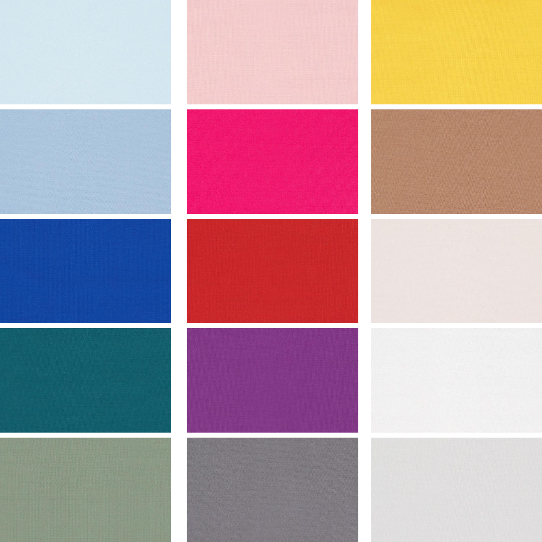
From these fashion weeks, Pantone® have predicted 10 colours that they think will be prevalent in Autumn/Winter 2022/23.

Fiery

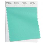
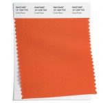
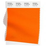
There are some really bright and bold colours to make a statement this autumn that are reminiscent of a roaring fire on Guy Fawkes night. Or for me, they evoke memories of the recent Winter Olympics and Paralympic Games held in Beijing. The fiery red (Lava Falls) feels similar to the Chinese flag and the Orange Tiger provides a nod to the Year of the Tiger which was marked recently for Chinese New Year.

Polar

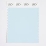
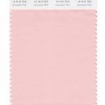
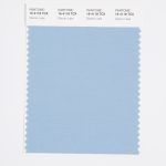
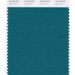
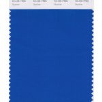
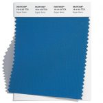
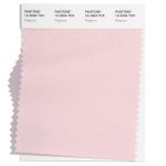
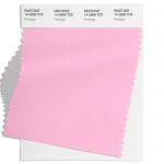
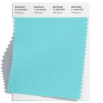
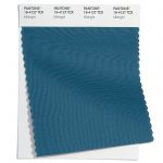
I’ve loved watching all the winter sports coverage and a number of the colours conjure up images of cold winters on the piste (or equally on a dark polar night) such as an icy turquoise (Watersprout), a pale pink (Nosegay) and the dark navy blue night sky of Midnight.
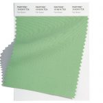
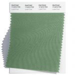
Rainforest

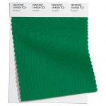
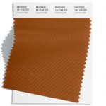
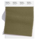
Lastly, there is a real grounding of some earthy, natural colours that would be happily found in a luscious rainforest including greens of Amazon and Martini, along with a rich brown (Caramel).
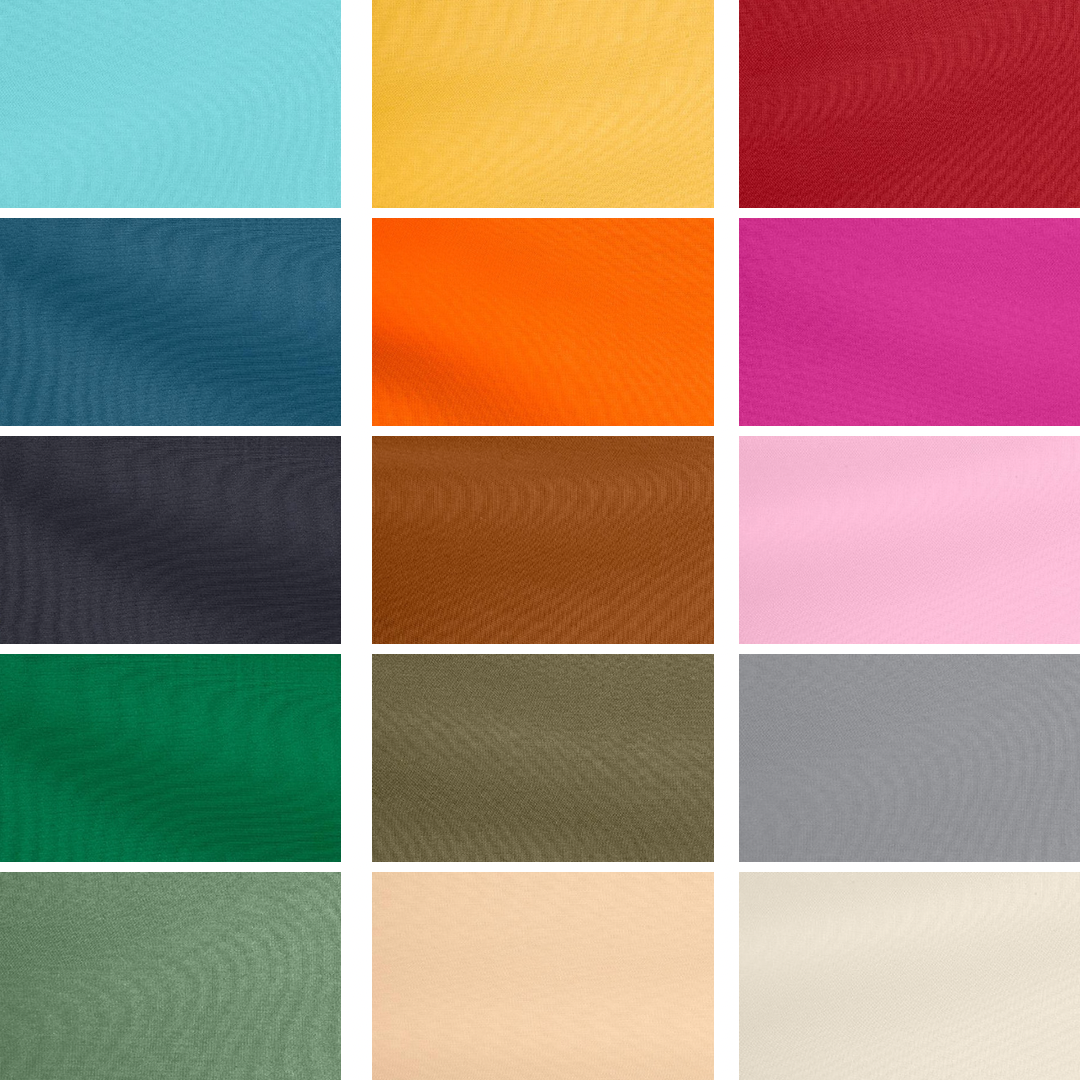
Fall 2022 colours 

The top ten colours for Fall 2022 from New York Fashion Week are:
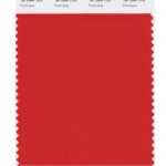
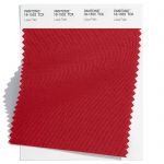
  • Pantone 18-1552 Lava Falls
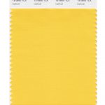
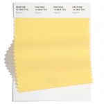
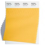
  • Pantone 14-0852 Samoan Sun
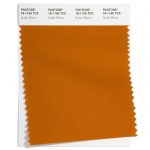
  • Pantone 16-1358 Orange Tiger
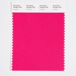
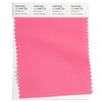
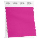
  • Pantone 17-2624 Rose Violet
  • Pantone 18-6024 Amazon
  • Pantone 14-2806 Nosegay
  • Pantone 14-4618 Waterspout
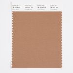
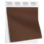
  • Pantone 18-1148 Caramel Café
  • Pantone 19-4127 Midnight
  • Pantone 18-0625 Martini Olive 

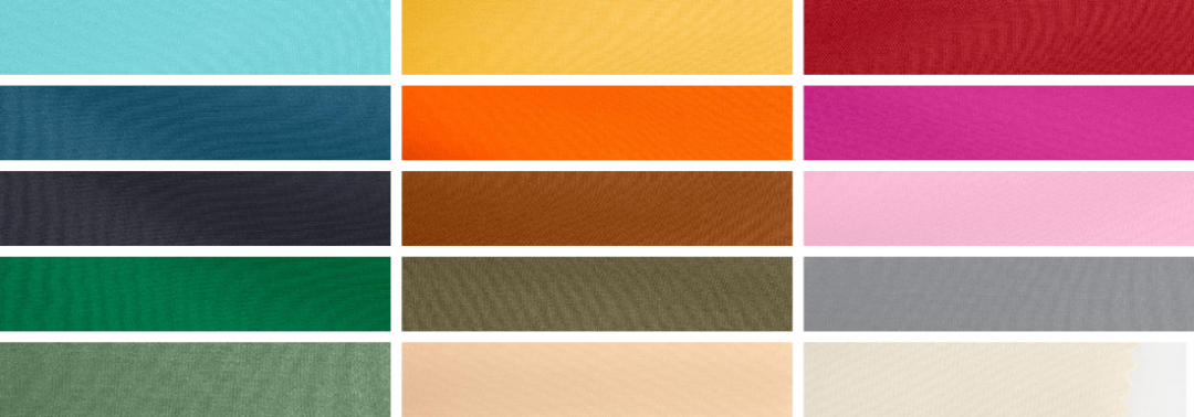
Fall 2022 extra colours from LFW

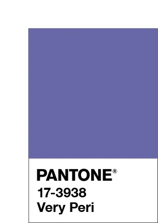
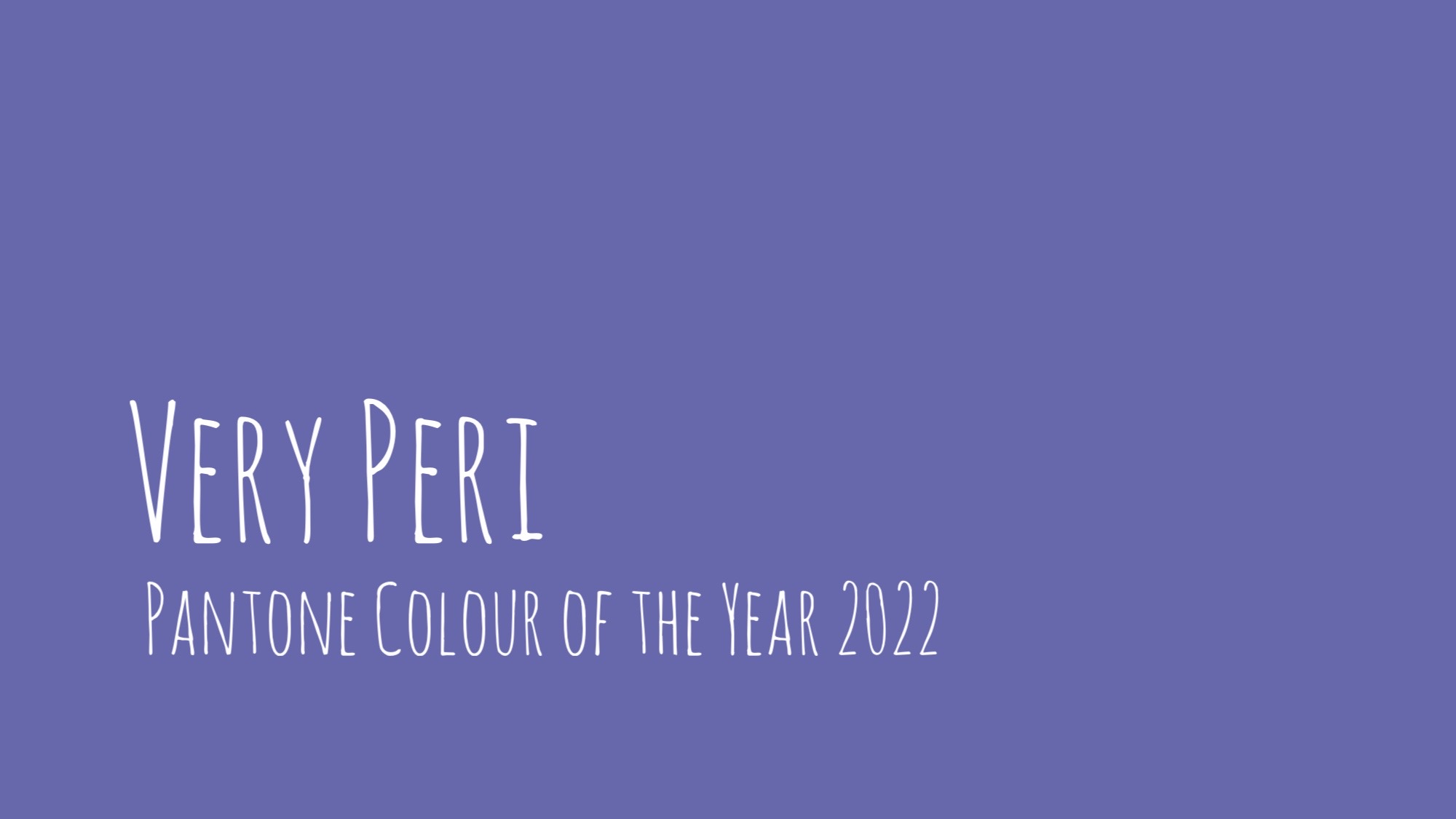
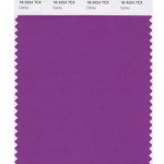
They may have different names but in the main the colours are repeated at London Fashion Week, with Watersprout apparent at both. There was one additional colour (instead of the bright pink from NYFW) to round off the colours for Fall 2022 in the form of the purple of Meadow Violet (similar to the current colour of the year, Very Peri).
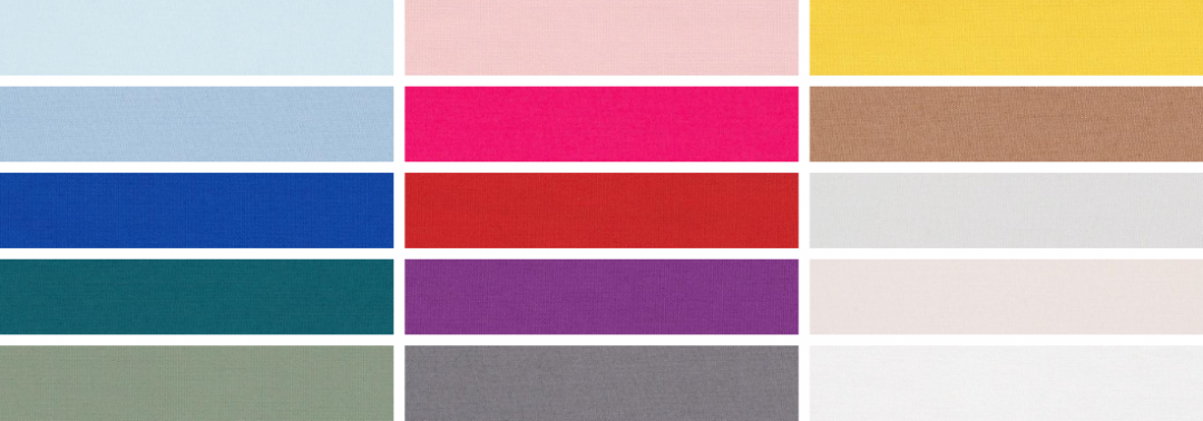
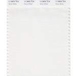
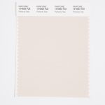
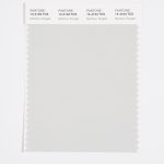
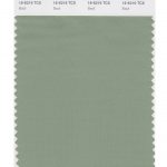
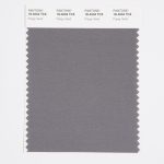
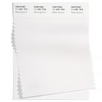
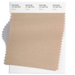
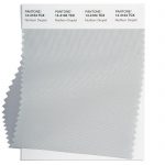
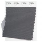
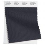
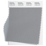
Neutral classics

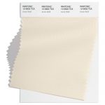
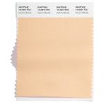
Pantone® have also created a Fall 2022 Classic Colour Palette. These are a group of neutrals that are core basics in the form of white, cream, dark and light grey, plus khaki green.

The bonus classic neutral colours for Fall 2022 are:

  • Pantone 12-0602 Arctic Wolf
  • Pantone 12-0813 Autumn Blonde
  • Pantone 19-4105 Polar Night
  • Pantone 17-0210 Loden Frost
  • Pantone 16-3917 Chiseled Stone

    Colour themes

    Colour plays an important part in our lives and it’ll be interesting to see how these colours filter through to influence things around us.

    Pantone® is the world-renowned authority on colour and the Pantone® Color of the Year is always really influential in any popular colour themes in fashion, interior design and weddings.

    Pantone® announce the Color of the Year 2022

    Pantone® announce the Color of the Year 2022

    Pantone® Colour of the Year 2022

    Aside from the obvious big occasion on the horizon, the other thing I look forward to in December is the announcement of the Pantone® colour of the year.

    I must admit, I was expecting a light and airy colour – perhaps a pale pink that would act like a breath of fresh air, so I had plumped for a gossamer pale pink.

    Very Peri 17-3938 

    Instead, Pantone® have announced that Very Peri will be the colour of the year for 2022, a lavender purple colour.

    It’s not that long since another purple (in the form of Ultra Violet) took the top spot in 2018. And purple is no stranger to the colour of the year with Radiant Orchid in 2014 and Blue Iris from 2008.

    A bit of a happy, unexpected surprise as this colour doesn’t appear in any of their seasonal predictions. Instead they’ve created a brand new colour combining a cool blue and vibrant red. And purple just happens to be one of my favourite (and company brand) colours!

    Spring 2022 predictions

    Aside from two grey colours in the neutral section, the colour predicitons from New York and London fashion weeks differed greatly which made it hard to see a clear winner for colour of the year for 2022.

    Pantone® are certainly not afraid of breaking or even making the rules. In the past, they’ve picked not one, but two colours such as this year (with Illuminating and Ultimate Gray in 2021) as well as in 2016 with Rose Quartz and Serenity.

    So they are perfectly within their rights to just create a brand new colour if the right shade isn’t already in their catalogue of colours.

    “It was really important for us to come up with a new color, because we have a very new vision of the world now,” said Pantone® Color Institute’s Executive Director Leatrice Eiseman.

    Merging and emerging

    Very Peri, has been described by colour company Pantone® as “a periwinkle shade of blue”. Leatrice Eiseman, executive director of Pantone® Color Institute said that the Colour of the Year for 2022 encompasses “the qualities of the blues, yet at the same time possesses a violet-red undertone. Pantone® 17-3938 Very Peri displays a spritely, joyous attitude and dynamic presence that encourages courageous creativity and imaginative expression.”

    “Pantone® 17-3938 Very Peri is a symbol of the global zeitgeist of the moment and the transition we are going through,” the brand explained. “As we emerge from an intense period of isolation, our notions and standards are changing, and our physical and digital lives have merged in new ways.”

    I’m surprised at myself that I wished for a pastel colour. But maybe we need something comforting, rich and warm like a heavy velvet blanket right now to see us through the winter and into 2022.

    #COY2022

    wonderful wedding wares

    Top Spring 2022 colours from Pantone®

    Top Spring 2022 colours from Pantone®

    Late sunshine 

    I have loved the late summer sunshine this week. With the children all back at school, I’ve actually felt like I’ve been on holiday as I have managed to eat my lunch sat in the garden in the sunshine with peace and quiet. It’s been lovely to extend that summer vibe for a little longer. We had such a wonderful summertime that I didn’t want it to end. We managed our first holiday in 2 years and got to relax and breathe in the sea breeze.

    But seasons come and seasons go and I know that the nights drawing in is a signal of the entrance of autumn – quick on the heels of a glorious summer break.

    However, my thoughts are being drawn to the lighter Spring days already and dreams of holidays, as the latest Pantone® announcement predicts that the colours that will dominate the scene for next year’s Spring and Summer are calming and evocative for travels further afield.

    Spring 2022

    With the fashion weeks just kicking off, Pantone® have revealed the Spring/Summer colours to look out for in 2022 including 10 seasonal colours alongside 5 neutral classics.

    There is an abundance of blues in the mix for next year, alongside a vibrant collections of bold colours. To me, they encapsulate two of my favourite things – being by the seaside, plus a joyous celebrations of colourful florals in my garden.

    The Pantone Color Institute’s executive director Leatrice Eiseman said “Half are in calming colors. Obviously, everyone wants to feel they’re in a safe haven. On the other hand, there is the very human proclivity of wanting to get out and be active again. That’s where the more energetic colors come in. The latter offer more experimentation.” Eiseman added. “Brighter colors lift your spirits and let you abandon the rules about color that you learned, when you were older. They bring you back to being a kid again and teach you to celebrate something in your life that will give you pleasure.”

    I do like to be besides the seaside

    We were so pleased to make it to a few beaches in both Scotland and Wales over the summer. With some wonderful coastal walks, harbour visits and simply playing on the sand. Eating fish and chips or ice creams always taste better when sitting by the seaside. The change of scene and pace of life are certainly relaxing. Just watching the rhythm of the sea washing in and out provides a real sense of escapism.

    I’m delighted that blues seem to be centre stage in the mix of colours for next year (perhaps eluding to one of them being the Colour of the Year 2022?). The beautiful seascape includes Spun Sugar, Glacier Lake, and Skydiver, along with a teal blue of Harbour Blue.

    Cool pastel colours

    The fragility of things at the moment couldn’t be described better than the name of the pale pink colour in Gossamer Pink – conjuring up images of dewy spiders’ webs glistening in the early spring sunrises.

    Teamed with a warming Coca Mocha and the earthy and pale neutral colours – it feels as fresh as newly washed sheets on the washing line in the summer breeze. The refreshing feeling we all need for our health and wellness.

    Gardening companions 

    Even before lock down, I had got the gardening bug and had started growing and propagating my own flowers and vegetables. It started with an obsession for succulents and indoor plants (I daren’t say the number out loud of how many house plants I have at the moment!) which spilled out in to the outdoors.

    We have loved growing our own fruit and vegetables and now filling the garden with more home grown flowers too. Gardening is such a relaxing and a very worthwhile past time that is currently seeing a soar in popularity. The lock down has certainly made everyone appreciate being outside and enjoying improving their natural surroundings.

    So the vibrant names of some of the colours conjure up joyful colours of spring and summer flowers just as I’m planning and planting my bulb lasagne for next year (such as the bright Daffodil colour). I’ve tried growing dahlias this year and can’t wait to try more in 2022 perhaps in the purple of Dahlia, or vibrant pink Innuendo. Along with the travel inducing flamboyant Poinciana tropical tree from Madagascar.

    Old favourites 

    It’s reassuring to also see the current colours of the year 2021 still showing their prescience and easing us through the transition to another year. Although with different names, you can still identify the yellow of Illuminating (which I correctly tipped this time last year as the Colour of the Year 2021) and also Ultimate Gray in the neutral classics.

    Spring 2022 colours

    The top ten colours for Spring 2022 are:
    • Spun Sugar 12-4401
    • Gossamer Pink 13-1513
    • Daffodil 14-0850
    • Glacier Lake 16-4118
    • Poinciana 18-1564
    • Coca Mocha 18-1019
    • Innuendo 18-2042
    • Dahlia 18-3324
    • Harbor Blue 18-4728
    • Skydiver 19-4151

    Spring 2022 extra colours from LFW

    In the main the colours are repeated at London Fashion Week, albeit in different shades of browns and pinks. However the emphasis shifts from the blues and bright red of NYFW to more rusty orange colours at London Fashion Week in the shape of Coral Rose and Sudan Brown. There is also an additional neon lime green and a really striking turquoise of Cascade.

    Here are the colours from LFW to round off the colours for Spring 2022:

    • Cascade 14-5713
    • Coral Rose 16-1349
    • Super Sonic 18-4143
    • Popcorn 12-0825
    • Potpourri 13-2004
    • Bubblegum 17-1928
    • Sudan Brown 18-1160
    • Fragile Sprout 15-0549
    • Orchid Bloom 14-3612
    • Coffee Quartz 18-1307

    Aside from two grey colours in the neutral section, the colours differ greatly which makes it hard to see a clear winner for colour of the year in 2022.

    Neutral classics

    Pantone® have also updated the Classic Colour Palette. These are a group of neutrals that are core basics in the form of a white, cream, khaki green, plus light and dark grey. Perfect grounding colours and perfect peaceful additional colours for weddings.

    The bonus classic neutral colours for Spring 2022 are: 

    • Snow White 11-0602
    • Perfectly Pale 13-0003
    • Northern Droplet 14-4104
    • Basil 16-6216
    • Poppy Seed 18-4004

    And at LFW these are:

    • White Alyssum 11-1001
    • Humus 15-1304
    • Fair Green 15-6316
    • Northern Droplet 14-4104
    • Poppy Seed 18-4004

    Colour themes

    It’ll be great to see how couples incorporate these colours in to their weddings next year. There’s plenty of scope for unique colour combinations and personalisation.

    Pantone® is the world-renowned authority on colour and the Pantone® Color of the Year is always really influential in any popular colour themes in fashion, interior design and weddings.

    Look out for my report when the 2022 colour of the year is released later in the year.

    Sign up to receive the latest wedding planning tips, tools, trends and traditions straight to your inbox.

    wonderful wedding wares