by Hanami Dream | 7, December, 2017 | blog, trends
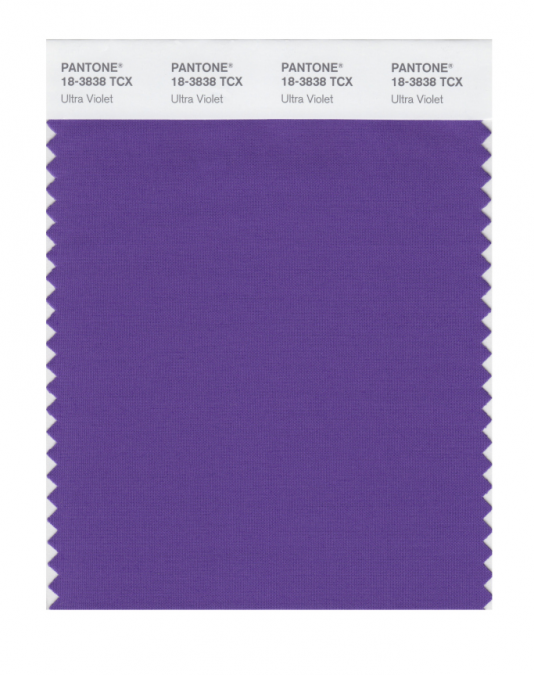
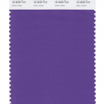
Pantone® have picked a deep purple ‘Ultra Violet’ as their colour of the year for 2018!
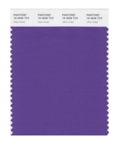
What a wonderful, vibrant colour that I can’t wait to see couples incorporating into their wedding colour schemes next year.
For me, it was always going to be a toss up between a bright yellow or a brilliant shade of purple. I’m over the moon that Pantone® have gone for such an attention grabbing and bold purple to be the colour of the year. It is a remarkable blue-toned shade of purple called Ultra Violet (also known as Pantone® 18-3838) and I’m pretty pleased as purple just happens to be my favourite colour!
As Pantone® Vice President Laurie Pressman said, it is an “optimistic and empowering color” for “originality, ingenuity, and visionary thinking”. It feels futuristic, magical and regally majestic – which is quite fitting for the year of another royal wedding in the UK.
Pantone® is the world-renowned authority on colour and the Pantone® Color of the Year is always really influential in any popular colour themes in fashion, interior design and weddings.
I’ve been desperate for a yellow or an orange colour to get top billing for a couple of years and my guess for the Color of the Year 2018 was for Meadowlark (see my Spring 2018 report). But I’m so pleased to see a vibrant, bright colour leading the way again in 2018.
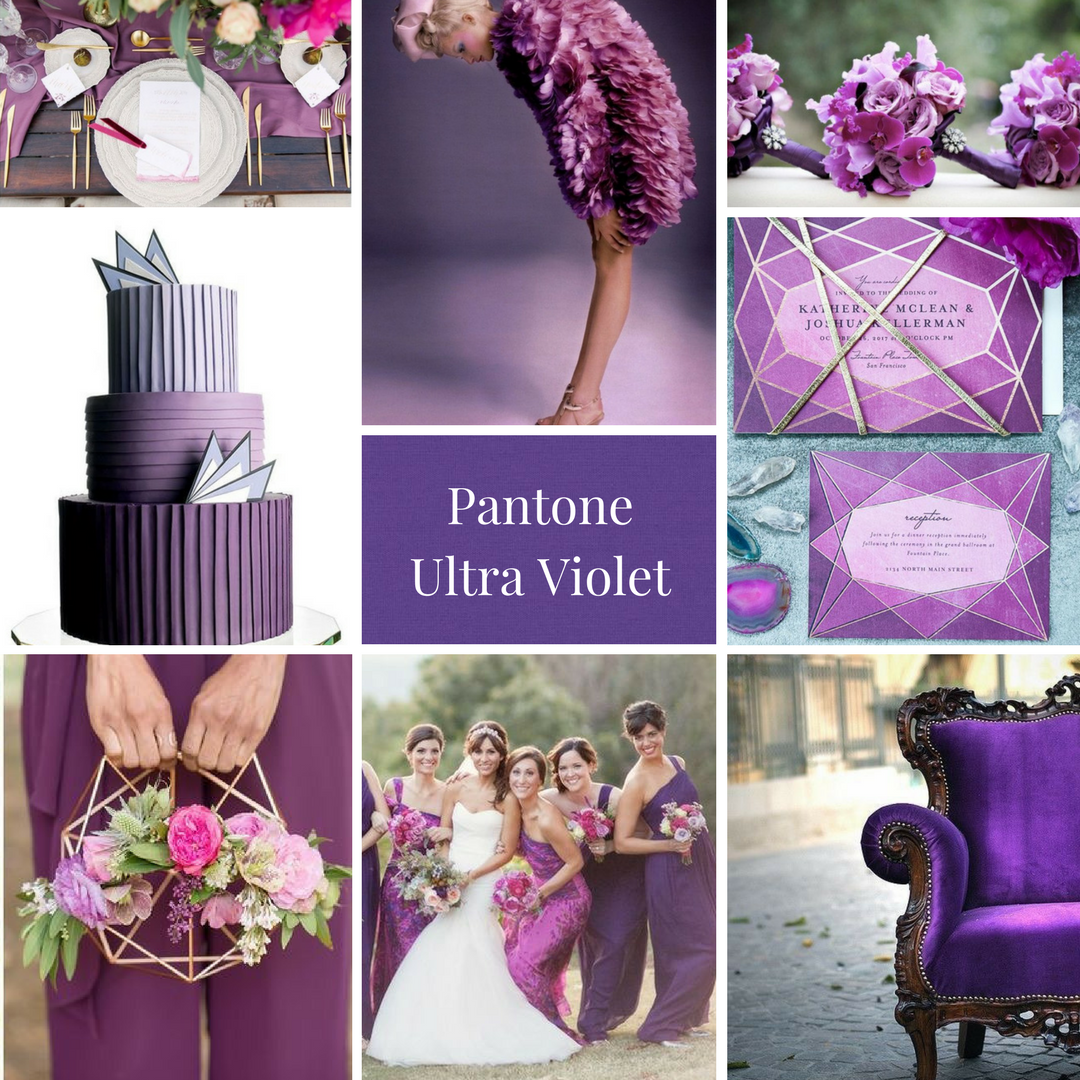
See more about my Ultra Violet mood board from the UK Academy of Wedding and Event Planning’s SS18 Pantone® mood board competition from earlier this year.
#COY2018
by Hanami Dream | 30, October, 2017 | inspiration, news
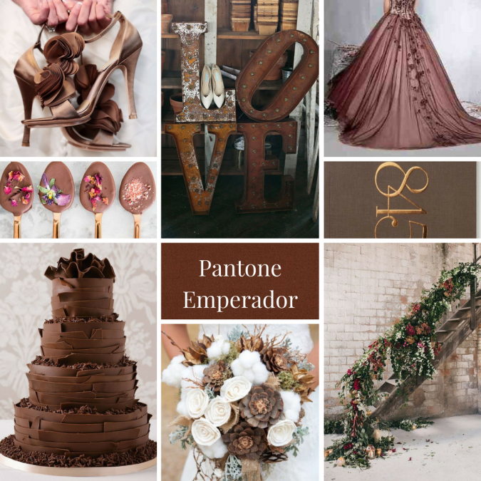
Pretty chuffed to have one of mood boards picked as finalist again in the UK Academy of Wedding and Event Planning SS18 Pantone® colour trend challenge.
http://www.weddingacademyglobal.com/colour-trend-challenge-finalists/

Emperador | Chocolate Factory | sophisticated, modern, indulgent and rich chocolate wedding with an industrial factory setting
IMAGE CREDITS:
Shoes | I take you http://www.itakeyou.co.uk/brown-wedding-ideas/1-23/
Full dress | Veromia via La Bella Bridal http://www.labellabridal.co.uk/wedding-dre…/veromia/WDVE014/
Bouquet | Michael Radford Photography http://www.michaelradfordphotography.com/ via https://www.buzzfeed.com/…/non-traditional-wedding-bouquets…
LOVE letters | Hudson Nichols Photography http://www.hudsonnicholsphotography.com/ via 100 Layer Cake http://www.100layercake.com/…/romantic-industrial-wedding-…/
Staircase | Albert Bardina Fotografia http://www.albertbardina.com/ via Green Wedding Shoes https://greenweddingshoes.com/industrial-wedding-inspirati…/
Chocolate dipped spoons | Sugar and Charm https://sugarandcharm.com/…/easy-entertaining-chocolate-dip…
Stationery | Birdcage Walk via http://www.fromupnorth.com/graphic-design-inspiration-616/
Cake | Marks and Spencer http://www.marksandspencer.com/milk-chocolate-…/p/p60008655…
by Hanami Dream | 6, September, 2017 | blog, trends
The children are only just back to school today so I was surprised to see the news from Pantone® about Spring 2018 colours landing on my desk already – how exciting!
Their timing to announce the next season’s colours has been much earlier this time around and ahead of all the fashion weeks. In February, we were left waiting until after both New York and London Fashion week to announce their Fall 2017 fashion report. But the Spring Summer 2018 New York fashion week isn’t due to kick off until tomorrow so I wasn’t expecting Pantone® to announce their colour forecast just yet. It’s great to see their report is going back to being a forecast rather than a colour counting exercise from the catwalks though.
So not only is their timing unexpected but so are the colours – both in quantity and palette.
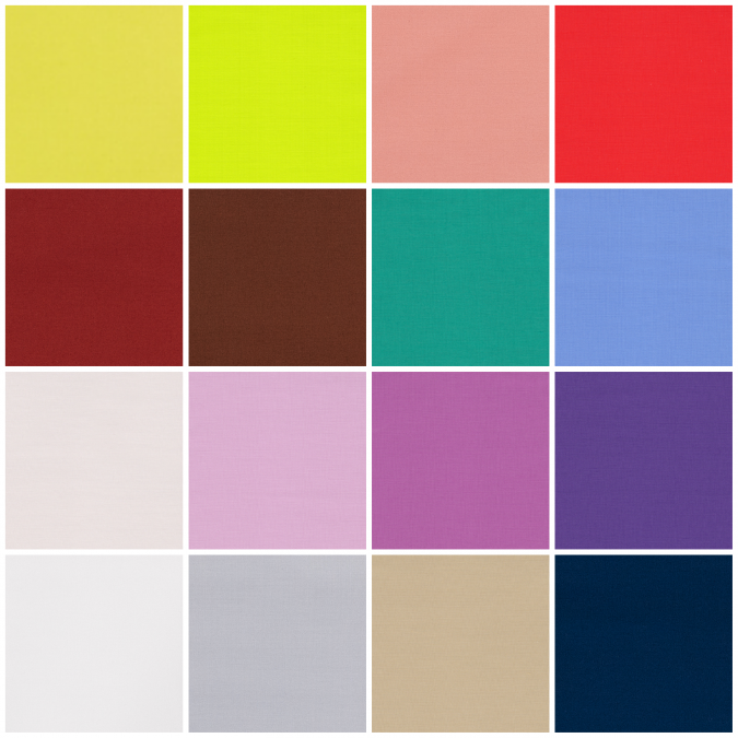
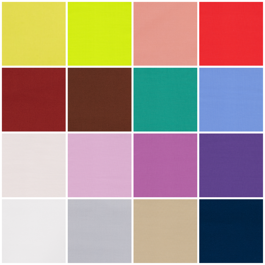
This season, instead of the usual 10 colours, we’ve been given an extra 2 to make 12 colours that Pantone® forecast to be the colours for Spring/Summer 2018. As if that wasn’t enough, they’ve also thrown in 4 bonus colours that act as neutrals and core basics.
I am so pleased to see yellow featuring high on their list – it’s such a comforting ray of sunshine. Does this mean that we’ll finally see a yellow as the colour of the year in 2018? I’ve been desperate for a yellow (or an orange colour) to get top billing for a couple of years and I cross everything for a bright colour like Meadowlark to take the top slot.
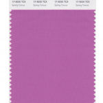
These Spring colours are certainly attention grabbing and there’s even a neon yellow amongst them. For me, I love that they are continuing the Spring 2017 trend away from pale pastels. This palette is right up my street! I love the blues (Little Boy Blue and Sailor Blue) and how these evolve in to my favourite colour of purple. With Pink Lavender, Ultra Violet, Almost Mauve and Spring Crocus.
The pastels that are used are barely-there colours and really work with the trend for gentle, ethereal and floaty materials and textures that are featuring in bridal attire at the moment.
I also like the food based colours that show a real culinary influence of Cherry Tomato and Coconut Milk, with a bit of added spice from Chili Oil.
Along with this is some wonderful floral inspiration for a beautiful spring meadow such as Blooming Dahlia, Spring Crocus, and Pink Lavender.
Plus the evolution of green continues in to this season. From the freshness of Greenery for Spring/Summer 2017 (and colour of the year in 2017), to the evergreen foliage of Shaded Spruce from Fall/Winter 2017, to a wonderful teal colour in Arcadia next Spring/Summer 2018 that mixes calming blue in to the green mix.
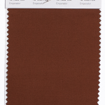
There’s also some unexpected earthy autumnal colours (like Chili Oil and the rich chocolatey brown of Emperador) that seem a little out of place from a traditional Spring palette but will act as great transitional colours to take us in and out of seasons.
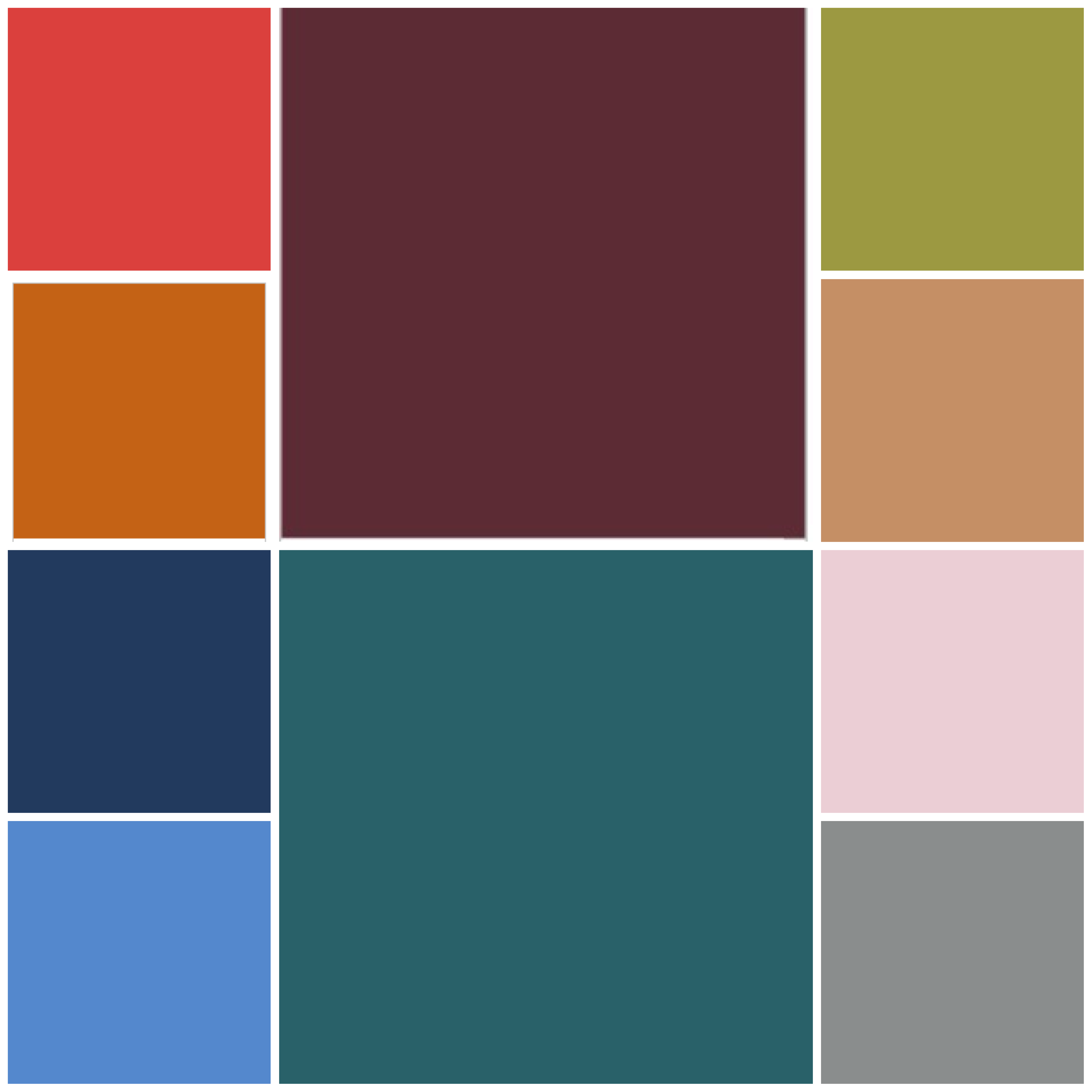
The top twelve colours from NYFW for Spring 2018 are:
- Meadowlark 13-0646
- Cherry Tomato 17-1563
- Little Boy Blue 4132
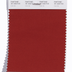
- Chili Oil 18-1440
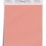
- Blooming Dahlia 15-1520
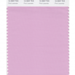
- Pink Lavender 14-3207
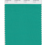
- Arcadia 16-5533
- Ultra Violet 18-2828
- Emperador 18-1028
- Almost Mauve 12- 2103
- Spring Crocus 17-3020
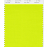
- Lime Punch 13-0550
Plus these from LFW (which are pretty similar to the ones from New York apart from the addition of another blue, a couple of wonderful dusky pinks, a warm burgundy and a fresh green):
- Cherry Tomato 17-1563
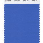
- Palace Blue 18-4043
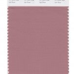
- Ash Rose 17-1514
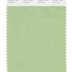
- Nile Green 14-0121
- Meadowlark 13-0646
- Blooming Dahlia 15-1520
- Ultra Violet 18-2828
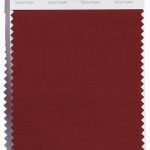
- Spiced Apple 18-1325
- Pink Lavender 14-3207
- Almost Mauve 12- 2103
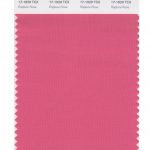
- Rapture Rose 17-1929
- Lime Punch 13-0550
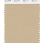
Pantone® have also created a Spring 2018 Classic Colour Palette. These are a group of neutrals that are core basics in the form of navy, grey, beige and off white (of Sailor Blue, Harbor Mist, Warm Sand and Coconut Milk respectively).
The bonus classic neutral colours for Spring 2018 are:
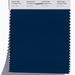
- Sailor Blue 19-4034
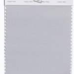
- Harbor Mist 14-4202
- Warm Sand 15-1214
- Coconut Milk 11-0608
It’ll be great to see how couples incorporate these colours in to their weddings next year. I can see how the classic neutrals will play a big part in coupling up with some of the more vibrant choices.
Pantone® is the world-renowned authority on colour and the Pantone® Color of the Year is always really influential in any popular colour themes in fashion, interior design and weddings.
See some of my trend predictions for weddings in 2017 and look out for my report when the 2018 colour of the year is released later in the year.
by Hanami Dream | 15, July, 2017 | blog, inspiration, styled shoots
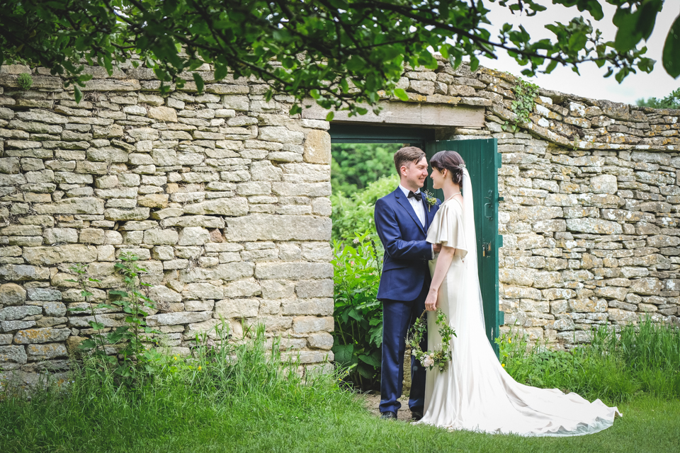
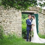
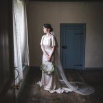
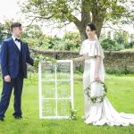
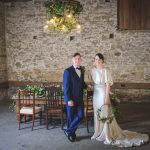
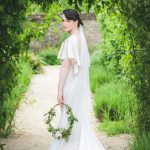
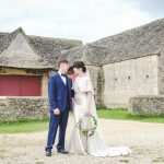
Based on The Secret Garden by Frances Hodgson Burnett (published in 1911), this modern Edwardian styled wedding shoot is a perfect harmony of traditional and contemporary elements brought together with sheer glamour and sophistication. Planned and designed by Hanami Dream and wonderfully captured by Squib Photography.

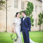
This elegant and delicate wedding is set in the grounds of a local English Manor House in the Oxfordshire Cotswolds of the UK (also used in the filming of another 1910s drama, Downtown Abbey). The lush greenery of a walled garden is discovered behind a secret locked door and its unseen natural beauty is unearthed after being concealed for many years.
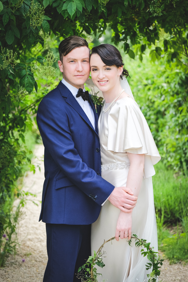
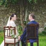
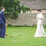
Complete with an intimate ceremony on the croquet lawn, drinks in a secluded corner of the garden, followed by a celebration in a stunning Cotswold stone barn, this wedding features modern twists on traditional wedding styles with a real sense of rejuvenation.
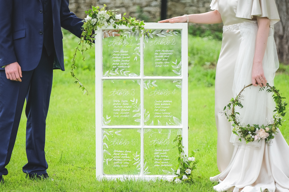
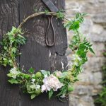
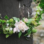
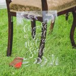
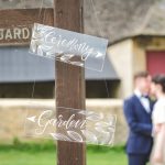
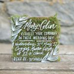
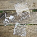
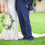
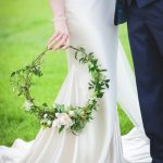
With clear acrylic ‘stationery’ and signage with white brush lettering (where the greenery of the garden can be seen through), a hoop bouquet, a fresh take on the time-honoured wedding dessert of a croquembouche, vintage pearl details, antique keys and a friendly robin redbreast motif. Mary and Colin would be proud to attend this stylish wedding.
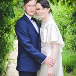
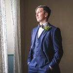
The colour palette is soft and understated so nothing distracts from the abundance of sumptuous cascading foliage. White is accented with hints of pink Pale Dogwood and plenty of the Colour of the Year of Greenery. There’s a definite nod to the Pantone® Spring/Summer 2017 colours with some subtle inclusion of blues (a navy Lapis for the groom’s suit and a denim Niagara of the manor house internal doors), Hazelnut and more greenery in the form of Kale.
Cogges Manor Farm was the ideal location for this wedding with its very essence in this era. It is nestled in the lovely market town of Witney and offers two stunning seventeenth century barns as well as a beautiful walled garden, stunning grounds and an impressive Manor House as a remarkable backdrop.
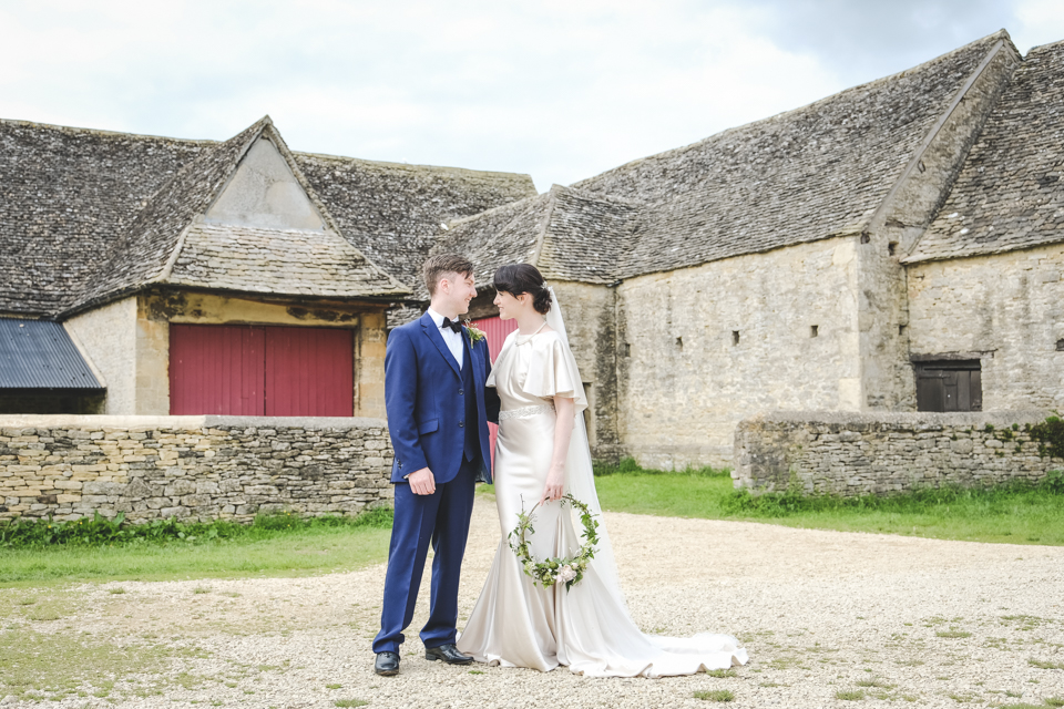
The couple got ready in the peaceful setting of the Manor House, strolled romantically through the walled garden, encouraged their families to ‘choose a seat not a side’ on vintage chairs (from Linda’s Vintage Hire) on the croquet lawn, and enjoyed the perfect blank canvas of the Barley Barn where modern, personalised details make this wedding complete.
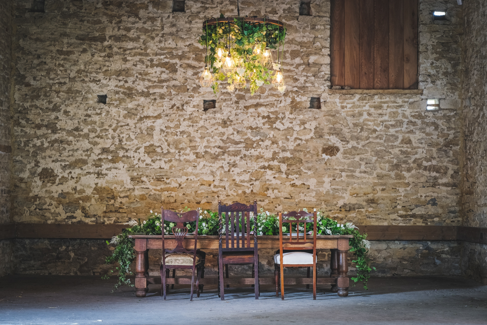
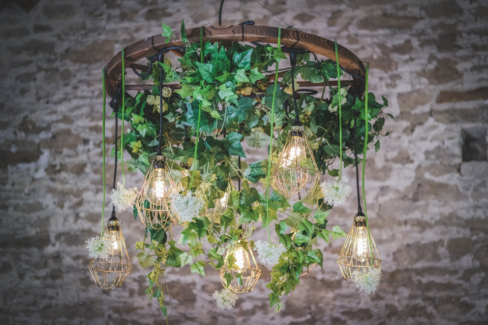
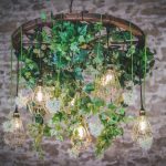
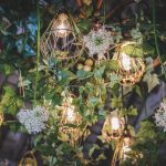
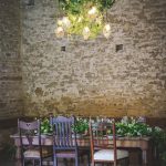
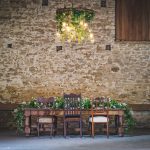
Hanging from one of the impressive beams is a large rustic wooden cartwheel from Oakwood Events, adorned with greenery along with stylish bulb cages around Edison type filaments, plus some added alliums (from Lark Rise Flowers).
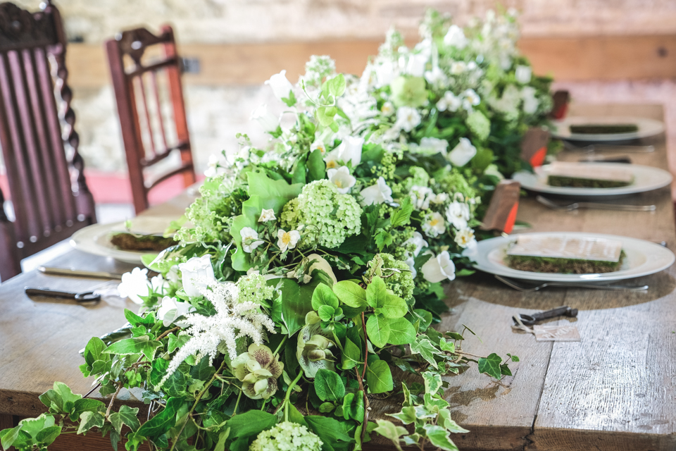
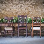
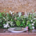
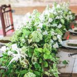
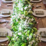
The top table is awash with greenery running down the whole of the table and spilling off the ends to the floor, courtesy of Lark Rise Flowers. Plus, the fragrance of the foliage was a delight to the senses with hosta, hedera, honeysuckle, laurel and hebe. Along with gentle inclusion of white flowers in the form of campanula, astilbe, lady’s mantle, sweet william, viburnum, rambling rose, helleborus seedheads and valeriana.
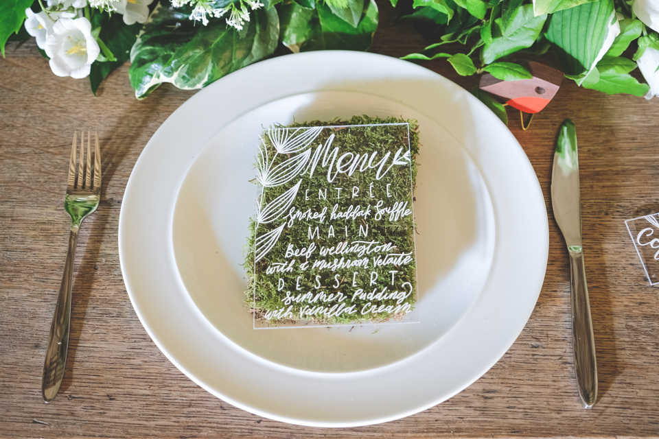
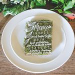
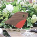
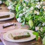
The sturdy wooden table, along with vintage chairs from Linda’s Vintage Hire, is set simply with white crockery and silver cutlery, plus clear acrylic menus sit on green moss. Alongside each setting is a clear acrylic place name (with guest names paying homage to the character names from the book) attached to vintage keys, along with favours of charming wooden robins by Muffat Prague.
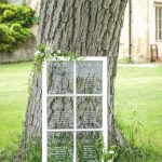
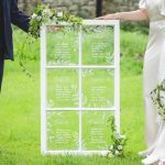
Guests are directed around the farm with stylish clear acrylic signage and find their places by referring to the reclaimed window pane table plan with white brush lettering thanks to The Paper Hare, completing the stationery suite of clear acrylic invitations and clear acrylic table number tubes.
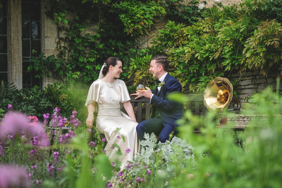
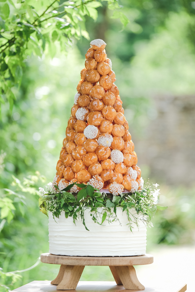
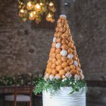
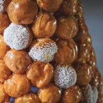
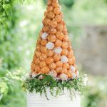
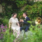
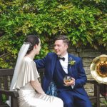
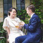
In the garden, the couple relax and enjoy a smooth glass of brandy whilst listening to the gramophone and admiring the remarkable cake by Cotswold Baking, a reintroduction of a traditional wedding dessert. This impressive croquembouche plays on the trend of wedding cake alternatives and sits on top of a plain white cake. The choux balls are decorated with edible pearl balls of varying sizes.
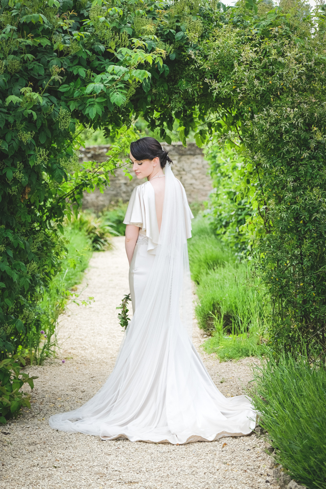
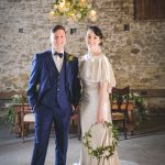
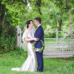
The bride chicly carries a hoop bouquet by Lark Rise Flowers leaving a beautiful scent of jasmine wherever she sashays. She has strong smoky eyes, pinched cheek blush and barely-there pale lipstick reminiscent of the times and beautifully recreated by Blushing Brides.
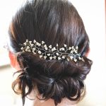
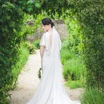
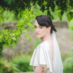
Her hair is ornamented with a delicate pearl hair vine by Designed to Sparkle and gathered up to reveal the breathtaking backless dress.
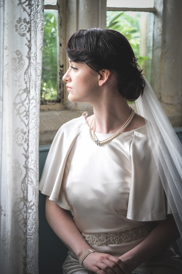
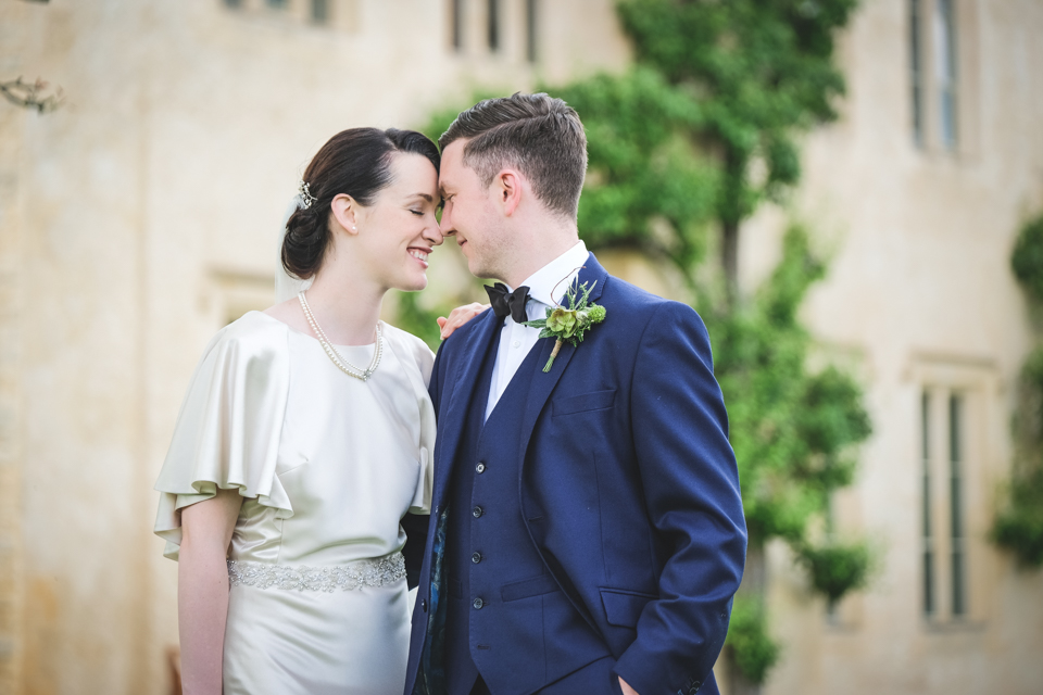
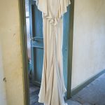
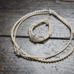
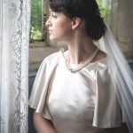
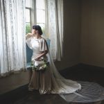
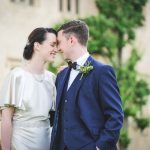
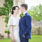
She perfectly fits the glamourous, champagne coloured bridal gown, made from Lux Charmeuse, featuring a high neckline, flutter sleeves, low back, attached silver beaded waistline and godet train by Justin Alexander, provided by Proposals of Witney. This 1910s styling is teamed with a multi-strand bracelet and necklace by Designed to Sparkle, made with navette set Swarovski crystal stones and pearls, in creamrose light shade.
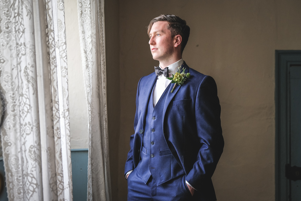
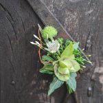
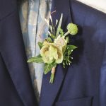
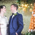
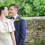
The suave, slicked-back groom suited the era with a blue three-piece suit made from a British fabric 100% wool, cut in a traditional style but more modern in shape from The Cotswold Tailor.
It’s the little details that bring any event to life and this was made possible by the wonderful local suppliers who provided their time, services, venue and products for free. Together we have showcased the amazing talent that our part of the UK has to offer the wedding industry.
Take a look at the fabulous suppliers that were involved in this styled shoot – Keeping it local with suppliers for the Secret Garden shoot
And take a glimpse behind the scenes at the how the theme and designs came to life – Behind the scenes: Secret Garden shoot
And here’s the video from the shoot too – Video: Secret Garden Wedding
#keepitlocal
-
-
-
-
-
-
-
-
-
-
-
-
-

-
-
-
-
-
-
-
-
-
-

-
-
-
-
-
-
-
after
-
-
Photography by Squib Photography
-
-
-
-
-
-
-
-
-
-
-
-
-
-
-

-
-
-
-
-
-
-
-
-
-
-
-
Planning & Design | Hanami Dream | www.hanamidream.co.uk
Location | Cogges Manor Farm | www.cogges.org.uk
Photographer | Squib Photography | http://www.squibphotography.co.uk/
Models | Úna and Daryl
Hair & Make up | Blushing Brides | http://www.blushingbrideshairandmakeup.com/
Bridal dress, shoes and veil | Proposals of Witney | http://www.proposalsbridalstudio.co.uk/
Groom clothing | The Cotswold Tailor | http://www.suitstailored.com/
Jewellery | Designed to Sparkle | http://www.designedtosparkle.co.uk/
Florist | Lark Rise Flowers | http://www.larkriseflowers.com/
Cake | Cotswold Baking | http://www.cotswoldbaking.co.uk/
Stationery | The Paper Hare | http://www.thepaperhare.com/
Lighting | Oakwood Events | http://www.oakwoodevents.co.uk/
Chairs, glasses & gramophone | Linda’s Vintage Hire | http://www.lindasvintagehire.co.uk/
Favours | Muffat Prague | www.muffatprague.com

by Hanami Dream | 14, July, 2017 | inspiration
lush green wedding inspiration
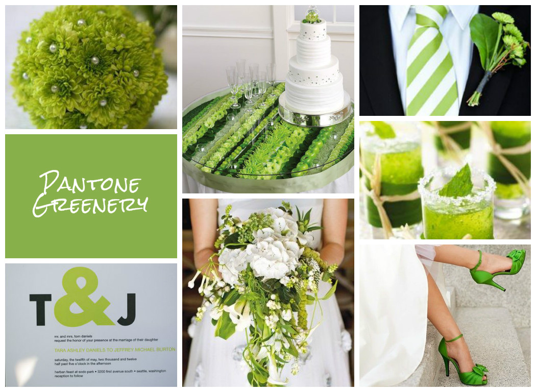
Images curated on Pinterest
Image Credits (clockwise):
Bouquet via Intimate Weddings
Tablescape and Cake via Blooms By The Box
Tie & Buttonhole: Photographer Jaime Y Photography via Wedding Loft
Drinks: via Classic Bride
Shoes via Marriage.com
Bouquet: Photographer Will Hartl via Brides Magazine
Stationery: Photographer Jenny GG Photography via Modernly Wed

by Hanami Dream | 23, February, 2017 | blog, trends
I’m not going to lie, I’m like a kid on Christmas Eve when I’m waiting with baited breath for the Pantone® announcements. For three times a year, I feel like a proper journalist waiting for the news to break about the next season’s top colours. (And I’m nearly beside myself waiting for the colour of the year announcement in December!)
Yes, I get excited! So when the fashion week season kicks off (this month is New York, London, Milan and then Paris) I’m on stand by waiting for Pantone® to make their declaration.
And it was quite a delay this time, as Pantone® waited until not only after New York Fashion Week to finish, but London as well. Whilst the fashion crowd have now moved on to Milan, I was beginning to think that Pantone® weren’t going to reveal a colour report at all this time. And if I may moan about Pantone® for one minute, I must say that I’m disappointed that it is less about their predictions now and more just about counting colours that designers have used. Don’t get me wrong, their report is comprehensive and incredibly impressive (blimey, there were around 180 shows at NYFW alone!) but I guess I feel it’s less about foresight in advance now.
However, it is good that their analysis is taking more of an international view for the first time and this report is a great overview of fashion designers’ use of colour in their Autumn/Winter 2017/2018 collections.
Plus I’ve already fallen deeply in love with the collection of colours that will trend this Autumn. Don’t get too excited. There’s no huge surprises. In fact, I probably could’ve written this article without even seeing the colours as they’re fairly typical and what you’d expect.
But they are a beautiful, rich collection of classic autumnal colours.
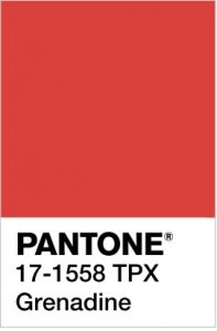
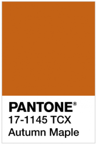
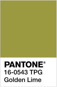
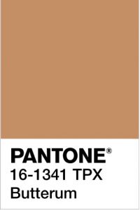
Looking at them makes me want to run, jump, kick and roll in a pile of crunchy fallen leaves all in the vibrant hues of Grenadine, Autumn Maple, Golden Lime and Butterum.
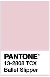
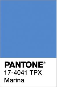
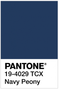
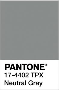
Even the distinctive, pale pink Ballet Slipper sits well with the cooler, wintry colours of Marina, Navy Peony and Neutral Gray.
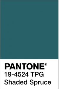
For me, the stand out colour is Shaded Spruce, a rich warm dark teal colour, which is a wonderful evolution of the Greenery colour of the year. It will take us from the freshness of spring/summer to the evergreen foliage of the winter.
Pantone® Color Institute Executive Director Leatrice Eiseman was right when she said that, “Cocooning colors are something you just want to wrap around yourself and feel comforted.”
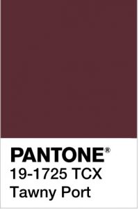
New York and London fashion weeks were full of tactile fabrics such as fur, velvet, quilting and tweed with a bit of Hollywood glam. These Fall/Winter 2017/2018 colours are Hygge at its best – comforting and cosy. How warming would that glorious and rich Tawny Port be to sup apres ski!
I also love the combination of the grey and yellow (maybe next year we’ll finally have a yellow as the colour of the year!) as it feels like such a comforting ray of sunshine.
The top ten colours from NYFW for Fall 2017 are:
- PANTONE 19-4524 TCX Shaded Spruce
- PANTONE 17-1558-TPX Grenadine
- PANTONE 17-1145-TCX Autumn Maple
- PANTONE 13-2808 TCX Ballet Slipper
- PANTONE 16-0543 TPG Golden Lime
- PANTONE 17-4041 TPX Marina
- PANTONE 19-4029 TCX Navy Peony
- PANTONE 17-4402-TPX Neutral Gray
- PANTONE 16-1341 TCX Butterum
- PANTONE 19-1725 TCX Tawny Port
Plus these from LFW (which are pretty similar to the ones from New York apart from a very welcome addition of a purple, a dark neutral brown and a fabulous yellow in the mix):
- PANTONE 18-1662 TCX Flame Scarlet
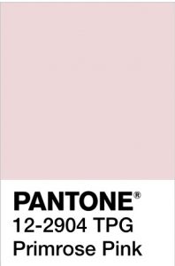
- PANTONE 12-2904 TPG Primrose Pink
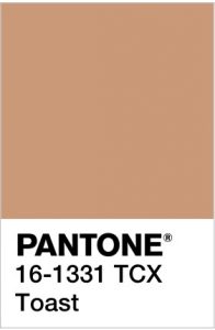
- PANTONE 16-1331 TCX Toast
- PANTONE 14-4121 TPX Blue Bell
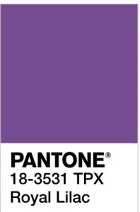
- PANTONE 18-3531 TPX Royal Lilac
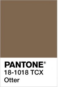
- PANTONE 18-1018 TCX Otter
- PANTONE 18-4028 TCX Navy Peony
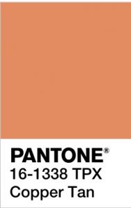
- PANTONE 16-1338 TPX Copper Tan
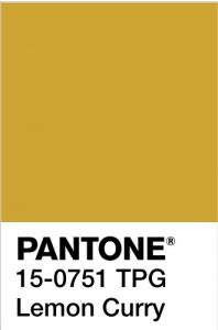
- PANTONE 15-0751 TPG Lemon Curry
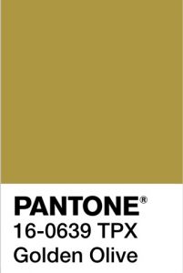
- PANTONE 16-0639 TPX Golden Olive
It’ll be great to see how couples incorporate these colours in to their weddings later this year (and whether the luxurious fabrics and sheer tops will influence wedding dress designs).
Pantone® is the world-renowned authority on colour and the Pantone® Color of the Year is always really influential in any popular colour themes in fashion, interior design and weddings.
See some of my other trend predictions for weddings in 2017.

by Hanami Dream | 21, December, 2016 | blog, trends
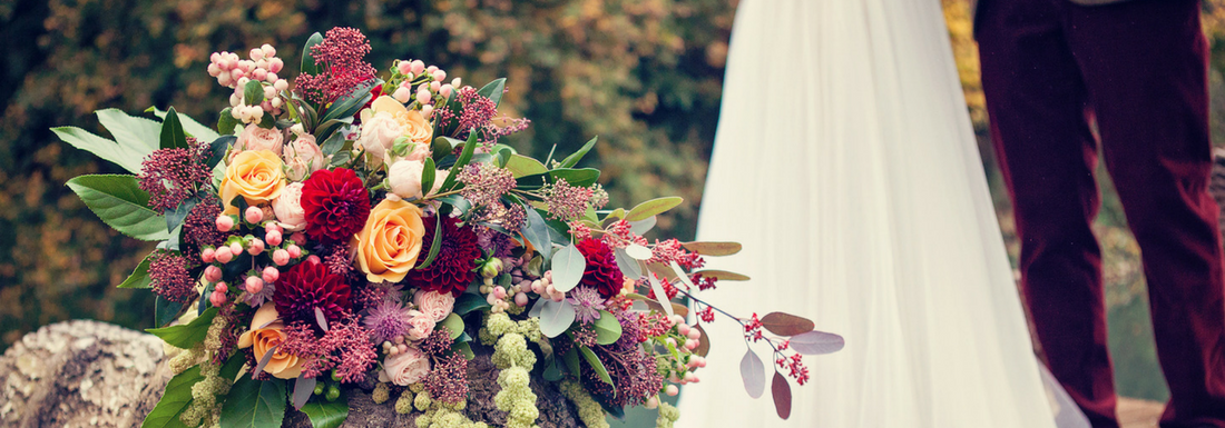 Weddings are a wonderful celebration of love and marriage. They can blend together families, traditions, cultures, creativity and lots of personal touches. Whether a religious, civil or humanist ceremony, a traditional or themed reception, these special days are about what is important to each individual couple.
Despite some couples’ originality, there are always trends that appear and popular themes that epitomise a particular era (think puff ball sleeves from the eighties). Sometimes fashion, films, television programmes, interior design, celebrity weddings and even current affairs influence these trends. Of course, there are some timeless and classic themes that never seem to go out of favour like a ‘romantic’ theme and personalisation is still key at the moment.
So what does 2017 hold for us?
Clothing
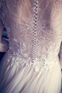
Bridal wear is really seeing a big shift in trends to provide new, innovative and unusual styles to make sure the bride makes a statement and is different to any other on her big day. Fashion trends that are appearing on the catwalks (that will surely influence weddings next year) include:
- Tailored separates including trousers or culottes, as well as shirts
- Athletic looking clothing but in evening wear material
- Alternative necklines to strapless such as halters, plunging and embellished necklines
- Varying lengths, cuts and material to provide short, sheer or cutouts
- Covering up the shoulders with long sleeves, boleros, lace or capes
- Plain veils
- Unusual accessories like ribbon hair bands, feather handbags and flat shoes
- Adornments on dresses such as bows, peplums, ruffles and 3D flowers
- Coloured & floral patterned dresses including various pastel shades and even black
Culture
The world of films and tv always influences trends and 2017 looks set to be a year of blockbusters to choose from such as:
- Comic book inspiration courtesy of Logan, Transformers, Lego Batman, Kong: Skull Island, Spider-Man and Wonder Woman
- Romantic fairy tales with Beauty & the Beast
- Futurist and space trends with releases of Blade runner 2049 and Star Wars 8
- Medieval individuality along with King Arthur: Legend of the Sword
- Beach and nautical themes thanks to Baywatch (plus Pamela Anderson’s 50th birthday) and Pirates of the Caribbean: Dead Men Tell No Tales
- Car racing, petrol head and Route 66 inspiration with Fast 8 and Cars 3
- 1920s Kazbar glamour with Murder on the Orient Express
- Fun themes spinning off from the Emoji Movie
And film and video will become more prevalent at weddings with more couples choosing 360 videos, virtual reality experiences and drones to capture their big day.
Celebrities
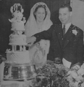
As well as the wonders of Pinterest, couples are inspired by seeing others doing something first. The affect of the royal wedding in 2011 is still apparent now as couples are choosing to have trees inside at their weddings. So it’s no surprise that details from celebrity weddings will influence wedding trends. Here are some famous engaged couples that could make it up the aisle in 2017 and their special days will be ones to watch:
- Pippa Middleton & James Matthews – I can’t wait to see how she tops her infamous bridesmaid dress and will Kate repay the favour?
- Tom Daly & Dustin Lance Black – will it be a swimwear only wedding like Tom has joked?
- Liv Tyler & Dave Gardner for a sports, fashion or rock and roll theme
- Emma Bunton & Jade Jones – though Baby Spice may need some help to start organising it as they’ve been engaged since 2010!
- Prince Harry & Meghan Markle – okay they’re not actually engaged yet but I can’t wait to see this that wedding day!
- Not exactly a celebrity (but to me she is a real star!) and that’s my mad Nan (self titled!) It’s so wonderful to see her so happy again and courting a lovely young man. Whilst we obviously miss Grampy, it would be lovely to see my Nan get hitched again. (Plus my little ones would make such cute attendants too!) There’s definitely a trend to seeing grandmothers as bridesmaids but I’d like to see mine as a bride next year.
Colour and styling
So much influences our daily lives which in turn spills over to the world of weddings including decorative elements from different arenas such as interior design, architecture, graphic design, lighting, furniture and textiles.
One part that overarches these elements is the importance of colour.
- The Pantone® Colour of the Year always plays a big part in influencing popular colours and I don’t think next year will be any exception. In 2017, the colour of the year is a yellowy green called Greenery. Pantone are citing it as ‘nature’s neutral’ [take a look at my report about the colour of the year] and I’m already a little bit in love with this colour! It will work well teamed with vibrant colours or partnered with pure white for a classic look. Here’s my take on the other colours to look out for in spring/summer 2017.
- Foliage – the colour of the year will also sit nicely alongside trends for more foliage and ‘bringing the garden inside’.
- Flowers – if you do go for flowers then they will need to make a statement and ‘go big or go home’ with paper florals emerging as an ecological and lasting alternative, new ways to wear flowers such as corsages, floral rings, anklets and chockers, as well as larger and looser bouquets
- Textures – be prepared for macramé in boho Coachella inspired themes, plus crushed velvet and total-coverage sequins for more luxurious styles
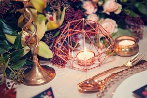
- Metallic – I’m so pleased that the metallic trend seems to be still going strong and isn’t showing any signs of tiring just yet. Rose, bronze, copper and gold – on their own, mixed together or used alongside white.
- Gem stones – this is a stunning and really striking trend using rocks lined with crystals (agate or hollow geodes) for a contemporary feel. As well as seeing marble coming back into the limelight.
- Transparent – strip it back by pairing nude and neutral colours alongside Perspex chairs, tables, menus and signage for a modern style
- Mix and match – pretty much anything goes and don’t be afraid to mix up all elements of the decor such as the colours, textures, metals and furniture. Not sure which colour to pick – well put them all together.
Catering
Family style serving is still a great way to share the wedding reception which works so well on long, large banquet tables lining the room.
Other food and drink highlights to support emerging tends include:
- Cakes – marbling icing, amazing geode cut out and crystal detailing and even wedding cakes with image projections on them
- Unusual catering vans, dessert tables and interactive stations st the reception – think oyster shuck trucks, gin bars and make your own pudding
- Food for favours – give you guests something they can take away and enjoy at home and remember the day like coffee beans, loose leaf tea or alcohol miniatures for favours
- Food walls – hang donuts (for example) to make edible decor which could even double as escort cards too! Delicious!
- Personalised cocktails – have your own cocktails created and served as the ‘house’ aperitif instead of Pimms or Buck’s Fizz when guests arrive. Or how about two different personal cocktails to represent the different tastes of the couple.
Current affairs
You may be living and breathing your wedding and everything else in the world is taking a back seat. However, things are still going on around you and some national, local and annual events may have an impact on your guests involvement, availability and enjoyment. Here’s some events that could influence your choice of dates.
In addition, around the world, some momentous celebrations could also influence wedding trends.
- Europe – We will mark 15 years since the launch of the Euro in January. Could thoughts of Brexit mean we embrace all things European whilst we are still part of Europe? Potential costs of some products could go up if/when we do exit Europe such as flowers that are imported so couples may be looking for cheaper alternatives.
- Then in April, it will be the 40th anniversary since the fall of Saigon. I love the tea ceremonies from this region as part of their weddings celebrations along with the opulent red and gold colours.
- In August, it will be 40 years since Elvis died. Will this give us another 1970s revival? – think rhinestone jumpsuits!
- Later in the year, it is the 100th anniversary of the Russian revolution in November. Perhaps this will herald Russian traditions becoming more popular such as week long weddings, a tour of the city to have photographs taken at historical places and wearing wedding crowns in the ceremony. As well as the Russian tradition of seeing which of the newlyweds can grab the biggest handful of bread at the wedding breakfast to see who will be the head of the household.
These are a few of my predictions for wedding trends in 2017. I’d love to hear what you think are going to be popular wedding trends next year. Email me at info@www.hanamidream.co.uk with your predictions. See more of my curation and inspiration on Pinterest.
May I take this opportunity to wish you a very Happy Christmas and all the best for the New Year.
Are you getting married in 2017? Is your wedding going to be following one of these trends? Let me know if you’d like to share the detail shots of your day on my blog to inspire other couples who are wedding planning. If you (and your photographer) are happy, then take a look how to submit your wedding.
by Hanami Dream | 8, December, 2016 | blog, trends
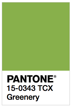
We are going green next year as the Pantone® Color of the Year 2017 is Greenery.

What a wonderful, fresh and vibrant colour that I can’t wait to see couples incorporating into their wedding colour schemes next year.
Greenery will look stunning alongside pure white as well as partnering perfectly with other colours. Plus it sits nicely with trends for more foliage and bringing the garden inside.
I love that the colour of the year is not subtle and withdrawn – its out with pastel and in with a vibrant splash of citrus colour! It makes me think of long cool glasses of mojitos brimming with fresh mint with a slice of lime on the top! I can hear the ice chinking as I write!
And it’s that sense of relaxing and getting away from the stresses of the world that Pantone® emphasis this colour will embody in 2017.
Leatrice Eiseman, the executive director of the Pantone Color Institute describes it as: “the color of hopefulness, and of our connection to nature. It speaks to what we call the ‘re’ words: regenerate, refresh, revitalize, renew. Every spring we enter a new cycle and new shoots come from the ground. It is something life affirming to look forward to.”
Pantone® is the world-renowned authority on colour and the Pantone® Color of the Year is always really influential in any popular colour themes in fashion, interior design and weddings.
I’ve been desperate for a yellow or an orange colour to get top billing for a couple of years and my guess for the Color of the Year 2017 was for Primrose Yellow (see my Spring 2017 report). So I’m so pleased to see a vibrant, bright colour leading the way in 2017.
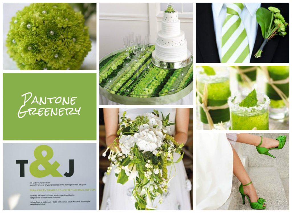
See more about my winning Greenery mood board from the UK Academy of Wedding and Event Planning’s SS17 Pantone® mood board competition from earlier this year.
#COY2017
by Hanami Dream | 22, November, 2016 | blog, inspiration, styled shoots
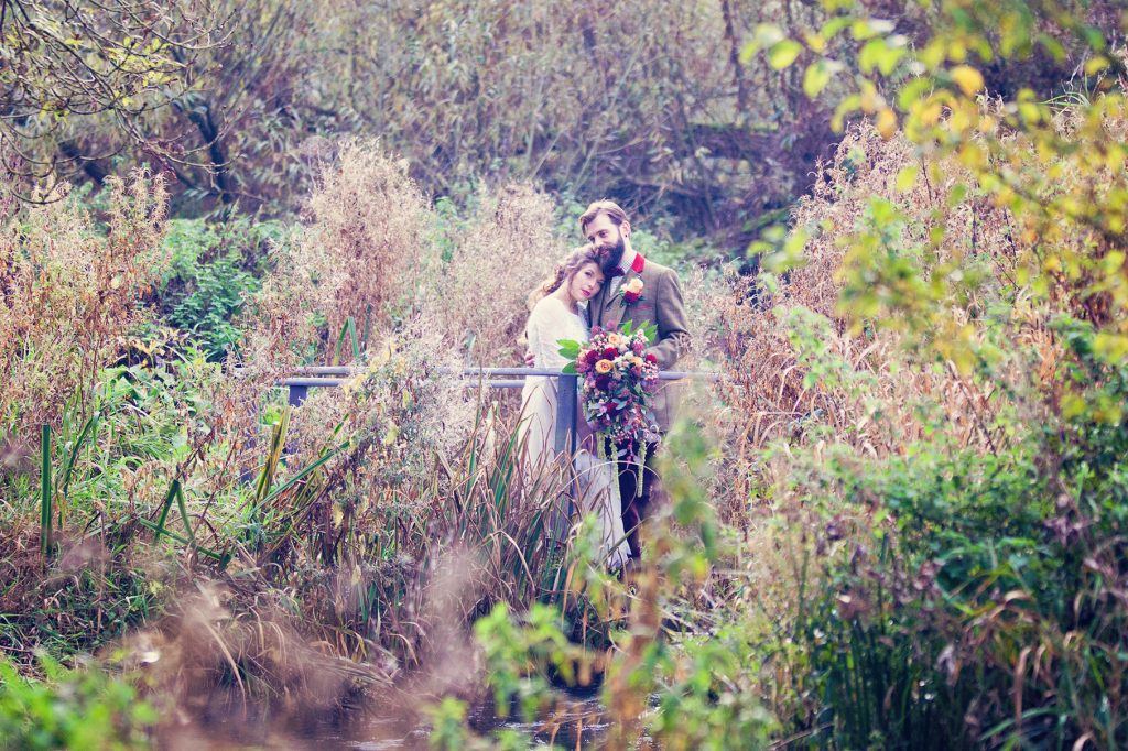
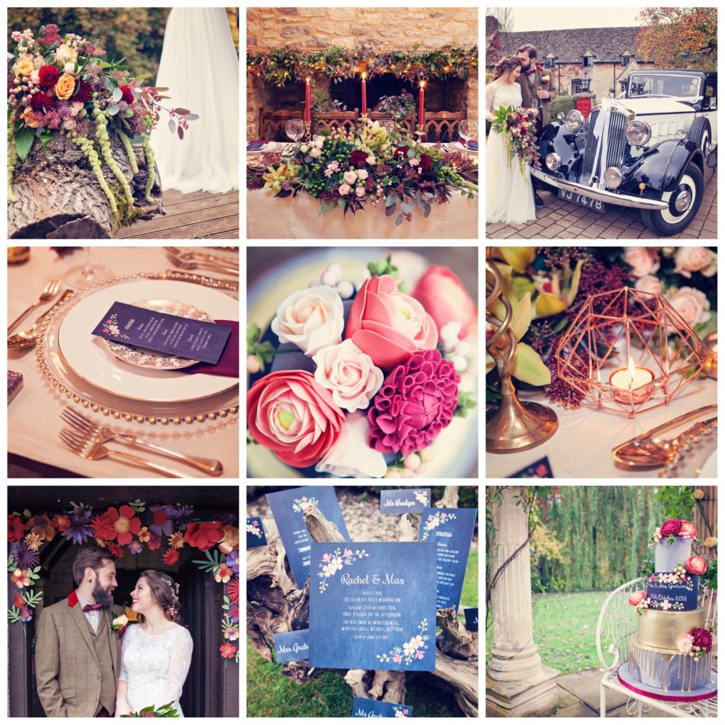
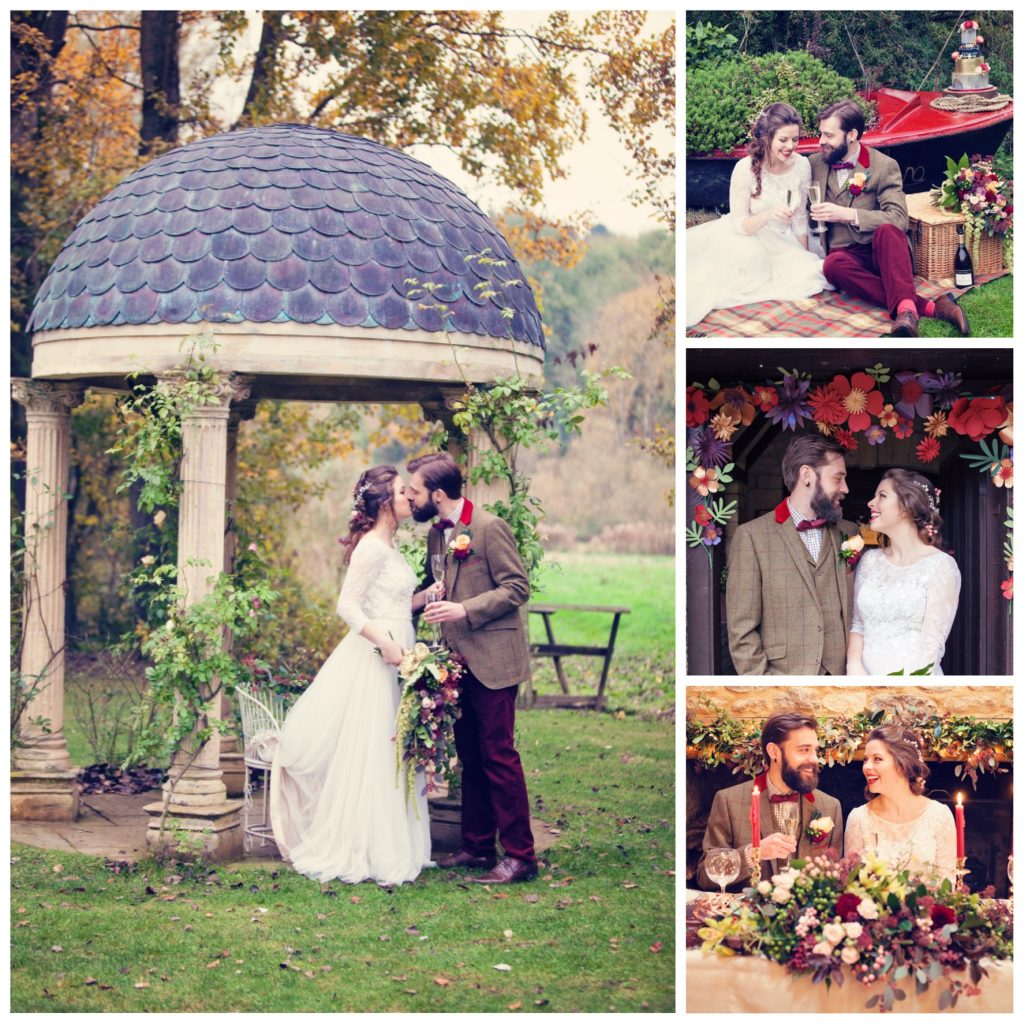
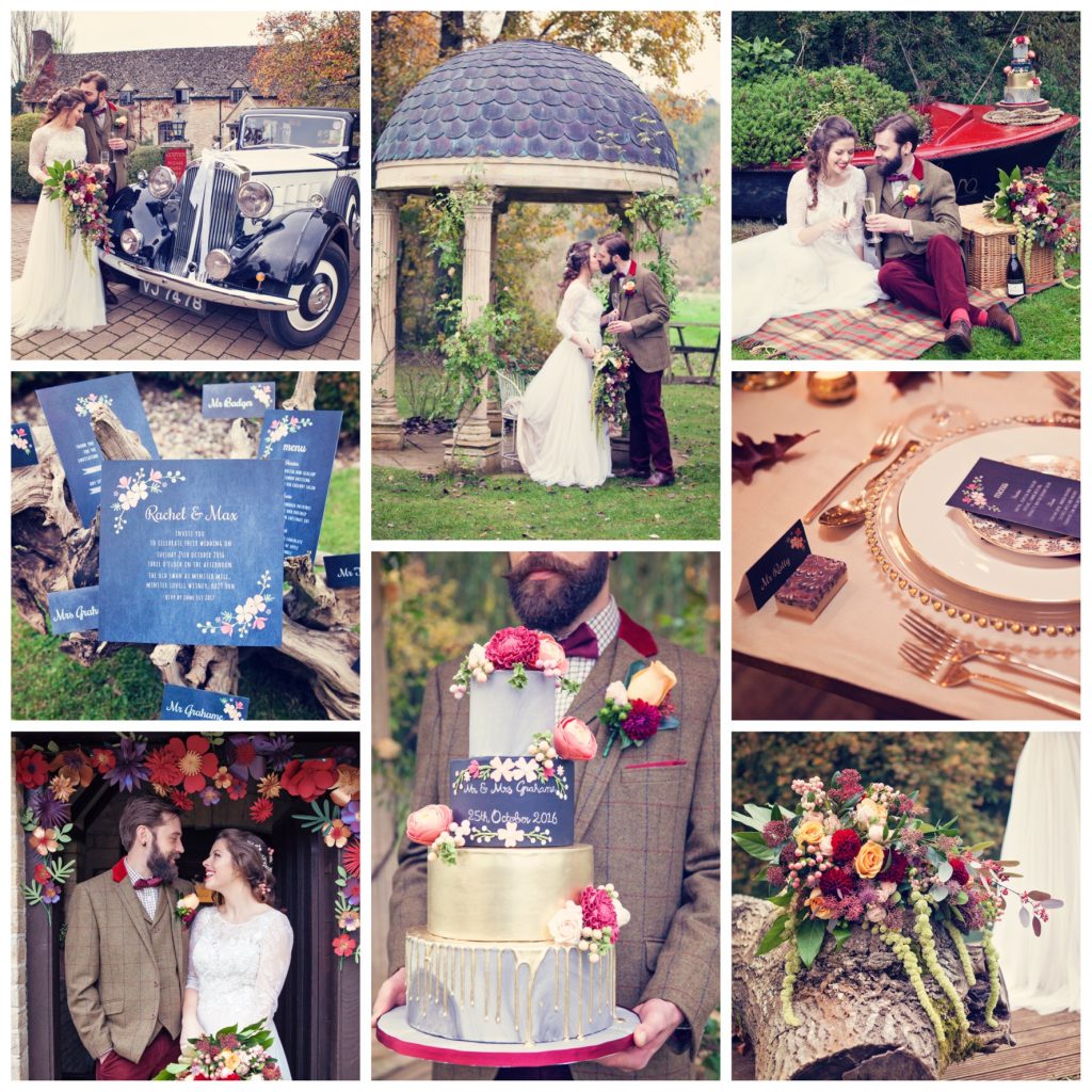
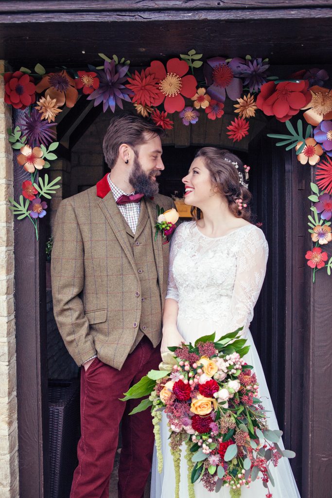
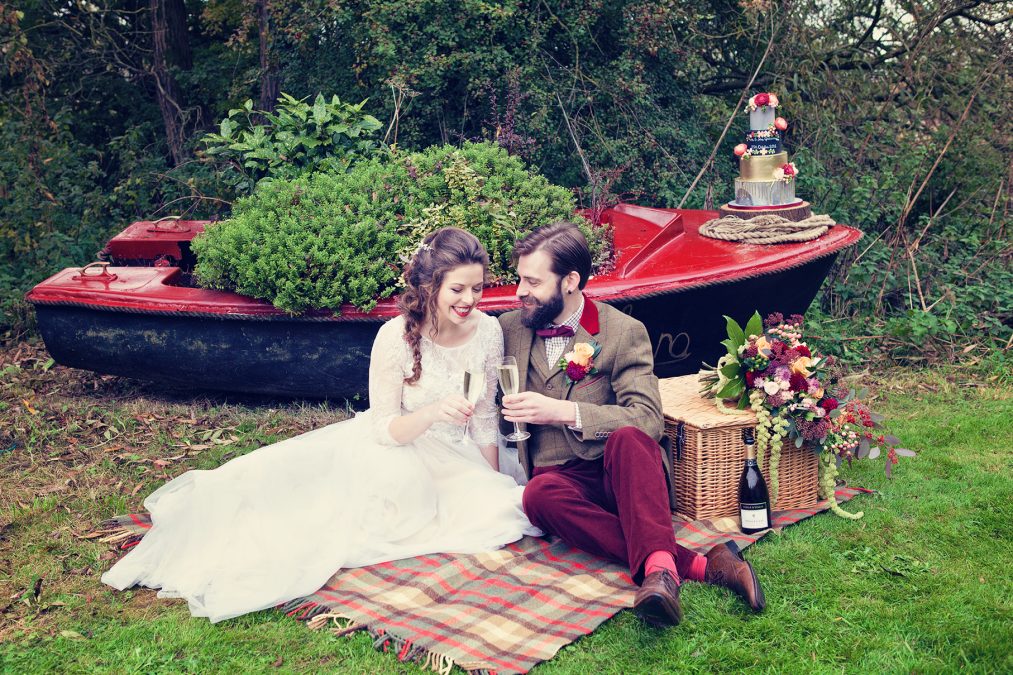
Set in the beautiful Oxfordshire countryside of the Cotswolds, this Wind in the Willows styled bridal shoot is an outdoor, autumnal adventure. Complete with vintage transport alongside a picturesque river, followed by a celebration in a grand hall dressed in marsala and gold, with chalk board and marble design features plus tactile fabrics like tweed, corduroy and suede. Planned and designed by Hanami Dream and wonderfully captured by Farrow Photography.
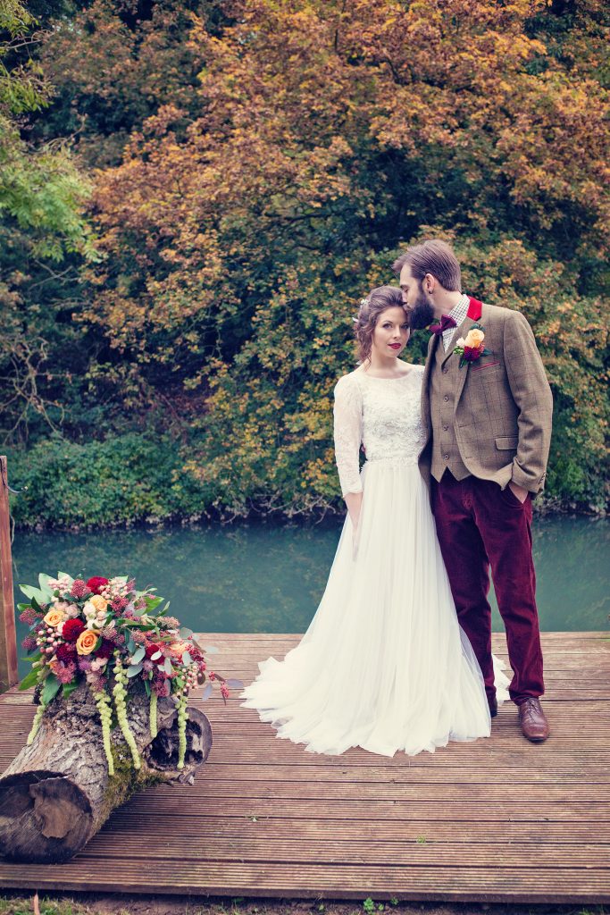 It is a true celebration of the beauty of nature and encapsulates the sense of an outdoors adventure as typified by the Wind in the Willows book by Kenneth Grahame. This is a chance to get away from the hectic, crowded city to a stunning and tranquil setting. Mole, Ratty, Toad and Badger would be proud to attend this relaxed bohemian wedding.
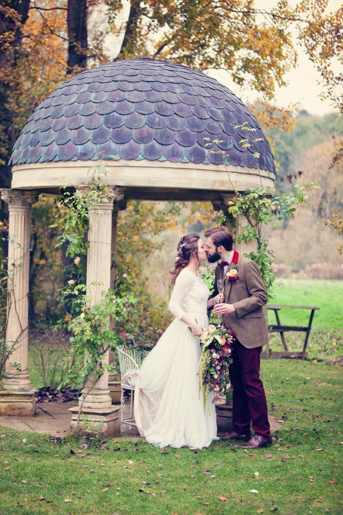
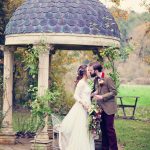
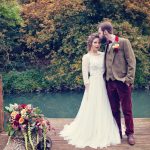
The Old Swan and Minster Mill was a perfect location for this wedding where the bride and groom gazed at one another during their wedding ceremony whilst on the love seats under the Temple Garden. This had the amazing backdrop of a splendid willow tree draping it’s branches in to the River Windrush, flowing on it’s way to join the River Thames. 
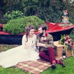
The couple moored their rowing boat by a disused boat house, explored the peaceful setting with treks down the river, over bridges, carefree on a tree swing and enjoyed a sumptuous, rustic picnic sat on a blanket with their hamper on the riverbank.
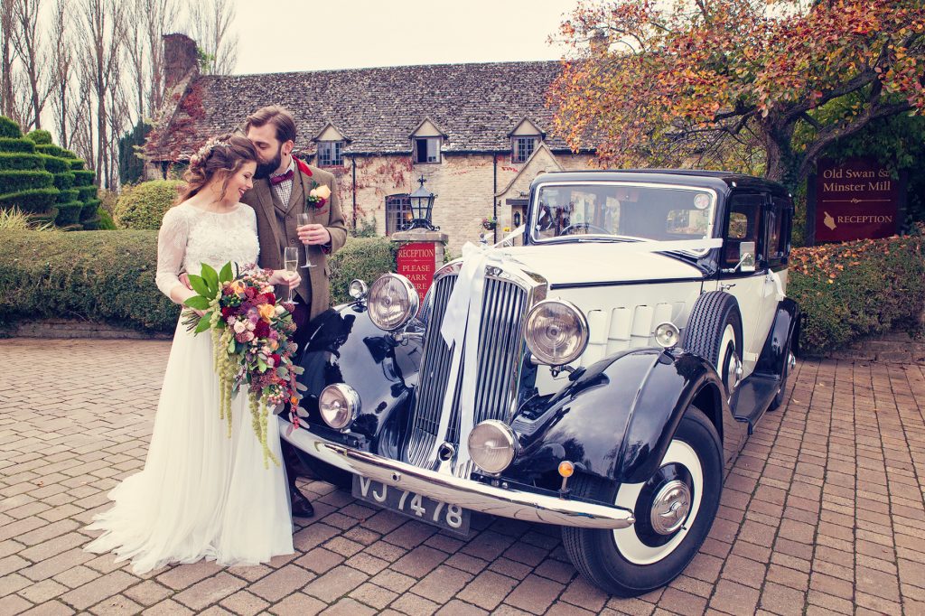
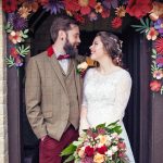
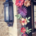
Mr Toad would have approved of the vintage Humber car (from British Classic Car Hire) to experience the open road before entering the Great Hall through a paper floral archway (by Paper Tree Design) to feast on a mouthwatering banquet.

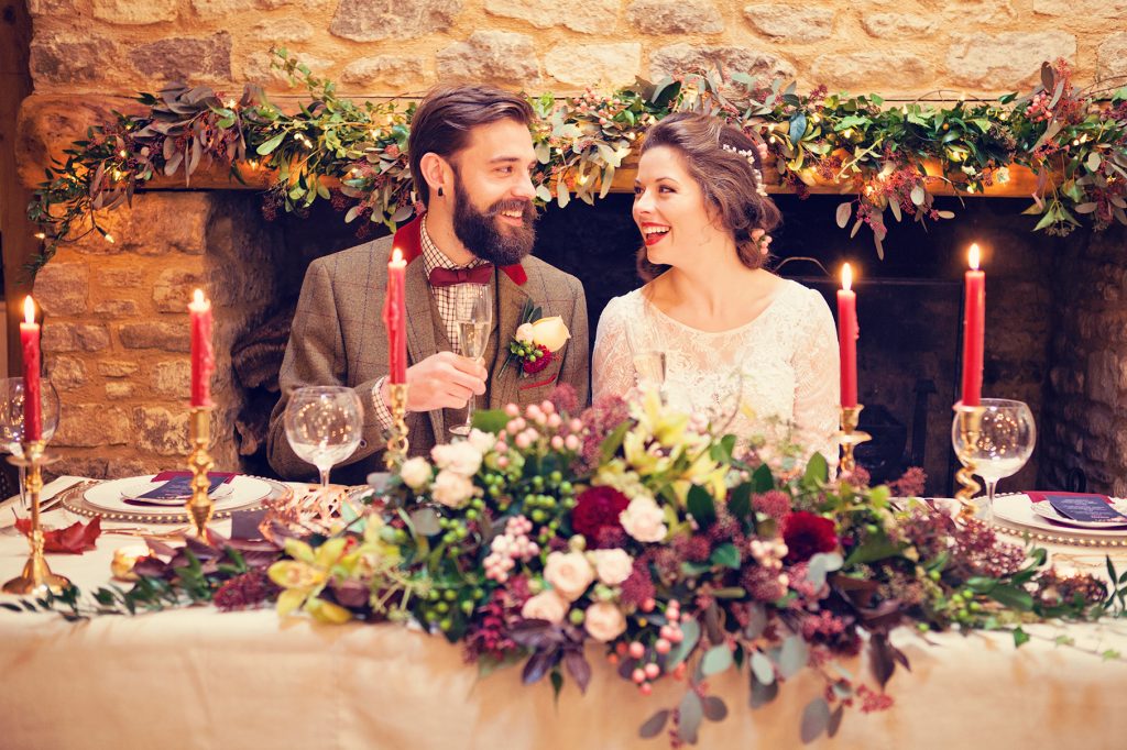
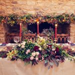
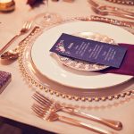
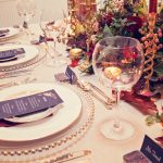
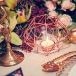
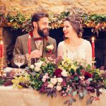
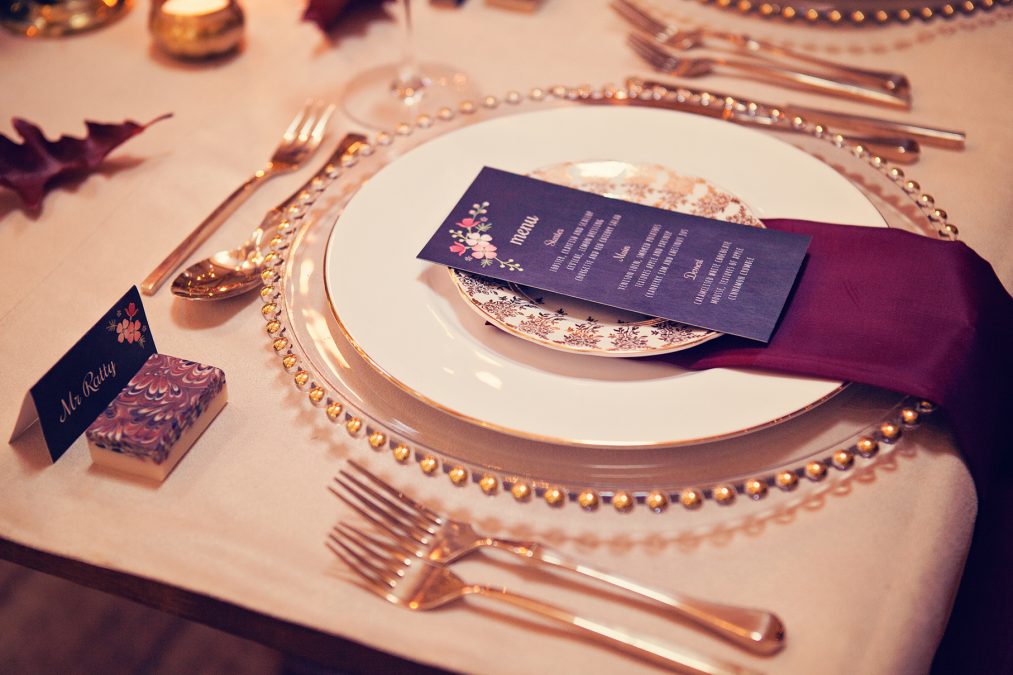
Once inside the happy couple sat in pride of place at the top table, in front of an impressive fireplace with a mantelpiece adorned with swashes of forest green foliage (from Classic Flowers) and fairy lights. The table was luxurious and tactile complete with a suede cream table cloth, copious amounts of marsala coloured candles in gold candlesticks and geometric copper tea light holders (from Talking Tables). Gold beaded charger plates were topped with gold vintage crockery (from Vintage Gold China), marsala coloured silk napkins and a chalk board design menu card (by Paper Tree Design), besides gold vintage cutlery (from Vintage Gold China).

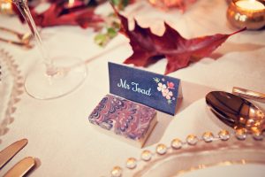
Guests found their places by referencing the chalk board style table plan and name cards (with guest names paying homage to the character names and table were named after chapters from the book by Paper Tree Design) and were given an opulent, marsala marbled soap as their fragrant favour (by Stonesfield Soap Company).

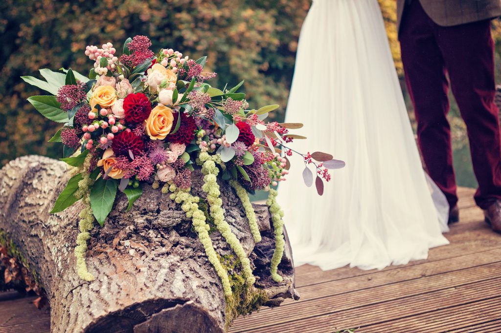
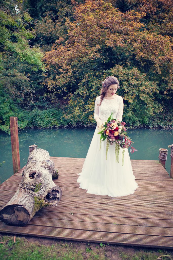
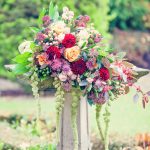
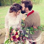
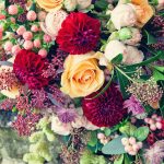
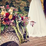
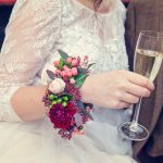
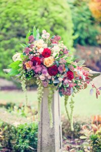
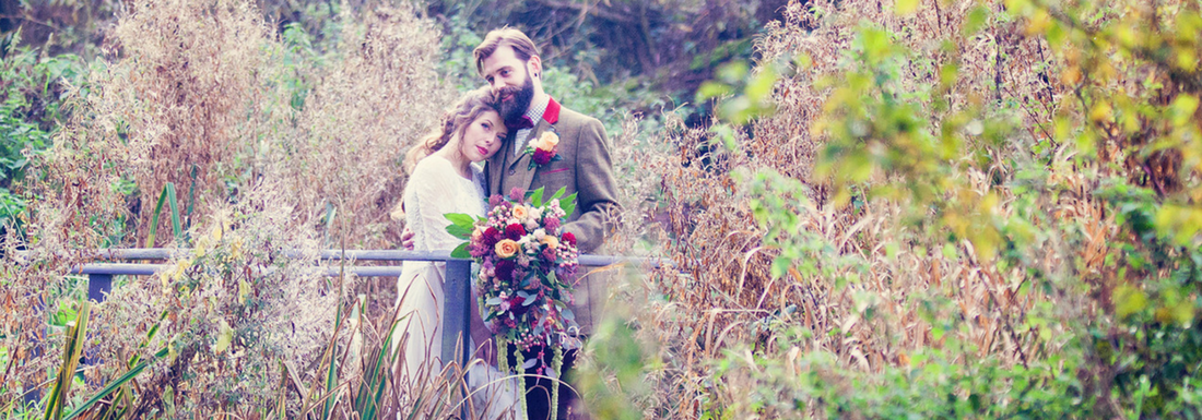
The top table was swathed in a striking floral table runner with a loose relaxed vibe containing lots of greenery along with burgundy dahlias, flowing amaranthus (mirroring the weeping willow tree outside), ranunculas, hypericum berries, snow berries, skimmia and bombastic roses. These flowers (from Classic Flowers) featured in the remarkable bouquet that the bride cradled, as well as in her loose braided hair (by Lucy Beesley Bridal), her corsage and the groom’s buttonhole. 
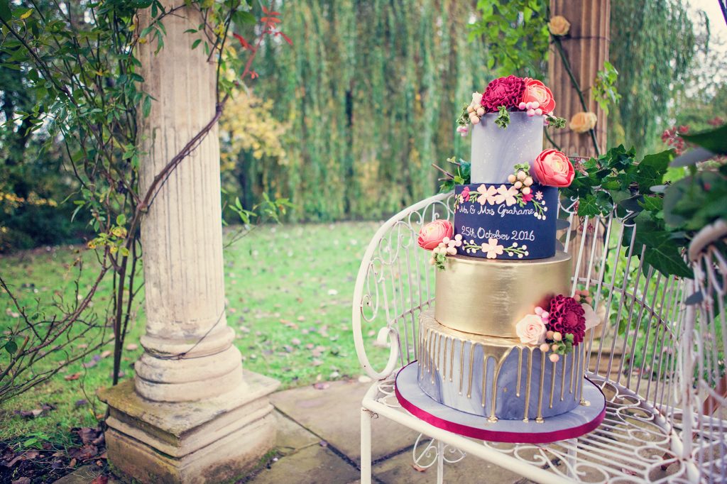
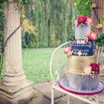
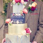
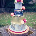
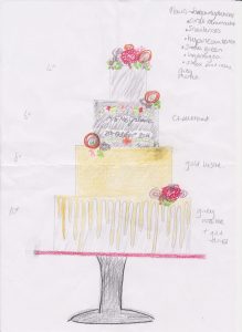
These florals were beautiful replicated on the cake (by The Pretty Cake Company) which also combined other on trend themes such as marbling, metallic gold lustre, drip effects and a chalkboard tier, which was sympathetic to the stationery and a nod to the author of the book. 
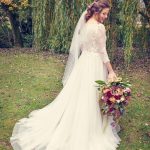
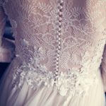
The gorgeous bride braved the cold autumnal weather, with a beautiful smile complete with marsala coloured lipstick (with makeup by Lucy Beesley Bridal) and perfectly fitted the romantic A line wedding gown with lace sleeves, sweeping net train and floral appliqued bodice by Watters (provided by Mae Bridal). She completed her look with a short veil (by Richard Designs) worn low below a delicate hair vine (by Miranda Templeton) and gold coloured Blake shoes (by Benjamin Adams). 
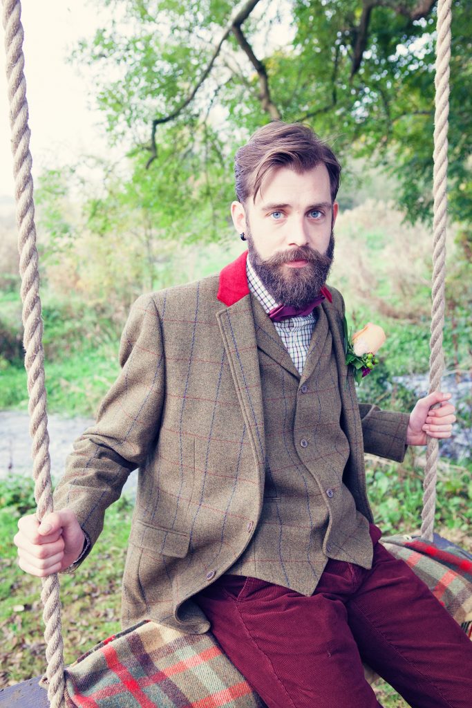
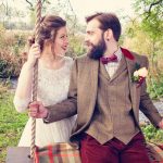
Our handsome, bearded groom suited the countryside surroundings with the dapper tweed jacket and waistcoat, coupled with a checked shirt, marsala bow tie and plush red corduroy trousers that he wore (from Keates of Witney). 
It’s the little details that bring any event to life and this was made possible by the wonderful local suppliers who provided their time, services, venue and products for free. Together we have showcased the amazing talent that our part of the UK has to offer the wedding industry.
Take a look at the fabulous suppliers that were involved in this styled shoot – ‘Keeping it local with suppliers for the Wind in the Willows shoot’
And take a glimpse behind the scenes at the how the theme and designs came to life – Behind the scenes: Wind in the Willows shoot
#keepitlocal
-

-

-

-
Photography by Farrow Photography
-

-

-

-

-

-

-

-

-

-

-

-

-

-

-

-
Photography by Farrow Photography
-

-

-

-

-

-

-

-

-

-

-

-

-

-

-

-

Planning & Design | Hanami Dream | www.hanamidream.co.uk
Location | Old Swan & Minster Mill | www.oldswanminstermill.co.uk
Photographer | Farrow Photography | www.farrowphotography.com
Models | Jess & Henry
Hair & Make up | Lucy Beesley Bridal | www.lucybeesleybridal.co.uk
Bridal dress and accessories | Mae Bridal | http://maebridal.co.uk
Groom clothing | Keates of Witney | www.keatesmenswear.co.uk
Florist | Classic Flowers | www.witneyflorist.co.uk
Cake | The Pretty Cake Company | www.theprettycakecompany.com
Stationery (including paper floral arch) | Paper Tree Design | www.papertreedesign.co.uk
Cutlery & Crockery | Vintage Gold China | www.vintagegoldchina.com
Copper geometric tea lights | Talking Tables | www.talkingtables.co.uk | sourced by Lark Rise Flowers | http://larkriseflowers.com
Favours | Stonesfield Soap Company | www.stonesfieldsoap.com
Transport | British Classic Car Hire | www.britishclassiccarhire.co.uk

by Hanami Dream | 22, November, 2016 | blog, styled shoots
I was really pleased to work with Farrow Photography on another styled shoot this autumn. We first joined forces in 2014 to bring to life some inspirational themes to show how you can enhance your milestone events. Following the success of our previous themed photo shoots, we collaborated once again to produce an amazing bridal styled shoot based around another well known story, The Wind in the Willows. It was also an honour to be able to showcase some amazing products from some fantastic local suppliers.

Theme
I choose the Wind in the Willows theme as it is another classic story with it’s roots firmly based in and around Oxfordshire. The book by Kenneth Grahame was written 108 years ago (published on 15th June 1908) and he took inspiration from the River Thames from his child hood and also from when he lived in Oxford when he was at school. In later life, he lived in Blewbury with his own family and The Wind in the Willows was based on stories that he used to tell to his son Alistair. It is even claimed that Mapeldurham was the vision for Toad Hall.
This book evokes such beautiful natural scenes of being beside the riverbank – a relaxing setting, which allows characters rustic picnics and peaceful treks down the river, all to contrast with hectic, crowded city life. Many cite that the book has a common theme of struggling with a sense of place. Whether it’s being comfortable with where you are or facing things that need to be changed.
For me, it typifies a sense of adventure and the great open road. So initially, I really wanted to focus on getting as many different modes of transport involved in this bridal shoot, including a rowing boat, a vintage car (poop poop!), a colourful old fashioned bow top caravan and even a barge, if possible.
There’s also a running theme of hospitality in the book, so I wanted to get across the feel of a decadent banquet in the Grand Hall as well as a sumptuous picnic.
I wanted to hint at the theme with slight nods to the book in place names, the table plan and on the cake. I certainly didn’t want to focus on the weasels at Toad Hall as their laughs and noises used to scare me when I listened to the cassette story as a child!
The final thing that I really wanted to capture was stunning, rich autumnal colours.

Styled shoot
A styled shoot takes almost as much time and effort to produce as a wedding day and entails bringing together the theme from many different suppliers.
The beauty of styled shoots (versus a real life wedding) is that it is a great opportunity to be a little more extravagant and really show off what you’ve always wanted to do. You can indulge your fantasies with new trends or products that couples may not have seen yet or something really unusual.
This styled shoot is a collaboration of like minded people that can create great things together but perhaps don’t have the budgets to produce this kind of work if they all worked independently.

Brief
I am very lucky to live in a beautiful part of the UK and am surrounded by some seriously talented wedding venues, professionals and suppliers. I was honoured that so many wanted to be involved in this shoot and they certainly didn’t disappoint with the products that they provided.
I gave them all the same brief that I was trying to achieve:
an outdoors adventure with vintage transport along the beautiful riverside, followed by celebrations in a grand hall dressed in marsala and tweed with chalk board signs
I also provided them with my collated vision and ideas on my Pinterest board.
The themes I wanted to encapsulate included:
- Transportation
- Autumn
- Bo-ho / 1970s
- Chalk board
- Marbling
- Greenery
I wanted to focus on the following autumnal colours:
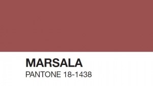
- Marsala (colour of the year in 2015 and still going strong)
- Pale pink/coral (Rose Quartaz is one of the colours of the year in 2016 and I wanted to have a dress that wasn’t a traditional white dress)
- Gold (using the current metallic trend along with copper and a welcome alternative to silver)
- Tweed (casual men’s wear perfect for the country setting)
- Forest Green (focusing on lots of greenery and foliage)

Designs
The creative suppliers worked wonders in transforming my overflowing pot of ideas and pairing it down in to realistic and achievable products for us to showcase.
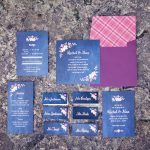
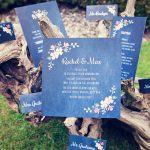
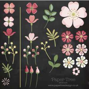
- Stationery designs – One of the first ideas for this shoot came from an image that I saw of a floral archway bursting with rich dark coloured flowers. Having spoken to Paper Tree Design about my vision, they were excited about making this floral arch from paper and card including lots of dark green foliage and some metallic and pearlised paper. The stationery had to synchronise up with lots of other elements such as the font and date of the wedding used on the invitation and cake, the flower illustrations used are ladies smock, wild rose and pink, and white campion, the menu used is a sample from the venue, plus the envelope liner was tweed inside a marsala coloured envelope.Then the theme came alive with the inclusion of the author and character names on the place cards (Mr Grahame, Mrs Grahame, Mr Toad, Mr Badger, Mr Mole, Mr Rat), and the seating plan had table names displayed on a chalk board which were named after the first 9 chapters of the book (1. The River Bank, 2. The Open Road, 3. The Wild Wood, 4. Mr Badger, 5. Dulce Domum, 6. Mr Toad, 7. The Piper at the Gates of Dawn, 8. Toad’s Adventures, 9. Wayfarers All).

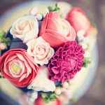
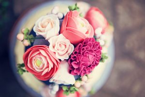
- Cake design – The Pretty Cake Company helped to combine a few ‘on trend’ themes for this photo shoot, whilst combining the floral themes too. Marble wedding cakes are a revived trend that are becoming very popular and combined with the ongoing popularity of metallic effects, this shoot was perfect to experiment with both. The top and bottom tier were covered using a hand mixed grey marbled sugarpaste. The top tier had a subtle splattering of edible gold lustre paint and the bottom tier had the gold drip effect which looked like it poured from the second gold lustred tier. The chalkboard effect on the third tier was sympathetic to the stationery used and with a nod to Kenneth Grahame whose book ‘The Wind in The Willows’ inspired this shoot. The cake was finished with a selection of arrangements of sugar flowers such as burgundy dahlias, coral ranunculus, sweet avalanche roses, snowberries and green viburnum.

- Flowers – Classic Flowers really went to town with my brief of having loose and flowing displays along with the colour themes running throughout the shoot. The green amaranthus especially in the bouquet worked in beautiful harmony with the weeping willow at the venue.Here are the flowers that were used in the shoot:
- Brides bouquet – Mustard roses, Astrantia, Green and Coral Hypericum, Bombastic spray roses, Green Amaranthus, Burgundy Dahlia, Skimmia, flowering eucalyptus, ivy and fatsia leaves.
- Buttonhole – Mustard rose, Bombastic spray roses, Burgundy Dahlia, Green and coral hypericum, flowering eucalyptus and skimmia leaves.
- Table arrangement – flowers as brides bouquet PLUS green orchids and soft ruscus.
- Swag on fireplace – Flowering eucalyptus, ivy, skimmia and soft ruscus.
- Temple – Peach roses
- Love Seat – ivy, flowering eucalyptus and skimmia
Despite getting stuck in Calais (due to the migrant camp closing), the flowers thankfully made their way from the Dutch supplier in time for the shoot!

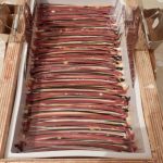
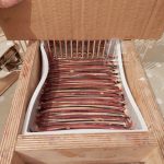
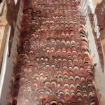
- Soap favours – the beautiful Marsala Peacock soap favours were an equistite addition to the beautifully laid tablescape in the banquet scene. Stonesfield Soap Company were amazing at making these bespoke soaps to match the colour theme of the shoot and they added a great aroma to the room whilst we were shooting! They are all made by hand and these images give an idea of the amount of processes that go in to making these favours. Here are the ingredients of the soaps that were used on this shoot:
- Oils used: olive oil, coconut oil, sunflower oil, shea butter (raw), rapeseed oil (UK cold-pressed), cocoa butter
- Essential oil blend: Lavender, mandarin, patchouli
- Other inclusions: goat milk yogurt, tapioca starch, kaolin clay
Suppliers
I couldn’t have been happier (and luckily) with the products that all the suppliers produced and provided.
- Venue – I picked the Old Swan and Minster Mill based on it’s riverside location and it’s glorious weeping willow tree. How fortuitous that we also discovered that they had an old disused boat house and moored rowing boat that just so happened to be painted in red to match our theme perfectly! Also the chairs in the dining room were also a perfect colour match. It seemed like fate to bring the venue and colour palettes together in one amazing venue.
- Hair – I was incredibily pleased that Lucy Beesley Bridal were available to do the bride’s hair and make up for this shoot. She actually did my hair at my own wedding 5 years – surely you can’t get a better recommendation! She brilliantly included the colour theme in the marsala lipstick and green/black eye liner and ensured the braided hair followed the loose and flowing themes.
- Dress – Originally, I really wanted to use a non-white dress for this shoot – like a pale pink or coral colour. Plus I wanted to get away from the strapless dresses we see all too often. So I briefed Mae Bridal that I wanted to use something that covered the shoulders (which I think our cold bride was appreciative on the day!) and that had embroidery on it. The Watters Amelia dress hit the brief bang on with a nude coloured under skirt, amazing embroidered back and sleeves, plus a nice bo-ho vibe to fit in with the laid back theme.
- Menswear – Keates of Witney provided a brilliant tweed jacket and waistcoat with pops of red to bring together the bow tie, cords and red of the checked shirt. Our groom looked like a proper country gent!
- Cutlery – I wanted to get away from all the silver cutlery adorning tables and push towards the mixed metallic trends that are appearing. I was also really keen to use local suppliers for this shoot and searched extensively for gold cutlery. I was delighted to find the Vintage Gold China whilst networking on a wedding Twitter hour one night. They seem to be the only supplier locally to have an extensive selection of modern and traditional styled gold cutlery as well as crockery to hire. Plus they were a font of knowledge and extremely happy to help with my quest for finding marsala coloured candles to go in their lovely selection of gold coloured candlesticks. Even after a tiring night washing up the products from the night before, they turned up with such enthusiasm and encouragement that it was a delight to have them involved in the shoot.
- Tea light holders – Another trend I wanted to include an element of geometric terrariums or candle holders. Just by chance, I was talking to Larkrise Flowers at the Cogges Wedding Open Day about my search and they were able to very kindly source some brilliant geometric copper candle holders from Talking Tables on my behalf.
- Car – The shoot’s main inspiration was always about different modes of transport, so it wouldn’t have been complete without the stunning Humber from British Classic Car Hire. And a stroke of luck that the interior of ‘Hester’ was a luxurious marsala coloured leather – it was meant to be! ‘Hester’ is stunning in Black and White, with her beautiful, almost Art Deco lines, lots of chrome detailing and huge headlights, Hester turns heads wherever she goes. A comfortable ride, sliding sun-roof and lovely drop down tables in the rear, she’s a real beauty.
- Models – And lastly the shoot was brought beautifully to life by the stunning models. I advertised for waves and beards and was so pleased that Jess and Henry were not only able to play our bride and groom but fitted the bill perfectly (his beard was so well coiffured!) They are a real life couple and this really showed in the way that they interacted and came across on camera. Not yet married, but very much in love, they were just right as the happy couple (even if it was a fake wedding!) I, for one, can’t wait to hear if playing the parts has sown any seeds and I look forward to hearing any engagement news in due course!

See more about our Wind in the Willows shoot – Inspiration: autumnal marsala & gold Wind in the Willows wedding
And take a look at the fabulous suppliers that were involved in this styled shoot – ‘Keeping it local with suppliers for the Wind in the Willows shoot’
#keepitlocal








 Weddings are a wonderful celebration of love and marriage. They can blend together families, traditions, cultures, creativity and lots of personal touches. Whether a religious, civil or humanist ceremony, a traditional or themed reception, these special days are about what is important to each individual couple.


 It is a true celebration of the beauty of nature and encapsulates the sense of an outdoors adventure as typified by the Wind in the Willows book by Kenneth Grahame. This is a chance to get away from the hectic, crowded city to a stunning and tranquil setting. Mole, Ratty, Toad and Badger would be proud to attend this relaxed bohemian wedding.