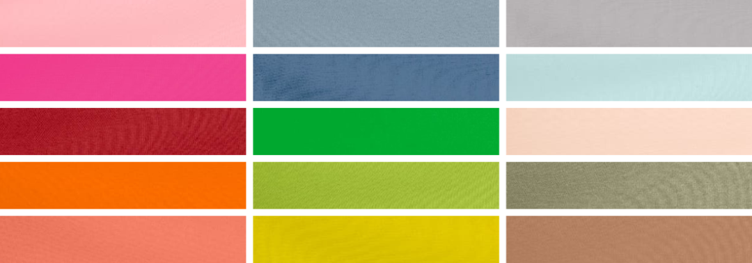
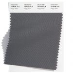
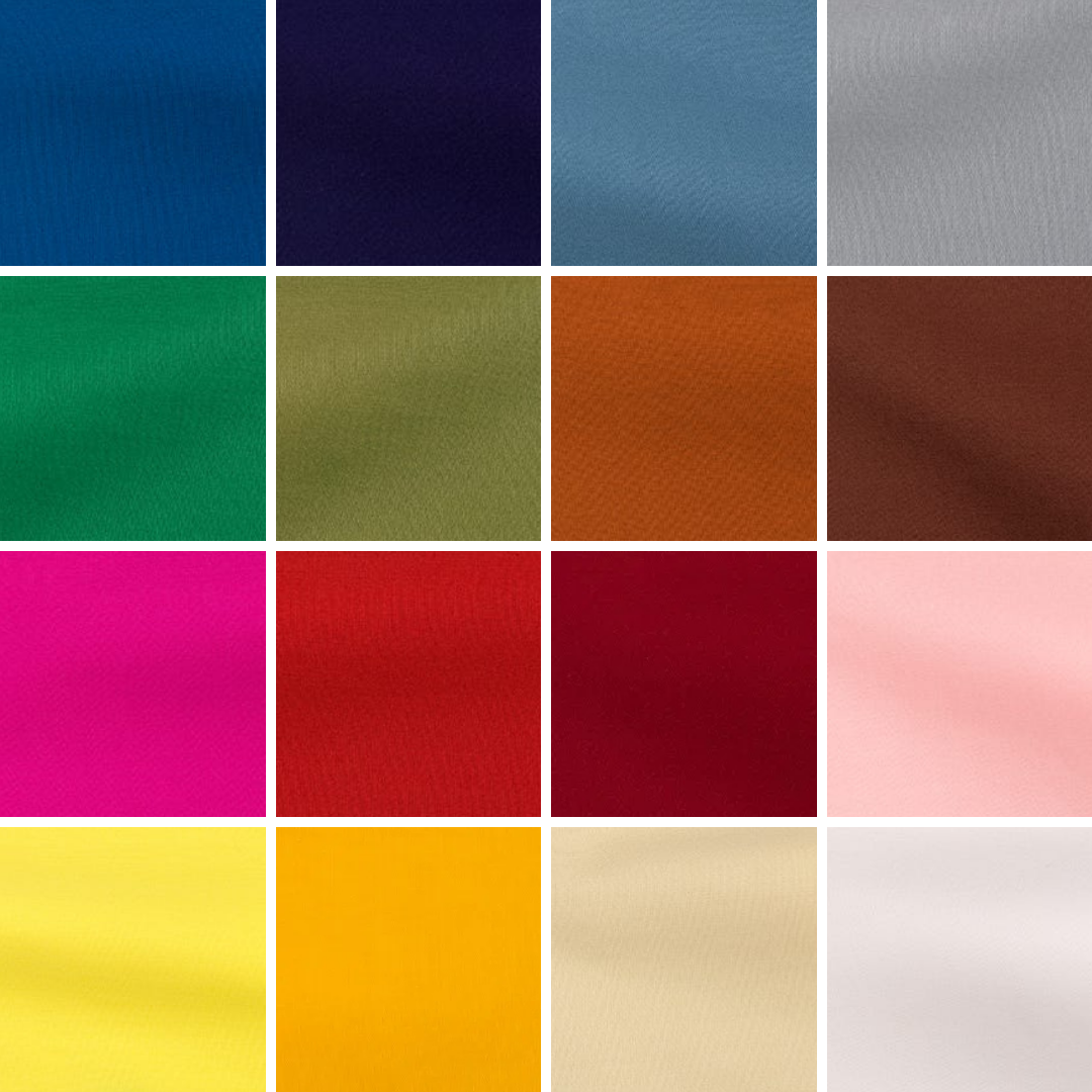
Top Spring 2023 colours from Pantone®
Grey clouds
It has been a strange start to the new academic year. I’m usually fired up and ready to start afresh with new vigour and enthusiasm. I was all raring to go when the children when back to school (even though the weather had taken a sudden noise dive towards autumn without the usual tailing out of sunny days.) It was strange to be by myself after having someone around me for the last 11 weeks (due to a string of illnesses before the summer holidays) so I was determined to crack on with the ever expanding to do list.
And then came the very sad news out of the blue that our Queen, of 70 years, had sadly passed away.
Rainbows in the sky
I was surprised by how I felt about the news and the emotions that I went through. It makes me so sad thinking about there being no Queen and it was like losing another Nan all over again. The weather was dull, grey and rainy on the day that she died and then somewhat symbolically a double rainbow arched the sky that evening.
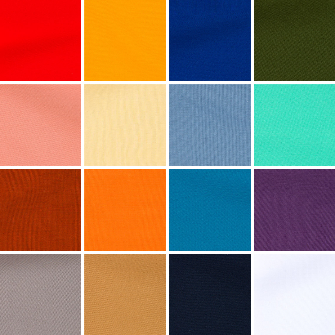
And a beautiful array of rainbow colours pretty well sums up the latest Pantone® announcement that predicts the colours for next year’s Spring and Summer.
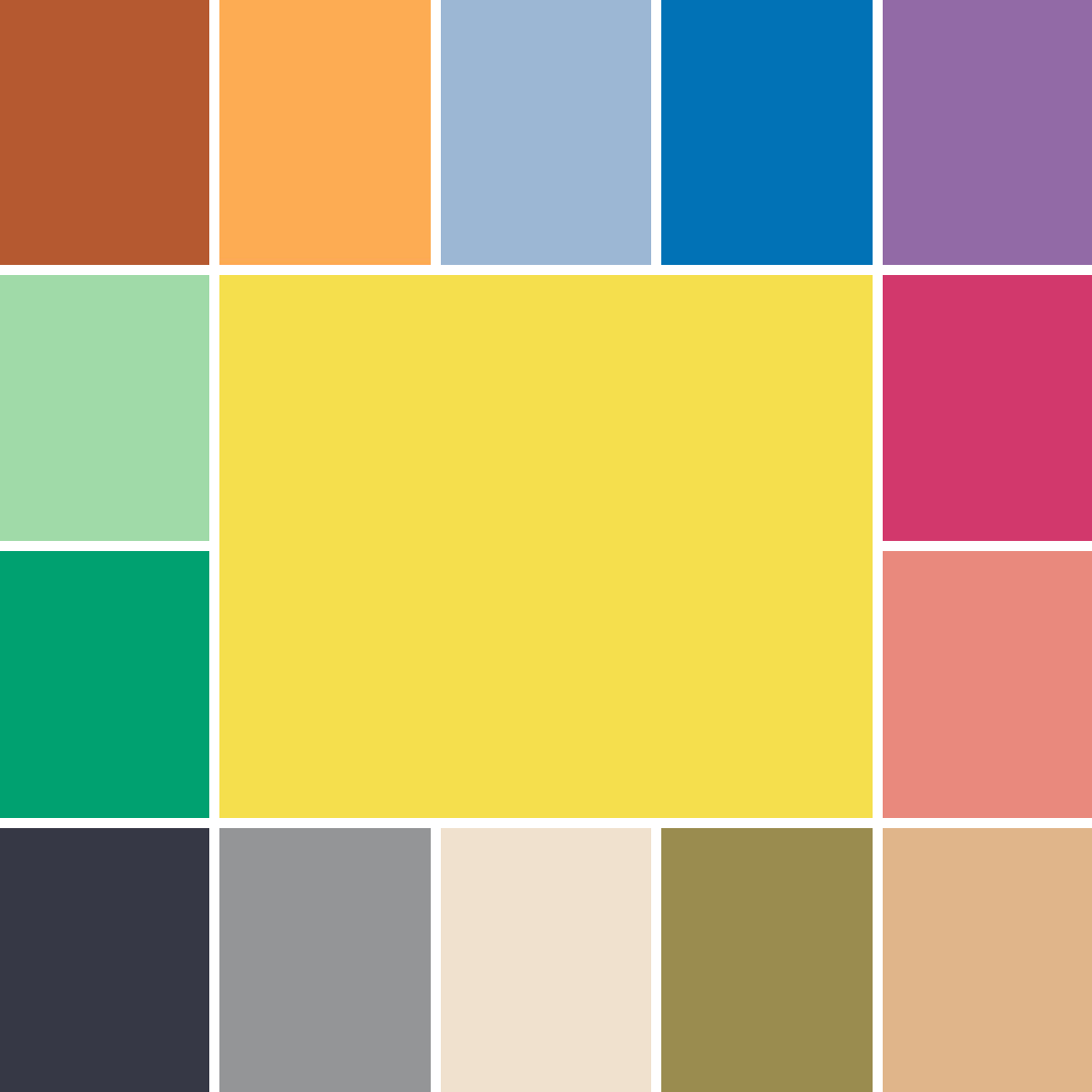
Spring 2023
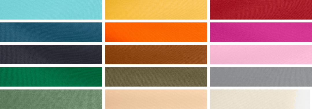
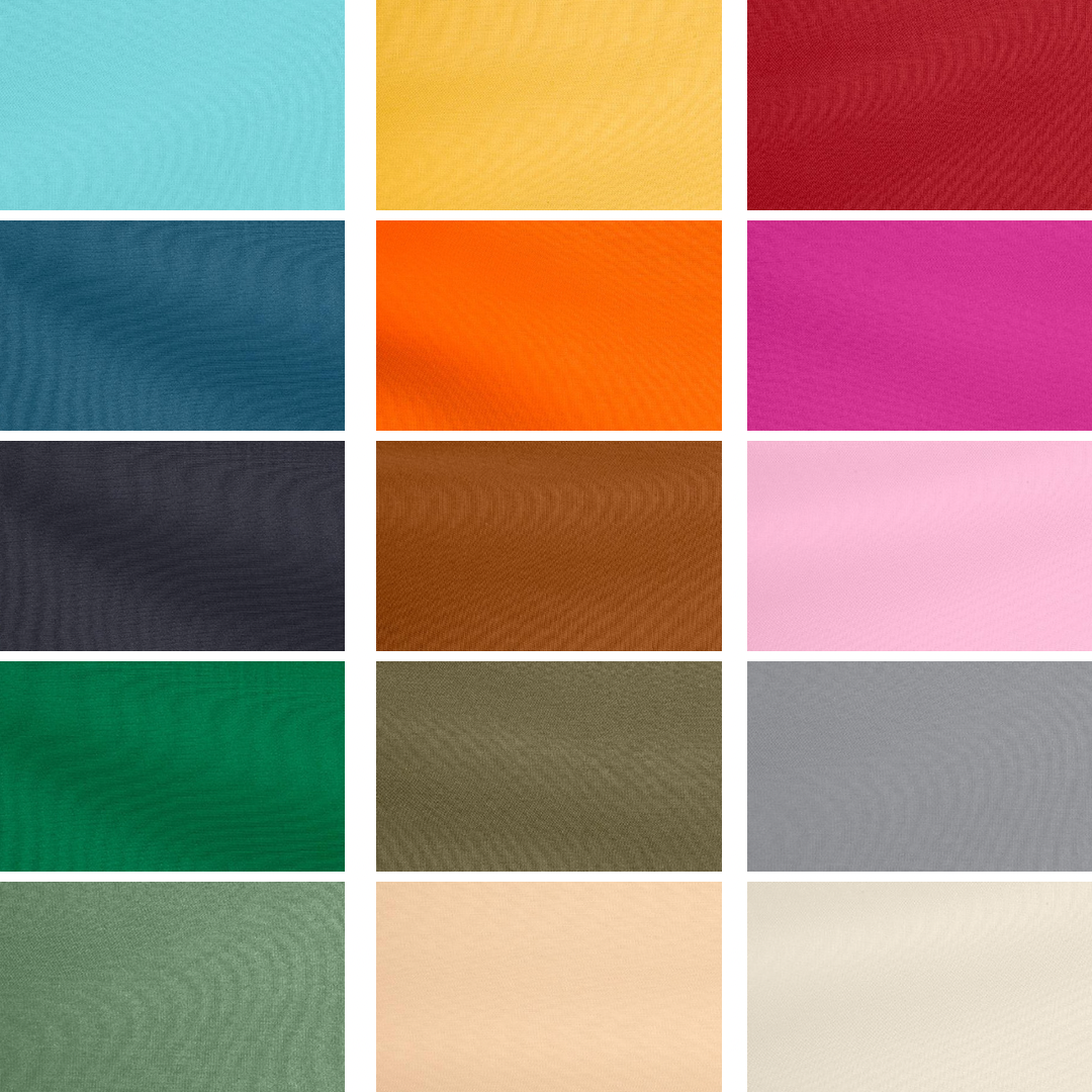
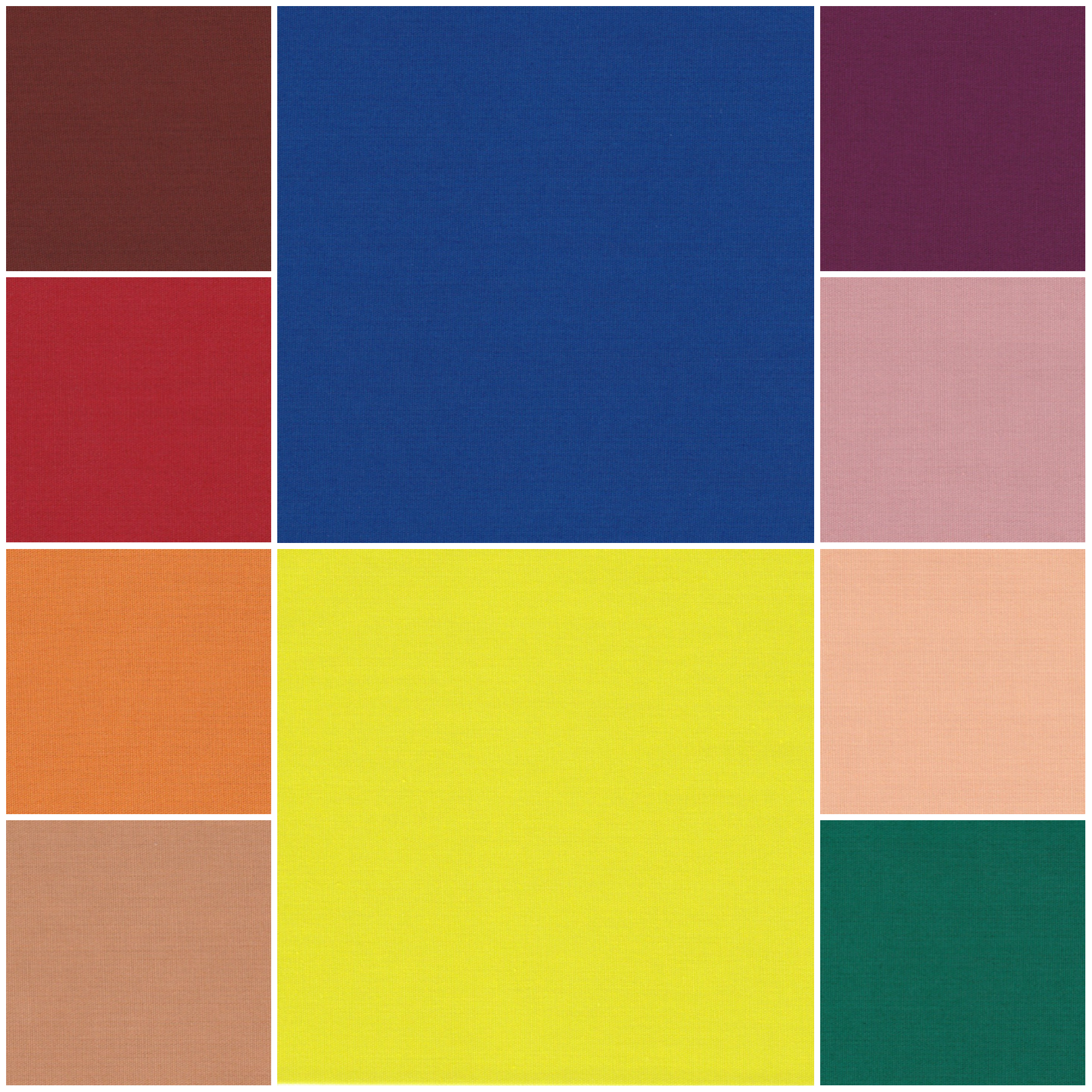
Following the fashion weeks, Pantone® have revealed the Spring/Summer colours to look out for in 2023 including 10 seasonal colours alongside 5 neutral classics.
There is an abundance of bright rainbow colours with a wonderful tropical vibe, alongside some soothing pastels.
The Pantone Color Institute’s executive director Leatrice Eiseman said “Colours for Spring/Summer 2023 are recalibrated for the new era we are entering. Blending escapism with reality, wholesomeness, and joy, we embrace the exploration of extreme contrast in mood and colour”.
Send her victorious
For me, many of the colours remind me of how bold the Queen always used to dress in her matching hats and jackets in bright colours. She often wore a solid colour from head to toe so that she stood out and was easily visible. You never caught her wearing a depressing colour.
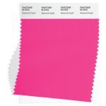
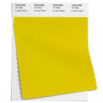
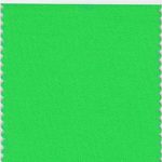
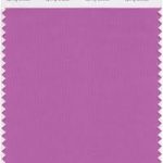
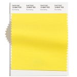
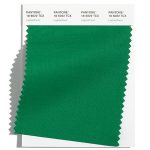
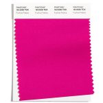
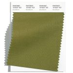
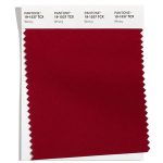
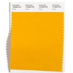
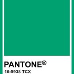
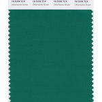
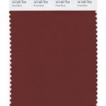
Colours like Empire Yellow, Classic Green, and Beetroot Purple are perfect examples of colours that would have been great as outfits fit for the Queen.
Queen Elizabeth II was famed for saying, “If I wore beige, nobody would know who I am.”
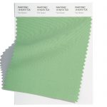
Stand out rainbow colours
The rainbow colours give such a positive outlook for next year and you can clearly spot a complete rainbow in the Spring line up of colours:
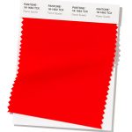
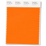
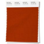
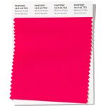
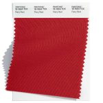
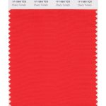
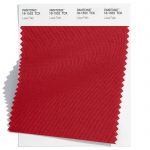
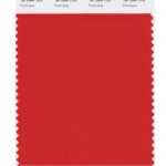
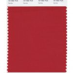
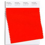
- Red – Fiery Red
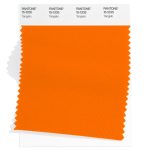
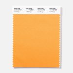
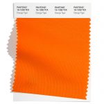
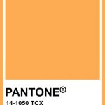
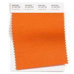
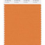
- Orange – Tangelo
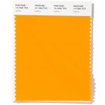
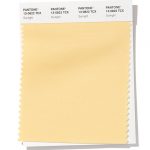
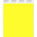
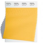
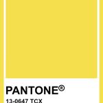
- Yellow – Empire Yellow
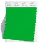
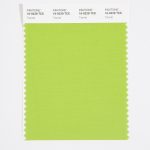
- Green – Classic Green
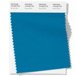
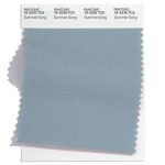
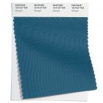
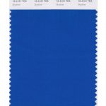
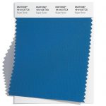
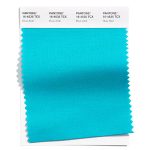
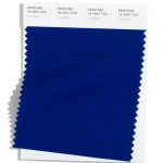
- Blue – Summer Song
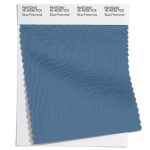
- Indigo – Blue Perennial
- Violet – Spring Crocus
Tropical island
Having had a wonderful summer this year, I can’t wait for another holiday next year and these colours exude travels to an exotic island far away. With clear blue waters, coral reefs, cloudless skies and the sun blazing down.
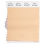
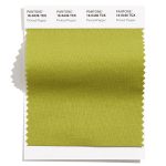
With colours such as Iced Mango as a mouth-watering sorbet and the vibrant feathers of a Love Bird or Andean Toucan. Paired alongside some neutral colours for a true coastal chic look.
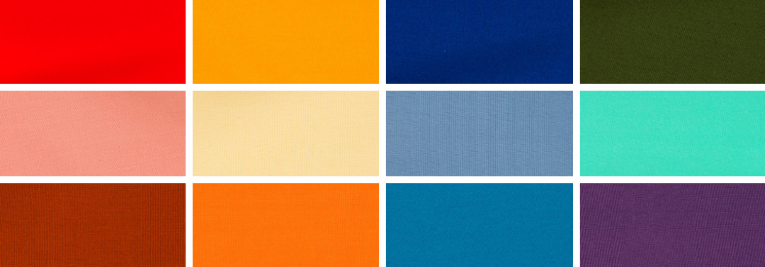
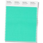
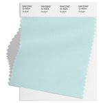
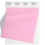
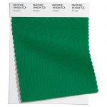
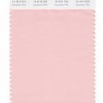
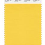
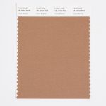
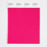
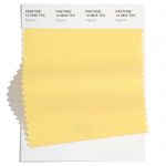
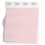
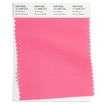
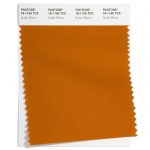
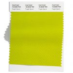
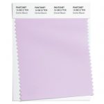
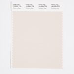
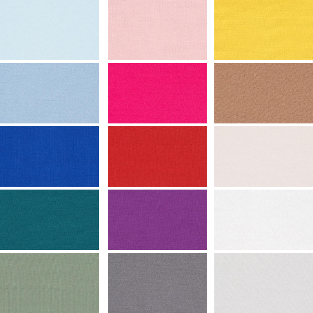
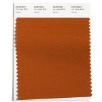
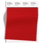
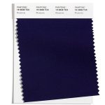
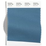
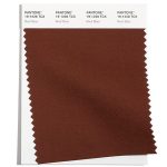
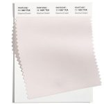
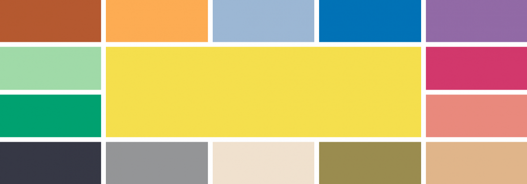
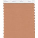
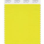
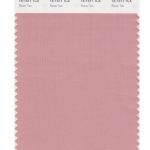
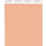
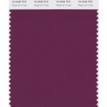
Spring 2023 colours
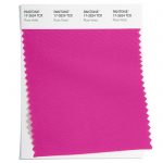
- Beetroot Purple 18-2143
- Empire Yellow 14-0756
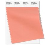
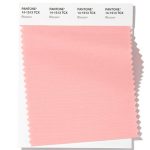
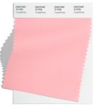
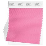
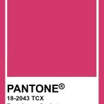
- Crystal Rose 12-1708
- Fiery Red 18-1664
- Blue Perennial 16-4036
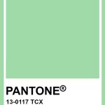
- Classic Green 16-6340
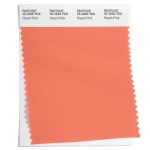
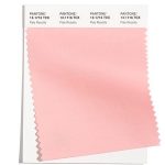
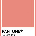
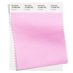
- Peach Pink 15-1530
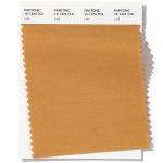
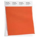
- Tangelo 15-1335
- Summer Song 14-4316
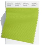
- Love Bird 13-0443
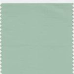
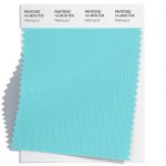
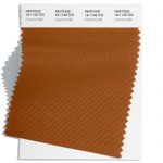
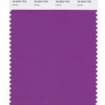
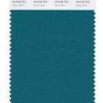
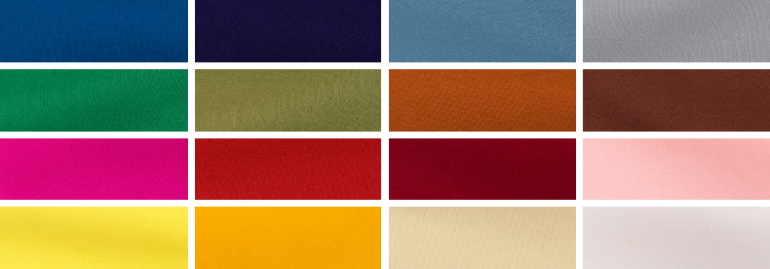
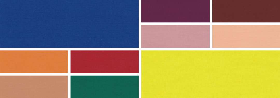
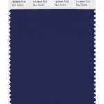
Spring 2023 extra colours from LFW
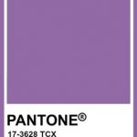
In the main the colours are repeated at London Fashion Week, albeit in lighter shades of yellow, red, orange and pale blue. However the emphasis shifts from the pink of New York Fashion Week to purple at London Fashion Week in the shape of Spring Crocus. The blues of LFW are also much more vibrant than those at NYW with Electric Blue Lemonade.
Here are the colours from LFW to round off the colours for Spring 2023:
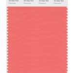
- Cherry Tomato 17-1563
- Persimmon 16-1544
- Iced Mango 14-1140
- Blazing Yellow 12-0643
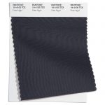
- Titanite 16-0229
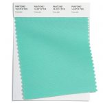
- Andean Toucan 16-6230
- Airy Blue 14-4122
- Electric Blue Lemonade 18-4245
- Spring Crocus 17-3020
- Pink Cosmos 16-2122
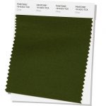
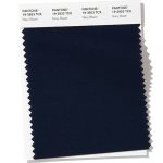
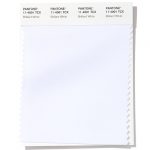
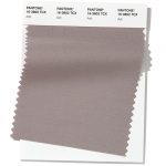
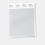
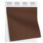
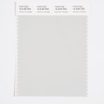
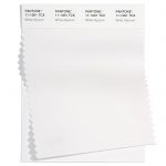
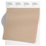
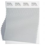
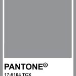
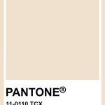
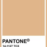
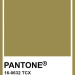
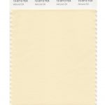
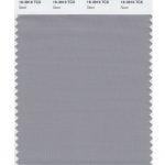
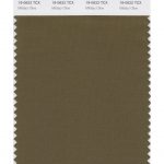
Neutral classics
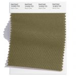
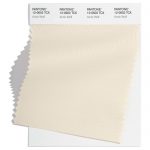
Pantone® have also updated the Classic Colour Palette. These are a group of neutrals that are core basics in the form of a coffee, khaki green, light grey, cream and blue. Perfect grounding colours and perfect peaceful additional colours for weddings.
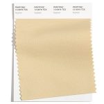
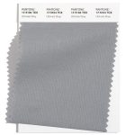
The bonus classic neutral colours for Spring 2023 are:
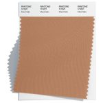
- Macchiato 17-1221
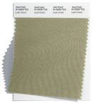
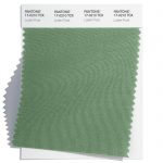
- Leek Green 15-0628
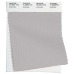
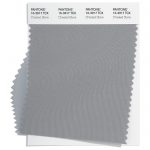
- Gray Lilac 13-3804
- Vanilla Cream 12-1009
- Skylight 12-4604
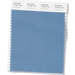
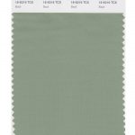
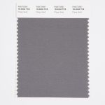
And at LFW these are:
- Oyster Mushroom 13-4201
- Grayed Jade 14-6011
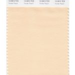
- Tender Peach 12-0912
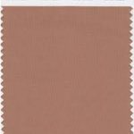
- Mocha Mousse 17-1230
- Bluing 19-3954
Colour themes
Colour plays an important part in our lives and it’ll be interesting to see how these colours filter through to influence things around us.
Pantone® is the world-renowned authority on colour and the Pantone® Color of the Year is always really influential in any popular colour themes in fashion, interior design and weddings.
Look out for my report when the 2023 colour of the year is released later in the year. My guess is for a bright green of Love Bird – we haven’t had a green since 2017 so feels fitting. And definitely a colour the Queen would have worn.
“We should take comfort that while we may have more still to endure, better days will return. We will be without friends again. We will be with our families again. We will meet again.” Queen Elizabeth II 2020


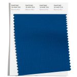
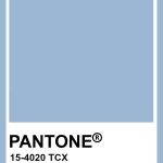
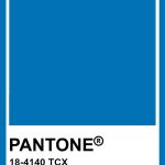


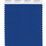

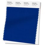
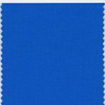
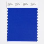
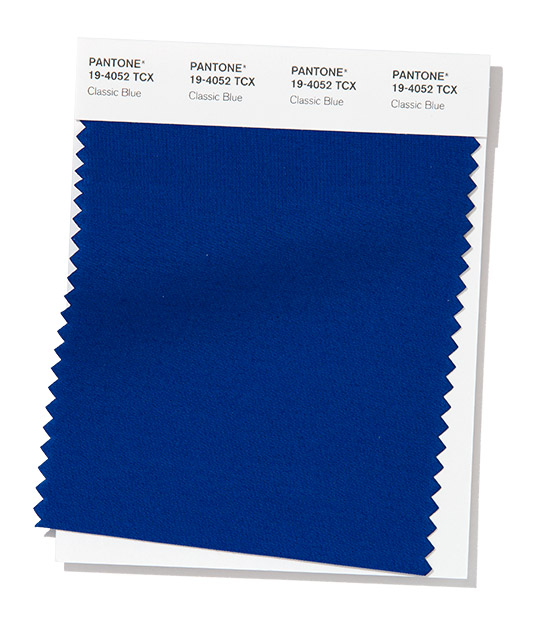 Classic Blue