ten years of memories
This year marks 10 years since Hanami Dream was founded. Each month in the build up to the 10th birthday of Hanami Dream in July 2024, I’m taking a look at how the business has changed and different aspects that have shaped the business to where it is today.
Last month, I looked at some of the achievements and accolades I’ve collected over the last ten years to celebrate successes, expertise and growing experience.
This month I’m looking back on one of my proudest moments over the last ten years.
blog awards
My tutor at the UK Academy of Wedding & Event Planners gave me invaluable support and guidance, including entering competitions to get my name out there and a form of marketing.
Amongst other competitions, I decided to play to my blogging strengths and entered the UK Blog Awards, they were the biggest and UK’s longest running programme to recognise influencer talent.
I entered the UK Blog Awards for 3 years and was lucky enough to be a finalist each year.
Just being a finalist gave me a huge sense of achievement, it was a great recognition and a wonderful testament to the level of support shown by my readers.
For full disclosure, I didn’t pay to enter these awards. I nominated my own blog and then it was down to a public vote to get through to the finals. Out of 4,000 entries and nominations I was one of only 6 bloggers in my category. So I was pretty chuffed and honoured to even be considered alongside the calibre of my fellow finalists in the category.
Then a judge picked one winner and one highly commended blog from the 6 finalists in each category.
highly commended
Back in 2016, I first took part in the UK Blog Awards and even attended the award ceremony that April. I was delighted that my blog received highly commended in the events category on my debut outing.
finalist
The following year I entered the wedding category of the UK Blog Awards in 2017 and was chosen as a finalist again. My blog was shortlisted and reached the final stage of the process.
However I was despondent that I didn’t equal (or better) my previous success. I was against stiff competition and returned home from the final empty handed.
I fell out of love with blogging for a while after this knock but eventually dusted myself down and decided to refocus and come back fighting the next year.
It was whilst I was on holiday, that I took a step back and looked at where my strengths lie and what I am really good at. I stopped worrying and looking at what others were doing and concentrated on my own stuff and focused on what I do best – creating my own content.
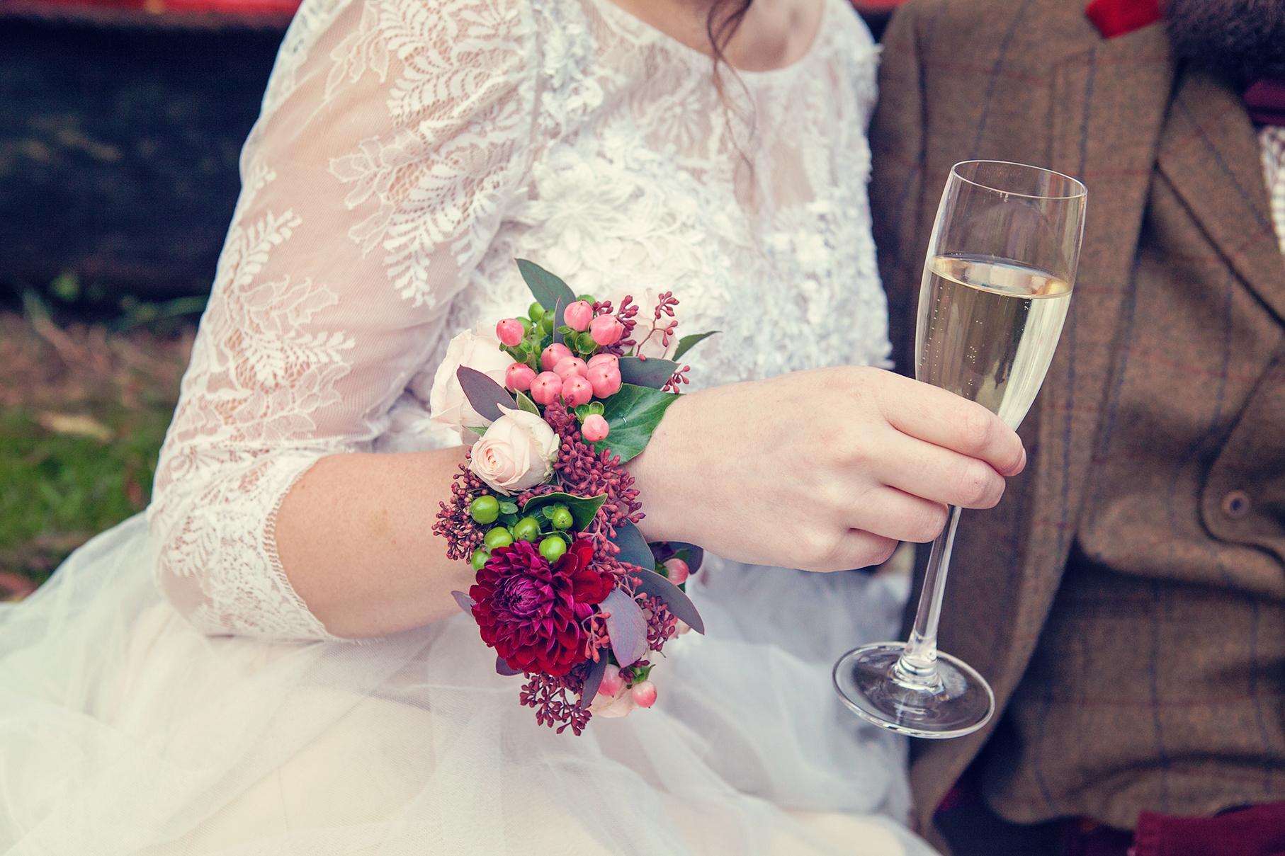
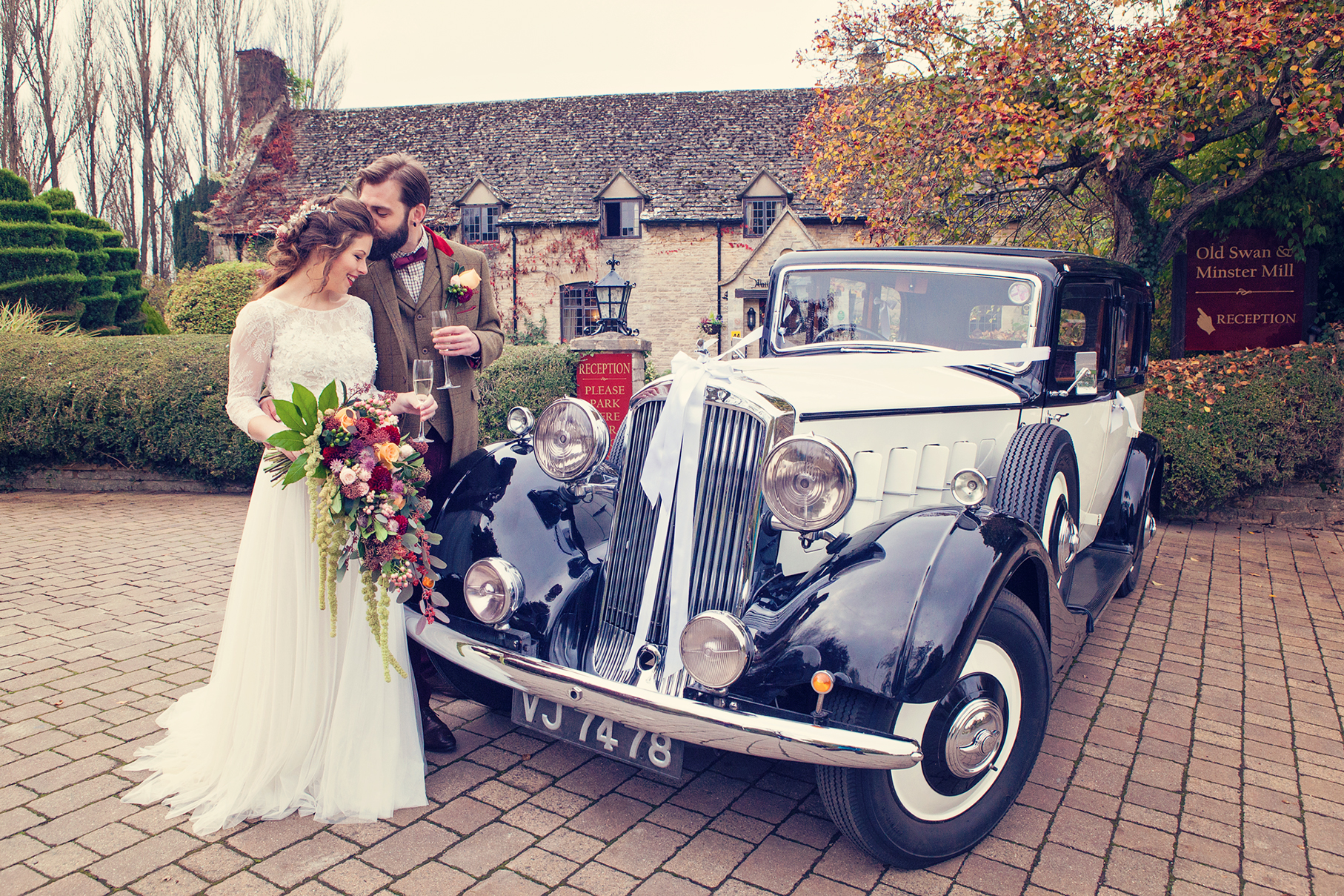
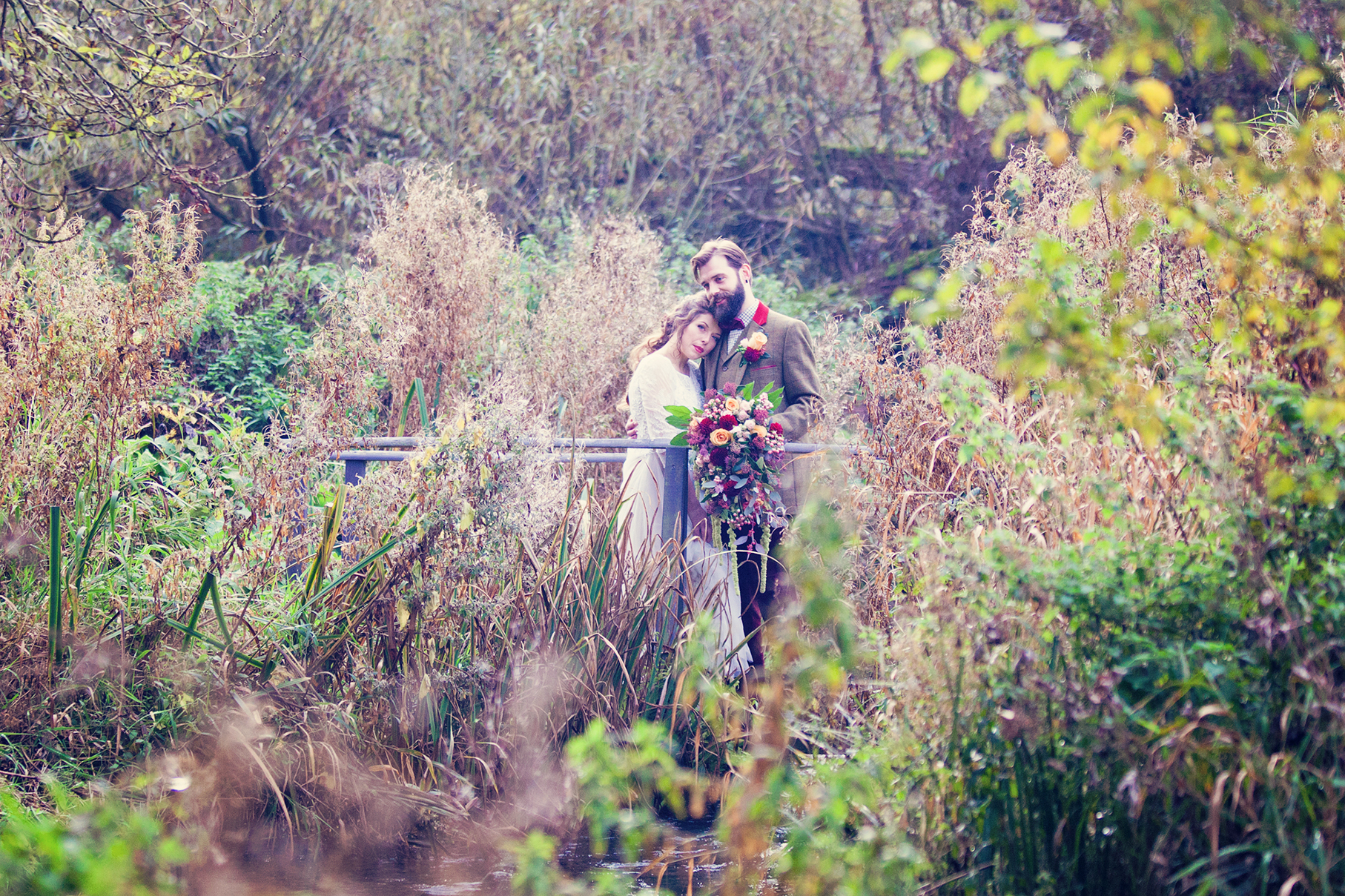
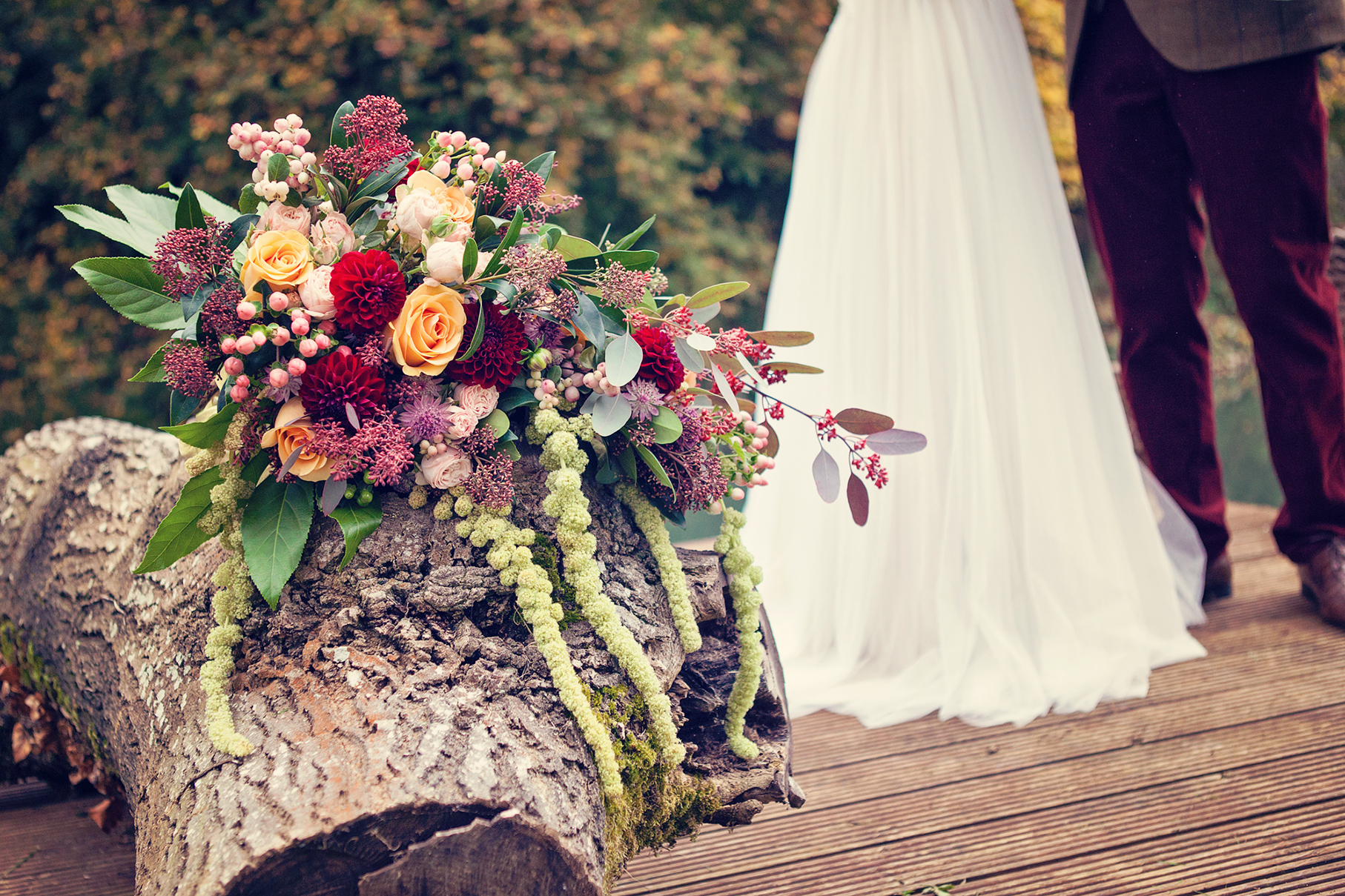
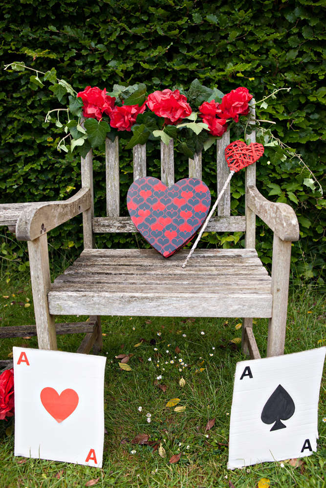
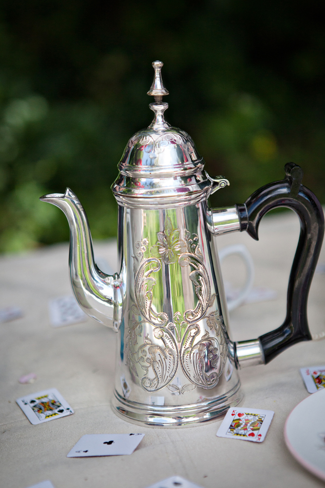
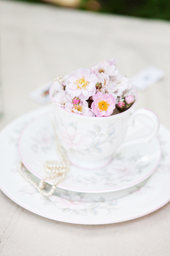
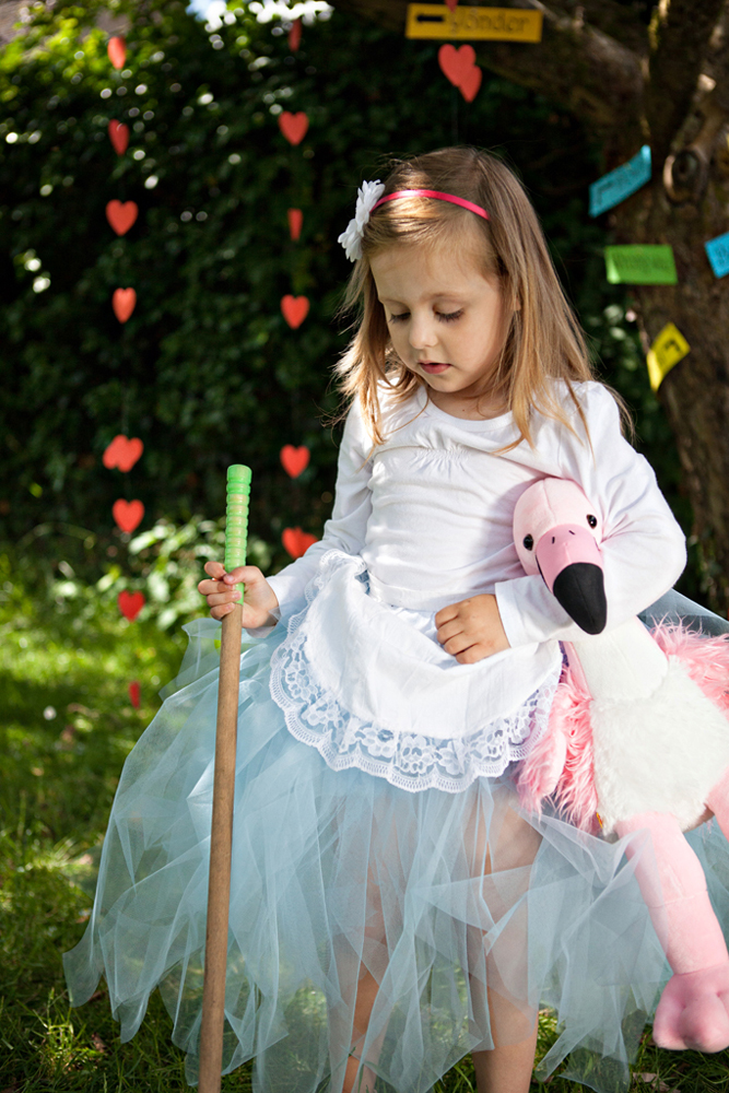
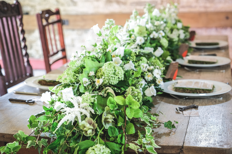
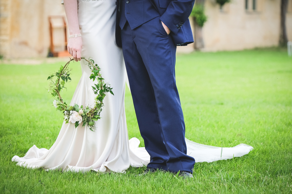
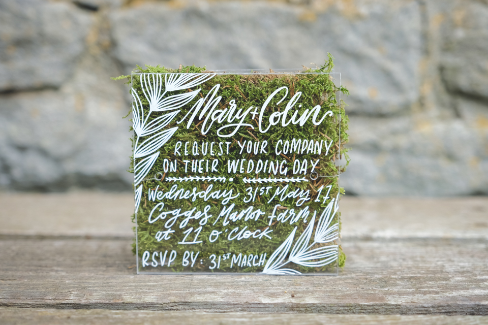
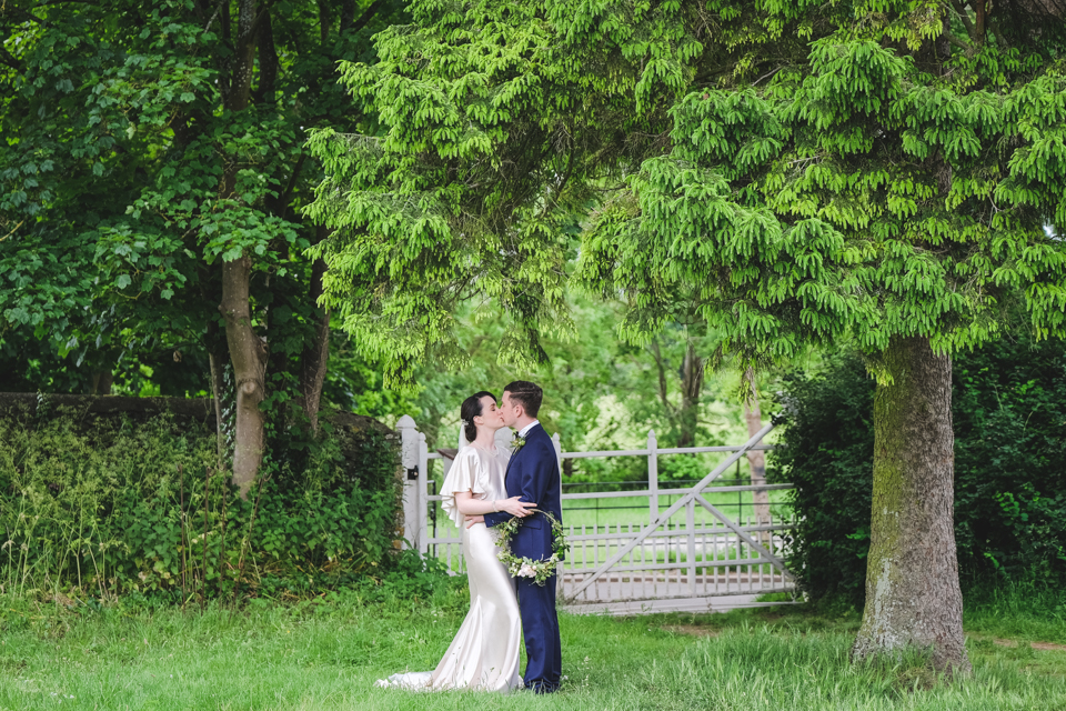
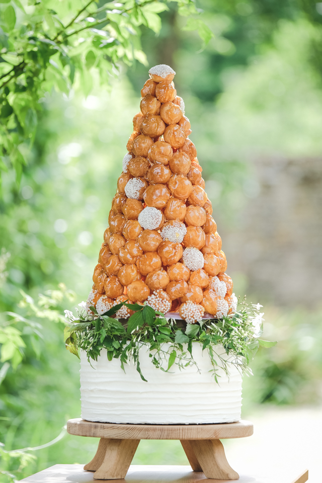
So, I organised three wonderful styled wedding photo shoots in a year. The uniqueness of the blog at that time came from showcasing my own beautiful and inspirational, trend-led styled wedding shoots, collaborating with local venues and innovative wedding suppliers.
winner
In 2018, I made it to the final round yet again. And was absolutely delighted to win the Events and Wedding individual UK Blog Award. It was such a great achievement and I was honoured to be alongside some amazing blogs! I was so pleased to win the UK Blog Awards in a year when I was been doing what I enjoyed best – showcasing my own content and keeping it local.
I remember the moment I found out so vividly. I was sat down on my back step with the bifolds open, enjoying the warm evening air, hunched over my phone trying to follow the results from the UK Blog Awards 2018. Sadly I wasn’t able to physically attend the award ceremony and, whilst I’m pleased to have avoided the big smoke of our capital city in the midst of a minor heat wave, I’m disappointed that I wasn’t there for the announcement of the UK Blog Awards and to hear my company name be called out as a winner.
My wedding blog had come so far … from highly commended in 2016, to winning in 2018!
It was tricky to follow who was winning the awards on the night via social media and they seemed to be whizzing through the categories. Then out of the blue, someone sent me a congratulations tweet. I wasn’t quite sure what this meant. Had I got highly commended, had I actually won, or was it just a prank?
I spent ages trawling through twitter for confirmation. I felt that I couldn’t get too excited until I knew for sure. Then a couple of other bloggers from my category very kindly tagged me in their Instagram stories and included shots of the big screen showing my name as the winner. It was the confirmation that I needed – I was delighted (but in disbelief for ages!)
That hot, humid and thundery night gave me one of the best memories of Hanami Dream.
judge
The following year, I was absolutely flattered to take the next step and evolve my involvement and in 2019 to become the wedding judge for the UK Blog Awards 2019.
It was not only a great honour but an inspiration to read all the blogs especially those with fresh content, a unique angle and a new take on topics, those tackling novel subjects that are ahead of trends and give a modern stance on the world of weddings and modern alternatives to old traditions.
It felt right to hand the baton on to the next wedding blog.
Blogging is about making your own niche, being yourself, being unique and doing what you do best. Blogging for me is about being a content creator, a journalist in your own field, reporting on your area of expertise as you see it.
exposure
It is always great to have another reason to shout about my business and to connect with other professionals and local businesses.
The added promotion not only gave my blog extra exposure, but it also showcased the stunning venues and highly talented wedding industry professionals from small, local and independent businesses, that my blog supported in the beautiful Oxfordshire countryside of the Cotswolds.
Winning the UK Blog Awards remains one of my greatest memories over the last ten years one which still makes me feel incredibly proud.
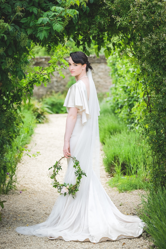
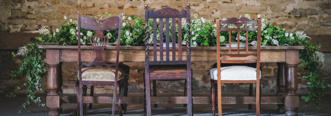
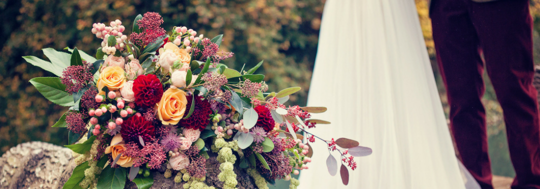
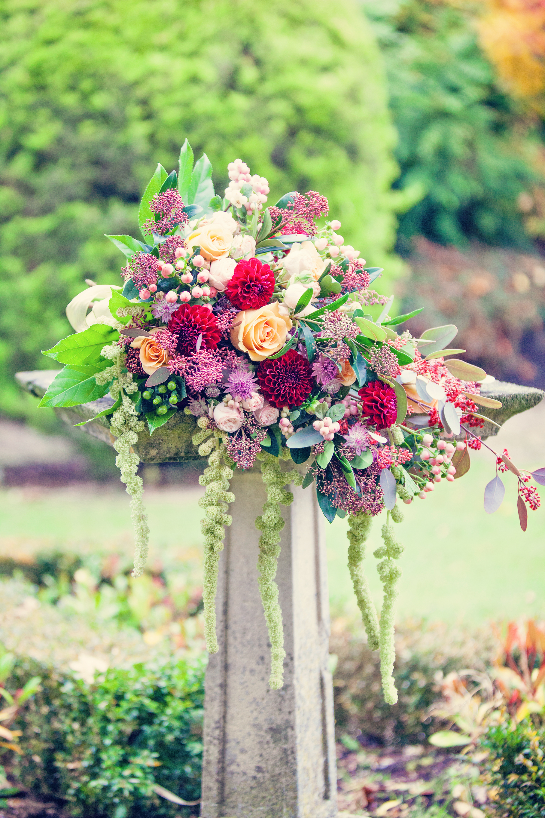
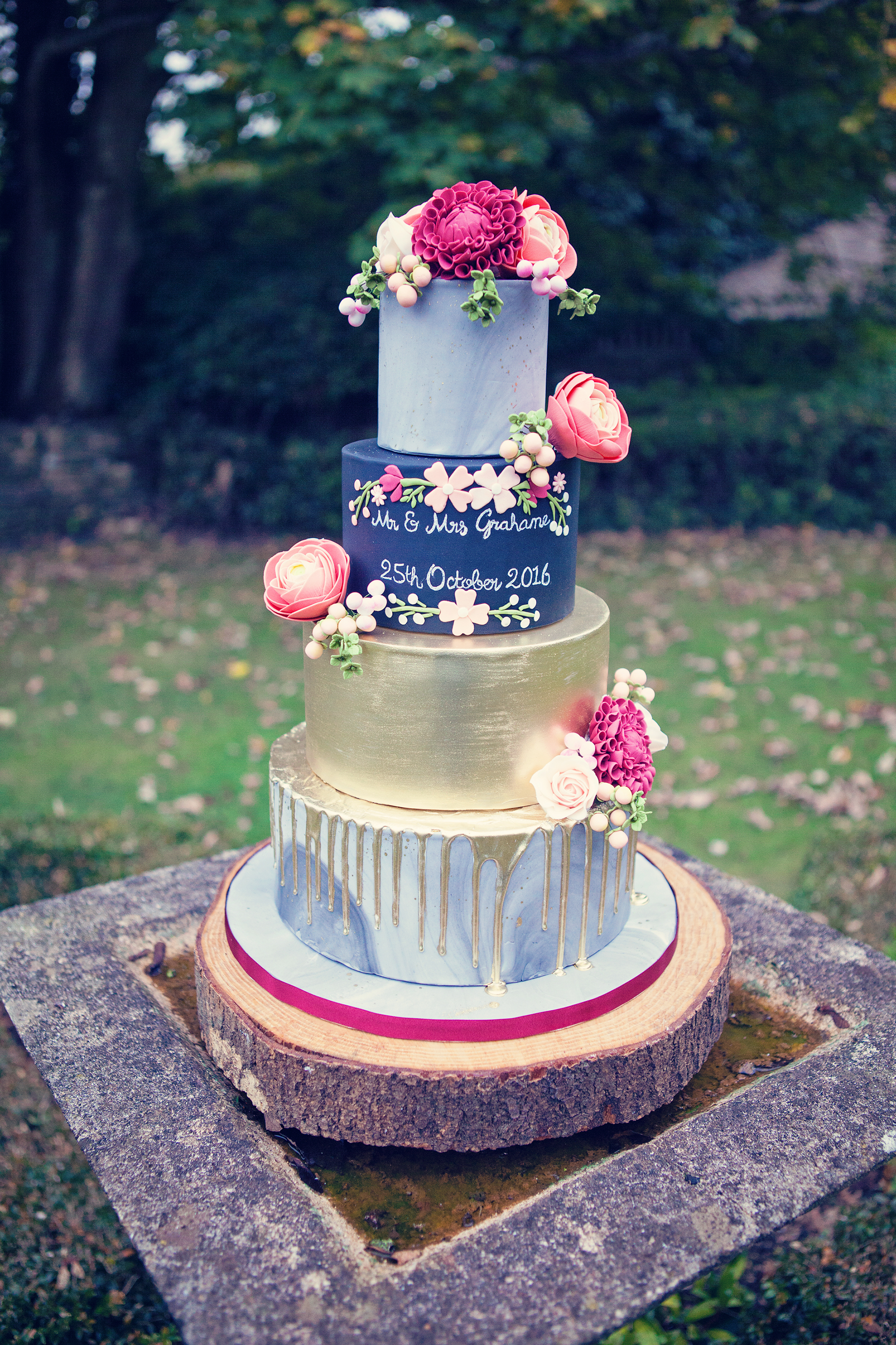
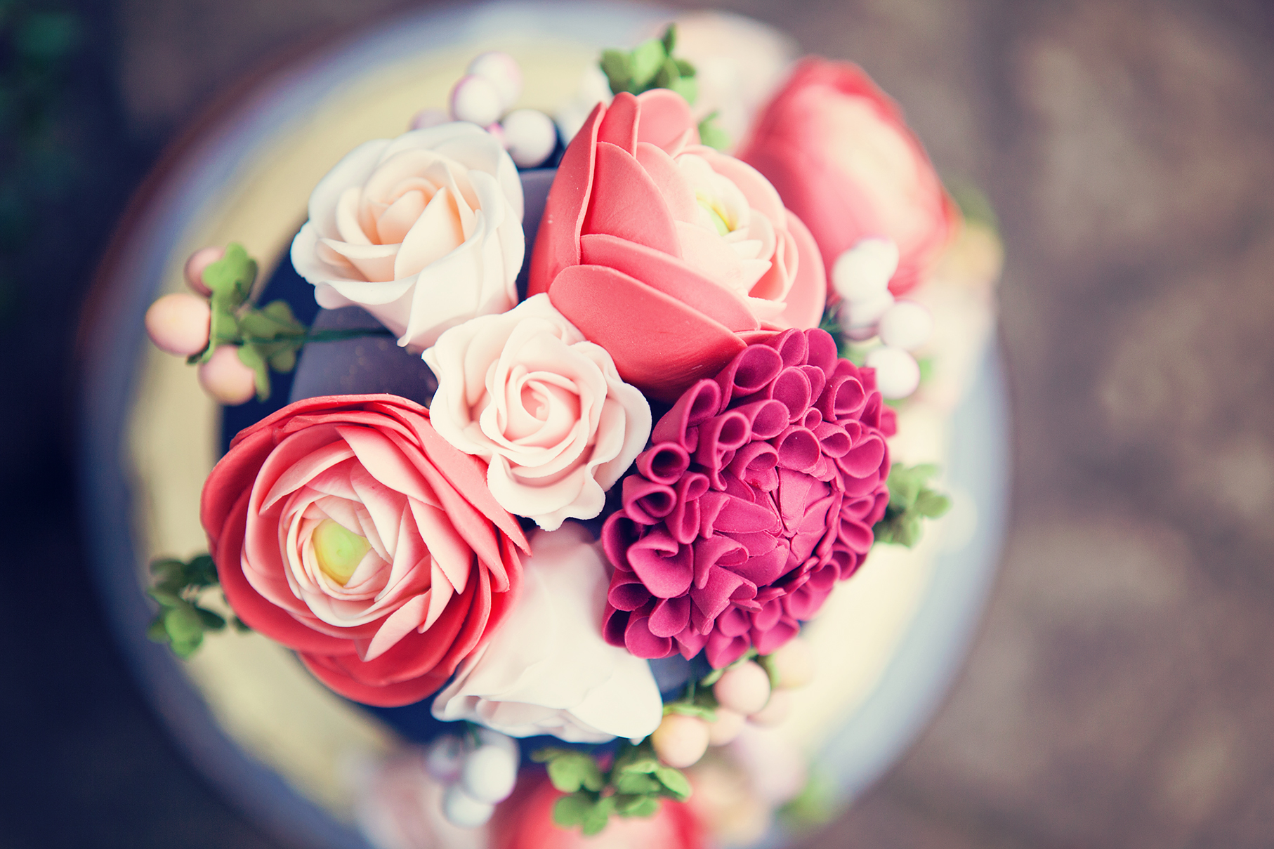
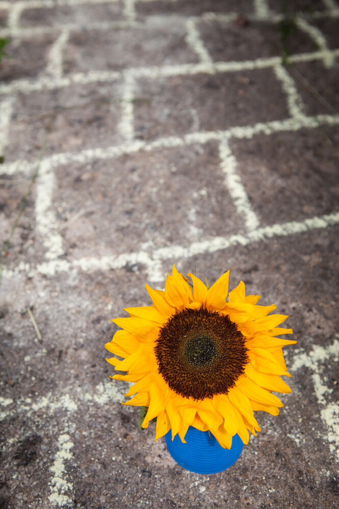
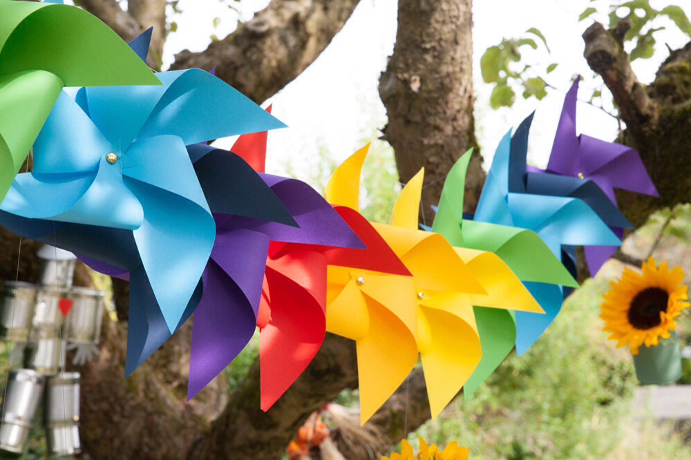
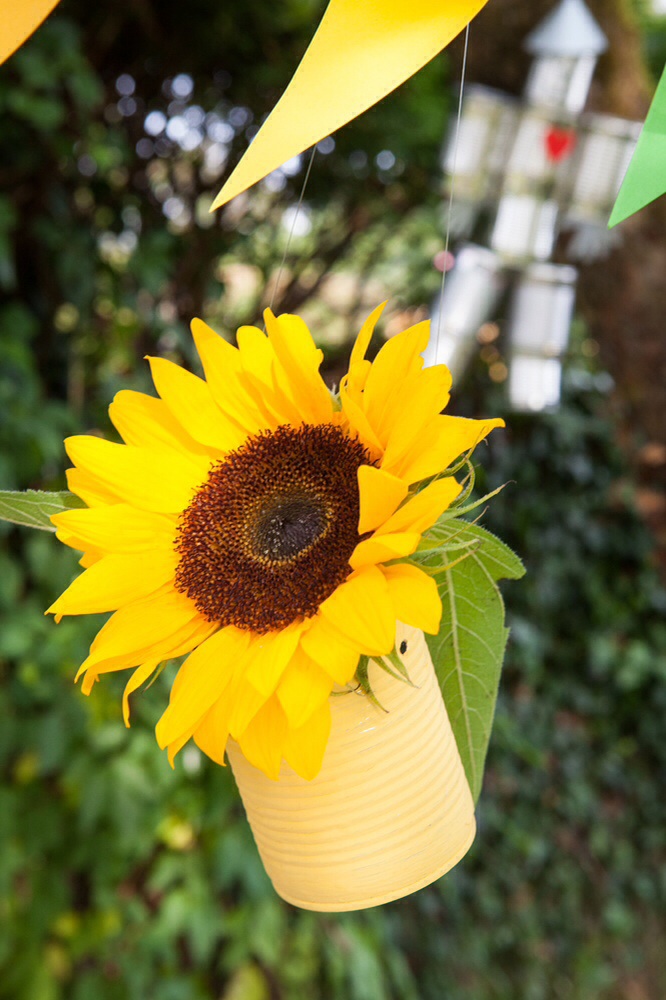
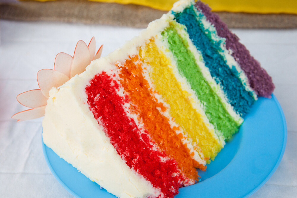
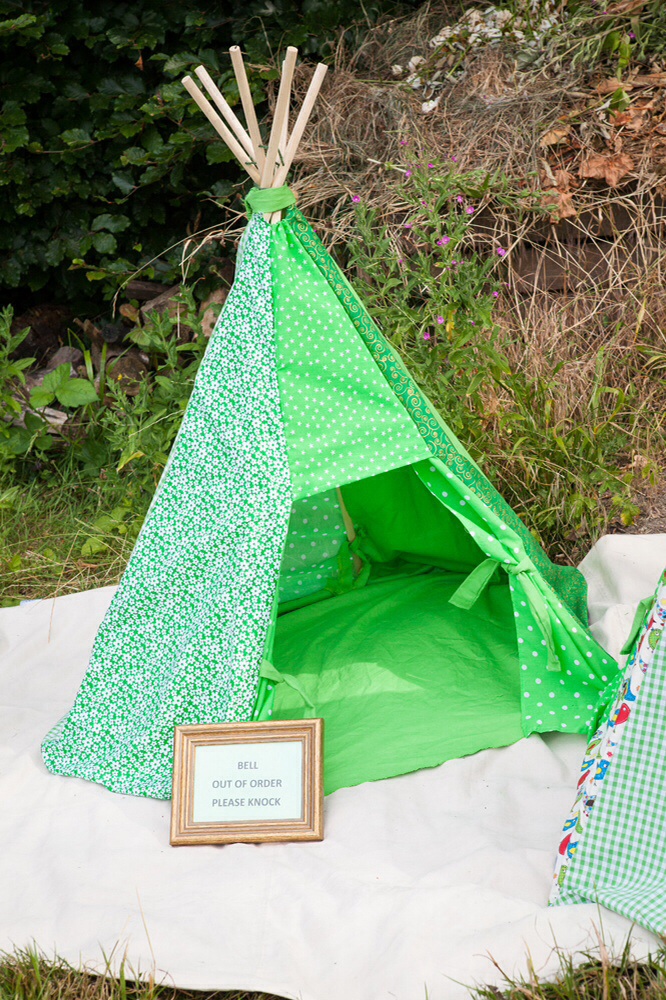
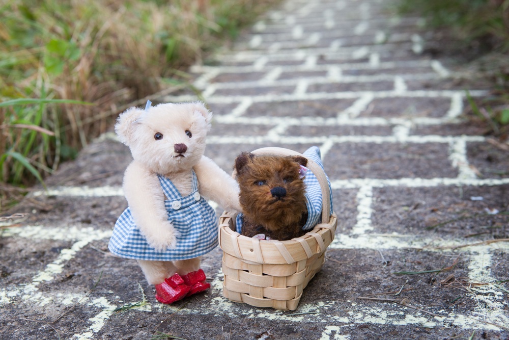
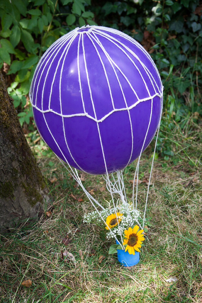
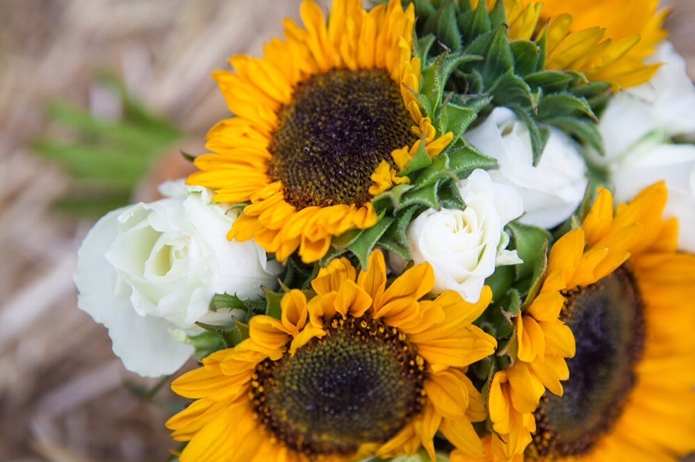
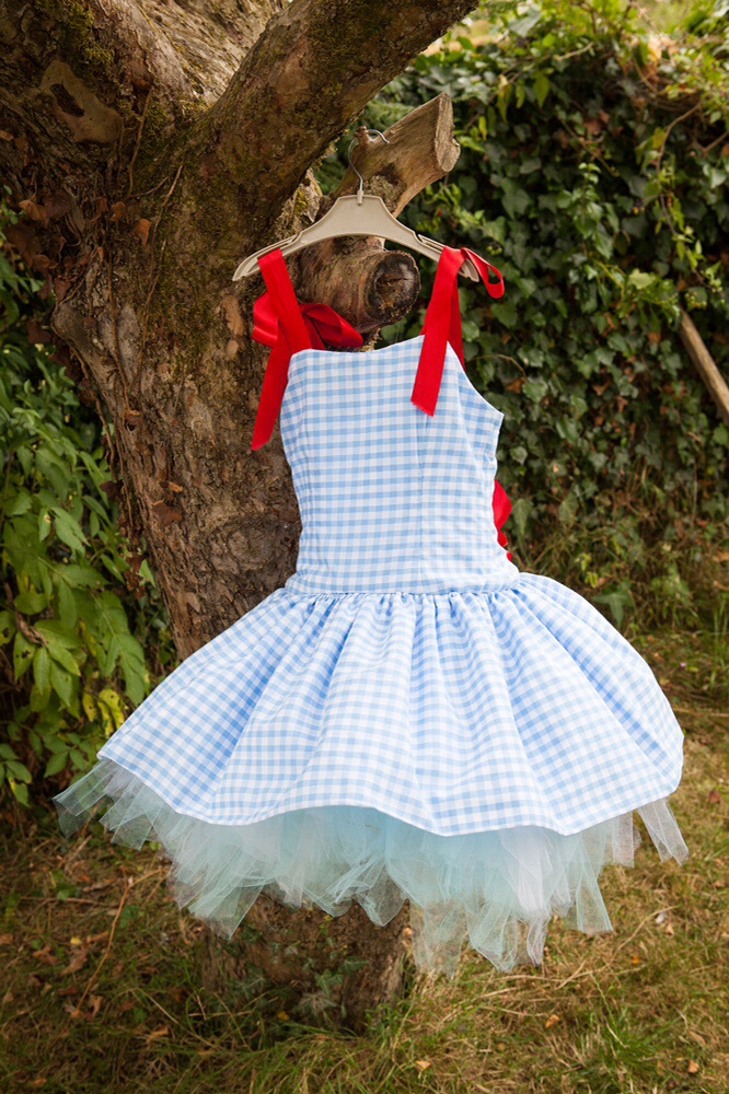
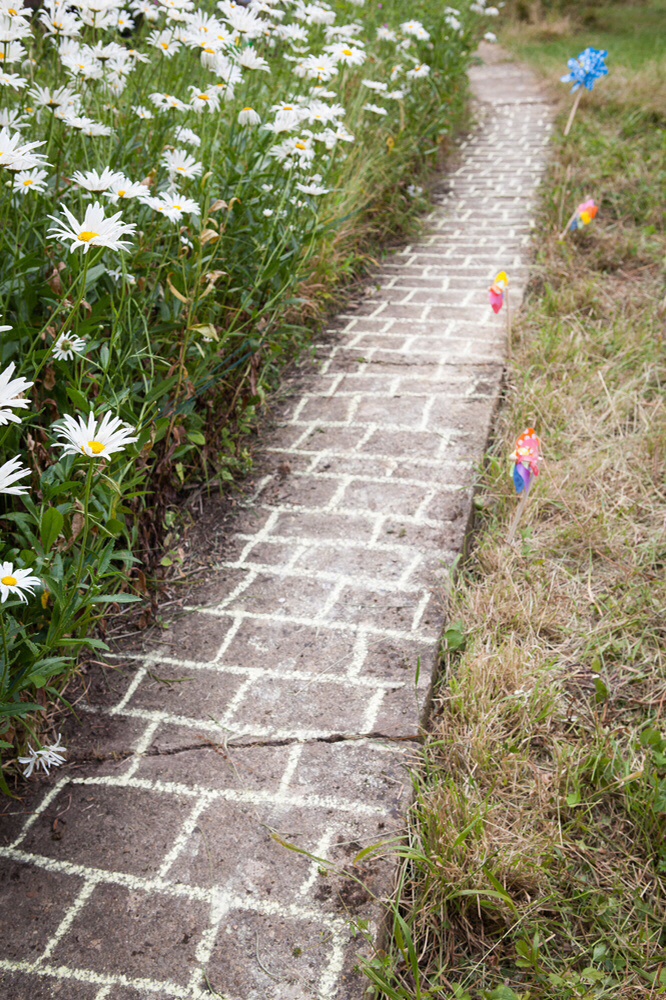
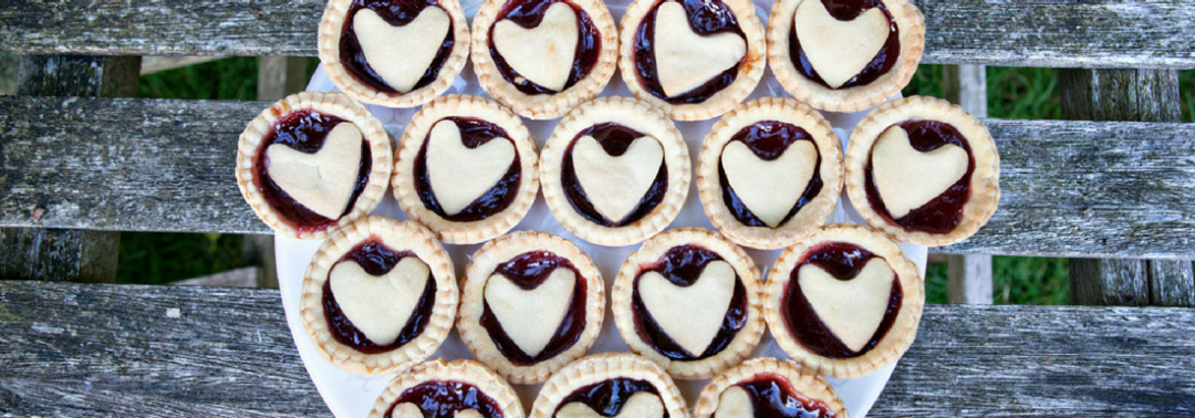
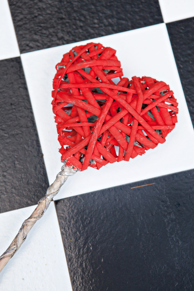
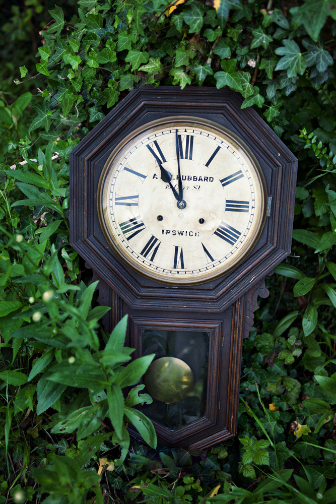
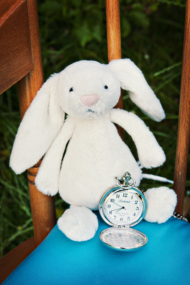
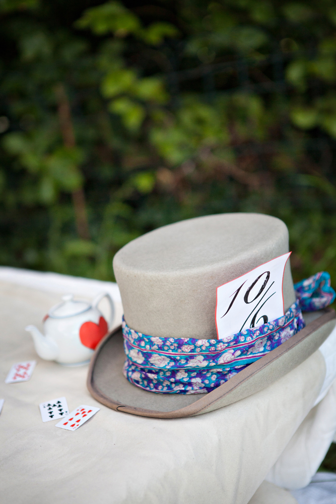
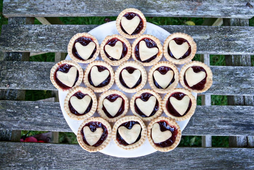
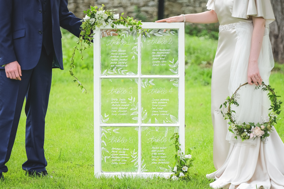
All photography in the post are by Farrow Photography from our Secret Garden photoshoot. Look out for more images from other shoots in next month’s post following the build up to the tenth birthday.